 A line chart is one of the basic and most commonly used techniques of data visualization. Such graphics are known to provide an informative look at the change of one or several variables over time. Right now, I’ll explain how to easily create a cool interactive line chart using JavaScript! The process will be demonstrated with the help of compelling examples that you can play with afterwards to hone your new data visualization development skills.
To make the article especially thrilling for you to read and learn from, I decided to showcase a practical application of a line chart to real-world data. The month of June was celebrated as Pride Month, and I thought it would be great to see how attitudes toward LGBT people have changed over the recent years. Then I found interesting public opinion data from the General Social Survey (GSS), a project of the National Opinion Research Center (NORC) at the University of Chicago, which appeared to be a good fit, and took part of it to visualize in this guide.
So, follow along with the tutorial and you will also be able to explore the shifts in acceptance of same-sex relationships in the United States over the last two decades! We will create a single-series JS line chart first, representing the general trend, and then a multi-series JS line chart to visualize a breakdown by age group.
All aboard!
JS Line Chart Preview
Before we begin, check out a preview! Here is a look at the beautiful line chart that we will have built with JavaScript by the end of this data visualization tutorial. Plus, it will be interactive and easily embeddable in any web page or app!
Doesn’t it feel great to look at this colorful chart and feel positive about the future outlook?
Read this step-by-step tutorial all the way to the end and you will learn how to produce such a line graph easily with very little coding.
Building Basic JavaScript Line Chart in 4 Simple Steps
The normal order of visualizing data in JavaScript charts can be broken down into four basic steps, and building a JS line chart follows the same pattern:
- Creating a basic HTML page to display the chart.
- Including all the JS scripts we need.
- Adding the data for the chart.
- Writing the JS charting code.
So now, let’s dig into each of these steps to draw our line chart in a jiffy.
1. Creating a basic HTML page
To start, we create a basic HTML page with a <div> block element for our line chart. To reference this block element later in the code, we give it an id attribute like “container”.
<html>
  <head>
    <title>JavaScript Line Chart</title>
    <style type="text/css">
      html, body, #container {
        width: 100%; height: 100%; margin: 0; padding: 0;
      }
    </style>
  </head>
  <body>
    <div id="container"></div>
  </body>
</html>
Here, we provide the <div> with the 100% width and height to render the line chart on the full screen. But it’s not necessary and can be customized according to your requirements, of course.
2. Including all the JS scripts
The second step is to reference all the necessary scripts to build the JS line chart. These scripts will go in the <script> tag inside of the <head> section.
In this tutorial, the line chart is built with AnyChart. It is a lightweight and flexible JavaScript (HTML5) charting library with detailed documentation and API reference. In addition, there are a lot of chart examples to check out and use as the starting point, as well as a utility called Playground to experiment with the code.
Since the line chart is one of the basic chart types, it requires only the base module of AnyChart. We can easily obtain it from the CDN. The JS line chart code itself will be written in the <script> tag inside of the <body> section.
<html>
  <head>
    <title>JavaScript Line Chart</title>
    <script src="https://cdn.anychart.com/releases/8.10.0/js/anychart-base.min.js"></script>
    <style type="text/css">
      html, body, #container {
        width: 100%; height: 100%; margin: 0; padding: 0;
      }
    </style>
  </head>
  <body>
    <div id="container"></div>
    <script>
      // All the code for the JS line chart will come here
    </script>
  </body>
</html>
3. Adding the data
In this tutorial, we will be visualizing data from the GSS Data Explorer, namely the data that shows how the breakdown of responses to the question “Is it wrong for same-sex adults to have sexual relations?” changed over time between 1990 and 2018. Namely, we’ll represent the percentage of responses “Not wrong at all” that looks like a good indicator of acceptance here.
AnyChart supports multiple options to load data to charts. The data set for our line chart is pretty straightforward and not large at all. So we can simply include it inside the code itself.
To do that, we create a function that will return the data to keep it as a separate block of code.
function getData() {
  return [
    ['1990',12],
    ['1991',14],
    ['1993',21],
    ['1994',21],
    ['1996',26],
    ['1998',26],
    ['2000',27],
    ['2002',31],
    ['2004',29],
    ['2006',31],
    ['2008',36],
    ['2010',41],
    ['2012',42],
    ['2014',48],
    ['2016',50],
    ['2018',57]
  ];
}
All the prep is done and now it’s time to create the line chart with a few lines of JavaScript code!
4. Writing the JS line charting code
Before anything else, we add a function enclosing all the JavaScript code needed to create the intended interactive line chart. This ensures that the code inside it will only execute once the page is all loaded.
We set up the data by calling the function we made in the previous step, and then we map the data to indicate that the first parameter for every data point is the X value and the second parameter is the Y value. Next, we call the line() function to create the JS line chart.
// create a data set on our data
var dataSet = anychart.data.set(getData());

// map data for the line chart,
// take x from the zero column and value from the first column
var seriesData = dataSet.mapAs({ x: 0, value: 1 });

// create a line chart
var chart = anychart.line();
Now, we set the titles for the line chart and for the Y-axis.
// configure the chart title text settings
chart.title('Acceptance of same-sex relationships in the US over the last 2 decades');

// set the y axis title
chart.yAxis().title('% of people who accept same-sex relationships');
Lastly, we load the mapped data to the line chart, set the container id, and draw the graphic.
// create a line series with the mapped data
var lineChart = chart.line(seriesData);

// set the container id for the line chart
chart.container('container');

// draw the line chart
chart.draw();
Voilà! A functional, interactive, JavaScript-based line chart is created! This was quite quick and simple, wasn’t it?
Check out the result below, and you are more than welcome to see this chart and play with its code on AnyChart Playground.
What does this line chart tell us? We can clearly see the positive change over time and how the acceptance of same-sex relationships in the United States was gradually increasing between 1990 and 2018 with just a few slight pauses.
But do not leave yet! Although this chart already looks good, it is just a very basic version of the JS line chart we can afford to obtain. It will only take a few more steps to add functionality and interactivity.
Now, get ready to make a stunning multi-line chart that will visualize a breakdown by age!
Creating Interactive Multi-Series JS Line Chart
When there is segregated data, we use a multi-series line chart to indicate each segment as a separate line. Let’s see how it is done!
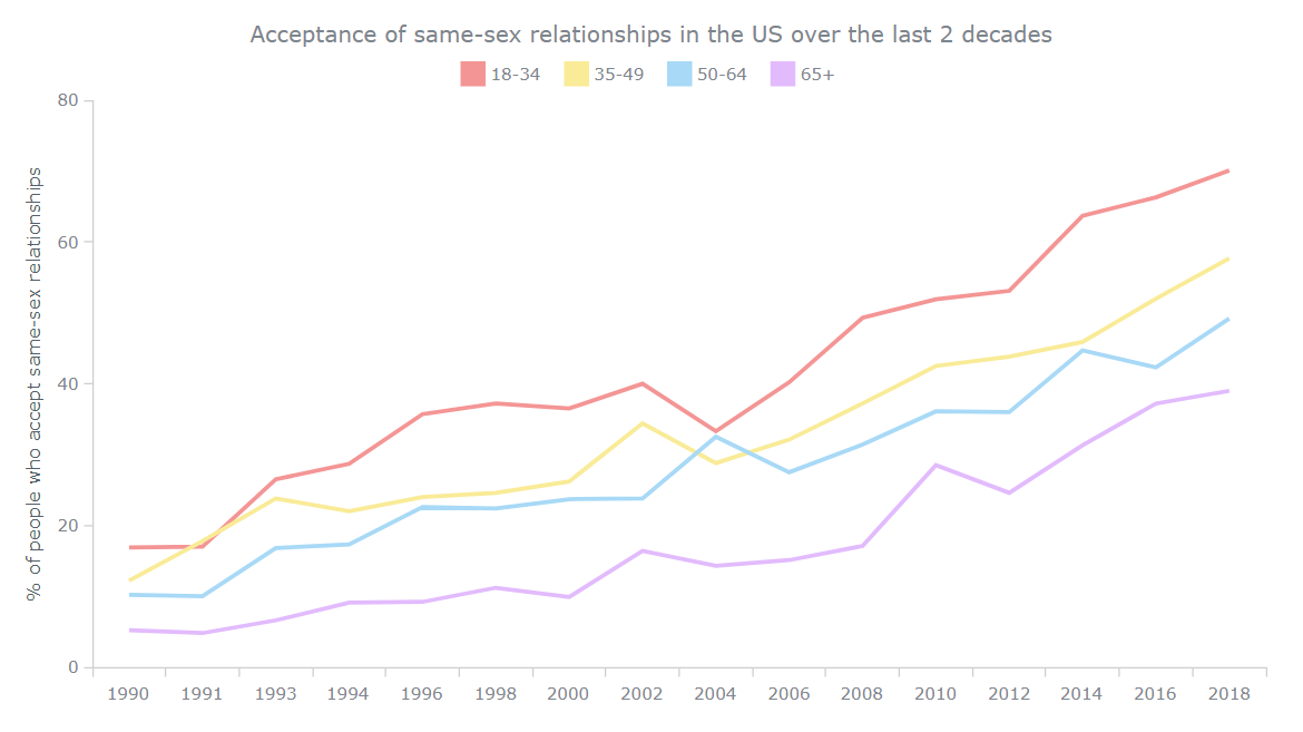
The basic code remains the same. But instead of one series, we will create multiple series. Of course, the data will contain multiple data points for each year now as we break down the total percentage for “Not wrong at all” by age groups: 18-34, 35-49, 50-64, and 65+.
function getData() {
  return [
    ['1990',16.9,12.2,10.2,5.2],
    ['1991',17,17.8,10,4.8],
    ['1993',26.5,23.8,16.8,6.6],
    ['1994',28.7,22,17.3,9.1],
    ['1996',35.7,24,22.6,9.2],
    ['1998',37.2,24.6,22.4,11.2],
    ['2000',36.5,26.2,23.7,9.9],
    ['2002',40,34.4,23.8,16.4],
    ['2004',33.3,28.8,32.5,14.3],
    ['2006',40.2,32.1,27.5,15.1],
    ['2008',49.3,37.2,31.4,17.1],
    ['2010',51.9,42.5,36.1,28.5],
    ['2012',53.1,43.8,36,24.6],
    ['2014',63.7,45.9,44.7,31.3],
    ['2016',66.3,52,42.3,37.2],
    ['2018',70.1,57.7,49.2,39]
  ];
}
We will need to create a different data mapping for each series.
// map data for the first series,
// take x from the zero column and value from the first column
var firstSeriesData = dataSet.mapAs({ x: 0, value: 1 });

// map data for the second series,
// take x from the zero column and value from the second column
var secondSeriesData = dataSet.mapAs({ x: 0, value: 2 });

// map data for the third series,
// take x from the zero column and value from the third column
var thirdSeriesData = dataSet.mapAs({ x: 0, value: 3 });

// map data for the fourth series,
// take x from the zero column and value from the fourth column
var fourthSeriesData = dataSet.mapAs({ x: 0, value: 4 });
We then link each of those series to a different line and name each series based on the segments.
// create the first series with the mapped data
var firstSeries = chart.line(firstSeriesData);
firstSeries.name('18-34');

// create the second series with the mapped data
var secondSeries = chart.line(secondSeriesData);
secondSeries.name('35-49');

// create the third series with the mapped data
var thirdSeries = chart.line(thirdSeriesData);
thirdSeries.name('50-64');

// create the fourth series with the mapped data
var fourthSeries = chart.line(fourthSeriesData);
fourthSeries.name('65+');
Here, since we have multiple lines depicted in our JS line plot, we need a legend that will help identify which line represents what segment. Don’t worry, it’s nothing complex. The chart legend is automatically created by the JS library and we just need to turn it on.
// turn the legend on
chart.legend().enabled(true);
That’s it! With these simple modifications, we get a lovely-looking multi-series line chart built with JavaScript! It can also be viewed and further played with on AnyChart Playground.
Again, we can distinctly grasp how the overall trend is positive in all age groups, especially in the younger generation.
Customizing Multi-Series JS Line Chart Design
The multi-series line chart looks great as is, but we can make it even more awesome with some customizations! AnyChart is great in that respect because it offers a whole lot of out-of-the-box options allowing you to modify the JS (HTML5) charts like this with ease.
So, let’s make some quick tweaks to have a more insightful view of the data.
1. Smoothening the lines
As we can see, the lines formed currently are sharp at the connections and give a more geometric feel. In the AnyChart JS library, we can get smoother lines by simply substituting “line” with “spline” when linking the data with the series.
// create the first series with the mapped data
var firstSeries = chart.spline(firstSeriesData);
firstSeries.name('18-34');

// create the second series with the mapped data
var secondSeries = chart.spline(secondSeriesData);
secondSeries.name('35-49');

// create the third series with the mapped data
var thirdSeries = chart.spline(thirdSeriesData);
thirdSeries.name('50-64');

// create the fourth series with the mapped data
var fourthSeries = chart.spline(fourthSeriesData);
fourthSeries.name('65+');
After these simple changes, our line chart becomes a spline chart!
2. Adding crosshair on hover for each data point
Since the lines in our visualization are now smooth, making crosshairs show up when the viewer hovers over the lines can improve readability. It is also easy to customize the crosshair behavior. In this case, for example, let’s keep only the X-axis connector and label.
// turn on the crosshair
chart.crosshair().enabled(true).yLabel(false).yStroke(null);
Check out the interactive JavaScript spline chart with the crosshair! It is available on AnyChart Playground.
Ultimately, for the final chart of this JS line chart tutorial, let’s go ahead with straight lines instead of smooth curves. But we’ll keep the crosshair anyway.
3. Improving the JS line chart tooltip
To make the line chart tooltip more informative, we make it display that the numbers are percentage values and the segments are age groups.
This can be simply done by setting the format() function for the tooltip in each line series. Here’s an example for the first one:
firstSeries
  .tooltip()
  .format("Age group 18-34 : {%value}%");
4. Changing the colors and other aesthetics
Since this JavaScript-based line chart talks about same-sex relationships, we can use pride colors to represent the lines. This makes the chart look more personalized and represents the topic better.
Let’s also make the lines a bit thicker so they look more pronounced. Modifying the color and the line width can be done together using the stroke attribute in the settings of each series. Like this:
firstSeries
  .stroke('3 #f49595')
Lastly, we add a simple animation to jazz up the line chart, which is again done very easily as the JavaScript library has it as a pre-built feature.
// turn on the line chart animation
chart.animation(true);
It’s done! A stunning, interactive JavaScript line chart is all wrapped up!
For your convenience, the final HTML/CSS/JS line chart code is below the visualization. Don’t hesitate to check it out on AnyChart Playground and maybe apply your data and other changes.
<html>
  <head>
    <title>JavaScript Line Chart</title>
      <script src="https://cdn.anychart.com/releases/8.10.0/js/anychart-base.min.js"></script>
      <style type="text/css">
        html, body, #container {
          width: 100%; height: 100%; margin: 0; padding: 0;
        }
      </style>
    </head>
    <body>
      <div id="container"></div>
      <script>

anychart.onDocumentReady(function () {

  // create a data set on our data
  var dataSet = anychart.data.set(getData());

  // map data for the first series,
  // take x from the zero column and value from the first column
  var firstSeriesData = dataSet.mapAs({ x: 0, value: 1 });

  // map data for the second series,
  // take x from the zero column and value from the second column
  var secondSeriesData = dataSet.mapAs({ x: 0, value: 2 });

  // map data for the third series,
  // take x from the zero column and value from the third column
  var thirdSeriesData = dataSet.mapAs({ x: 0, value: 3 });

  // map data for the fourth series,
  // take x from the zero column and value from the fourth column
  var fourthSeriesData = dataSet.mapAs({ x: 0, value: 4 });

  // create a line chart
  var chart = anychart.line();

  // turn on the line chart animation
  chart.animation(true);

  // configure the chart title text settings
  chart.title('Acceptance of same-sex relationships in the US over the last 2 decades');

  // set the y axis title
  chart.yAxis().title('% of people who accept same-sex relationships');

  // turn on the crosshair
  chart.crosshair().enabled(true).yLabel(false).yStroke(null);

  // create the first series with the mapped data
  var firstSeries = chart.line(firstSeriesData);
  firstSeries
    .name('18-34')
    .stroke('3 #f49595')
    .tooltip()
    .format("Age group 18-34 : {%value}%");

  // create the second series with the mapped data
  var secondSeries = chart.line(secondSeriesData);
  secondSeries
    .name('35-49')
    .stroke('3 #f9eb97')
    .tooltip()
    .format("Age group 35-49 : {%value}%");

  // create the third series with the mapped data
  var thirdSeries = chart.line(thirdSeriesData);
  thirdSeries
    .name('50-64')
    .stroke('3 #a8d9f6')
    .tooltip()
    .format("Age group 50-64 : {%value}%");

  // create the fourth series with the mapped data
  var fourthSeries = chart.line(fourthSeriesData);
  fourthSeries
    .name('65+')
    .stroke('3 #e2bbfd')
    .tooltip()
    .format("Age group 65+ : {%value}%");

  // turn the legend on
  chart.legend().enabled(true);

  // set the container id for the line chart
  chart.container('container');

  // draw the line chart
  chart.draw();

});

function getData() {
  return [
    ['1990',16.9,12.2,10.2,5.2],
    ['1991',17,17.8,10,4.8],
    ['1993',26.5,23.8,16.8,6.6],
    ['1994',28.7,22,17.3,9.1],
    ['1996',35.7,24,22.6,9.2],
    ['1998',37.2,24.6,22.4,11.2],
    ['2000',36.5,26.2,23.7,9.9],
    ['2002',40,34.4,23.8,16.4],
    ['2004',33.3,28.8,32.5,14.3],
    ['2006',40.2,32.1,27.5,15.1],
    ['2008',49.3,37.2,31.4,17.1],
    ['2010',51.9,42.5,36.1,28.5],
    ['2012',53.1,43.8,36,24.6],
    ['2014',63.7,45.9,44.7,31.3],
    ['2016',66.3,52,42.3,37.2],
    ['2018',70.1,57.7,49.2,39]
  ];
}
Conclusion
A line chart is a very functional and practical form of data visualization. It is used rather often. So I thought you would love to know how to create a line chart hassle-free. Using a JavaScript charting library like AnyChart is a convenient way to not only quickly create both good-looking and informative line charts but also add some customizations to tailor the visualization to suit your specific needs in a pretty straightforward manner.
For a deeper look at how to build and personalize JS line charts, see the line chart documentation. Also, don’t miss out on checking out theseline chart examples for inspiration.
If you have any questions about the JavaScript line charts built in this tutorial, or the line chart type in general, or any specific features you are not sure how to implement, please leave them in the comments and I will do my best to provide timely responses.
Let us all be proud of who we are and add this chart into the data visualization development skillset to flaunt!
The team of AnyChart thanks Shachee Swadia, a freelance data designer, for contributing this excellent JS Line Chart tutorial.
Contact us if you want to create a cool guest post for our blog.
Check out other JavaScript charting tutorials.
- Categories: AnyChart Charting Component, Big Data, Business Intelligence, HTML5, JavaScript, JavaScript Chart Tutorials, Tips and Tricks
- 2 Comments »