 Wondering how data designers and developers create compelling donut charts using JavaScript? Then you’ve come to the right place at the right time. Follow along and you will learn how to build an interactive JS donut chart with great ease even if you are a beginner!
In this tutorial, we will be visualizing data about the global market share of the top online music streaming platforms. It is a good example of information that can be nicely represented in a donut chart.
To make sure we are on the same page, let’s first see what a donut chart is and then get down to charting straight away!
What Is Donut Chart?
Basically, donut charts (or doughnut charts) are pie charts with a cut-out area of the center which can be filled with additional information. They are frequently used as a way to visualize the proportions of categorical data.
In a donut chart, the size of each slice (or piece) depicts how much of the total each category represents. Consequently, this type of data visualization can help you quickly understand the proportional composition of a variable.
As a rule of thumb, the number of categories visualized in a donut chart graphic should be limited to a few to keep the representation uncluttered and avoid legibility issues.
JS Donut Chart Preview
Take a look at how the JS donut chart will turn out at the end of this tutorial. And it will be interactive!
Building Basic JavaScript Donut Chart
A beautiful JS donut chart can be built in just four easy steps. Isn’t that music to our ears?
- Create an HTML page.
- Include JavaScript files.
- Add the data.
- Write some JS charting code.
1. Create an HTML page
The first thing we do is create a basic HTML page with a block element designed to hold the donut chart.
To identify this <div> later in the code, we give it an id attribute. Let it be just “container” this time.
We also specify the width and height parameters inside the <style> block as “100%” so the donut chart fills the whole page.
<html>
  <head>
    <title>JavaScript Donut Chart</title>
    <style type="text/css">
      html, body, #container {
        width: 100%; height: 100%; margin: 0; padding: 0;
      }
    </style>
  </head>
  <body>
    <div id="container"></div>
  </body>
</html>
2. Include JavaScript files
There are many JavaScript charting libraries out there providing ready-made features that are of great help to quickly visualize data in graphs even without a lot of technical skills and experience. Some of them support donut charts out of the box.
In this tutorial, we are using the AnyChart JS library. It is a lightweight, strong, and flexible solution for interactive data visualization. AnyChart is also great for beginners because of extensive and detailed documentation and a whole lot of chart examples with the source code that can be played with on the dedicated playground.
So, as step two, let’s include the necessary JavaScript files from the library’s CDN (or you can download them if you want).
AnyChart’s JavaScript charting library features a modular system to ensure optimal performance. To create an interactive HTML5 donut chart using it, we need to add two scripts — the core module and the pie-and-donut module — to the <head> section of the HTML page.
<html>
  <head>
    <title>JavaScript Donut Chart</title>
    <script src="https://cdn.anychart.com/releases/8.10.0/js/anychart-core.min.js"></script>
    <script src="https://cdn.anychart.com/releases/8.10.0/js/anychart-pie.min.js"></script>
    <style type="text/css">
      html, body, #container {
        width: 100%; height: 100%; margin: 0; padding: 0;
      }
    </style>
  </head>
  <body>
    <div id="container"></div>
    <script>
      // All the code for the JS donut chart will come here
    </script>
  </body>
</html>
3. Add the data
A donut chart is a simple chart type that requires a straightforward and limited dataset. So, although AnyChart supports multiple ways to load data, we will just pass the data directly in a hassle-free manner.
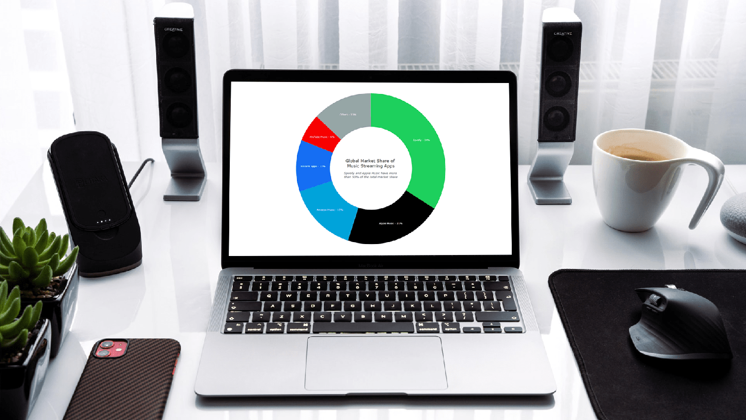
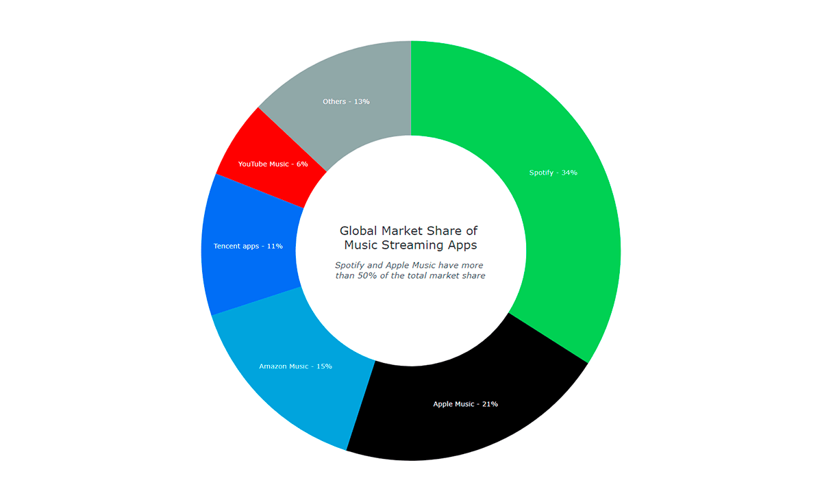
For this tutorial, I decided to take data on the market share of the leading music streaming apps, which I collected from the Business of Apps website. So, I am just adding it as shown below:
var data = anychart.data.set([
  ['Spotify', 34],
  ['Apple Music', 21],
  ['Amazon Music', 15],
  ['Tencent apps', 11],
  ['YouTube Music', 6],
  ['Others', 13]
]);
Now that we have everything all set, let’s get ready to see the donut chart shape up by adding some JavaScript code! Basically, this is quite intuitive.
4. Write the JS charting code for our donut chart
The first thing we do is add a function enclosing all the code, which makes sure that the code inside it will only execute once the page is ready.
Donut charts are very straightforward to create with an appropriate JS library and in this case, it will actually be just a couple of lines of code!
As we have learned just above, a donut chart is fundamentally a pie chart with a hole, like a ring all in all. So, we simply create a pie chart instance and give it an inner radius value to make it a donut chart.
// create a pie chart with the data
var chart = anychart.pie(data)
// set the chart radius making a donut chart
chart.innerRadius('55%');
Then we give our donut chart a title and set the container id before finally drawing the resulting visualization.
chart.title('Music Streaming Apps Global Market Share')
chart.container('container');
chart.draw();
That’s it — a fully functional interactive JavaScript-based donut chart is ready! Isn’t this absolutely easy?
Notice that the legend was created automatically. Also, go ahead and click on its items or any piece to see the cool interactive donut slicing behavior.
The initial version of this basic JS donut chart with the full code is available on AnyChart Playground and CodePen.
This donut chart distinctly shows that Spotify is the global leader and that Spotify and Apple Music together hold more than half of the market of music streaming apps.
Now, let’s customize our donut chart to make it look even cooler and communicate the insights in a clearer manner.
Customizing JS Donut Chart
A great feature of AnyChart’s JavaScript library is that the initial donut chart is built very quickly and then there are a ton of options to fine-tune the chart any way we want.
Let’s see some interesting ways to make our interactive donut chart more aesthetic and informative:
- Change the color palette.
- Add labels.
- Improve the tooltip.
- Add details to the center of the donut.
1. Change the color palette
Colors are the simplest yet most effective way to make a chart look more personalized. Since we are representing brands here, we can apply their colors to the visualization of the corresponding data points.
This is quite uncomplicated where we just define the color palette to use and pass it as an argument when creating the donut chart.
// create a color palette
var palette = anychart.palettes.distinctColors();

// set the colors according to the brands
palette.items([
  { color: '#1dd05d' },
  { color: '#000000' },
  { color: '#00a3da' },
  { color: '#156ef2' },
  { color: '#f60000' },
  { color: '#96a6a6' }
]);

// apply the donut chart color palette
chart.palette(palette);
Look at how our donut chart looks with the brand colors!
This donut chart version is available with the code on AnyChart Playground and CodePen.
2. Add labels
Since we have a lesser number of segments and each is sufficiently large, we can add the name of the brand along with the percentage figure inside each slice of the donut chart. This would eliminate the need for a legend.
Again, this is really simple and can be done with just two additional lines of JS code.
// set the position of labels
chart.labels().format('{%x} — {%y}%').fontSize(16);

// disable the legend
chart.legend(false);
3. Improve the tooltip
It is always a good idea to make the tooltip clear and value-adding. In our donut chart, there are only two points of information: the brand name and the percentage share. So, we can have a basic tooltip with that information without any clutter.
chart.tooltip().format('Market share: {%PercentValue}%');4. Add details to the center of the donut
An important aspect of data visualization lies in space utilization. Since the donut chart has a blank middle, we can use that to display the title and some other information.
Let’s define a standalone element and position it in the center. Along with the title, we also add a subtitle that represents our observation:
// create a standalone label
var label = anychart.standalones.label();

// configure the label settings
label
  .useHtml(true)
  .text(
    '<span style = "color: #313136; font-size:20px;">Global Market Share of <br/> Music Streaming Apps</span>' +
    '<br/><br/></br><span style="color:#444857; font-size: 14px;"><i>Spotify and Apple Music have more <br/>than 50% of the total market share</i></span>'
  )
  .position('center')
  .anchor('center')
  .hAlign('center')
  .vAlign('middle');

// set the label as the center content
chart.center().content(label);
The result is below!
There it is — a cool and funky donut chart built with JavaScript!
You can find the final code for this donut chart here below, or on AnyChart Playground, or on CodePen.
<html>
  <head>
    <title>JavaScript Donut Chart</title>
    <script src="https://cdn.anychart.com/releases/8.10.0/js/anychart-core.min.js"></script>
    <script src="https://cdn.anychart.com/releases/8.10.0/js/anychart-pie.min.js"></script>
    <style type="text/css">
      html, body, #container {
        width: 100%; height: 100%; margin: 0; padding: 0;
      }
    </style>
  </head>
  <body>
    <div id="container"></div>
    <script>

anychart.onDocumentReady(function () {

  // add data
  var data = anychart.data.set([
    ['Spotify', 34],
    ['Apple Music', 21],
    ['Amazon Music', 15],
    ['Tencent apps', 11],
    ['YouTube Music', 6],
    ['Others', 13]
  ]);

  // create a pie chart with the data
  var chart = anychart.pie(data);

  // set the chart radius making a donut chart
  chart.innerRadius('55%')

  // create a color palette
  var palette = anychart.palettes.distinctColors();

  // set the colors according to the brands
  palette.items([
    { color: '#1dd05d' },
    { color: '#000000' },
    { color: '#00a3da' },
    { color: '#156ef2' },
    { color: '#f60000' },
    { color: '#96a6a6' }
  ]);

  // apply the donut chart color palette
  chart.palette(palette);

  // set the position of labels
  chart.labels().format('{%x} — {%y}%').fontSize(16);

  // disable the legend
  chart.legend(false);

  // format the donut chart tooltip
  chart.tooltip().format('Market share: {%PercentValue}%');

  // create a standalone label
  var label = anychart.standalones.label();

  // configure the label settings
  label
    .useHtml(true)
    .text(
      '<span style = "color: #313136; font-size:20px;">Global Market Share of <br/> Music Streaming Apps</span>' +
      '<br/><br/></br><span style="color:#444857; font-size: 14px;"><i>Spotify and Apple Music have more <br/>than 50% of the total market share</i></span>'
    )
    .position('center')
    .anchor('center')
    .hAlign('center')
    .vAlign('middle');

  // set the label as the center content
  chart.center().content(label);

  // set container id for the chart
  chart.container('container');

  // initiate chart drawing
  chart.draw();

});

    </script>
  </body>
</html>
Conclusion
In this tutorial, we’ve seen how fast and easy it is to create and customize an interactive JS donut chart. It is one of the simplest charts to build and therefore a great option when one is starting to learn data visualization for the web.
If you want to further improve the donut chart we’ve just made or create a completely different one for your own needs, check out the donut chart documentation and don’t miss out on the donut chart examples for inspiration. You are also welcome to look into other chart types supported in the AnyChart JavaScript data visualization library.
Please let me know if you have any questions about building or using donut charts or anything related to data visualization and I will do my best to respond and be of help.
Go on then, start creating different charts and keep listening to music — both are good for creativity!
We at AnyChart would like to thank Shachee Swadia for producing this amazing JS Donut Chart tutorial.
If you would like to create a cool guest post for our blog, please get in touch with us and let’s discuss it.
See other JavaScript charting tutorials.
- Categories: AnyChart Charting Component, HTML5, JavaScript, JavaScript Chart Tutorials, Tips and Tricks
- 2 Comments »
Comments (2)
Please create two layer doughnut chart with custom label inside a slice
Hi, please check out the Sunburst Chart type of visualization as it is likely what you are looking for and can make use of:
Please feel free to contact our Support Team if you need further assistance.