 Data visualization is our passion and we are glad to high-five all who share it! Welcome to DataViz Weekly! For all of you guys, we have curated another four new awesome interactive data visualization projects worth checking out. Glance at their list below and then take a closer look:
- WorldTour transfers during the 2020-2021 offseason — Carrie Bennette
- Precinct-level map of the 2020 U.S. election — The Upshot
- Representation of age generations in the U.S. Senate over time — wcd.fyi
- Healthy Streets Index for London — _STREETS
Data Visualization Weekly: January 29, 2021 — February 5, 2021
WorldTour Transfers in 2020-2021 Offseason

Carrie Bennette, a data scientist and data visualization designer, created a fun Sankey diagram that could excite bicycle racing fans. The graphic represents all transfers that took place on the UCI WorldTour, the premier men’s international road cycling tour, during the latest offseason.
This chart does a great job showing how teams and their strength changed. The teams are ordered according to the number of ProCyclingStats (PCS) points, for 2020 at the top and for 2021 at the bottom. Lines between the nodes represent individual riders. The width of the lines corresponds to the PCS ranking of each rider. The diagram is interactive and you can hover over the flows and nodes to see more details.
Find out who moved where and what teams succeeded to get higher-rated rosters after this WorldTour transfer season.
Precinct-Level Map of 2020 Election

The Upshot by The New York Times published an “extremely detailed” choropleth map of the 2020 election. It represents the precinct-level vote results for 1,922 (of 3,143) counties in 42 states and keeps getting updated as new data arrives.
In addition to the 2020 results, the map also allows you to investigate change from 2016 through visualization of vote margin shifts. In that view, it greatly shows what happened in the suburbs. Take a look at Atlanta (pictured above), Phoenix, and Pittsburgh as some of the most striking examples where the blue shift trend is so clearly seen.
Explore how America voted, in new details. If you want to check out more election maps, don’t miss out on our special edition, 20+ Electoral Maps Visualizing 2020 U.S. Presidential Election Results.
Representation of Age Generations in U.S. Senate Over Time
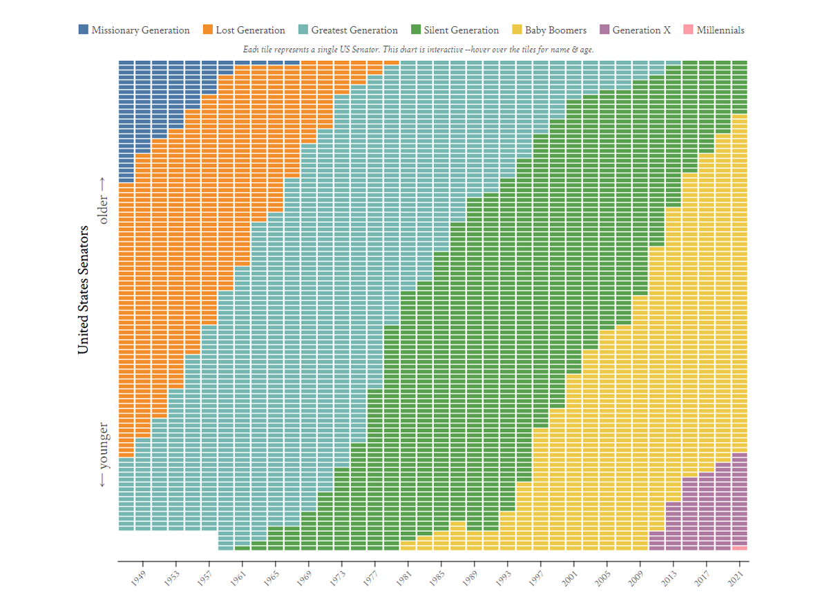
When looking at what’s changed in the U.S. Senate after the 2020 election, let’s not miss one important thing which has not too much relation to parties. The first Millennial has arrived! 33-year-old Jon Ossoff from Georgia is the first-ever Senator who belongs to that generation. You can see him represented as the lone pink tile in this simple but cool visualization from wcd.fyi.
The chart visualizes the generational breakdown of the U.S. Senate over time since 1947 based on data from the ProPublica Congress API. One tile is one Senator — hover over them to see names, ages, and more.
See the generational shifts in the Senate. Below the chart, you can read about how it was built as well as find an alternate, table view.
Healthy Streets Index for London

The _STREETS research group launched an interactive map that shows at a glance how healthy each street in Central London is. The visualization is based on the Healthy Streets Index scores summarizing ten urban environmental and experiential indicators — for air quality, noise levels, traffic dominance, availability of places to stop and rest, things to see and do, and more. Combined, these factors are expected to determine how good a street is to walk, cycle, and spend time in.
The Healthy Streets Index scores for each street are displayed using a traditional color palette, from red (low) to yellow (medium) to green (high).
The project is currently available for Central London only. But the authors are already working on expanding it, first to cover the entire United Kingdom and then go international. Check it out.
***
New DataViz Weekly roundups go live every Friday. Stay tuned!
- Categories: Data Visualization Weekly
- No Comments »