 Network graphs are a special, very interesting form of data visualization. Unlike more traditional chart types like bar graphs or pie charts, a network graph does a bit more than visualize numerical data. With these charts, you represent each object as a point, referred to as a node, and the connections between the objects as a line, referred to as either a link or an edge. Here, we do not focus on representing objects with the same precision we are typically used to. Instead, we are trying to discover relationships in a network or sections of a network and are less worried about individual nodes.
Right now, I will guide you through how to develop an interactive network graph for the web using JavaScript (HTML5). Inspired by one fun visualization created by Ben Sullins, I decided to take data about the last decade’s biggest TV series, Game of Thrones. It is an epic fantasy tale revolving around the quabbles of various faction-like houses. So in this tutorial, I will be visualizing the relationships in the world of Game of Thrones by showing who attacked whom. Follow me, it’s going to be a cool adventure!
Network Graph To Be Made
Building JS Network Graph From Scratch
Basically, to build a JS-based network graph, we need to follow the same four steps as with literally any JavaScript chart:
- Create an HTML page.
- Add the necessary scripts.
- Load the data that will be visualized.
- Draw the chart.
1. Create an HTML page
The first step towards building our network graph is to setup an HTML page. This involves creating a basic HTML template for the chart as well as adding the necessary CSS rules.
Here we also add a title for our HTML page and create a div to contain the chart.
<!DOCTYPE html>
<html>
  <head>
    <title>JavaScript Network Graph</title>
    <style>
      html, body, #container {
        width: 100%;
        height: 100%;
        margin: 0;
        padding: 0;
      }
    </style>
  </head>
  <body>
    <div id="container"></div>
    <script>
      // The chart code goes here.
    </script>
  </body>
</html>
I’ve set the CSS to make the container div fill the entire page. You may want to change this depending on your use case, of course.
2. Add the necessary scripts
The second step is to add all the necessary scripts. We will be using AnyChart JS Charts which is a very easy to use and powerful JavaScript charting library. I personally love AnyChart because it is great for both beginners and pros alike. It lets you quickly prototype data visualizations and really helps speed up the entire development process.
To make good use of the AnyChart library, we need to add its dedicated modules. In this tutorial, we will be using three of them. The Core and Graph modules are required to draw our network graph, and the Data Adapter module will help us import the Game of Thrones JSON data (more on that shortly).
<script src="https://cdn.anychart.com/releases/8.8.0/js/anychart-core.min.js"></script>
<script src="https://cdn.anychart.com/releases/8.8.0/js/anychart-graph.min.js"></script>
<script src="https://cdn.anychart.com/releases/8.8.0/js/anychart-data-adapter.min.js"></script>
We add these scripts to the head of our code.
3. Load the data we are going to be visualizing
As explained earlier, the data we will be using is based on Game of Thrones. I’ve found a great dataset, The War Of The Five Kings. The data was originally sourced from A Wiki of Fire and Ice, a wiki dedicated to Game of Thrones. It was then scraped and cleaned up by data scientist Chris Albon, the Director of Machine Learning at the Wikimedia Foundation. I processed it further by myself for the purpose of this JS network graph tutorial; you can find the result here, in JSON.
The thing is, AnyChart wants your network graph data in a particular format. It wants a JSON object with an array of nodes and an array of edges. Each node requires an ‘id’. The edges need a ‘from’ and ‘to’, which is the source and target of each connection respectively.
Like this:
nodes: [{ "id": "Lannister" }]
edges: [{ "from": "Lannister", "to": "Tully" }]
Then we need to import our data. Loading data for JavaScript data visualizations can sometimes be quite a pain. But with AnyChart, working with data really is super straightforward. Leveraging the right function, you can easily import CSV, JSON, XML, and even a Google spreadsheet!
Here, our data is in the JSON format, so we need the following function:
anychart.data.loadJsonFile('https://static.anychart.com/git-storage/word-press/data/network-graph-tutorial/data.json', function (data) {
  // The chart code goes here.
})
Because we want our chart to be drawn only after the data is successfully loaded, we will place our code to draw the chart within this function.
4. Draw the chart
The fourth and final step is to draw the chart. Here we command to create a chart from our data, set the chart title, and then visualize our graphic using these very straightforward functions:
// create a chart from the loaded data
var chart = anychart.graph(data);

// set the title
chart.title("Network Graph showing the battles in Game of Thrones");

// draw the chart
chart.container("container").draw();
And this is the result:
See this network graph example with the full HTML/CSS/JS code on AnyChart Playground or CodePen.
Maybe not as aesthetically impressive as our D3.js-based inspiration but we will get to that later. Take some time to hover over the nodes, maybe drag them around a bit. How amazing? With these four simple steps and a few lines of the JavaScript code, we have created this fairly powerful and interactive network graph.
The full code is as follows, check it out:
<html>
  <head>
    <script src="https://cdn.anychart.com/releases/8.8.0/js/anychart-core.min.js"></script>
    <script src="https://cdn.anychart.com/releases/8.8.0/js/anychart-graph.min.js"></script>
    <script src="https://cdn.anychart.com/releases/8.8.0/js/anychart-data-adapter.min.js"></script>
    <style type="text/css">
      html, body, #container {
        width: 100%;
        height: 100%;
        margin: 0;
        padding: 0;
      }
    </style>
  </head>
  <body>
    <div id="container"></div>
    <script>
      anychart.onDocumentReady(function () {
        anychart.data.loadJsonFile("https://static.anychart.com/git-storage/word-press/data/network-graph-tutorial/data.json", function (data) {
        // create a chart from the loaded data
        var chart = anychart.graph(data);
        // set the title
        chart.title("Network Graph showing the battles in Game of Thrones");
        // draw the chart
        chart.container("container").draw();
        });
      });
    </script>
  </body>
</html>
Customizing Network Graph Appearance
As impressive as our visualization currently is we can make it better. A lot better. All decent JS charting libraries allow you to customize the charts you build using their API. Making use of these customizations to better tell your data story is a critical skill to have as a data visualization developer. Some of these customizations are aesthetic, like changing the size or color of an element, and some functional like changing the tooltips.
Below, I will be demonstrating a few of the customization techniques available to network graphs.
Changing the iteration steps
Network graphs are drawn using an algorithm which iteratively attempts to improve its layout. With each iteration, the algorithm optimizes a step further according to an error metric. This would suggest that the more iterations, the better. However, sometimes the algorithm’s idea of an optimized layout and your (and your user’s) idea of an optimized layout may be considerably different. By changing the number of iterations, we can get different layouts which may suit our needs.
Add the code below and you’ll see what would happen if you used only 10 iterations, the default being 500.
// set the iteration step
chart.layout().iterationCount(10);
Well, it was just a quick demonstration. Let’s skip this change and see how to do something else interesting about our JS network graph visualization.
Customizing the nodes (basic):
We can customize the size, fill, and stroke of each node, as well as set different rules for each state. By state I mean the default node, a hovered node, or a selected node. Colors in a JavaScript network graph can be set the same way you would set a CSS color, and here we’ll use hex code.
- Display hover/selected/normal changes:
// set the size of nodes
nodes.normal().height(30);
nodes.hovered().height(45);
nodes.selected().height(45);

// set the fill of nodes
nodes.normal().fill("#ffa000");
nodes.hovered().fill("white");
nodes.selected().fill("#ffa000");

// set the stroke of nodes
nodes.normal().stroke(null);
nodes.hovered().stroke("#333333", 3);
nodes.selected().stroke("#333333", 3);
See this network graph example with the full HTML/CSS/JS code on AnyChart Playground or CodePen.
Customizing the nodes (advanced):
Personally my favorite aesthetic change for a network graph is to replace the node icons with images. Here we can replace the great houses of Westeros (our nodes) with the images. This can easily be done by adding the filepath for the image to each node’s object in our JSON. For example:
{id: "Example",
  fill: {
    src: "example_url"
  }
},
I’ve already made this change and the updated file can be found here. By using this JSON with the images included, we get the following graphic:
See this network graph example with the full HTML/CSS/JS code on AnyChart Playground or CodePen.
How cool is that? It is so much more engaging than it was before.
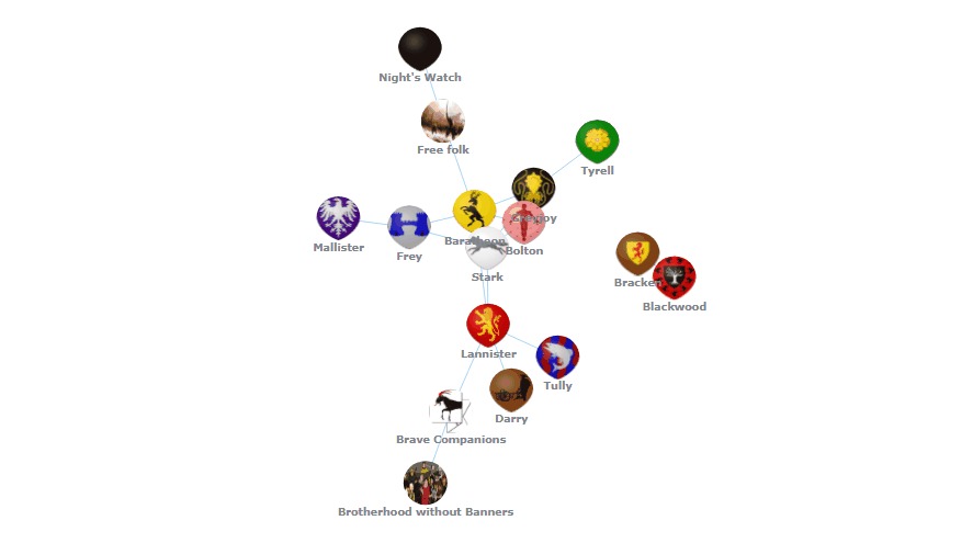
Node Labels
Not all of us know the banners of each house, and having to hover over each node to see which one it belongs to can be quite painful. To get around this, we can label each node. This is easily done with the following code:
// enable the labels of nodes
chart.nodes().labels().enabled(true);

// configure the labels of nodes
chart.nodes().labels().format("{%id}");
chart.nodes().labels().fontSize(12);
chart.nodes().labels().fontWeight(600);
And this results in:
See this network graph example with the full HTML/CSS/JS code on AnyChart Playground or CodePen.
For your convenience, here’s the full code of this (final for this tutorial) interactive JavaScript network graph visualizing data about the Game of Thrones battles:
<html>
  <head>
    <script src="https://cdn.anychart.com/releases/8.8.0/js/anychart-core.min.js"></script>
    <script src="https://cdn.anychart.com/releases/8.8.0/js/anychart-graph.min.js"></script>
    <script src="https://cdn.anychart.com/releases/8.8.0/js/anychart-data-adapter.min.js"></script>
    <style type="text/css">
      html, body, #container {
        width: 100%;
        height: 100%;
        margin: 0;
        padding: 0;
      }
    </style>
  </head>
  <body>
    <div id="container"></div>
    <script>

      anychart.onDocumentReady(function () {
        anychart.data.loadJsonFile("https://static.anychart.com/git-storage/word-press/data/network-graph-tutorial/data_images.json", function (data) {

          // create a chart from the loaded data
          var chart = anychart.graph(data);

          // set the title
          chart.title("Network Graph showing the battles in Game of Thrones");

          // access nodes
          var nodes = chart.nodes();

          // set the size of nodes
          nodes.normal().height(30);
          nodes.hovered().height(45);
          nodes.selected().height(45);

          // set the stroke of nodes
          nodes.normal().stroke(null);
          nodes.hovered().stroke("#333333", 3);
          nodes.selected().stroke("#333333", 3);

          // enable the labels of nodes
          chart.nodes().labels().enabled(true);

          // configure the labels of nodes
          chart.nodes().labels().format("{%id}");
          chart.nodes().labels().fontSize(12);
          chart.nodes().labels().fontWeight(600);

          // draw the chart
          chart.container("container").draw();

        });
      });

    </script>
  </body>
</html>
Conclusion
And just like that we have an awesome visualization for unpacking the complicated relationships in this network. In the tutorial, I’ve showed just how fast and easy it is to get a JS network chart up and running and how with a tiny bit more effort we could really bring our chart to life with a few choice tweaks.
Honestly, there are so many more changes you could make. Visit the gallery of network graphs for further inspiration, as well as see this pretty extensive network graphs documentation and look around in AnyChart Docs for ideas on what you could change to further improve this chart and how to implement them.
If this tutorial has piqued your interest about charts based on the show, check out this awesome list of 32 Game of Thrones data visualizations.
- Categories: AnyChart Charting Component, HTML5, JavaScript, JavaScript Chart Tutorials, Tips and Tricks
- 7 Comments »
Comments (7)
How can I show multiple edges between nodes??
Hello, I am afraid we need more details to help you out. Could you please contact our Support Team directly with more information on exactly what you want to get in the result?
how it could separate or create a greater distance between the nodes, or position each node differently by coordinates?
Hi Brayan,
You can set the “fixed” type of layout and specify the coordinates of each node manually as described here in the documentation.
If you need any further assistance, please feel free to reach out to our amazing Support Team directly.
Cheers.
Does it support clustering nodes ? means if double click on node that will expand 10 child node instances attached to it. in initial view parent node shows +10 in node label to let user know that there are 10 child nodes available, that way user can click on node and expand 10 child nodes.