 These days you see choropleth maps in a variety of webpages and utilized for various subjects. Have you wondered how such data visualizations are built? Are you interested in making them by yourself? If so, stay with me through this JS charting tutorial, where I will show you how to create an interactive JavaScript choropleth map from scratch but with ease.
Basic knowledge of HTML5 and JS is always helpful, but even if you are a beginner in this field, understand these four simple steps and you will be able to quickly get a good-looking cross-platform interactive choropleth map data visualization for your app or website!
What exactly are choropleth maps? When you break down the word, you see that choro- (“choros”) means “area” and pleth- (“plethos”) means “multitude.” Exactly, these maps are used to visualize statistical data related to multiple geographic areas. Each area is colored or shaded differently according to the value of the given data, making it easy to grasp how a measurement varies across a territory.
For this JS mapping tutorial, I will use open COVID-19 data to show the distribution of confirmed cases and deaths around the world by country. I will start with a basic choropleth map that will graphically represent the confirmed cases. Then I will add a legend, customize the tooltip, and add bubbles to visualize the number of deaths.
Let’s get started!
How to Create JavaScript Choropleth Map
Generally, building a JavaScript-based chart or map requires four basic things:
- Create the HTML page for your chart.
- Add the necessary JavaScript files.
- Prepare the data you want to visualize.
- Write the JS code for the chart.
Now, let’s look at each step in detail. Here is a choropleth map that will be the final output of the first part of this tutorial:
Step 1: Create the HTML page for your map
The first thing you need to do is create a basic HTML page. Give it a title and create an HTML block element (for example, <div>) to place your map chart. To identify this <div> later in the code, you should also give it an id attribute of your choice. Here, I have used the value “container”.
So your page can look like this:
<!DOCTYPE html>
<html>

<head>
  <title>Choropleth Map</title>
  <style>
    html,
    body,
    #container {
      width: 100%;
      height: 100%;
      margin: 0;
      padding: 0;
    }
  </style>
</head>

<body>
  <div id="container"></div>
</body>

</html>
Note that you can use CSS rules in the <style> block to define how you want your upcoming JavaScript choropleth map to be placed. In this case, using “100%” in both width and height parameters will make the visualization occupy the entire page.
Step 2. Add the necessary JavaScript files
Second, you should go to the <head> section and reference all the appropriate JS scripts you are going to use.
To create a choropleth map along this tutorial, I will use AnyChart’s AnyMap JS library which, as its name suggests, is specifically designed to produce maps. JavaScript charting libraries are very popular nowadays; they provide commonly needed functions out of the box to make the developing process simpler and faster. This specific library is lightweight, flexible, and easy to get started, particularly thanks to a greatly written documentation and a lot of samples in the map gallery.
In this tutorial, I will use the CDN, but keep in mind that you can download the scripts if you want.
For the choropleth map that I have in mind, I will need the following modules:
- Core, which is the the basic module needed in order to use any other module,
- Geo Maps, which contains the necessary information to create geo map charts, and
- GeoData, which contains information about the geographic locations.
Additionally, I will use Proj4js, a free open-source JavaScript library that transforms point coordinates to geographic coordinates.
Here is the HTML code for this section:
<!DOCTYPE html>
<html>

<head>
  <title>Choropleth Map</title>
  <script src="https://cdn.anychart.com/releases/8.7.1/js/anychart-core.min.js" type="text/javascript"></script>
  <script src="https://cdn.anychart.com/releases/8.7.1/js/anychart-map.min.js" type="text/javascript"></script>
  <script src="https://cdn.anychart.com/releases/8.7.1/geodata/custom/world/world.js" type="text/javascript"></script>
  <script src="https://cdnjs.cloudflare.com/ajax/libs/proj4js/2.3.15/proj4.js" type="text/javascript"></script>
  <style>
    html,
    body,
    #container {
      width: 100%;
      height: 100%;
      margin: 0;
      padding: 0;
    }
  </style>
</head>

<body>
  <div id="container"></div>
  <script>
    // The choropleth map code will be written here
  </script>
</body>

</html>
Step 3: Prepare the data you want to visualize
Load the data
In the third step, add data. In light of the COVID-19 pandemic, I will create a JavaScript choropleth map that will visualize the current situation around the world using data from the European Center for Disease Prevention and Control (ECDC). I have downloaded the JSON version and you can find it here (data as of April 14).
It is easy to load data from a JSON file using the Data Adapter helper module of AnyChart, which should be added to the <head> section:
<!DOCTYPE html>
<html>

<head>
  <title>Choropleth Map</title>
  <script src="https://cdn.anychart.com/releases/8.7.1/js/anychart-core.min.js" type="text/javascript"></script>
  <script src="https://cdn.anychart.com/releases/8.7.1/js/anychart-map.min.js" type="text/javascript"></script>
  <script src="https://cdn.anychart.com/releases/8.7.1/geodata/custom/world/world.js" type="text/javascript"></script>
  <script src="https://cdnjs.cloudflare.com/ajax/libs/proj4js/2.3.15/proj4.js" type="text/javascript"></script>
  <script src="https://cdn.anychart.com/releases/8.7.1/js/anychart-data-adapter.min.js"></script>
  <style>
    html,
    body,
    #container {
      width: 100%;
      height: 100%;
      margin: 0;
      padding: 0;
    }
  </style>
</head>

<body>
  <div id="container"></div>
  <script>
    // The choropleth map code will be written here
  </script>
</body>

</html>
Now you can use the loadJsonFile method provided by the Data Adapter to load JSON.
anychart.data.loadJsonFile ("https://static.anychart.com/git-storage/word-press/data/choropleth-map-tutorial/data.json", function (data) {

});
Structure the data
The JSON data, which you have just loaded, contains data per day for each country.
There are two things you need to do here:
- Calculate the sum of all confirmed cases for each country.
- Structure the data in a format that will be recognizable by AnyChart. Specifically, I want to create an array that will have a region id and a value.
To implement the above, you need to write some code. Here is the approach I will use to calculate and structure the data:
I will read the JSON data and calculate the total confirmed cases for each country. As soon as I am done with one country, I will pass this info into an array that I have named “data” and then I will continue with the next country.
The array will use:
id: the geographic identifier for the countryvalue: the number of total confirmed cases for the countrytitle: the name of the country
Here is the code for this section:
anychart.data.loadJsonFile ("https://static.anychart.com/git-storage/word-press/data/choropleth-map-tutorial/data.json", function (data) {

  // Variables
  // go into the records section of the data
  var geoData = data.records

  // sum of all cases per country
  var sumCases = 0;

  // convert cases to numbers
  var numC;

  // create a new array with the resulting data
  var data = [];

  // Go through the initial data
  for (var i = 0; i < geoData.length; i++) {
    // convert strings to numbers and save them to new variables
    numC = parseInt(geoData[i].cases);

    // check if we are in the same country by comparing the geoId.
    // if the country is the same add the cases to the appropriate variables
    if ((geoData[i + 1]) != null && (geoData[i].geoId == geoData[i + 1].geoId)) {
      sumCases = sumCases + numC;
    }
    else {
      // add last day cases of the same country
      sumCases = sumCases + numC;

      // insert the resulting data in the array using the AnyChart keywords
      data.push({ id: geoData[i].geoId, value: sumCases, title: geoData[i].countriesAndTerritories })

      // reset the variables to start over
      sumCases = 0;

    }
  };
});
Map the data
The final part of this step consists in connecting the resulting data with the geographic map. Just add the following two lines of the code and it will be completed:
var chart = anychart.map(data);
chart.geoData(anychart.maps.world);
Step 4: Write the JS code for the chart
Finally, write some JavaScript code to develop the JS choropleth map itself!
Remember that everything should be placed inside the <script> tag. You need to enclose the code inside the anychart.onDocumentReady function that is executed when the page is ready.
<script>
  anychart.onDocumentReady(function () {
    // The choropleth map code will be written here
  });
</script>
Data needs to be placed inside of this function, so let’s take the code from step 3 and put it here, to start with:
<script> anychart.onDocumentReady(function () { // The choropleth map code will be written here anychart.data.loadJsonFile ("https://static.anychart.com/git-storage/word-press/data/choropleth-map-tutorial/data.json", function (data) { // Variables // go into the records section of the data var geoData = data.records // sum of all cases per country var sumCases = 0; // convert cases to numbers var numC; // create a new array with the resulting data var data = []; // Go through the initial data for (var i = 0; i < geoData.length; i++) { // convert strings to numbers and save them to new variables numC = parseInt(geoData[i].cases); // check if we are in the same country by comparing the geoId. // if the country is the same add the cases to the appropriate variables if ((geoData[i + 1]) != null && (geoData[i].geoId == geoData[i + 1].geoId)) { sumCases = sumCases + numC; } else { // add last day cases of the same country sumCases = sumCases + numC; // insert the resulting data in the array using the AnyChart keywords data.push({ id: geoData[i].geoId, value: sumCases, title: geoData[i].countriesAndTerritories }) // reset the variables to start over sumCases = 0; }};
// connect the data with the map
var chart = anychart.map(data); chart.geoData(anychart.maps.world);
});
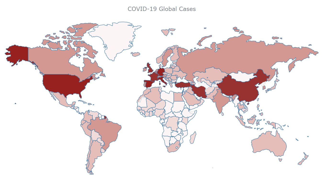
</script>Finally, let’s set everything else, coloring each country according to the value of the total number of confirmed cases. First, I will specify the chart type, create the series, and add an appropriate title. Second, I will create a color scale and apply it to the chart. Look:
// specify the chart type and set the series
var series = chart.choropleth(data);

// set the chart title
chart.title("COVID-19 Global Cases");

// color scale ranges
ocs = anychart.scales.ordinalColor([
  { less: 99 },
  { from: 100, to: 999 },
  { from: 1000, to: 9999 },
  { from: 10000, to: 29999 },
  { from: 30000, to: 39000 },
  { from: 40000, to: 59000 },
  { from: 60000, to: 99999 },
  { greater: 100000 }
]);

// set scale colors
ocs.colors(["rgb(252,245,245)", "rgb(241,219,216)","rgb(229,190,185)", "rgb(211,152,145)", "rgb(192,117,109)", "rgb(178,93,86)", "rgb(152,50,48)", "rgb(150,33,31)"]);

// tell the series what to use as a colorRange (colorScale)
series.colorScale(ocs);
Then, command to draw the map chart:
// set the container id
chart.container('container');

// draw the chart
chart.draw();
Here is the result:
The resulting JS choropleth map, embedded from AnyChart Playground, gives a concise visualization of how COVID-19 has affected each country. You can hover over areas to see the name and the number of confirmed cases, for each country. Everyone can read such a geographic data visualization with ease.
The full code of the choropleth map just built using JavaScript/HTML5 is below:
<!DOCTYPE html>
<html>

<head>
  <title>Choropleth Map</title>
  <script src="https://cdn.anychart.com/releases/8.7.1/js/anychart-core.min.js" type="text/javascript"></script>
  <script src="https://cdn.anychart.com/releases/8.7.1/js/anychart-map.min.js" type="text/javascript"></script>
  <script src="https://cdn.anychart.com/releases/8.7.1/geodata/custom/world/world.js" type="text/javascript"></script>
  <script src="https://cdnjs.cloudflare.com/ajax/libs/proj4js/2.3.15/proj4.js" type="text/javascript"></script>
  <script src="https://cdn.anychart.com/releases/8.7.1/js/anychart-data-adapter.min.js"></script>

  <style>>
    html,
    body,
    #container {
      width: 100%;
      height: 100%;
      margin: 0;
      padding: 0;
    }
  </style>
</head>

<body>
  <div id="container"></div>
  <script>

    anychart.onDocumentReady(function () {

      // load the data
      anychart.data.loadJsonFile("https://static.anychart.com/git-storage/word-press/data/choropleth-map-tutorial/data.json", function (data) {

        // Variables
        // go into the records section of the data
        var geoData = data.records

        // sum of all cases per country
        var sumCases = 0;

        // convert cases to numbers
        var numC;

        // create a new array with the resulting data
        var data = [];

        // Go through the initial data
        for (var i = 0; i < geoData.length; i++) {
          // convert strings to numbers and save them to new variables
          numC = parseInt(geoData[i].cases);

          // check if we are in the same country by comparing the geoId.
          // if the country is the same add the cases to the appropriate variables
          if ((geoData[i + 1]) != null && (geoData[i].geoId == geoData[i + 1].geoId)) {
            sumCases = sumCases + numC;
          }
          else {

            // add last day cases of the same country
            sumCases = sumCases + numC;

            // insert the resulting data in the array using the AnyChart keywords
            data.push({ id: geoData[i].geoId, value: sumCases, title: geoData[i].countriesAndTerritories })

            // reset the variables to start over
            sumCases = 0;

          }
        };

        // connect the data with the map
        var chart = anychart.map(data);
        chart.geoData(anychart.maps.world);

        // specify the chart type and set the series
        var series = chart.choropleth(data);

        // set the chart title
        chart.title("COVID-19 Global Cases");

        // color scale ranges
        ocs = anychart.scales.ordinalColor([
          { less: 99 },
          { from: 100, to: 999 },
          { from: 1000, to: 9999 },
          { from: 10000, to: 29999 },
          { from: 30000, to: 39000 },
          { from: 40000, to: 59000 },
          { from: 60000, to: 99999 },
          { greater: 100000 }
        ]);

        // set scale colors
        ocs.colors(["rgb(252,245,245)", "rgb(241,219,216)", "rgb(229,190,185)", "rgb(211,152,145)", "rgb(192,117,109)", "rgb(178,93,86)", "rgb(152,50,48)", "rgb(150,33,31)"]);

        // tell the series what to use as a colorRange (colorScale)
        series.colorScale(ocs);

        // set the container id
        chart.container('container');

        // draw the chart
        chart.draw();
      });

    });
  </script>
</body>

</html>
JS Choropleth Map Customization
You already have a wonderful and fully functional JavaScript choropleth map. But what if you want to change some things or add some further functionality?
AnyChart is a very flexible JS charting library. So you can easily include modifications that are specific for your needs.
Right now I will show you how to implement the following changes:
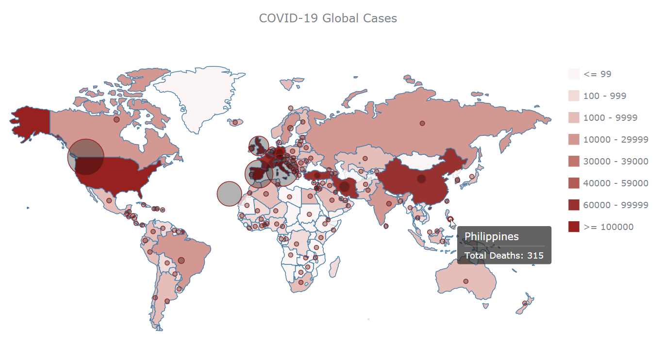
- Add a legend to the chart
- Add bubbles for graphical representation of the number of deaths
- Configure the tooltip
In the end, I will get the following picture:
Add a legend to the chart
As a general rule for data visualization, every time you utilize a color scale, you should include an explanation of what each color represents somewhere on the page
Using AnyChart, you can create a legend just by adding chart.legend(true);.
In this case, because the choropleth map has only one series, you will need to have the involved categories represented in the legend.
Here’s the code for adding a legend to the JS choropleth map created above:
// enable the legend
chart.legend(true);

// set the source mode of the legend
chart.legend().itemsSourceMode("categories");
That’s functional, but for aesthetic reasons I want the legend to appear on the right-hand side of the chart and to be aligned vertically. To do that, I will just add some CSS rules:
// enable the legend
chart.legend(true);

// set the source mode of the legend and add styles
chart.legend()
  .itemsSourceMode("categories")
  .position('right')
  .align('top')
  .itemsLayout('vertical')
  .padding(50, 0, 0, 20)
  .paginator(false);
Here is the result (available on AnyChart Playground with the full code):
Add bubbles that will represent the number of deaths
Inspired by the visualization created by the Center for Systems Science and Engineering (CSSE) at Johns Hopkins University, I decided to depict the number of deaths using bubbles.
First, the total number of COVID-19 deaths for each country needs to be stored in the data alongside the total number of COVID-19 cases:
// sum of all cases per country
var sumCases = 0;

// sum of all deaths per country
var sumDeaths = 0;

// convert cases and deaths to numbers
var numC;
var numD;

// create a new array with the resulting data
var data = [];

// Go through the initial data
for (var i = 0; i < geoData.length; i++) {
  // convert strings to numbers and save them to new variables
  numC = parseInt(geoData[i].cases);
  numD = parseInt(geoData[i].deaths);

  // check if we are in the same country by comparing the geoId
  // if the country is the same, add cases and deaths to the appropriate variables
  if ((geoData[i + 1]) != null && (geoData[i].geoId == geoData[i + 1].geoId)) {
    sumCases = sumCases + numC;
    sumDeaths = sumDeaths + numD;
  }
  else {

    // add last day cases and deaths of the same country
    sumCases = sumCases + numC;
    sumDeaths = sumDeaths + numD;

    // insert the resulting data in the array using the AnyChart keywords
    data.push({ id: geoData[i].geoId, value: sumCases, size: sumDeaths, title: geoData[i].countriesAndTerritories })

    // reset the variables to start over
    sumCases = 0;
    sumDeaths = 0;

  }
};
Second, store only the countries that have at least one death in a separate array:
// variable to store data that will be used for bubbles
var bubbleData=[];

// store only the countries that have at least 1 death
for (var i=0; i<data.length; i++) {
  if (data[i].size>0){
    bubbleData.push(data[i]);
  }
};
Then, add the following JS code to create the bubble series on top of the choropleth series on the map.
// create a series for bubbles
var series_1 = chart.bubble(bubbleData);
Take a look at the map below or on AnyChart Playground:
It is a good idea to customize the size of the bubbles so that they don’t occupy so much space on the plot. To do this, use AnyChart’s maxBubbleSize() and minBubbleSize() functions. For example, like this:
// set the maximum size of the bubble
chart.maxBubbleSize(25);

// set the minimum size of the bubble
chart.minBubbleSize(3);
Next, you can modify the color and stroke of the bubbles to make them more consistent with the rest of the chart:
// set colors and stroke of bubbles
series_1.normal().fill("black", 0.3);
series_1.hovered().fill("black", 0.1);
series_1.selected().fill("black", 0.5);
series_1.normal().stroke("rgb(150,33,31)");
series_1.hovered().stroke("rgb(150,33,31)", 2);
series_1.selected().stroke("rgb(150,33,31)", 4);
Check out the outcome after these modifications, below or on AnyChart Playground:
Configure the choropleth map tooltip
Finally, let’s configure the JS choropleth map’s tooltip so that it shows information about total cases if you hover over a country’s territory and total deaths if you hover over a bubble.
The code to achieve this can look as follows:
// tooltip formatting
series.tooltip().format("Total Confirmed Cases: {%value}");
series_1.tooltip().format("Total Deaths: {%size}");
Look at the result — you can also find it on AnyChart Playground with the full code:
Just in case, here’s the code of the final customized choropleth map coded in JavaScript, which can now be easily embedded into a web, mobile or standalone project:
<!DOCTYPE html>
<html>

<head>
  <title>Choropleth Map</title>
  <script src="https://cdn.anychart.com/releases/8.7.1/js/anychart-core.min.js" type="text/javascript"></script>
  <script src="https://cdn.anychart.com/releases/8.7.1/js/anychart-map.min.js" type="text/javascript"></script>
  <script src="https://cdn.anychart.com/releases/8.7.1/geodata/custom/world/world.js" type="text/javascript"></script>
  <script src="https://cdnjs.cloudflare.com/ajax/libs/proj4js/2.3.15/proj4.js" type="text/javascript"></script>
  <script src="https://cdn.anychart.com/releases/8.7.1/js/anychart-data-adapter.min.js"></script>

  <style>
    html,
    body,
    #container {
      width: 100%;
      height: 100%;
      margin: 0;
      padding: 0;
    }
  </style>
</head>

<body>
  <div id="container"></div>
  <script>

    anychart.onDocumentReady(function () {

      // load the data
      anychart.data.loadJsonFile("https://static.anychart.com/git-storage/word-press/data/choropleth-map-tutorial/data.json", function (data) {

        // Variables
        // go into the records section of the data
        var geoData = data.records

        // sum of all cases per country
        var sumCases = 0;

        // sum of all deaths per country
        var sumDeaths = 0;

        // convert cases and deaths to numbers
        var numC;
        var numD;

        // create a new array with the resulting data
        var data = [];

        // Go through the initial data
        for (var i = 0; i < geoData.length; i++) {
          // convert strings to numbers and save them to new variables
          numC = parseInt(geoData[i].cases);
          numD = parseInt(geoData[i].deaths);

          // check if we are in the same country by comparing the geoId.
          // if the country is the same add the cases and deaths to the appropriate variables
          if ((geoData[i + 1]) != null && (geoData[i].geoId == geoData[i + 1].geoId)) {
            sumCases = sumCases + numC;
            sumDeaths = sumDeaths + numD;
          }
          else {
            // add last day cases and deaths of the same country
            sumCases = sumCases + numC;
            sumDeaths = sumDeaths + numD;

            // insert the resulting data in the array using the AnyChart keywords
            data.push({ id: geoData[i].geoId, value: sumCases, size: sumDeaths, title: geoData[i].countriesAndTerritories })

            // reset the variables to start over
            sumCases = 0;
            sumDeaths = 0;

          }
        };

        // connect the data with the map
        var chart = anychart.map(data);
        chart.geoData(anychart.maps.world);

        // specify the chart type and set the series
        var series = chart.choropleth(data);

        // variable to store data that will be used for bubbles
        var bubbleData = [];

        // store only the countries that have at least 1 death
        for (var i = 0; i < data.length; i++) {
          if (data[i].size > 0) {
            bubbleData.push(data[i]);
          }
        };

        // create a series for bubbles
        var series_1 = chart.bubble(bubbleData);

        // set the maximum size of the bubble
        chart.maxBubbleSize(25);

        // set the minimum size of the bubble
        chart.minBubbleSize(3);

        // set colors and stroke of bubbles
        series_1.normal().fill("black", 0.3);
        series_1.hovered().fill("black", 0.1);
        series_1.selected().fill("black", 0.5);
        series_1.normal().stroke("rgb(150,33,31)");
        series_1.hovered().stroke("rgb(150,33,31)", 2);
        series_1.selected().stroke("rgb(150,33,31)", 4);

        // set the chart title
        chart.title("COVID-19 Global Cases");

        // color scale ranges
        ocs = anychart.scales.ordinalColor([
          { less: 99 },
          { from: 100, to: 999 },
          { from: 1000, to: 9999 },
          { from: 10000, to: 29999 },
          { from: 30000, to: 39000 },
          { from: 40000, to: 59000 },
          { from: 60000, to: 99999 },
          { greater: 100000 }
        ]);

        // set scale colors
        ocs.colors(["rgb(252,245,245)", "rgb(241,219,216)", "rgb(229,190,185)", "rgb(211,152,145)", "rgb(192,117,109)", "rgb(178,93,86)", "rgb(152,50,48)", "rgb(150,33,31)"]);

        // tell the series what to use as a colorRange (colorScale)
        series.colorScale(ocs);

        // enable the legend
        chart.legend(true);

        // set the source mode of the legend and add styles
        chart.legend()
          .itemsSourceMode("categories")
          .position('right')
          .align('top')
          .itemsLayout('vertical')
          .padding(50, 0, 0, 20)
          .paginator(false);

        // tooltip formatting
        series.tooltip().format("Total Confirmed Cases: {%value}");
        series_1.tooltip().format("Total Deaths: {%size}");

        // set the container id
        chart.container('container');

        // draw the chart
        chart.draw();
      });


    });
  </script>
</body>

</html>
Conclusion
In this tutorial, I have shown you in detail how to create an interactive JavaScript choropleth map chart. Such data visualizations can be a really helpful tool for analyzing statistics at a glance.
Feel free to play with the code of the JS choropleth map samples built along the tutorial. For example, would you like to add zoom UI controls next? You can also visit the AnyChart gallery to see more demos of choropleth, bubble, and other JS maps.
- Categories: AnyChart Charting Component, AnyMap, Big Data, HTML5, JavaScript, JavaScript Chart Tutorials, Tips and Tricks
- 2 Comments »
Comments (2)
Hi, the tutoriel is really helpful but as a non specialist, I am not durci will be table to adaptation alone the code to be set up. Is Theresa a possibility to obtain tailor made advise on a final version of the code for a specific project?
Hi, please contact our support engineers directly with more details on what you are trying to get and they will be more than happy to help you out in an instant. Thank you.