 Another week has brought multiple new awesome charts and infographics into the focus of our attention. Join us on a quick review of the most interesting data visualization projects, within the framework of the regular DataViz Weekly feature on the AnyChart blog.
- Top 100 languages and their origins — WordTips
- Airbnb’s legal challenges — Bloomberg
- Dutch trains on an average working day — Jan Willem Tulp for NS
- Political email filtering in Gmail — The Markup
Data Visualization Weekly: February 21, 2020 — February 28, 2020
Top 100 Languages and Their Origins
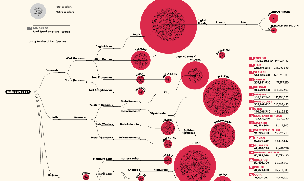
There are over 7 thousand vernaculars regularly spoken currently around the globe. The WordTips website charted the 100 most popular languages in a cool infographic that shows the origin tree for each of them. The size of bubbles visualizes the total number of language speakers worldwide; the dotted inner part displays how many of them are native.
Look at the top 100 languages and their origins. Don’t miss out on some interesting insights below the visualization.
Airbnb’s Legal Challenges
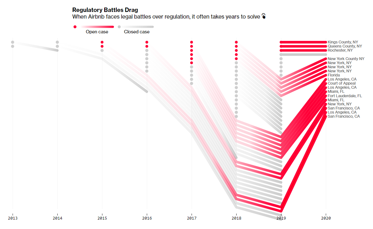
Airbnb, the biggest home-sharing company in the world, has become one of the most litigious startups lately. Struggling with short-term rental regulations in American cities, Airbnb seeks to clarify its legal status and protect thousands of listings. Legal assaults against Airbnb have also increased. Meanwhile, the clock ticks on the company’s stock market debut.
Bloomberg made three beautiful visualizations to illustrate a story about a ramp-up in Airbnb legal challenges. Take a look. There’re one chart showing all lawsuits and appeal cases over time, another one specifying battles over regulations with cities across the U.S. and the state of these cases, and a map displaying the drop in total listings in San Francisco after the city’s regulations had taken effect.
Dutch Trains on Average Working Day
???NEW PROJECT: for the Dutch Railways @NS_online I have created an interactive #dataviz for their 2019 annual report that shows train travel on an average working day: https://t.co/7bdm5ZWKkH Thanks @dnnsptri @f19_nl @ggjvasse pic.twitter.com/esrTAitC2U
— Jan Willem Tulp (@JanWillemTulp) February 27, 2020
Data visualization expert Jan Willem Tulp created a fascinating interactive data visualization for the 2019 annual report of the Dutch Railways. It displays all train travels in the Netherlands on an average working day when 1.3 million travelers take the train around the country.
See the train movements per station and per minute, carbon dioxide savings, as well as the number of travelers and trains currently running. “We need a name for this type of #dataviz,” Alberto Cairo commented when retweeting this, another prominent expert in data visualization. Right.
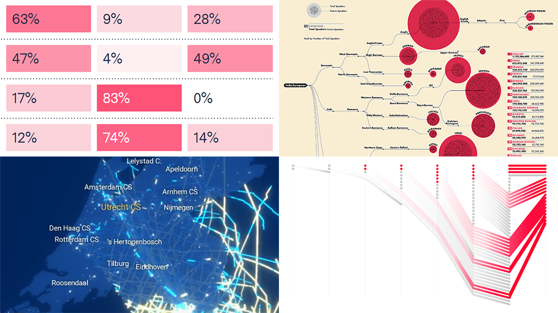
Political Email Sorting in Gmail
The Markup published the results of a simple test. Earlier, wondering how Gmail filters political email, they created a new Gmail account and signed up to receive letters from presidential candidates, advocacy groups, think tanks, and non-profit organizations.
Only 11% of all incoming emails landed in the primary inbox folder. About 50% got to Promotions. 40% were sent to the Spam folder. A heat map chart-like visualization provides details on maybe the most intriguing part — where Gmail delivered emails from the U.S. presidential candidates. Hmm, aiming to help users organize their email, Gmail’s sorting algorithm indeed may have influence on the election. Check out the chart and read more in the article (co-published with The Guardian).
Tip: This week, we’ve published a guest tutorial on how to create heat maps in JS and you might like to read it.
***
Thanks for looking through DataViz Weekly. Stay tuned for great charts.
- Categories: Data Visualization Weekly
- No Comments »