 Visualizing recurring patterns that may be recognized in data, socio-economic deprivation neighborhood by neighborhood across the United States, the global corporate debt issue, and England’s childhood obesity — these topics are in the focus of the new DataViz Weekly digest that we are glad to present right now.
Data Visualization Weekly: July 6, 2018 — July 13, 2018
Visualizing Recurring Patterns in Data

On FlowingData, you’ll find a new useful data visualization guide from Nathan Yau. This time, he talks about five options to make use of when visualizing recurring patterns in data. As has always been the case, the guide features pros and cons of each method, as well as multiple striking dataviz examples to illustrate the solutions.
U.S. Neighborhood Atlas
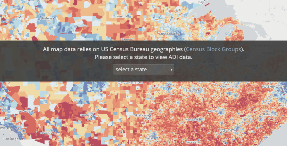
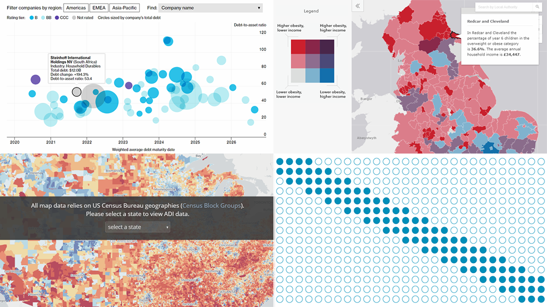
Researchers from the School of Medicine and Public Health at the University of Wisconsin—Madison created the Neighborhood Atlas. It is an interactive map that displays the Area Deprivation Index (ADI) across the United States of America and Puerto Rico. As a result, it helps to understand the degree of the socio-economic status disadvantage in each area and is expected to boost research into the socio-economic factors that affect health of the citizens at the neighborhood level.
Corporate Debt and “Titans of Junk”
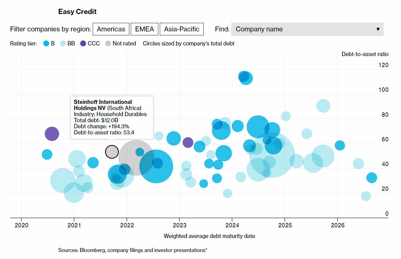
Bloomberg dug into the global issue of corporate borrowing and found sixty-nine companies around the world that (1) currently have a debt of five billion U.S. dollars or more, as well as (2) have increased it by at least 50% within the past five years. Check out the “Titans of Junk” article with multiple charts to learn more about them and how this problem challenges the markets.
Childhood Obesity Map of England
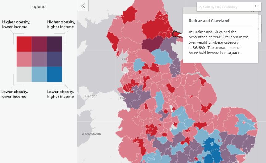
Daily Mail Online published an interactive map that displays the regional divide in the children’s obesity in England and reveals the link between overweight and poverty, area by area. The visualization is based on data from the National Childhood Measurement Programme (NCMP).
***
Check out our previous Data Visualization Weekly posts for more of the interesting dataviz works we’ve shared so far with our readers. And, of course, don’t miss out the awesome AnyChart JS Charts 8.3.0 release pushed earlier this week, if you know the worth of robust JavaScript (HTML5) charting.
Have a great time!
- Categories: Data Visualization Weekly
- No Comments »