 Have you ever wondered, how web developers create and integrate interactive JavaScript pie charts into HTML5 apps and web pages? If the answer is yes – keep on reading! This article explains how to create, change and integrate a pie chart into your web page. Beware! A hot-button political issue is present in this article. But we will not offend anyone!
Pie chart is one of the most popular chart types. Mathematically speaking it looks like a circle divided into sectors which represent a part of a whole. For the most of us, pie charts look like real pies or pizzas cut into several slices. In this article, you will find a detailed tutorial on how to build one, with JS chart code samples.
Creating JavaScript Pie Chart
There are four basic steps you should do to make a chart of any type with a JavaScript charting library. Spend 5 minutes and you will learn to add an interactive JS (HTML5) pie chart that looks like this to your web page:
Step 1. Create an HTML page
The very first thing you need to do is to create a file in which you will put your chart later. Create a simple HTML page, set its title and create a container for the future chart:
<!DOCTYPE html>
<html>
  <head>
    <title>JavaScript Pie Chart</title>
  </head>
  <body>
    <div id="container" style="width: 100%; height: 100%"></div>
  </body>
</html>
The width and height parameters of the container can be set in percents or in pixels. They are responsible for the chart’s width and height. Setting them to “100%” will make the chart fill the whole page.
Step 2. Reference all necessary files
The second step is about adding links into the <head> section. It is necessary to load the JavaScript charting library and create a tag where the whole code of our future pie chart sample will be put in:
<!DOCTYPE html>
<html>
  <head>
      <title>JavaScript Pie Chart</title>
      <script src="https://cdn.anychart.com/releases/8.0.1/js/anychart-core.min.js"></script>
      <script src="https://cdn.anychart.com/releases/8.0.1/js/anychart-pie.min.js"></script>
  </head>
  <body>
    <div id="container" style="width: 100%; height: 100%"></div>
    <script>
        <!-- chart code will be here -->
    </script>
  </body>
</html>
Step 3. Put the data together
The main purpose of creating a chart is to visualize data. So, it is clear that your data is the most important part of a chart and charting is only a way to present data in a graphical, visual manner.
If you choose a wrong chart type to visualize the data, you may mislead yourself or a chart viewer. So choose the chart type wisely! If you don’t know what’s the difference between chart types, check out the Choosing Chart Type series of articles on our blog. You are also welcome to use this nifty tool, Chartopedia; you’ll find Pie Chart there and see that this chart type is good to show Part Of The Whole.
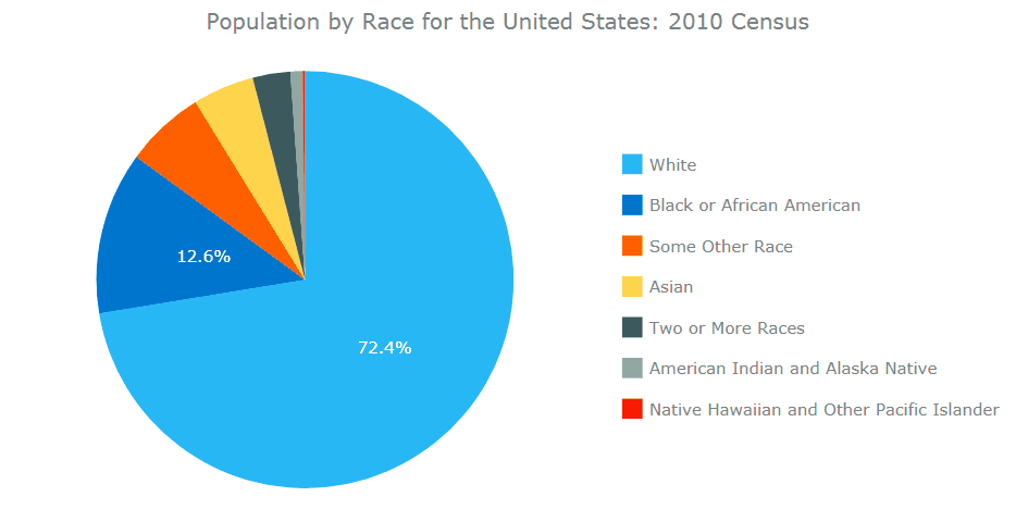
Showing what some whole consists of is exactly what we are going to do now. We’ll see the composition of the whole American nation in terms of race. To find out, let’s check out U.S. Department of Commerce Economics and Statistics Overview of Race and Hispanic Origin: 2010 and take some data from there:
| Population by Race for the United States: 2010 Census | |
| Race | Number |
| White | 223,553,265 |
| Black or African American | 38,929,319 |
| American Indian and Alaska Native | 2,932,248 |
| Asian | 14,674,252 |
| Native Hawaiian and Other Pacific Islander | 540,013 |
| Some Other Race | 19,107,368 |
| Two or More Races | 9,009,073 |
If you looked at the original data table in the Census Brief, you may have noticed there is a separate column with percentages. The great thing about JavaScript charts is that you don’t need it, you can put in data, and the chart calculates everything:
// set the data
var data = [
    {x: "White", value: 223553265},
    {x: "Black or African American", value: 38929319},
    {x: "American Indian and Alaska Native", value: 2932248},
    {x: "Asian", value: 14674252},
    {x: "Native Hawaiian and Other Pacific Islander", value: 540013},
    {x: "Some Other Race", value: 19107368},
    {x: "Two or More Races", value: 9009073}
];
Step 4. Write the chart code
This is the finishing step in creating an interactive JavaScript pie chart. Add the anychart.onDocumentReady function. This function is executed when the page is ready. Create the chart entity, put it into the container and connect the data with the chart.
anychart.onDocumentReady(function() {

  // set the data
  var data = [
      {x: "White", value: 223553265},
      {x: "Black or African American", value: 38929319},
      {x: "American Indian and Alaska Native", value: 2932248},
      {x: "Asian", value: 14674252},
      {x: "Native Hawaiian and Other Pacific Islander", value: 540013},
      {x: "Some Other Race", value: 19107368},
      {x: "Two or More Races", value: 9009073}
  ];

  // create the chart
  var chart = anychart.pie();

  // set the chart title
  chart.title("Population by Race for the United States: 2010 Census");

  // add the data
  chart.data(data);

  // display the chart in the container
  chart.container('container');
  chart.draw();

});
Here’s how it looks:
See the Pen Creating a JavaScript Pie Chart: Basic Example by AnyChart JS Charts (@AnyChart) on CodePen.
That’s it! A simple pie chart created with a JavaScript charting library is ready!
Change Chart Appearance
This section is optional. If you are not satisfied with the chart appearance and want it to be more remarkable and attractive, you can make the necessary changes.
JS pie charts have a lot of settings. You can learn about them in the Pie Chart Settings article and grab some ideas and code from the Pie Chart Gallery.
Let’s get our modifications started!
Legend
Pie charts have a special control element: legend. Also known as the chart’s key, the legend is linked to the data that’s displayed on the chart.
By default, the legend is placed at the bottom of the chart and it is not looking good in this particular case.
To move the legend to the right and make its elements stack vertically, add the following setting to the code:
// set legend position
chart.legend().position("right");
// set items layout
chart.legend().itemsLayout("vertical");
Look how these modifications changed the pie chart:
See the Pen Creating a JavaScript Pie Chart: Move Legend by AnyChart JS Charts (@AnyChart) on CodePen.
Much better, right?
Sort
Another thing we can change is the order of slices in a pie to facilitate the visual data analysis. Let’s sort things out:
// sort elements
chart.sort("desc");
And the picture becomes clearer:
See the Pen Creating a JavaScript Pie Chart: Sort Slices by AnyChart JS Charts (@AnyChart) on CodePen.
Explode
There is one last thing we can do to highlight the hot-button issue we mentioned in the beginning. Let’s make the majority group stand out visually. To do so, we change the data by mean of a special setting:
{x: "White", value: 223553265, exploded: true},
And the final JavaScript pie chart looks as follows:
See the Pen Creating a JavaScript Pie Chart: Explode by AnyChart JS Charts (@AnyChart) on CodePen.
This pie chart could be a good addendum to many articles on the state of racial relations in the USA. “America really is more divided than ever” is the name of a Washington Post article by Joel Achenbach and Scott Clement. “America is more racially divided than it has been in decades,” echoes Carol Anderson in the Financial Times. These are troubling times and everyone hopes that the society will remember Barack Obama’s words: “That’s the path out of moments like these. Not to withdraw, or shout each other down, but to reach out to each other — even if it’s difficult — and find some common ground.”
Conclusion
This small tutorial explains how to build a pie chart using the AnyChart JavaScript charting library. Go to the official AnyChart JS Charts website for more information and, in particular, visit the JavaScript Chart Gallery for more chart types illustrated. The AnyChart Charts Documentation and AnyChart JavaScript API will help you to build and adjust your HTML5 charts with ease.
- Categories: AnyChart Charting Component, HTML5, JavaScript, JavaScript Chart Tutorials, Tips and Tricks
- 29 Comments »
Comments (29)
how do I convert this pie chart into image format?
Hello! Any chart, including a pie chart, can be exported to images using the context menu or API. Please see the Exports article in our JavaScript charting documentation:
https://docs.anychart.com/Common_Settings/Exports
Feel free to reach out to our Support Team in case you need any further assistance:
https://www.anychart.com/support/
How can l change the background color of this chart div even if l write it in to the style its not working
To change the background of the chart, you can use the background() method. For example:
chart.background().fill("gold");Learn more in the documentation:
https://docs.anychart.com/Appearance_Settings/Background
Hope this helps. If you need further assistance, please contact our support engineers directly. Thanks.
Is it possible to make each slice navigate to html pages or perform a function when selected?
Hi Josh! Sure, you can attach an event listener (or several) to any element and define an action to be performed once the event is triggered. You are welcome to read about event listeners in the documentation:
https://docs.anychart.com/Common_Settings/Event_Listeners
How can I render a pie chart in series type.
Hello, could you please explain exactly what you mean you want to achieve? You are welcome to reply here or get in touch with our Support Team directly. Thanks.
Hii, how can I customize the colours of the legend and the pie?
Hello. You are more than welcome to check out the documentation and pie chart examples in our gallery. In case of any troubles finding exactly what you need please get in touch with our support engineers for further assistance. Thanks.
Hi there – I’m trying to create a pie in each data row of a data table constructed used datatables. js
The examples I’ve seen on the site are all about calling one instance of a pie chart per HTML, with the script text outside the body of the HTML.
I’d like to take the data for each row, and send it via a script in the HTML file to a JS file containing the function that actually draws the pie.
I’ve developed the pie style I want in the playground, but just need to work out how to connect it all up so it actually draws the pie for every instance. So, my HTML file has on every row a script like this:
makethepie(container_reference, datatable_point1, datatable_point2, datatable_point3);
And there’s a function in a js file like so:
function makethepie(ct,dtp1,dtp2,dtp3) {
{
var data = [{name: ‘Emails:’, value: dtp1},{name: ‘Calls:’, value: dtp2},{name: ‘Meetings:’, value: dtp3},{name: ‘Working Events:’,value: dtp4}];
var chart = anychart.pie(data);
chart.container(ct);
chart.draw();}
}
But this doesn’t seem to work, even though I’m referencing the core anychart js file in the HTML file.
Hi! I would like to ask about ‘Why I use a same method as yours (base on the html code upwards)How can I change the height to be taller as it will not just be 100%.But I could change the width.(Sorry my English is poor)thank you.
Hi. Sorry, not sure exactly what you mean. Basically, you just set the corresponding values in the container style settings according to your needs, in percentage or in pixels, and that’s it. Try to open one of the examples on CodePen and play with the parameters in the CSS section. If you still cannot achieve what you want, please contact our support engineers directly and they will be more than happy to look into this and provide further assistance. Thanks.
Hi, I want to remove the percentages that appear can you guide me how’s that possible
Hello,
If you want to remove the percentages from the labels, you can simply add the following line chart.labels(false); and they will disappear.
For more information, please see the AnyChart Documentation, e.g. Pie Chart Docs and Labels Docs.
If you have any additional questions, please contact our Support Team directly.
Thank you.
hi i want to change color pie can you give me code to change color
Hi. You can easily switch to a different design theme (here’s a demo). For more advanced customization, check out the Pie Chart Appearance and Color Management articles in our documentation. Hope this helps. If you still have any questions, please do not hesitate to contact our Support Team directly. Cheers.
This is very helpful! I was wondering if there is a way to click one component of the graph, whereby that section expands as the entire graph and you can view subsections of that one component? If that makes any sense?
Thanks!
Hi Chelsea. Thank you. Yes, you are welcome to make use of the drill down feature available in our JS chart library. If you have more questions, feel free to ask again here or contact our Support Team. Cheers.
Can I add an extra line of information under percent value ?
Sure. Basically, here’s all you need to add to the code:
chart.labels().format('{%percentValue}%\nthe second line');
Here’s a chart sample where this is applied:
https://codepen.io/anon/pen/KYYLNv
Learn more about formatting functions in AnyChart in our Docs:
https://docs.anychart.com/Common_Settings/Text_Formatters#formatting_functions
it isnt resposnive at all
Sure it is. For example, you can move the mouse over pieces and click them, the legend is also responsive. And it finely adapts to the screen width if you mean that responsiveness. Or what do you mean?