 Hey everybody, are you ready for another dose of interesting data visualizations? The new DataViz Weekly collection is already here! So – no matter whether it’s for fun, inspiration, or both – you are welcome to take a look.
Today in Data Visualization Weekly:
- “first leaf” appearance across the United States;
- different future of black and white boys raised in wealthy families;
- the pay of CEO vs. median employees in publicly traded companies;
- US population in the Alperin-Sheriff data set.
Data Visualization Weekly: March 16, 2018 – March 23, 2018
“First Leaf” Appearance Across US
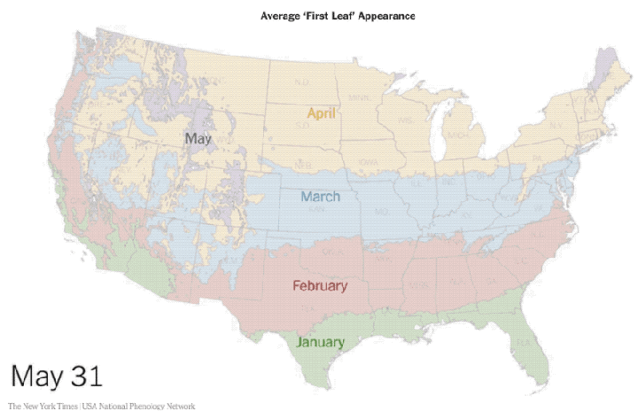
Spring of 2018 has already sprung in many parts of the United States. However, some regions are still in the wait. The New York Times published a cool map visualizing how spring spreads across the US, displaying the estimated “first leaf” appearance time for each part of the country.
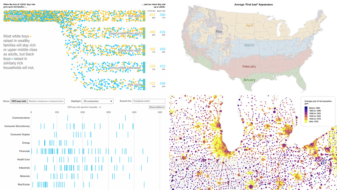
Black Boys Raised in Wealthy US Families Rarely Become Rich as Adults
Black boys from rich families earn less as adults than white ones with the same or very similar background. That’s true for 99% of the United States. And that’s what data shows. The New York Times tells the story accompanied with a lot of charts including beautiful animated visualizations.
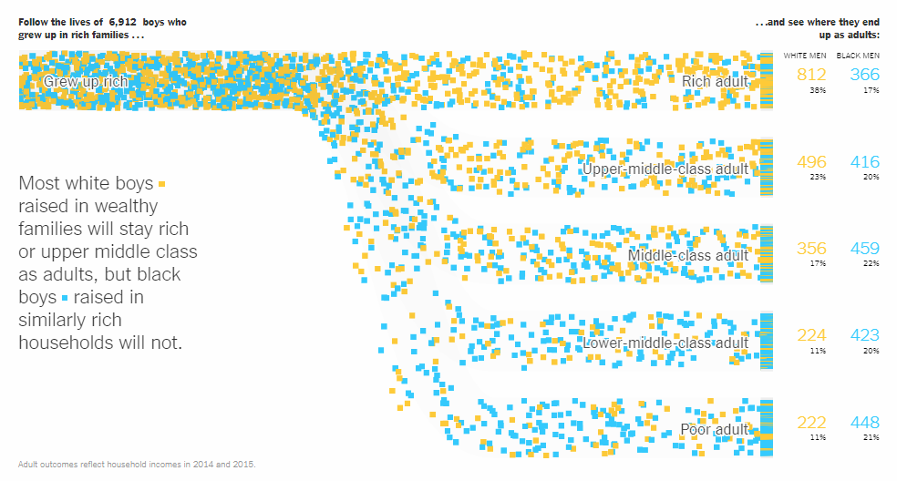
Comparing CEO Pay to Median Employee Salary
Publicly traded businesses in the United States are now obliged to disclose the level of compensation their CEO gets in comparison with the median employee’s pay. Bloomberg published a visualization of the corresponding data from Russell 1000 and S&P 500 companies’ official filings. Check it out to see how workers’ pays stack up to CEOs’.
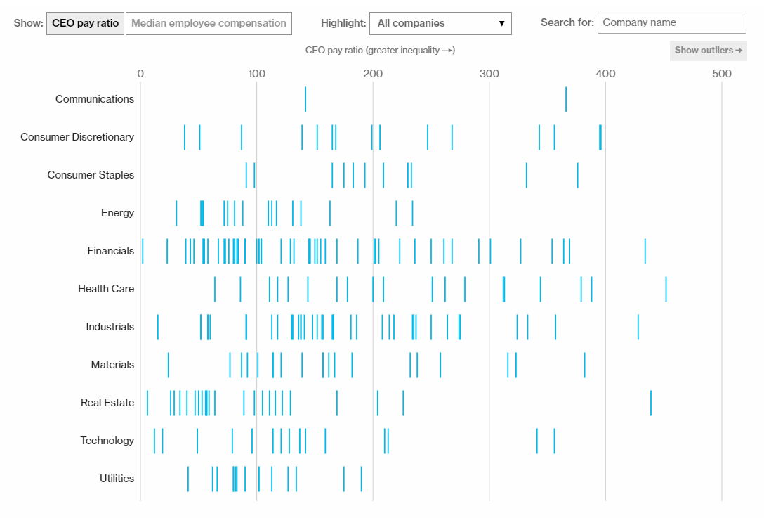
Visualizing US Population in Alperin-Sheriff Data Set
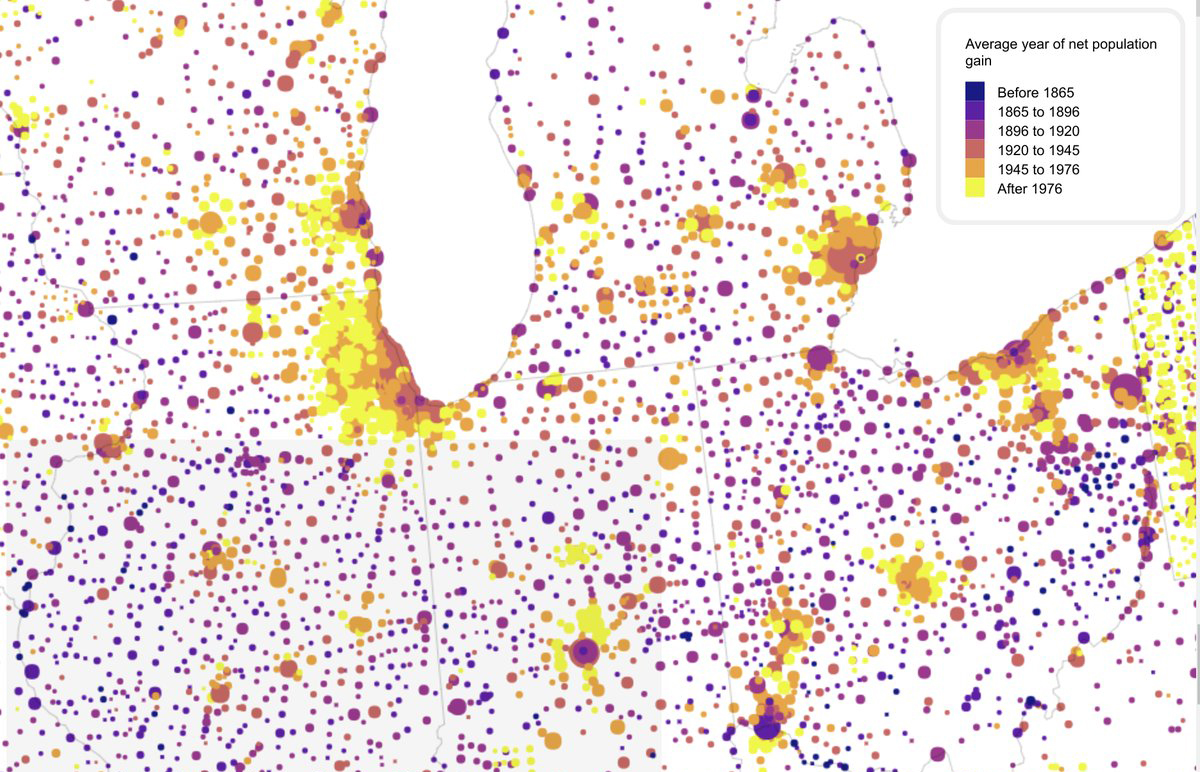
Jacob Alperin-Sheriff, a Wikipedia editor and a Georgia Tech graduate student, entered the population of 25,000 cities and counties from the US Census. Benjamin Schmidt, Northeastern University’s assistant professor of history, assembled a data set out of that information, which is currently reported to be four times bigger than historians have previously had to work with, and made its narrative visualization.
***
That’s all that we wanted to share with you in this new Data Visualization Weekly post. Have a great weekend!
- Categories: Data Visualization Weekly
- No Comments »