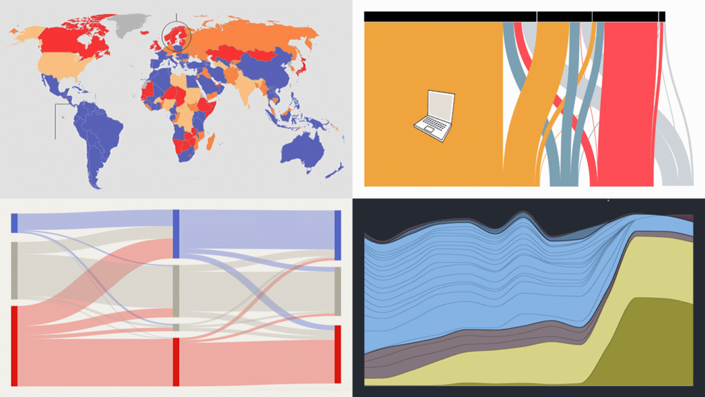
Data visualization has two core purposes: explanation and exploration. In DataViz Weekly, you can see how they naturally end up combining. Check out some of the most interesting data visualization examples we’ve recently found around the web lately, where charts and maps do their job in a compelling way:
- China’s rise in AI research talent — The Economist
- Shadow fleet capitalizing on Iran war — The Financial Times
- Vietnam’s rise as a U.S. electronics supplier — Bloomberg
- Food self-sufficiency by country — Amanda Shendruk

Data Visualization Weekly: March 27 – April 3, 2026
China’s Rise in AI Research Talent
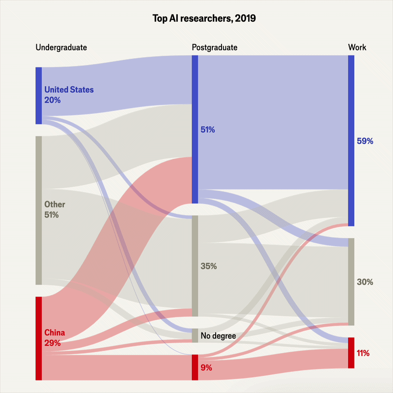
The United States has long been home to the largest share of the world’s top AI researchers. That is changing, as both the training and the retention of elite talent shift toward China.
The Economist tracked the education and career paths of researchers who presented papers at NeurIPS 2025, the world’s leading AI conference. A bump chart opens the piece, ranking countries by their number of top AI researchers from 2016 to 2025, with China jumping to first place last year. Next comes a scrollytelling section with a Sankey diagram as the centerpiece, showing how top AI researchers’ countries of origin changed across three stages: undergraduate, postgraduate, and work. It starts with the 2019 picture and transitions to 2025 as you scroll, revealing how the U.S. and China shares moved in opposite directions. Further down, bar charts dig deeper into researcher populations and career trends across countries.
Read the piece in The Economist.
Shadow Fleet Capitalizing on Iran War
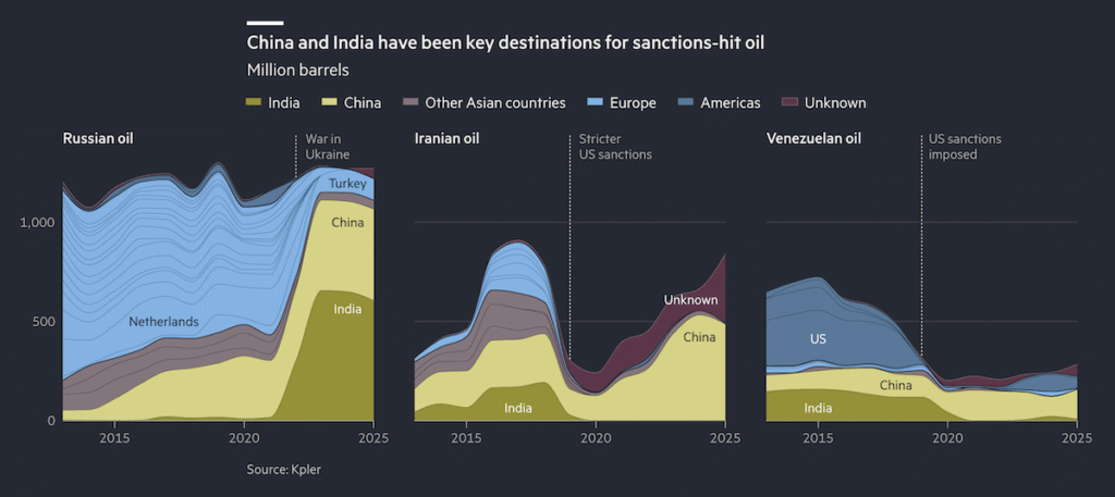
When war with Iran broke out in late February 2026, a fleet of tankers operating outside Western insurance and regulatory systems moved to center stage. Commonly known as the shadow fleet, these ships have long transported sanctioned crude from Russia, Iran, and Venezuela, and as conventional traffic stalled in the Gulf, demand for their services surged.
The Financial Times investigates how the shadow fleet has navigated and capitalized on the Iran war, using a series of visualizations. Three stacked area charts, visible above, track where sanctions-hit oil from Russia, Iran, and Venezuela has flowed since the mid-2010s, showing how Western buyers gradually exited as China and India absorbed the bulk. A dot-and-connector map built on satellite and ship-tracking data shows individual tankers switching off their signals or spoofing GPS positions near Kharg Island, Iran’s main export terminal, around the start of the conflict. Further into the piece, additional visuals, including line and stepped area charts, cover the fleet’s operations and evasion tactics in more detail.
See the story on the Financial Times, by Lucy Rodgers, Nassos Stylianou, Alice Hancock, Chris Cook, Irene de la Torre Arenas, and Sam Learner.
Vietnam’s Rise as U.S. Electronics Supplier
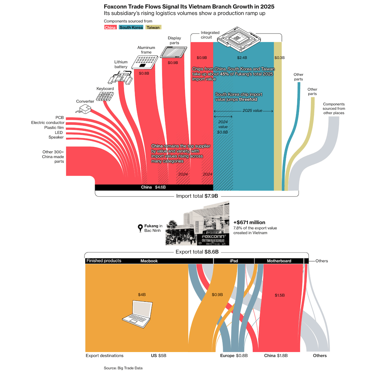
When the Trump administration imposed sweeping tariffs on April 2, 2025, China faced the steepest levies. One stated goal was reducing U.S. dependence on Chinese-made goods and bringing manufacturing back to America.
Bloomberg analyzed shipment-level customs data to examine what actually shifted in the year since. A pictogram chart opens the piece, showing Vietnam overtook China as the leading source in 2025 compared to 2024, with an annotation callout that the shift was driven largely by manufacturers like Foxconn and BYD expanding from China into Vietnam. A Sankey diagram then maps Foxconn’s Vietnamese factory — components flowing in from China, South Korea, and Taiwan at the top, finished MacBooks, iPads, and motherboards flowing out to export destinations at the bottom. Further graphics reveal more about the shift, including a diverging bar chart showing how China’s losses in U.S. electronics imports were largely offset by gains from others, mostly Vietnam and India.
Take a look at the article on Bloomberg, by Andy Lin, Nguyen Xuan Quynh, Spe Chen, and Claire Jiao.
Food Self-Sufficiency by Country
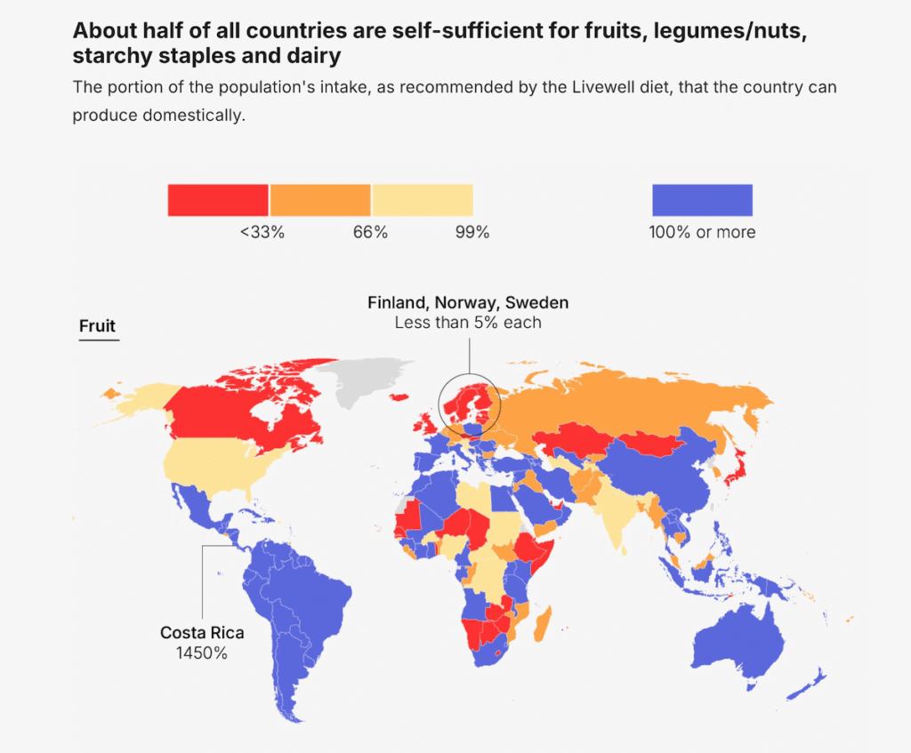
No country runs its food supply in isolation. Most rely on global trade to fill gaps between what their land produces and what their population needs.
Amanda Shendruk built a data story examining how self-sufficient 187 countries are across seven food groups, based on research published in Nature Food. A choropleth map for each food group shows what share of domestic need each country can meet through its own production. The picture varies sharply by category. For meat, 121 of 187 countries produce a surplus. For fish and vegetables, fewer than one in four nations can cover their own needs. Only Guyana currently qualifies across all seven food groups. A final choropleth map shifts the question to potential, showing how much agricultural land each country would need for a fully home-grown diet.
Explore the story on Amanda Shendruk’s Not-Ship.
Wrapping Up
AI research talent, oil markets, global supply chains, food security — four very different subjects, each brought into sharper focus by thoughtful data visualization. We will be back next week with more in DataViz Weekly.
- Categories: Data Visualization Weekly
- No Comments »