 Every week, someone somewhere turns a pile of data into something you actually want to look at. We round up the best examples from what we found right here in DataViz Weekly. On the list this time:
- Corruption Perceptions Index 2025 — Transparency International
- U.S. college degrees by field since 1970 — FlowingData
- Women’s clothing sizes — The Pudding
- What’s actually in liver — Gourmet Data

Data Visualization Weekly: February 20–27, 2026
Corruption Perceptions Index 2025
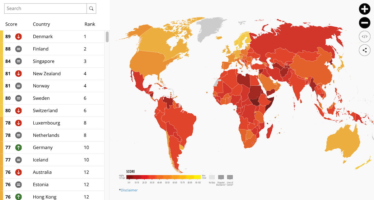
Public sector corruption is present to varying degrees in countries around the world. How does it look today, and is the world making progress?
Transparency International presents the answers in its annual Corruption Perceptions Index, now out for 2025. The results for 182 countries and territories are displayed on an interactive choropleth map, with a color gradient running from dark red for the lowest-scoring countries to lighter shades for the highest, on a scale from 0 (highly corrupt) to 100 (very clean).
Clicking on any country surfaces its score and rank. A sidebar index lists all countries and lets you jump directly to any entry. Year-selector controls going back to 1995 allow switching between past editions, making it possible to check how any country’s score has shifted over time.
Check out the map and the index on the Transparency International website.
U.S. College Degrees by Field Since 1970
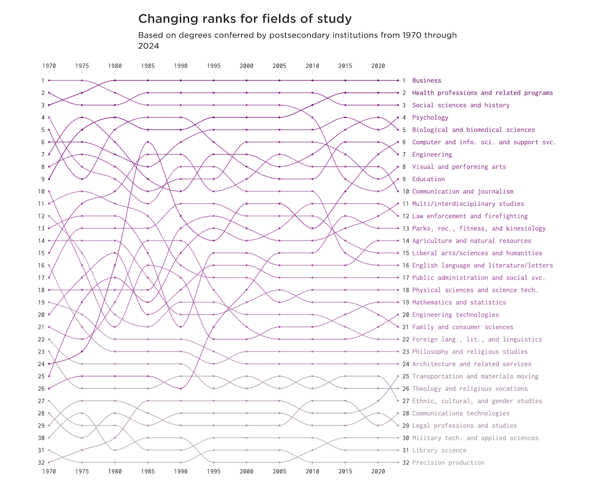
The mix of subjects American college students choose to study has shifted considerably over the past half-century. Which fields have grown, which have faded, and which have held steady?
Nathan Yau built an interactive bump chart tracking 32 fields of study by the number of bachelor’s degrees conferred each year from 1970 through 2024, based on data from the National Center for Education Statistics. Each field is represented as a line running left to right across the chart, with its vertical position showing its rank for that year.
The more a field has risen or fallen over the decades, the more its line weaves through the others. Fields that stayed consistently popular run nearly flat across the full chart.
Explore the chart on Nathan’s blog FlowingData.
Women’s Clothing Sizes
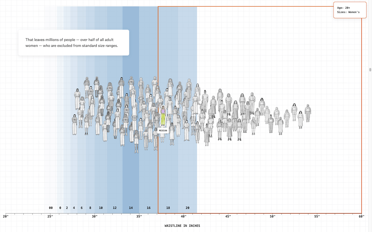
Women’s clothing sizes have no universal standard. Each brand sets its own measurements, and those measurements change over time without any obligation to inform shoppers.
The Pudding published a scroll-driven data story tracing a representative sample of American girls and women across age groups, using body measurement data from the National Center for Health Statistics. An illustrated crowd chart displays figures along a waistline axis with colored bands marking size ranges, showing where the median and key percentiles fall at each life stage.
A dot plot then lines up 15 popular brands by the waistline ranges their sizes cover, with two vertical reference markers indicating the median waistline at age 15 and for adult women. It is followed by an interactive comparison that sets 1995 and 2021 ASTM sizing guidelines side by side on the same axis, showing how size labels have changed over time. The piece closes with a grid of body-silhouette charts, one per brand, where curved lines show how each brand’s sizes scale across bust, waist, and hip.
See the piece on The Pudding, by Amanda Sakuma and Jan Diehm.
What’s Actually in Liver
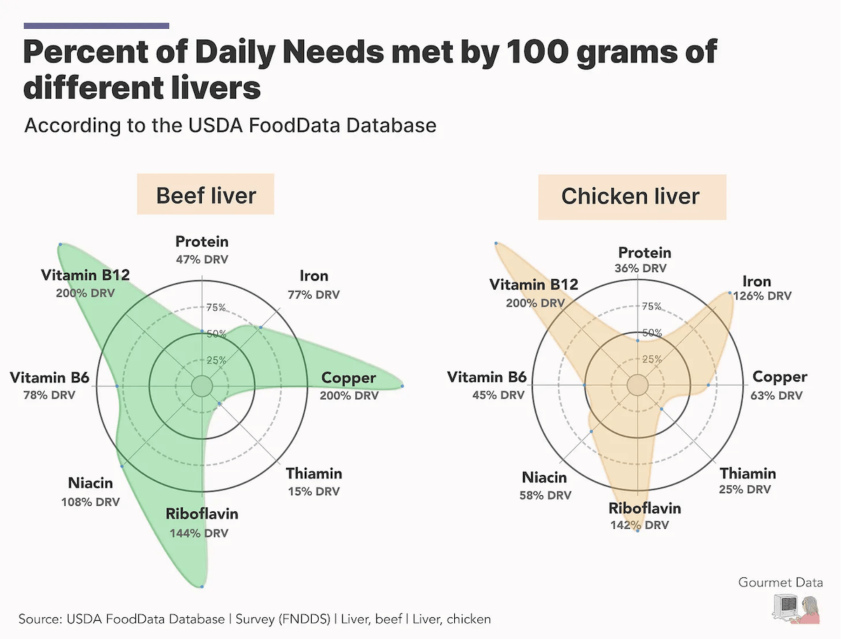
Liver is widely regarded as one of the most nutrient-dense foods available. How its nutritional profile actually breaks down — and how different types compare — is less commonly known.
Juweek Adolphe put together a chart-driven post exploring liver nutrition using data from the USDA FoodData Database. A Sankey diagram opens the piece, breaking down what 100 grams of beef liver is actually made of. From there, a mix of bar charts, radar charts, pie charts, and Voronoi treemaps delve into more details — such as how vitamin-to-mineral ratios differ between liver and other cuts, how beef and fish liver compare in macronutrient makeup, and how different liver types stack up against daily nutritional needs.
Worth noting: the Gourmet Data blog has a whole archive of similarly fun, chart-heavy deep dives into food topics. Well worth a browse.
Check out the post on Juweek’s blog Gourmet Data.
Wrapping Up
Data visualization keeps finding new ways to make the world more legible and every week brings together fresh examples worth paying attention to. DataViz Weekly will be back with more of the best charts and maps we discover, next Friday. Have a great weekend!
- Categories: Data Visualization Weekly
- No Comments »