 Data visuals do not have to be complicated to work. Clear structure can do a lot of the heavy lifting on its own. A few fresh examples like this are in the spotlight in this new edition of DataViz Weekly:
- Measles cases rise in the U.S. — CNN Health
- Population shifts across the U.S. — FlowingData
- U.S. science cutbacks — Nature
- Food deserts in the U.S. — ILSR

Data Visualization Weekly: January 23–30, 2026
Measles Cases Rise in U.S.
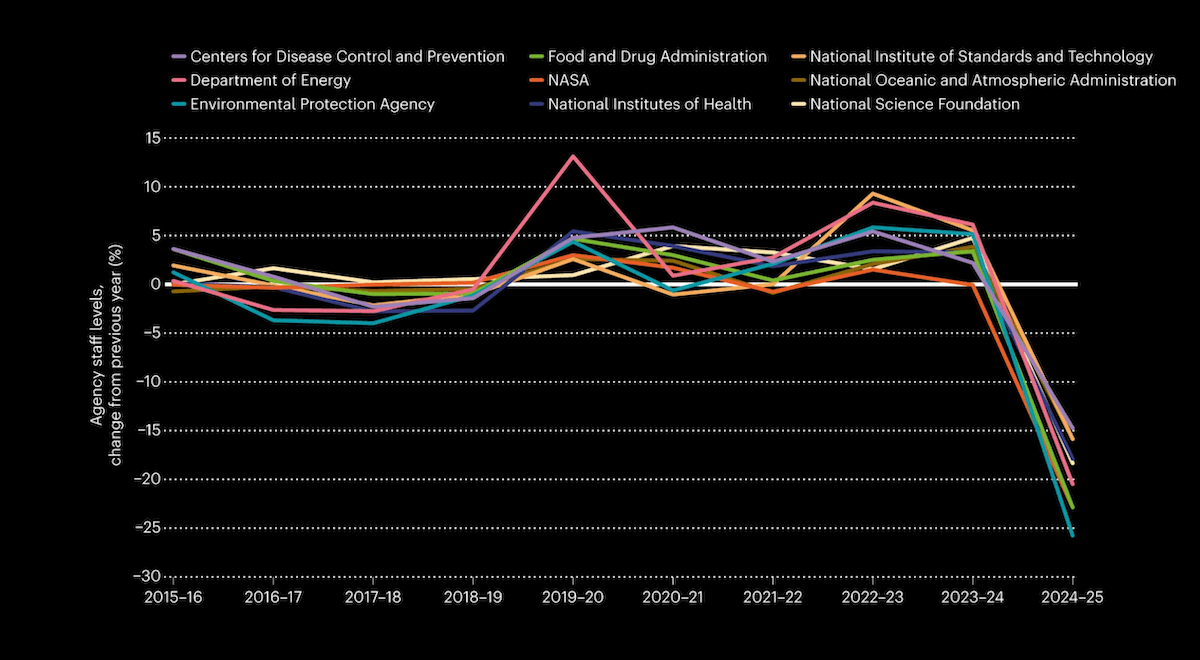
Measles can spread quickly once it reaches people without immunity. A fast-growing outbreak in South Carolina is driving U.S. totals up quickly early in 2026.
CNN Health shows this with a line chart that compares how cumulative U.S. measles cases build through the year against recent years. The 2026 line, displayed through January 29, rises much more steeply than the others and already exceeds the full-year totals shown for 2023 and 2024. The article also includes a bar chart of annual U.S. measles cases since 2020, for a longer-term context.
See the article on CNN Health, by Meg Tirrell, Deidre McPhillips, and Jamie Gumbrecht.
Population Shifts Across U.S.
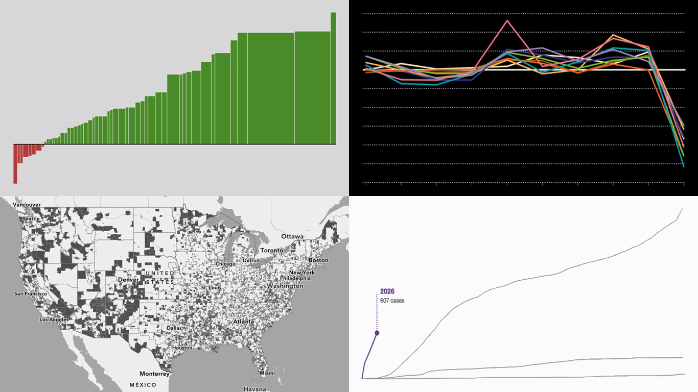
Population change is a steady background process, shaped by who moves in or out and how many people are born or die. New 2025 estimates for the United States show that since 2020, most states have grown, while a smaller group has gone the other way.
Nathan Yau visualizes the shifts with an interactive bar Mekko chart that compares states in two ways at once. Each state (as well as the District of Columbia and Puerto Rico) appears as a horizontal bar, where bar length represents the percent change since 2020 and bar height reflects the total change in population. Controls let you reorder the bars by percent change, total change, or state name, making it easy to scan the results from different angles without changing the view.
Check out the post on FlowingData.
U.S. Science Cutbacks
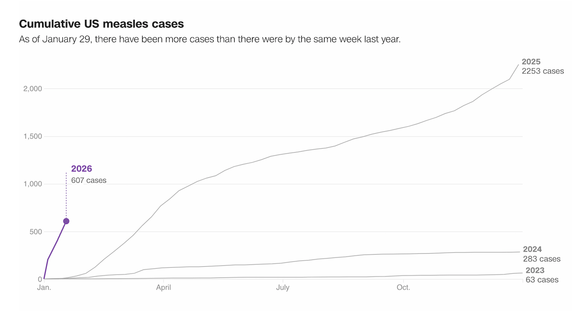
Big changes in government priorities can reshape science quickly, especially when they affect funding and staffing. One year into Donald Trump’s second term, U.S. research has faced major disruptions, from grant terminations to workforce losses.
Nature explores the developments using a scroll-driven series of graphics. The line chart displayed above focuses on staffing across federal science agencies, showing year-over-year percentage changes over the past ten years. Each colored line represents one agency, and the sharpest recent drops stand out at a glance. The piece also includes additional visuals, including a treemap and column charts, to show disruptions to grant funding, shifts in international-student enrollment, and proposed research budget cuts.
Explore the feature on Nature, by Max Kozlov, Jeff Tollefson, Dan Garisto, and Kim Albrecht.
Food Deserts in U.S.
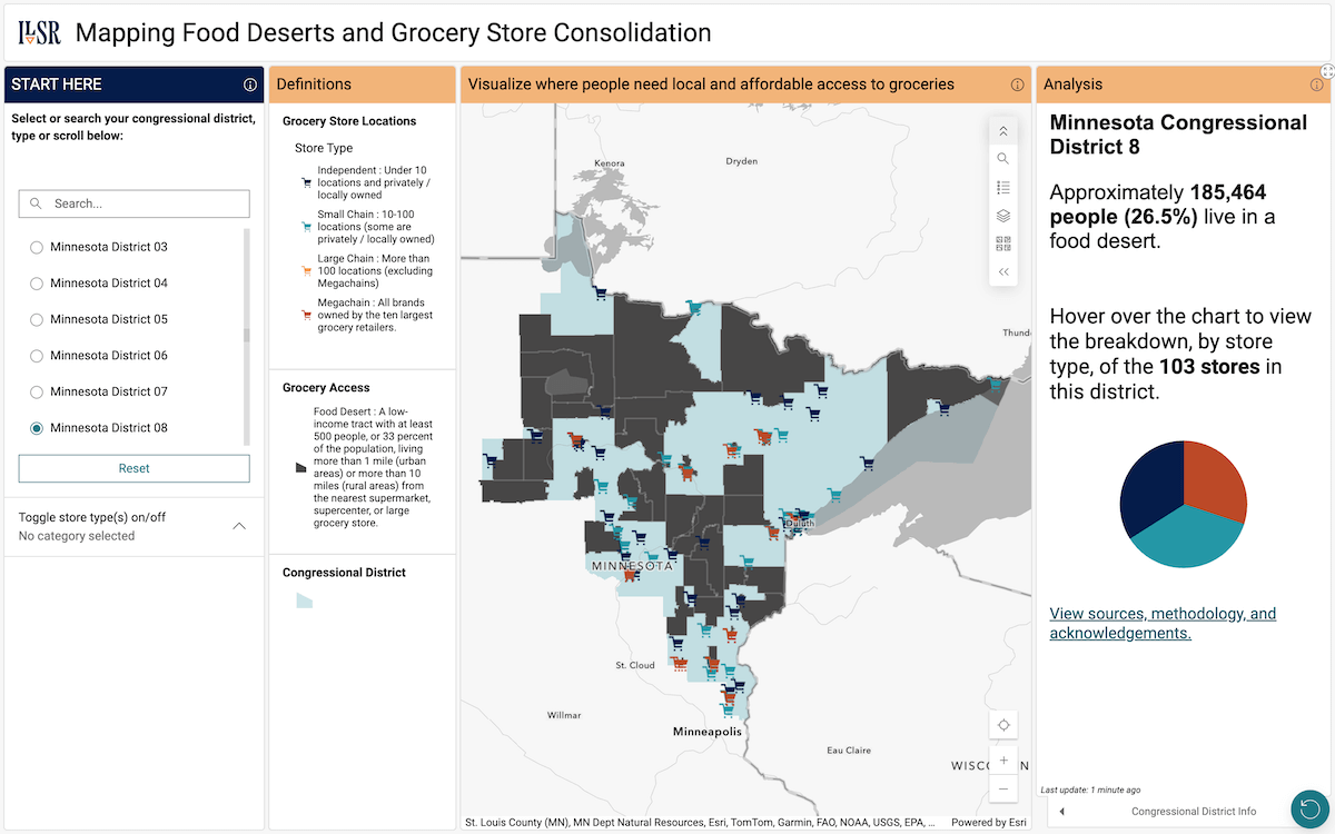
In many parts of the United States, low-income areas do not have a grocery store nearby, which makes fresh food harder to reach. These areas are often called food deserts, and the pattern varies widely across the country.
The Institute for Local Self-Reliance (ILSR) launched an interactive choropleth map that lets readers explore food-desert census tracts alongside grocery store locations and types, linking food access with industry consolidation. Food deserts appear as shaded areas, while stores are marked as points color-coded by category, separating independent grocers, small chains, large chains, and megachains such as Walmart and Kroger. You can search and browse by congressional district, and the local mix of store types is summarized in pie charts.
Open the map here, by Katy Milani and Christine Parker, and learn more about the project on the ILSR website.
Wrapping Up
Clear data visualization does not always require complex techniques. These examples show how clear structure can make the point land.
Stay tuned for DataViz Weekly, where we round up fresh data-visual work worth a look for ideas and inspiration.
- Categories: Data Visualization Weekly
- No Comments »