 Data becomes much easier to explore and explain when it is shown visually. If you want to see how that plays out in practice, you are in the right place. Welcome to DataViz Weekly, where we round up the most interesting charts and maps we have spotted over the past week. Featuring this time:
- Solar pressure on Europe’s power grid — Bloomberg
- China’s trade rise over two decades — Folha de S.Paulo
- Sleep deprivation in wartime Ukraine — Texty.org.ua
- Cats’ laziness — Lisa Hornung
Data Visualization Weekly: October 24–31, 2025
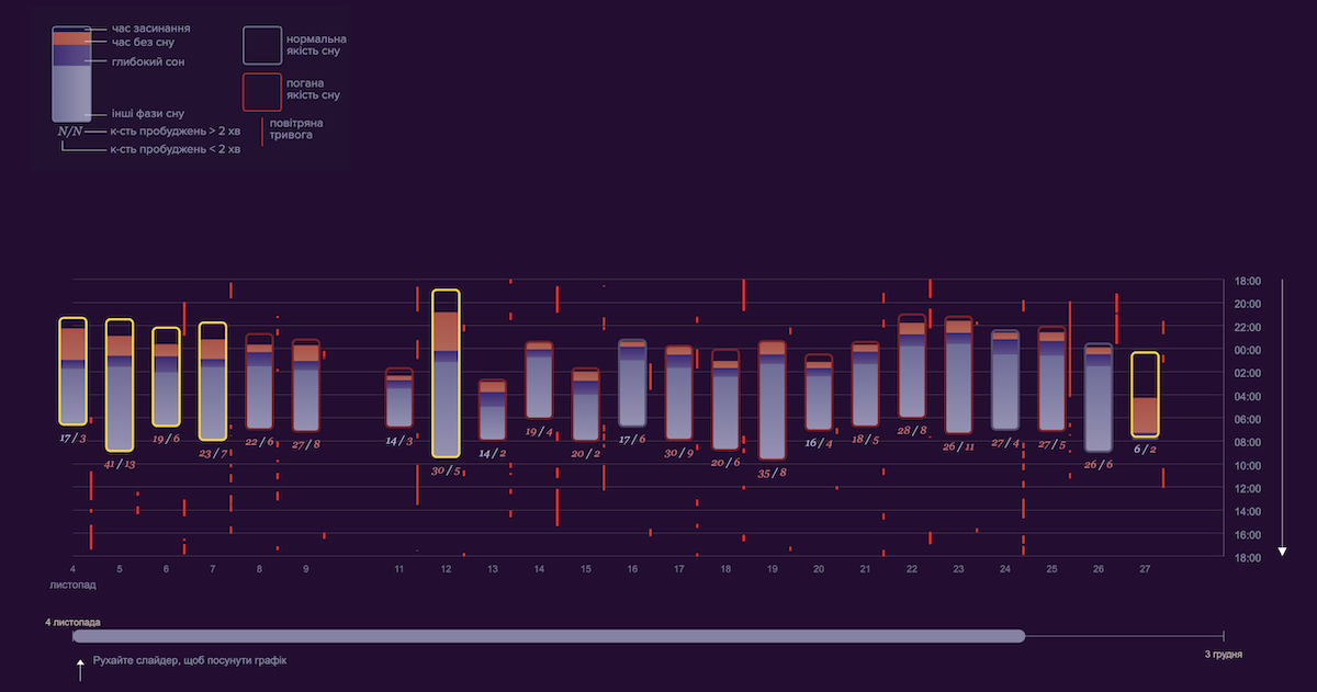
Solar Pressure on Europe’s Power Grid
Across Europe, solar power is growing faster than ever, with about four panels installed every second. The surge, however, is straining an electricity network built long before renewables became central to power generation.
Bloomberg explores how this rapid solar expansion is transforming the continent’s energy balance and revealing weak points in its grid. The article features a range of data graphics that visualize key dynamics, with polar charts catching the eye. Animated versions show monthly solar output in Spain and Germany, highlighting seasonal spikes in generation. Another set of polar diagrams illustrates the share of solar production during hours of negative electricity prices, a pattern now visible throughout the year.
? Check out the article on Bloomberg, by Will Mathis, Tom Fevrier, and Hayley Warren.
China’s Trade Rise Over Two Decades
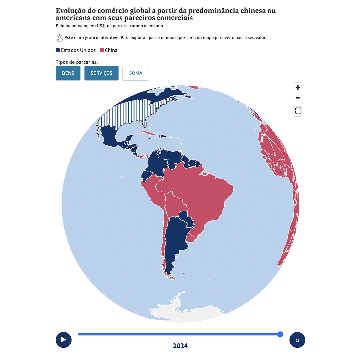
Over the past two decades, global trade patterns have shifted dramatically. China has emerged as the dominant commercial partner for most of the world, reshaping supply chains and reducing the relative weight of the United States.
Folha de S.Paulo demonstrates this transformation through an interactive 3D globe that tracks, year by year from 2000 to 2024, which countries traded more with China or the U.S. Users can toggle between goods, services, or totals, as well as play an animation to watch red gradually replace blue as Chinese influence expands. Two complementary flat choropleth maps compare 2000 and 2024 side by side, making the global realignment immediately clear.
? See the piece on Folha de S.Paulo, by Marcela Canavarro, Maeli Prado, and Vitor Antonio.
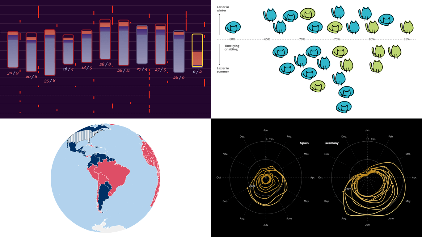
Sleep Deprivation in Wartime Ukraine
Sleep is when the body restores itself, stress subsides, and the brain clears away the day’s stimuli. But in wartime Ukraine, that natural rhythm has been disrupted: air raid sirens, nightly attacks, and constant anxiety make even short rest difficult.
Texty.org.ua presents the findings of a six-month scientific study that tracked the sleep of more than a hundred Ukrainians, led by researchers from the Laboratory for Sleep, Cognition and Consciousness Research at the University of Salzburg. The scrollytelling piece visualizes individual sleep patterns with stacked column charts plotted along a timeline, showing when participants went to bed, how long they stayed awake, and how much deep sleep they got each night. Red vertical lines mark the timing of air raids, revealing how nightly alerts and attacks disrupt rest and contribute to persistent insomnia.
? Explore the story on Texty.org.ua, by Yevheniia Drozdova and Nadiia Kelm.
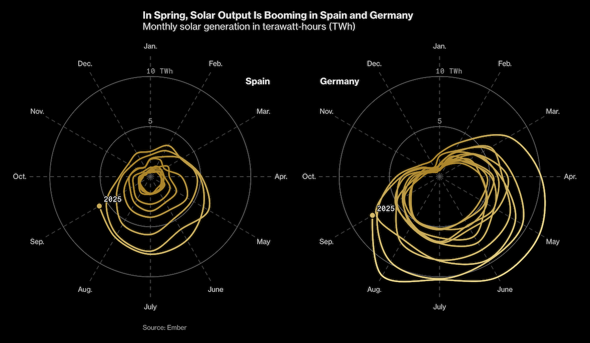
Cats’ Laziness
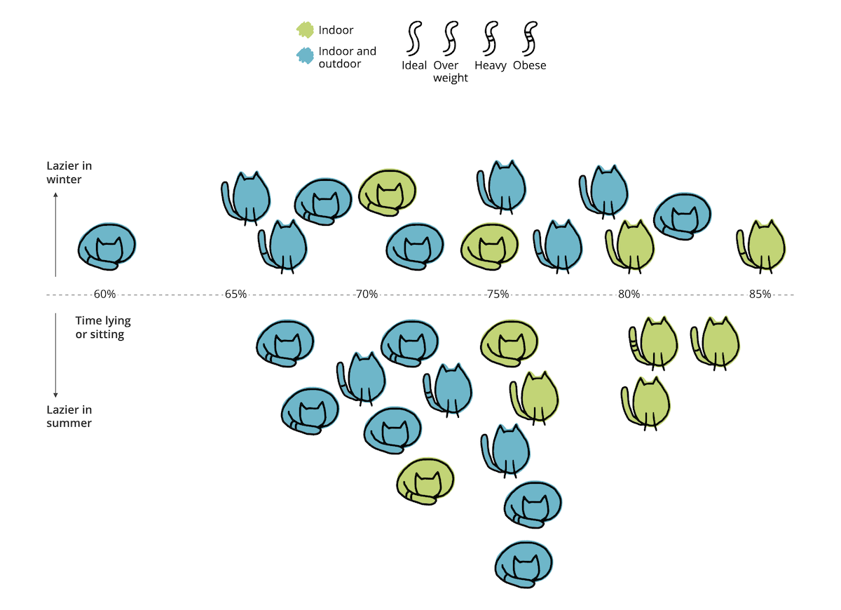
Cats are famous for their love of sleep and stillness. Yet behind all that lounging lies a daily rhythm shaped by nature and refined through domestication.
Lisa Hornung visualizes how cats actually spend their time using data from a Massey University study that tracked 28 pets with accelerometers. The project features a bar chart, a Sankey diagram, and a strip plot showing how much time cats devote to lying, sitting, standing, and other activities. The interactive scatter plot at the end uses cat images as markers, letting readers explore each animal’s lifestyle and behavior in detail.
? Look at the project at lazy-cats.netlify.app, by Lisa Hornung.
Wrapping Up
These four projects once again show how visualization helps uncover structure and meaning in complex data. Each turns information into something you can see and understand at a glance.
We will keep watching for more compelling examples of charts and maps that make data speak with clarity and purpose. Stay tuned for Data Visualization Weekly!
- Categories: Data Visualization Weekly
- No Comments »