 When data needs to be explored or explained, visualization helps. Here are several fresh examples of how that works in practice. On the agenda in DataViz Weekly today:
- U.S. federal funding and shutdowns — The New York Times
- H-1B workers at U.S. research institutions — The Xylom
- USAID medical supply disruptions — The Washington Post
- Daytime air alerts in Kyiv — CNN
Data Visualization Weekly: September 26 – October 3, 2025
U.S. Federal Funding and Shutdowns
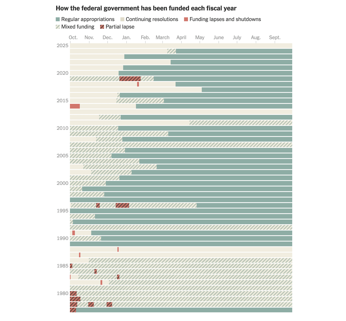
The United States faces another government shutdown, part of a long pattern of funding disruptions stretching back decades. Since the 1970s, missed deadlines and temporary fixes have become common in the federal budget process.
The New York Times shows how Congress has handled federal budget laws year by year. The article begins with a chart that lays out how government funding unfolded in each fiscal year since 1977, marking stretches of regular appropriations, temporary measures known as continuing resolutions (C.R.), as well as funding lapses and shutdowns. Other graphics track how many standalone bills were passed annually, how often lawmakers relied on large combined “omnibus” bills, and how many days in each year were covered by C.R.s.
See the story in The New York Times by Lazaro Gamio.
H-1B Workers at U.S. Research Institutions
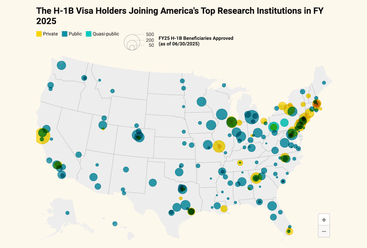
Immigrants and foreign nationals have been a major force behind U.S. innovation, and many research universities rely on them through the H-1B visa program. Recent policy moves have raised questions about how these institutions can continue to attract and retain skilled workers.
The Xylom used U.S. Customs and Immigration Services data to trace where more than 13,000 H-1B visa holders joined over 200 top research institutions in fiscal year 2025. A bubble map shows their nationwide distribution, with bubble size representing the number of approved beneficiaries and color indicating whether the institution is public, quasi-public, or private. A companion spike map depicts the potential financial burden from new visa fees, with spike height corresponding to the share of federal R&D funds required to sustain current hiring levels and colors again showing institution type. Both maps are interactive, with tooltips appearing on hover to display details for each institution.
Check out the project on The Xylom by Alex Ip.
USAID Medical Supply Disruptions
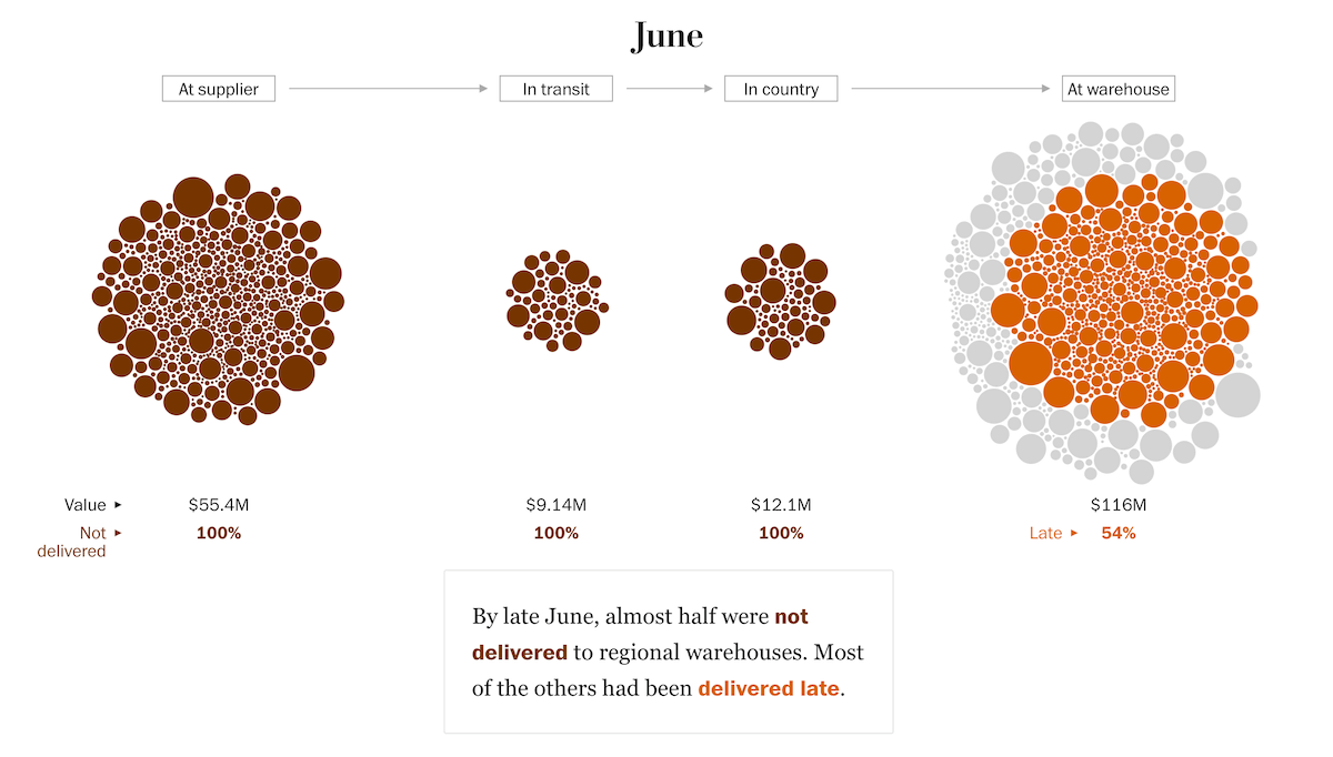
A pause in U.S. foreign aid upended health supply chains, delaying deliveries of antimalarial and HIV medications to dozens of countries. Clinics and warehouses received shipments late or not at all, with local care interrupted while goods sat at various points in the pipeline.
The Washington Post represents this disruption with a bubble-based scrollytelling visual that tracks more than 1,600 planned orders scheduled for delivery by the end of June. Each circle represents a shipment, with size reflecting its cost and color indicating whether it was delivered late or not delivered at all. As the reader scrolls, the circles move to positions showing where supplies were located at different points in time — at the supplier, in transit, in country, or already at the warehouse.
Explore the article on The Washington Post by Meg Kelly, Joyce Sohyun Lee, Rael Ombuor, Sarah Blaskey, Andrew Ba Tran, Artur Galocha, Eric Lau, and Katharine Houreld.
Daytime Air Alerts in Kyiv
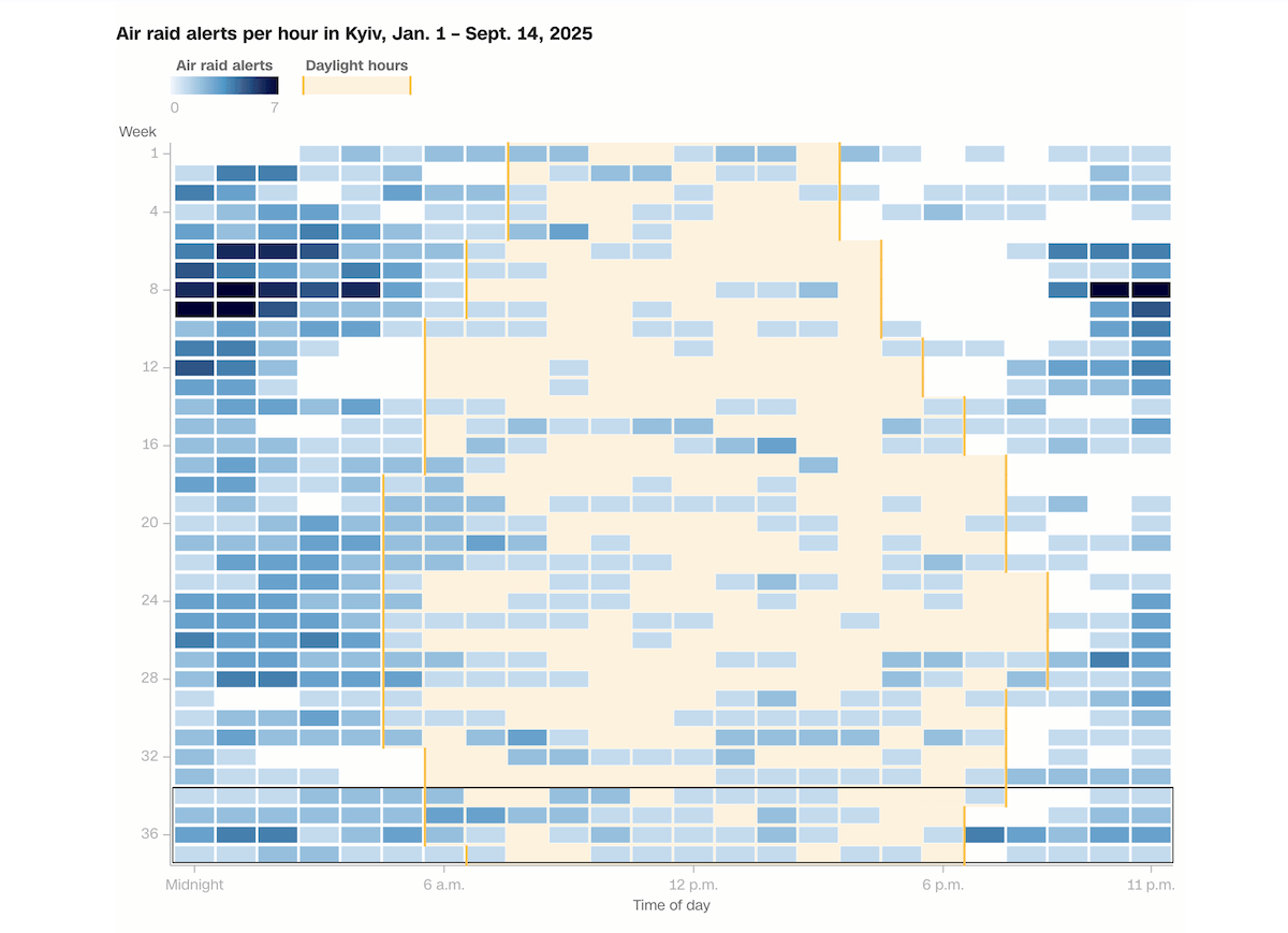
Air raid alarms have become part of daily life in Ukraine since 2022. While many of the strikes once came at night, recent months have brought more daytime attacks, repeatedly interrupting schools, workplaces, and public spaces in cities like Kyiv.
CNN reports on how the pace of alerts has shifted. At the center is a chart showing the weekly distribution of air raid alarms in Kyiv from January to mid-September 2025, broken down by time of day, highlighting the latest four weeks that averaged about nineteen hours under alerts. Another graphic illustrates Russia’s escalating use of drones this year, with columns indicating daily launches.
Take a look at the piece on CNN by Daria Tarasova-Markina and Ivana Kottasová.
Wrapping Up
Thanks for reading this edition of Data Visualization Weekly. We hope these projects gave you something interesting to look at and think about. Come back soon for more examples of how data can be brought to life through visualization.
- Categories: Data Visualization Weekly
- No Comments »