 Visual graphics often play a crucial role in revealing the stories hidden in data. They help untangle complex realities while highlighting insights that might otherwise be hard to grasp. This edition of DataViz Weekly showcases recent articles where robust visualization of data drives effective storytelling:
- Donor age in U.S. political fundraising — On Data and Democracy
- Migration across the Mediterranean — Reuters
- Wildfires in Spain — Colpisa
- Japan Airlines Flight 123 crash, 40 years ago — Nikkei
Data Visualization Weekly: August 15–22, 2025
Donor Age in U.S. Political Fundraising
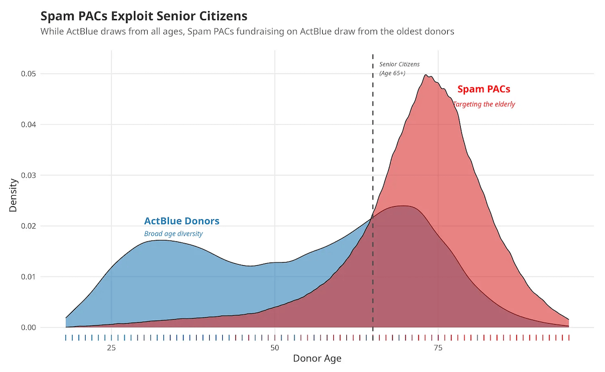
Some political action committees in the United States use manipulative fundraising messages that mimic common scam tactics, from fake deadlines to exaggerated emotional appeals. Donor data shows how strongly these efforts rely on older Americans, raising concerns about financial exploitation in politics.
Adam Bonica presents his findings on his blog On Data and Democracy, with charts that make the patterns immediately visible. An area chart contrasts the broad age range of ActBlue contributors with the sharp skew toward seniors among spam PAC donors. Columns further provide a detailed look at donor age distributions for specific candidates and movements.
Check out the post on On Data and Democracy.
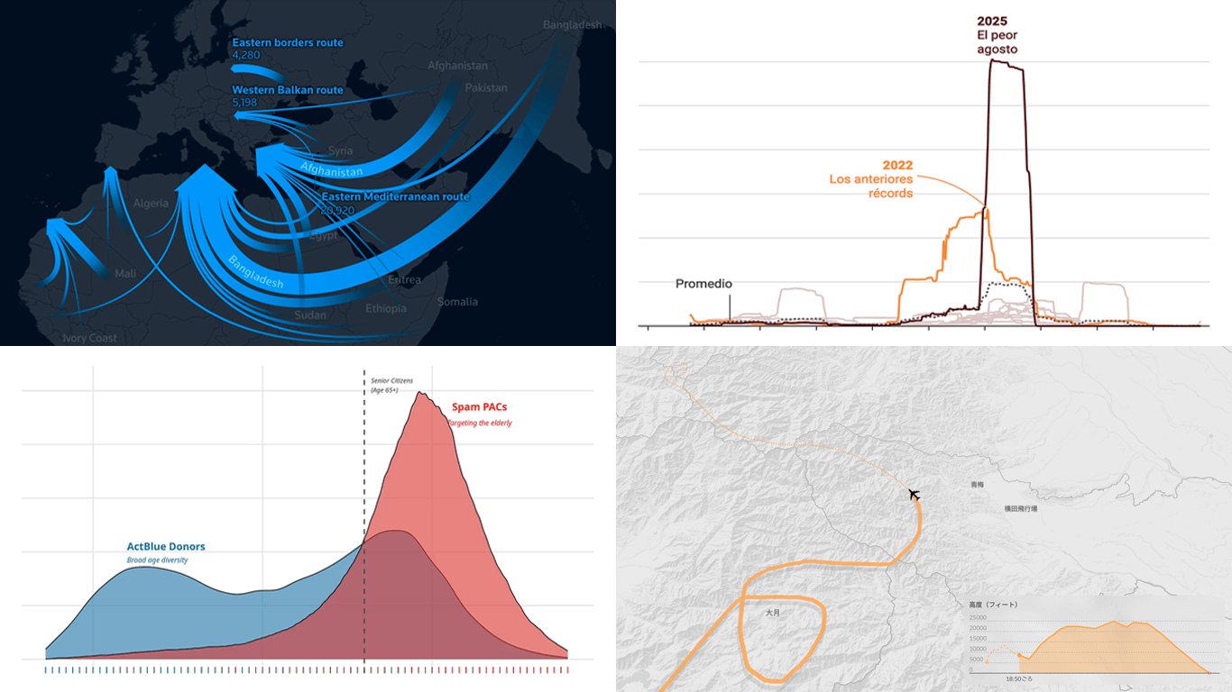
Migration Across Mediterranean
The Central Mediterranean remains one of the world’s deadliest migration routes, with thousands still attempting the crossing to the European Union each year. Official figures show fewer arrivals, but rescue groups warn that deterrence policies leave migrants at greater risk at sea.
Reuters reconstructs the journey of a dinghy from Libya that ran out of fuel before being rescued last year, using various visual techniques to trace the departure, distress calls, and rescue. Flow maps, dot maps, and line charts set the case within the broader context of Mediterranean migration, highlighting shifting routes, declining arrivals, and persistently high numbers of deaths and disappearances.
Explore the story on Reuters by Joan Faus, Mariano Zafra, and Sudev Kiyada.
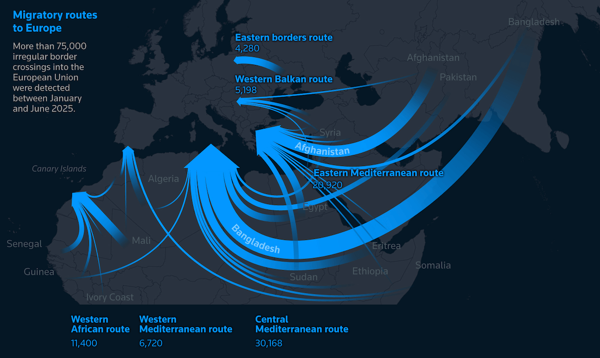
Wildfires in Spain
Between August 8 and 19, Spain experienced one of its worst wildfire periods in recent decades. More than 330,000 hectares burned in 35 large fires, with Ourense, Zamora, León, and Cáceres among the hardest-hit provinces.
Colpisa illustrates the scale with data visuals tracing day-by-day fire spread and total area burned. The line chart above, showing the 30-day moving average of hectares burned over the past ten years, highlights how exceptional this period has been. Bubble diagrams and a bubble map provide further context on locations and relative impact.
See the article from Colpisa, for example on Diario SUR, by Guillermo Villar and Álex Sánchez.
Japan Airlines Flight 123 Crash, 40 Years Ago
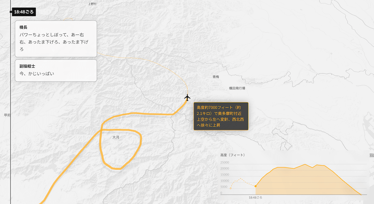
On August 12, 1985, Japan Airlines Flight 123 went down in Gunma Prefecture, killing 520 people in the deadliest accident involving a single aircraft. The Boeing 747 lost control minutes after departing Tokyo’s Haneda Airport and went down about half an hour later.
Nikkei revisits the disaster with a scrolling timeline with a route map and altitude-showing area chart, showing how the aircraft’s condition and crew communications evolved throughout the flight. Additional graphs place the tragedy in a broader context, showing worldwide trends in fatal aviation accidents and deaths over time.
Look at the piece on Nikkei, produced by 藤田翔 (Sho Fujita), 前田健輔 (Kensuke Maeda), 丹藤優菜 (Yuna Tando), 山田達 (Tatsuya Yamada), 浅井雄斗 (Yuto Asai), 宮下啓之 (Hiroyuki Miyashita), 榎本行浩 (Yukihiro Enomoto), 綱島雄太 (Yuta Tsunashima).
Wrapping Up
Good data visualization does more than simplify information. It adds a storytelling layer that makes patterns, context, and meaning stand out. Each edition of Data Visualization Weekly showcases how recent projects make data speak. Share your own visual work to be part of the ongoing conversation.
- Categories: Data Visualization Weekly
- No Comments »