 The web keeps producing data visualization work across all kinds of subjects and formats. We keep tracking it, and DataViz Weekly is where the most interesting projects we come across get their spotlight. See our latest picks:
- Iran crisis and its impact — Reuters
- Pokémon taxonomy tree — The Straits Times
- 250 years of U.S. immigration — The Economist
- Terrain of human happiness — The Pudding

Data Visualization Weekly: February 27 – March 6, 2026
Iran Crisis and Its Impact
Last weekend, the United States and Israel launched air strikes on Iran. The conflict sent immediate shockwaves across the region and beyond.
Reuters compiled its ongoing visual coverage of the Iran crisis into a single, continuously updated page. It currently opens with an animated map built on ship-tracking data showing a near-standstill in vessel movement across the Strait of Hormuz and surrounding waters, a chokepoint for roughly a fifth of the world’s oil and LNG supply. A locator inset orients viewers to the wider Gulf region.
Further sections include more maps, such as those providing an at-a-glance view of air traffic disruptions (see the animation above) and damage assessments of key Iranian government and military sites. There are also diagrams of Iran’s power structure annotated to show which senior figures have been killed, a chart tracking U.S. public opinion on the strikes, and more.
See the reporting on Reuters, by Sudev Kiyada, Clare Trainor Farley, Ally J. Levine, Travis Hartman, Adolfo Arranz, Han Huang, Mariano Zafra, and others.
Pokémon Taxonomy Tree
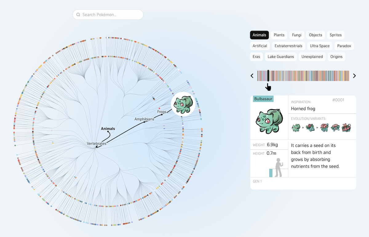
Pokémon has drawn on real-world biology, mythology, and science since its debut in the 1990s. This year marks three decades of the franchise, and the roster has grown to over 1,300 characters spanning animals, plants, ancient creatures, and beings from other dimensions.
The Straits Times built a radial tree diagram placing all Pokémon released through 2025 within a custom taxonomy modeled on biological classification. Arceus sits at the center as the in-universe creator, with branches extending outward through up to four nested tiers. Those are groupings like Animals, Vertebrates, Amphibians, and Frogs. Each Pokémon appears as a colored dot at the outermost ring. A horizontal strip above the sidebar acts as a scrollable index, letting you step through every entry in sequence.
Clicking a dot or using the search bar opens a detail panel on the right. The panel shows the Pokémon’s real-world inspiration, its evolution chain, weight, height relative to a human figure, and a short description. Category filters, including Animals, Plants, Fungi, Objects, Sprites, Artificial, Extraterrestrials, and more, let you focus on specific branches of the tree.
Explore the interactive on The Straits Times, by Ang Qing, Billy Ker, Ng Weng Chi, Lee Yu Hui, Shannon Teoh, and Youjin Shin.
250 Years of U.S. Immigration
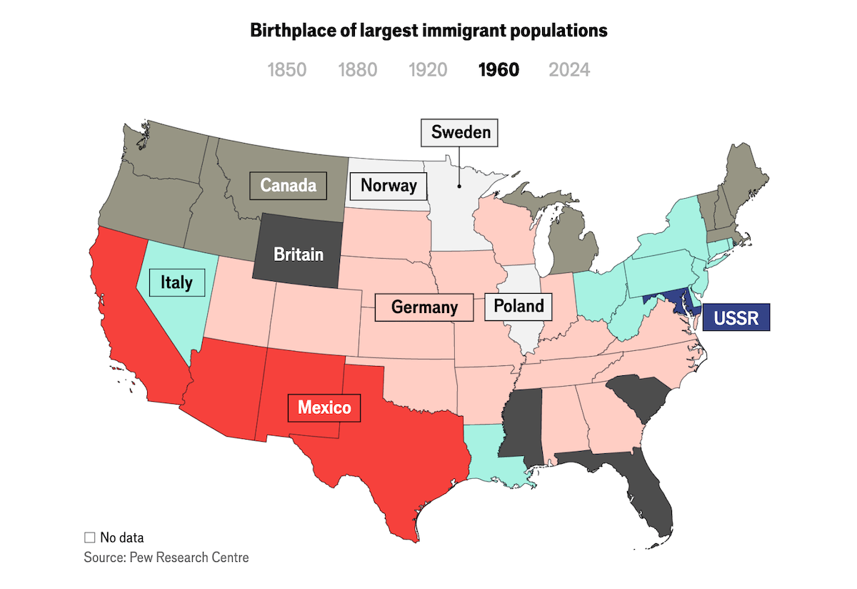
Immigration has defined American society since the country’s founding. Periods of openness have repeatedly given way to restriction, and the origins of newcomers have changed dramatically with each wave.
The Economist traces this history across several data visuals. An interactive choropleth map shows the birthplace of the largest immigrant population in each state, with five snapshots from 1850 to 2024 showing how the dominant origins shifted over time. An area chart covers the foreign-born share of the U.S. population since 1850. Two spline charts, with individual survey readings shown as dots behind the trend lines, track public opinion on immigration levels since 1965 and attitudes by party affiliation since 2001.
Check out the article on The Economist.
Terrain of Human Happiness
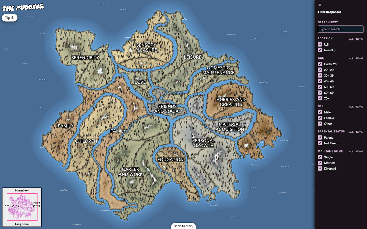
What makes people happy varies widely by life stage, personality, circumstance, and how much control a person has over the moment. Researchers have long tried to categorize that terrain, but happiness resists tidy classification.
Alvin Chang mapped over 100,000 crowdsourced happy moments onto a navigable fantasy-style landscape. Immediate pleasures sit in the north, long-term ones in the south, self-directed ones to the east, and passive moments to the west. The landmass is divided into labeled continents: Family, Children, Love, Friends and Social, Career and Work, Leisure, Hobbies and Creation, and more. Countries and sub-regions are nested inside.
Each moment is represented by a drawn person icon. Clicking one opens a card with the contributor’s age, gender, country, marital status, and their happy moment in their own words. A minimap in the corner, laid out as a quadrant chart, keeps the two axes visible as the map is zoomed and panned.
At the end of the guided narrative, a filter panel opens up the full dataset for free exploration by location, age, sex, parental and marital status, and keyword search.
Look at the project on The Pudding, by Alvin Chang.
Wrapping Up
Iran crisis, Pokémon taxonomy, two and a half centuries of U.S. immigration, and a landscape of happy moments — this week’s selections show just how many directions data visualization can take. See you next Friday with more in DataViz Weekly.
- Categories: Data Visualization Weekly
- No Comments »