 Curious how data visualization plays out in practice? Welcome to DataViz Weekly, our regular roundup of striking real-world examples. Here is what we are pleased to present in this edition:
- Gambling dominance in the Premier League shirt sponsors — Bloomberg
- Global groundwater loss and mega drying regions — ProPublica
- Finding the most consistent way to dice an onion — The Pudding
- Heatwave mortality risk across Europe — The Economist
Gambling Dominance in Premier League Shirt Sponsors
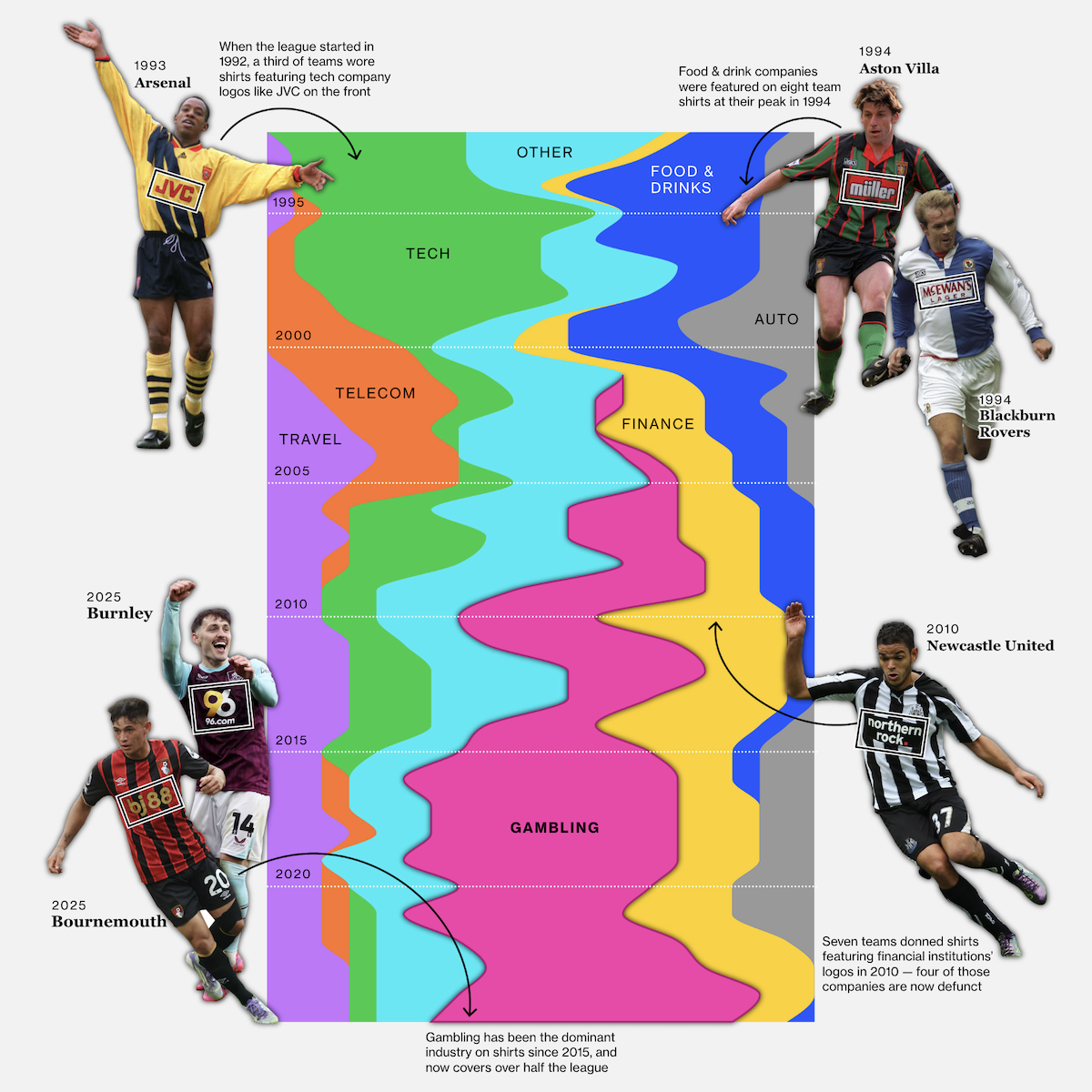
More than half of Premier League clubs will begin the new season with gambling company logos on their jerseys, marking the second consecutive year this has been the case. No other industry has matched this level of dominance in the league’s shirt sponsorship history, which dates back to 1992.
Bloomberg visualizes how sponsorship trends have shifted over the decades with a streamgraph showing the share of kits sponsored by different industries each season. The graphic traces tech’s early prominence, peaks for food and drink brands in the mid-1990s, a surge in financial institution logos around 2010, and gambling’s rise to majority status since 2015. The story also addresses the league’s decision to phase out front-of-shirt gambling sponsors starting next year while noting that such advertising will persist in other matchday spaces.
See the piece on Bloomberg by Aaron Gordon and Elena Mejía.
Global Groundwater Loss and Mega Drying Regions
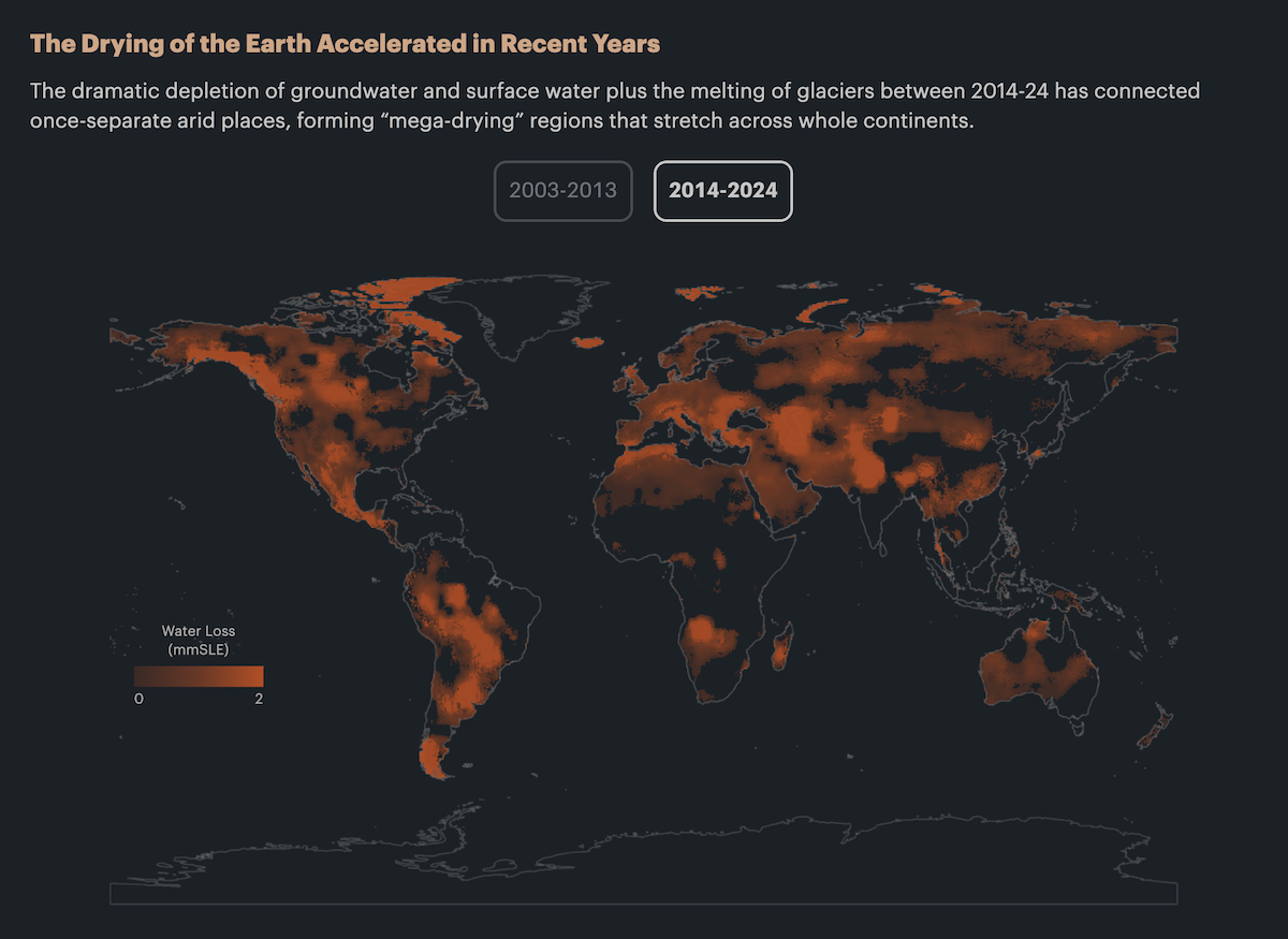
The world’s freshwater reserves are shrinking, with groundwater overuse now a major contributor to both large-scale drying and rising sea levels. Across much of the populated world, aquifers are being depleted faster than they can naturally recharge, putting food production, geopolitical stability, and long-term habitability at risk.
ProPublica represents the spread of what scientists refer to as “mega-drying” regions in a global heat map comparing conditions from 2003–2013 to 2014–2024. Based on two decades of NASA GRACE satellite data, the visual shows how groundwater loss and surface water depletion are connecting once-isolated dry zones into vast, connected belts across continents. The accompanying story explains how these trends now contribute more to sea level rise than melting glaciers and examines both visible consequences, like land subsidence, and less apparent risks, including food insecurity and geopolitical tension.
Check out the story on ProPublica by Abrahm Lustgarten, with graphics by Lucas Waldron.
Finding Most Consistent Way to Dice Onions
Ever cry while cutting an onion? Well, now you don’t have to! Building off of chef J. Kenji López-Alt, we found the mathematically optimal way to dice an onion. *Cutting uniform pieces has not been proven to reduce crying, but you do get bragging rights.https://t.co/bxNrO6M787 pic.twitter.com/LTXHIfy352
— The Pudding (@puddingviz) August 14, 2025
Uniform cuts help food cook evenly, taste better, and look good on the plate. Home cooks may not worry as much as professional chefs, but dicing an onion neatly remains a familiar challenge.
The Pudding slices into the question with mathematical modeling and a series of diagrams showing how different cutting strategies compare. From vertical and radial cuts to more complex approaches involving horizontal slices and variable depths, the visuals evaluate standard deviation in piece size across thousands of combinations. Turns out the most consistent results come from aiming radial cuts well below the center.
Explore the project on The Pudding by Andrew Aquino, with Russell Samora and Jan Diehm.
Heatwave Mortality Risk Across Europe
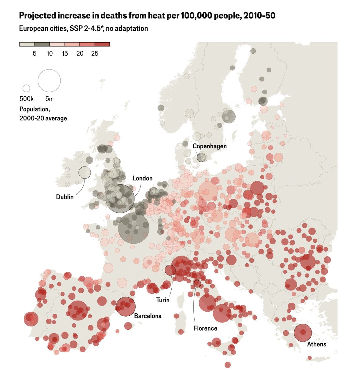
Extreme heat is one of the deadliest weather threats and can be no less lethal as floods or earthquakes. Europe is warming faster than much of the world, and last week a severe heatwave triggered red alerts across multiple countries.
The Economist examines how vulnerable European cities are with a set of charts and maps based on recent studies — showing past spikes in mortality on the hottest days, long-term warming trends, and projected future death rates. The bubble map above, for example, shows the expected increase in heat-related deaths per 100,000 people across European cities if no further adaptation measures are taken.
Take a look at the article on The Economist.
Wrapping Up
These real-life examples show how data can be transformed into meaningful visualizations that inform, reveal, or provoke thought. Stay tuned for more on Data Visualization Weekly — and feel free to share your favorite recent charts, maps, infographics, visual stories, or other notable data-driven works with us.
- Categories: Data Visualization Weekly
- No Comments »