 The human brain processes visual information more readily than raw numbers. That makes data visualization a particularly effective way to uncover insights. DataViz Weekly presents some of the best recent examples we have come across:
- Public lands for sale in the United States — The Wilderness Society
- Future flight turbulence under warming — The Washington Post
- U.S. federal finances — Reuters
- Winners of the Information is Beautiful Awards — Data Visualization Society
Data Visualization Weekly: June 13–20, 2025
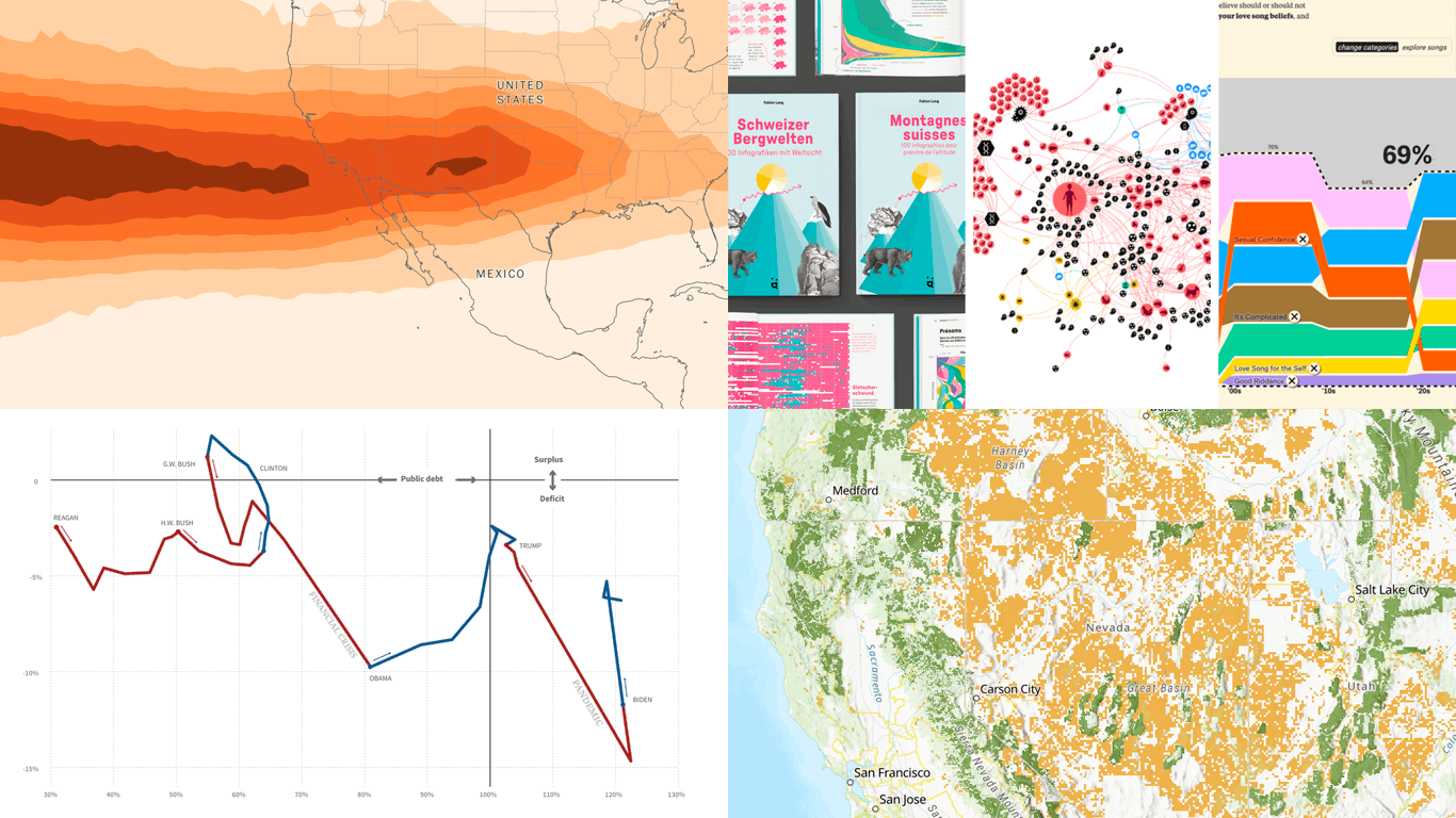
Public Lands for Sale in U.S.
A sweeping budget reconciliation bill introduced by the U.S. Senate Energy & Natural Resources Committee could lead to the sale of over 250 million acres of public lands across the West. These areas include critical wildlife habitats, roadless wilderness, and local recreation zones — now potentially up for grabs under provisions that would fast-track privatization.
To illustrate the scope, The Wilderness Society published an interactive map highlighting Forest Service and BLM lands made eligible for disposal under the proposed legislation. Color-coded by agency, the map lets you explore which lands are at stake and where, emphasizing the scale of the potential sell-off.
Learn more and see the map on The Wilderness Society’s website.
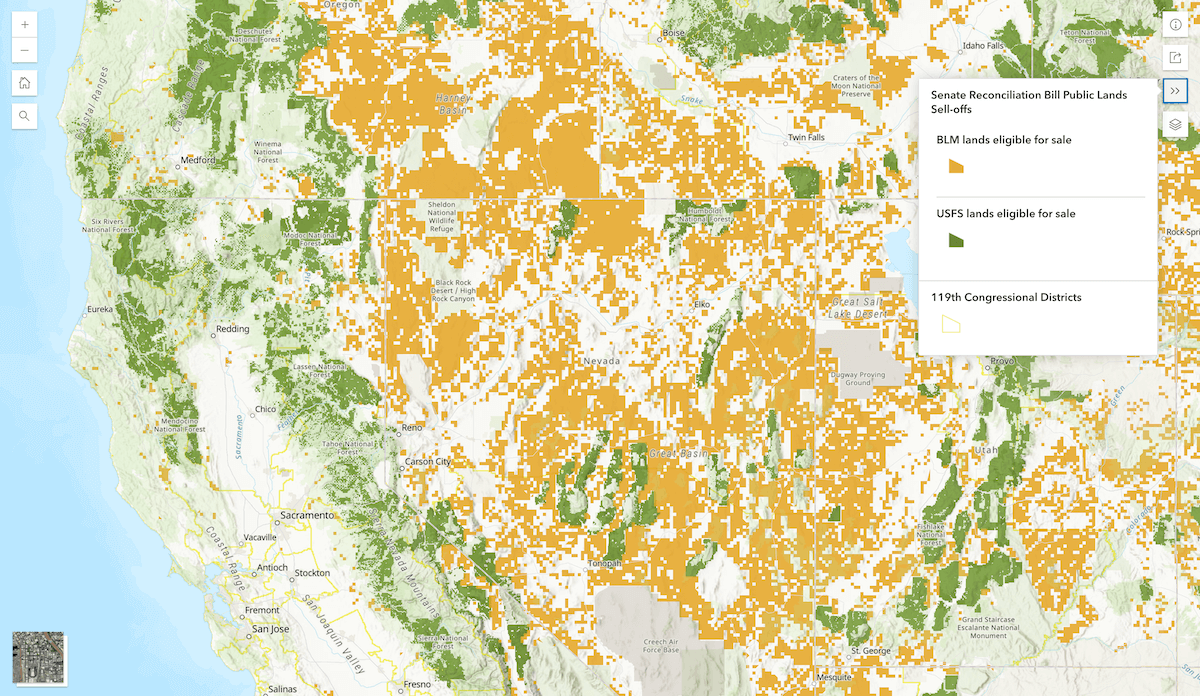
Future Flight Turbulence Under Warming
Clear-air turbulence, once rare and unpredictable, is becoming more frequent and dangerous as the atmosphere warms. Climate research shows that popular flight corridors — particularly across the U.S. Southwest and North Atlantic — may face increasingly bumpy skies in the coming decades.
The Washington Post built an interactive map using recent modeling data to show how severe turbulence is projected to increase along global flight routes at 2°C of warming. You can input any pair of airports to view future turbulence patterns on that path, color-coded by risk. Complementary diagrams explain the science behind the trend, highlighting how shifting jet streams and intensified vertical wind shear are already reshaping the flight experience.
Check out the interactive on The Washington Post, by Daniel Wolfe.
U.S. Federal Finances
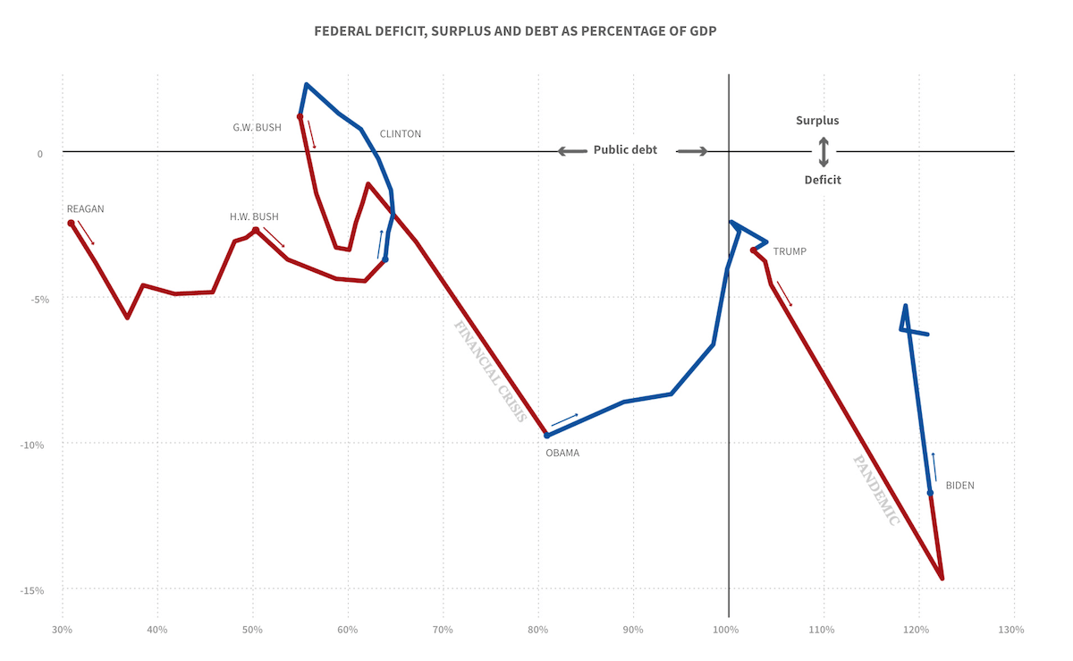
The role and size of the federal government in the United States have been debated since the nation’s founding. Over the years, government spending has expanded and contracted in response to wars, economic downturns, periods of growth, and shifting political agendas — and that dynamic is once again in the spotlight amid new efforts to reshape federal priorities.
Reuters created a detailed visual explainer of how federal finances work, illustrating the sources of government revenue, the breakdown of mandatory and discretionary spending, and long-term trends in deficits and public debt. The graphics also explore changes in income distribution, tax brackets, and the projected fiscal effects of proposed tax legislation.
Look at the project on Reuters, by Sarah Slobin and Howard Schneider.
Winners of Information is Beautiful Awards
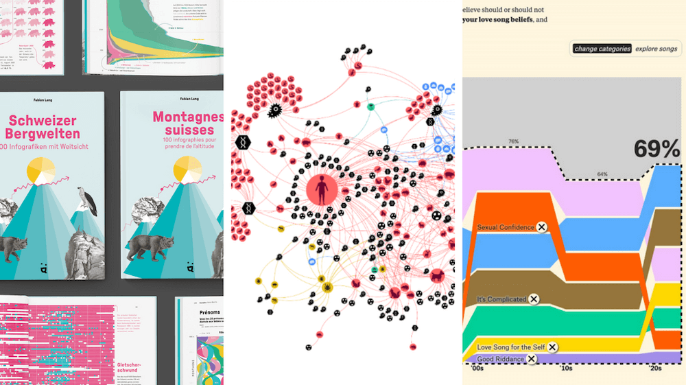
Instead of spotlighting a single project, we are taking a different approach for the final entry in this edition of DataViz Weekly. This time, we are celebrating a whole collection of outstanding work that showcases the diversity and creativity of today’s data visualization field.
The Data Visualization Society announced the winners of the 2024 Information is Beautiful Awards. Recognized as one of the most prestigious honors in the field of data visualization, the awards highlight exceptional projects across a variety of categories:
1. Arts, Entertainment, and Culture:
- Gold: Is the Love Song Dying? — David Mora and Michelle Jia
- Silver: Databeads — Eszter Katona and Mihály Minkó
- Bronze: Beyond the Score. Wynton Marsalis’ Musical Legacy Visualized — Emanuele Pizzuti, Martina Dossi
2. Business Analytics:
- Gold: Office Vacancies Data Story — Moody’s Corporation
- Silver: What’s Driving Up Burger Prices? — ABC News
- Bronze: 10 Major Risks Shaping Insurance Today Data Story — Moody’s Corporation
3. Current Affairs and Politics:
- Gold: The Birdsong of Sorrow Above Ukraine — Anastasia Balagurova
- Silver: How the 2024 U.S. Election Was Decided, Vote by Vote — The Washington Post
- Bronze: A Torrent of Trash — Sudev Kiyada, Han Huang, Adolfo Arranz, Simon Scarr
4. Humanitarian:
- Gold: The World’s Hunger Watchdog Warned of Catastrophe in Sudan. Famine Struck Anyway — Reuters
- Silver: Pathways to Prosperity for Adolescent Girls in Africa — OneTandem
- Bronze: Lives in Limbo: Struggles of Asylum Seekers in Hong Kong — South China Morning Post
5. Leisure, Games, and Sports:
- Gold: Swiss Mountains · Schweizer Bergwelten · Montagnes Suisses — Fabian Lang
- Silver: Vertical Momentum: High Jump & Pole Vault — Krisztina Szucs
- Bronze: Games of Two Eras — South China Morning Post
6. People, Language, & Identity:
- Gold: This Is a Teenager — Alvin Chang
- Silver: The Roots of Racism — Jack Beckwith
- Bronze: Gaza Lives: Resisting Cultural Genocide — The Kontinentalist
7. Places, Spaces, & Environment:
- Gold: I Want a Better Catastrophe — Andrew Boyd, Jona Pomerance, Marlan Dörk
- Silver: Seeking Shadow. A Cool Fix for Hot Cities — Urbi Atlas
- Bronze: Buildings Wrapped in Solid Gasoline — Mariano Zafra and Sudev Kiyada
8. Science, Technology, & Health:
- Gold: Zoonotic Web — Liuhuaying Yang
- Silver: Navigate the Obstacles to Transportation Electrification — Radio-Canada
- Bronze: Beyond Crisis: Lives Saved — Jessica Russo
9. Unusual:
- Gold: World in Tangible Fragments — Nadezda Andrianova
- Silver: Material Interactions: Data-Driven Community Quilting — Syracuse University School of Information Studies
- Bronze: Hello From The Data Vandals — The Data Vandals
Special awards were also presented across several additional categories:
10. Impressive Individual:
- Gold: Liuhuaying Yang
- Silver: Diana Estefania Rubio
- Bronze: Kenneth Field
11. Outstanding Studio:
- Gold: The Pudding
- Silver: Revisual Labs
- Bronze: The Kontinentalist
12. Rising Star:
- Mandy Spaltman
13. Test of Time:
- RAWGraphs (formerly RAW) — DensityDesign, Calibro, Inmagik
14. Most Impactful Community Leader:
- Lisa Charlotte Muth
15. Community Vote:
- Aguayos: Exploring the Beauty of Migratory Flows within Latin America and the Caribbean — Mariana Villamizar
16. Most Beautiful:
- Is the Love Song Dying? — David Mora and Michelle Jia
Check out the official announcement page for the full list with snapshots and links. Prepare to be inspired.
Wrapping Up
That is all for this edition of Data Visualization Weekly! If you appreciate how visualizations can bring clarity to complexity — and chances are you do if you are reading this — stay tuned. More great work is coming your way soon.
- Categories: Data Visualization Weekly
- No Comments »