 The pie chart, a widely used chart type yet also a topic of debate here and there, has cemented its place in the realm of data visualization. When used appropriately, it provides an intuitive insight into the composition of data, with each slice of the pie representing a distinct component. In this tutorial, I’ll guide you through a straightforward path of creating interactive pie charts using JavaScript.
Every chart begins with data. To demonstrate the concepts in this tutorial, I decided to visualize the composition of the Indian Premier League (IPL) winnership over its 16-season history.
Whether you’re a novice or an experienced coder, get ready to immediately acquire the valuable skills of crafting visually appealing JS-based pie charts from scratch.
Steps to Create a JS Pie Chart
The toss is done, and it’s time to step onto the field. Come along as I guide you through crafting a functional, interactive pie chart with JavaScript in just four straightforward steps.
1. Setting the stage
Before we dive into code, let’s prepare our canvas. Every chart needs a container, so we’ll start by creating a simple HTML page. Within it, we’ll define a container element with a unique ID to host our pie chart. If you want the chart to fill the entire page, set the container’s width and height parameters in CSS to 100%.
<html>
  <head>
    <title>Pie Chart in JS</title>
    <style type="text/css">
      html, body, #container {
        width: 100%; height: 100%; margin: 0; padding: 0;
        }
    </style>
  </head>
  <body>
    <div id="container"></div>
  </body>
</html>
2. Gathering tools
Building a JavaScript pie graph from scratch can be a daunting task, but we’re in luck! There are plenty of JS charting libraries that provide pre-built functions and features, making data visualization development seamless. For this tutorial, I’ve chosen the AnyChart JS library, suitable for beginners and experts alike, but feel free to use your favorite one as the logic of the process will be the same.
We’ll connect the necessary library files from a content delivery network (CDN). These scripts will reside in the <head> section of our HTML page, setting the stage for our pie chart. The JavaScript code itself will be placed between the <script> and </script> tags, which can be added to either the <head> or the <body> sections.
<html>
  <head>
    <title>Pie Chart in JS</title>
    <script src="https://cdn.anychart.com/releases/8.11.1/js/anychart-core.min.js"></script>
    <script src="https://cdn.anychart.com/releases/8.11.1/js/anychart-pie.min.js"></script>
    <style type="text/css">
      html, body, #container {
        width: 100%; height: 100%; margin: 0; padding: 0;
      }
    </style>
  </head>
  <body>
    <div id="container"></div>
    <script>
      // All the code for the JS Pie Chart will come here
    </script>
  </body>
</html>
3. Adding data
Charts rely on data, and we’ve got options for how to incorporate it. In this tutorial, we’ll manually input the data directly into our JavaScript charting code. However, keep in mind that you can, of course, also fetch data from databases or files.
let data = anychart.data.set([
  ["Chennai Super Kings", 5],
  ["Mumbai Indians", 5],
  ["Kolkatta Knight Riders", 2],
  ["Deccan Chargers", 1],
  ["Gujarat Titans", 1],
  ["Rajasthan Royal", 1],
  ["Sunrisers Hyderabad", 1],
]);
4. Writing a JavaScript charting code
Now, let’s transition from scoring singles to hitting those thrilling fours and sixes. You’ll see how just a few lines of code can create an interactive JS pie chart in no time.
Firstly, to ensure everything runs smoothly, we enclose all our code within a function. This guarantees that our chart-building process only begins after the page has fully loaded. The data goes directly there as the first ball.
anychart.onDocumentReady(function () {
  // add the data
  let data = anychart.data.set([
    ["Chennai Super Kings", 5],
    ["Mumbai Indians", 5],
    ["Kolkatta Knight Riders", 2],
    ["Deccan Chargers", 1],
    ["Gujarat Titans", 1],
    ["Rajasthan Royal", 1],
    ["Sunrisers Hyderabad", 1]
  ]);
  // The upcoming JS code goes here...
});
Now, for the game-changing moment — we create a pie chart instance with a single line of code.
let chart = anychart.pie(data);To provide context to our pie graphic and help viewers understand its purpose, let’s add a descriptive title.
chart.title("IPL Winnership Over 16 Seasons");Lastly, we refer to the HTML element designated earlier as the chart container and, with a simple command, draw the resulting pie chart.
chart.container("container");
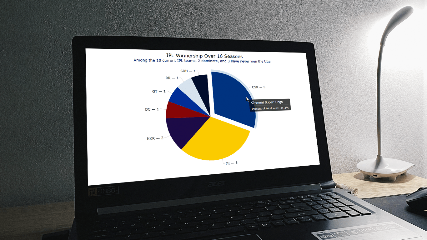
chart.draw();And there you have it! A nice chart that vividly visualizes the composition of the IPL winnership over the entire span of 16 seasons. You’ll notice that the top two teams dominate, accounting for almost two-thirds of all IPL titles during this period. Feel free to explore the initial version here with the code; the complete HTML/CSS/JS code is also below.
<html>
  <head>
    <title>Pie Chart in JS</title>
    <script src="https://cdn.anychart.com/releases/8.11.1/js/anychart-core.min.js"></script>
    <script src="https://cdn.anychart.com/releases/8.11.1/js/anychart-pie.min.js"></script>
    <style type="text/css">
      html, body, #container {
        width: 100%; height: 100%; margin: 0; padding: 0;
      }
    </style>
  </head>
  <body>
    <div id="container"></div>
    <script>
      anychart.onDocumentReady(function () {
        // add the data
        let data = anychart.data.set([
          ["Chennai Super Kings", 5],
          ["Mumbai Indians", 5],
          ["Kolkatta Knight Riders", 2],
          ["Deccan Chargers", 1],
          ["Gujarat Titans", 1],
          ["Rajasthan Royal", 1],
          ["Sunrisers Hyderabad", 1],
        ]);
        // create a pie chart with the data
        let chart = anychart.pie(data);
        // set the chart title
        chart.title("IPL Winnership Over 16 Seasons");
        // set container id for the chart
        chart.container("container");
        // initiate chart drawing
        chart.draw();
      });
    </script>
  </body>
</html>
Some Options to Customize a Pie Chart
Now that we’ve created a basic JS pie chart, let’s delve into possible ways of customizing it to elevate its visual appeal.
1. Modify the color palette
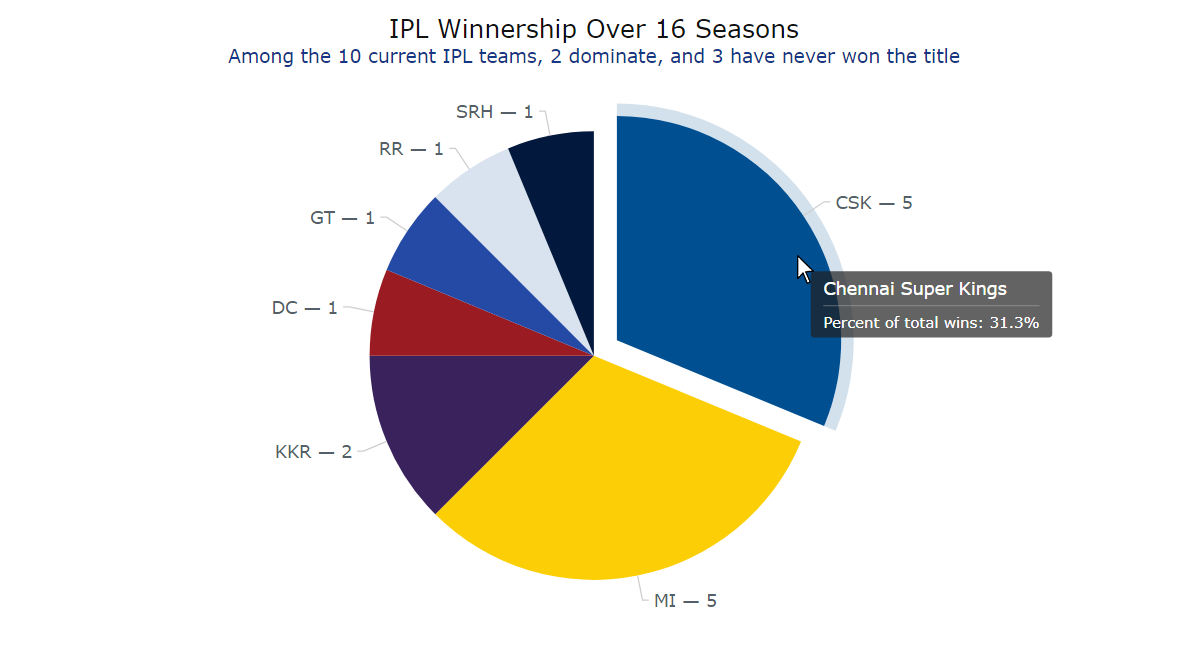
A smart way to enhance a chart is by using colors that are relevant to the data it represents. In our case, since we’re plotting IPL teams, why not incorporate the primary colors from each team’s logo?
To achieve this, we’ll create a customized color palette and apply it to the initial pie chart.
// create a custom palette
let palette = anychart.palettes.distinctColors();
// set the colors according to the team brands
palette.items([
  {color: "#004f91"},
  {color: "#fcce06"},
  {color: "#3a225d"},
  {color: "#9a1c22"},
  {color: "#254aa5"},
  {color: "#D9E3EF"},
  {color: "#02183c"}
]);
// set the palette to the chart
chart.palette(palette);
2. Format the labels and disable the legend
Let’s enhance the readability of the pie chart by improving the labels on the slices. We can display information about both the team and the number of titles won in an explicit manner.
Using abbreviations instead of full team names can be a wise choice to maintain chart conciseness and visual appeal. So, first, we’ll incorporate the abbreviations into the data.
// add the data
let data = anychart.data.set([
  ["Chennai Super Kings", 5, "CSK"],
  ["Mumbai Indians", 5, "MI"],
  ["Kolkatta Knight Riders", 2, "KKR"],
  ["Deccan Chargers", 1, "DC"],
  ["Gujarat Titans", 1, "GT"],
  ["Rajasthan Royal", 1, "RR"],
  ["Sunrisers Hyderabad", 1, "SRH"]
]);
// create a pie chart with the data, naming the values in the dataset
let chart = anychart.pie(data.mapAs({name: 0, value: 1, abbr: 2}));
Next, we’ll proceed to configure the labels themselves. Our goal is to format them, displaying the team abbreviation alongside the number of titles won. Additionally, we’ll specify a font size larger than the default to ensure the labels have a more pronounced visual impact. To guarantee that all labels, including those exceeding the pie slice boundaries, remain easily visible, we’ll position them outside the chart; adjusting the label position to “outside” ensures each label is automatically linked to its corresponding slice with a connecting line.
chart
  .labels()
  .format("{%abbr} — {%value}")
  .fontSize(14)
  .position("outside");
Since all labels are now readily visible, let’s disable the legend to avoid redundancy.
chart.legend(false);
3. Improve the tooltip
Using a tooltip is an effective approach to providing additional information within a chart. While our pie visualization already presents the necessary information, we can further enhance it by modifying the tooltip using the format() function.
chart
  .tooltip()
  .format("Percent of total wins: {%PercentValue}{decimalsCount: 1}%");
4. Enhance the chart title
A title can be an important element that complements a data graphic. For example, let’s customize the pie chart’s one and include a subtitle to highlight the main takeaway.
chart
  .title()
  .enabled(true)
  .useHtml(true)
  .text(
    '<span style = "color: #111; font-size:20px; margin-bottom:10px; dy:20px">IPL Winnership Over 16 Seasons</span>' +
      '<br/><span style="color:#173685; font-size: 15px;">Among the 10 current IPL teams, 2 dominate, and 3 have never won the title</span>'
  );
Observe the sophisticated and refined appearance of the JavaScript pie chart now! You can access the interactive version along with the code for this tutorial’s final chart here; the complete HTML/CSS/JS code is also below.
<html>
  <head>
    <title>Pie Chart in JS</title>
    <script src="https://cdn.anychart.com/releases/8.11.1/js/anychart-core.min.js"></script>
    <script src="https://cdn.anychart.com/releases/8.11.1/js/anychart-pie.min.js"></script>
    <style type="text/css">
      html, body, #container {
        width: 100%; height: 100%; margin: 0; padding: 0;
      }
    </style>
  </head>
  <body>
    <div id="container"></div>
    <script>
      anychart.onDocumentReady(function () {
        // add the data
        let data = anychart.data.set([
          ["Chennai Super Kings", 5, "CSK"],
          ["Mumbai Indians", 5, "MI"],
          ["Kolkatta Knight Riders", 2, "KKR"],
          ["Deccan Chargers", 1, "DC"],
          ["Gujarat Titans", 1, "GT"],
          ["Rajasthan Royal", 1, "RR"],
          ["Sunrisers Hyderabad", 1, "SRH"]
        ]);
        // create a pie chart with the data, naming the values in the dataset
        let chart = anychart.pie(data.mapAs({name: 0, value: 1, abbr: 2}));
        // create a custom palette
        let palette = anychart.palettes.distinctColors();
        // set the colors according to the team brands
        palette.items([
          {color: "#004f91"},
          {color: "#fcce06"},
          {color: "#3a225d"},
          {color: "#9a1c22"},
          {color: "#254aa5"},
          {color: "#D9E3EF"},
          {color: "#02183c"}
        ]);
        // set the palette to the chart
        chart.palette(palette);
        // configure the labels
        chart
          .labels()
          .format("{%abbr} — {%value}")
          .fontSize(14)
          .position("outside");
        // disable the chart legend
        chart.legend(false);
        // format the tooltip
        chart
          .tooltip()
          .format("Percent of total wins: {%PercentValue}{decimalsCount: 1}%");
        // set chart title text settings
        chart
          .title()
          .enabled(true)
          .useHtml(true)
          .text(
            '<span style = "color: #111; font-size:20px; margin-bottom:10px; dy:20px">IPL Winnership Over 16 Seasons</span>' +
              '<br/><span style="color:#173685; font-size: 15px;">Among the 10 current IPL teams, 2 dominate, and 3 have never won the title</span>'
          );
        // set container id for the chart
        chart.container("container");
        // initiate chart drawing
        chart.draw();
      });
    </script>
  </body>
</html>
Conclusion
Wrapping up, I hope this JS pie charting tutorial will be helpful to you. Feel free to adapt what you’ve learned here to your projects and datasets. Should you have any questions or innovative ideas, don’t hesitate to get in touch.
Creating engaging charts can be as captivating as watching IPL matches. Start your visualization journey and tell compelling data stories.
Published with the permission of Shachee Swadia. Originally appeared on Codementor with the title “Creating a Pie Chart with JavaScript” on September 27, 2023.
You may also like to read the JavaScript Pie Chart Tutorial originally published on our blog earlier.
Check out more JavaScript charting tutorials and continue mastering interactive data visualization.
Got an idea for some nice guest post? Let us know.
- Categories: AnyChart Charting Component, HTML5, JavaScript, JavaScript Chart Tutorials, Tips and Tricks
- No Comments »