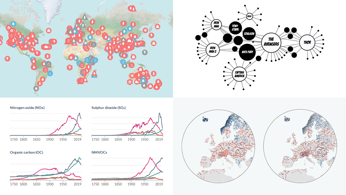
 Ready to see some wonderful data visualizations? DataViz Weekly is here as always on Friday! Check out these awesome new ones:
- Extreme weather attribution to human-caused climate change — Carbon Brief
- River discharge anomaly in Europe — Dominic Royé
- Air pollution emissions by country since 1750 — Our World in Data
- Connections in the Marvel Cinematic Universe — Tristan Guillevin
Data Visualization Weekly: August 19, 2022 — August 26, 2022
Extreme Weather Attribution to Human-Caused Climate Change
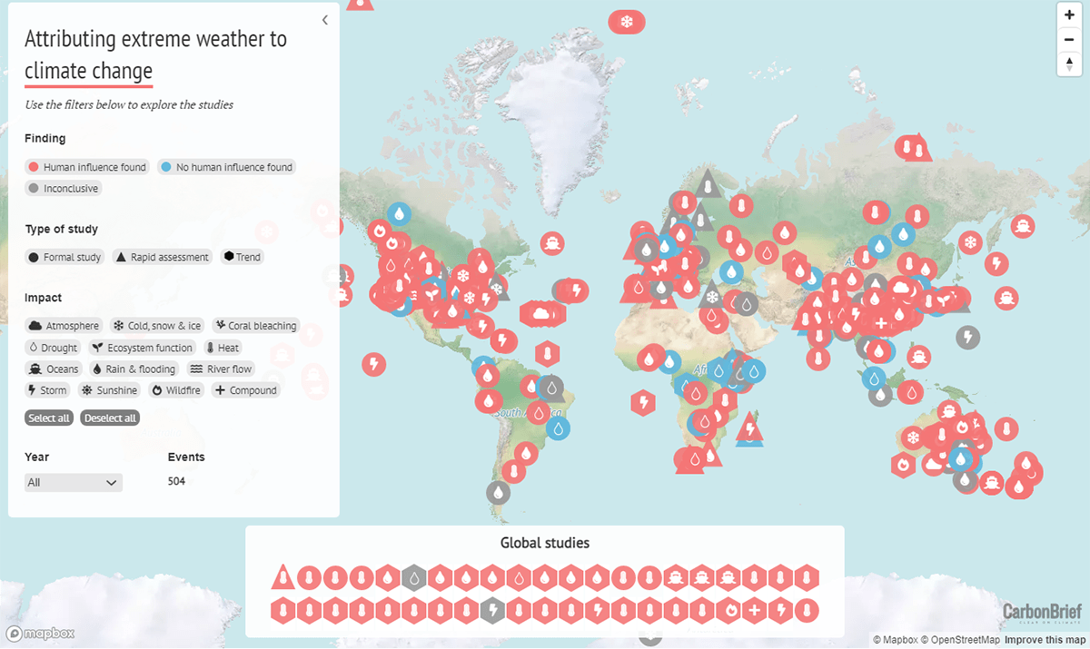
A lot of research has been done on extreme weather events around the world over the past couple of decades. The vast majority of all those studies link such events with human-caused climate change.
Carbon Brief mapped 504 studies in the field of extreme weather attribution across the globe, which is all the team knows about for the time being. The visualization shows the location of the wildfires, drought, flooding, and other events researched in these works. The markers’ color represents whether scientists found that climate change was a factor. The shape displays the type of study. The symbols indicate different types of events.
It is the fifth iteration of Carbon Brief’s attribution map. The previous ones were published in 2017, 2019, 2020, and 2021. See the map and read the accompanying article with all details on the website of Carbon Brief.
River Discharge Anomaly in Europe
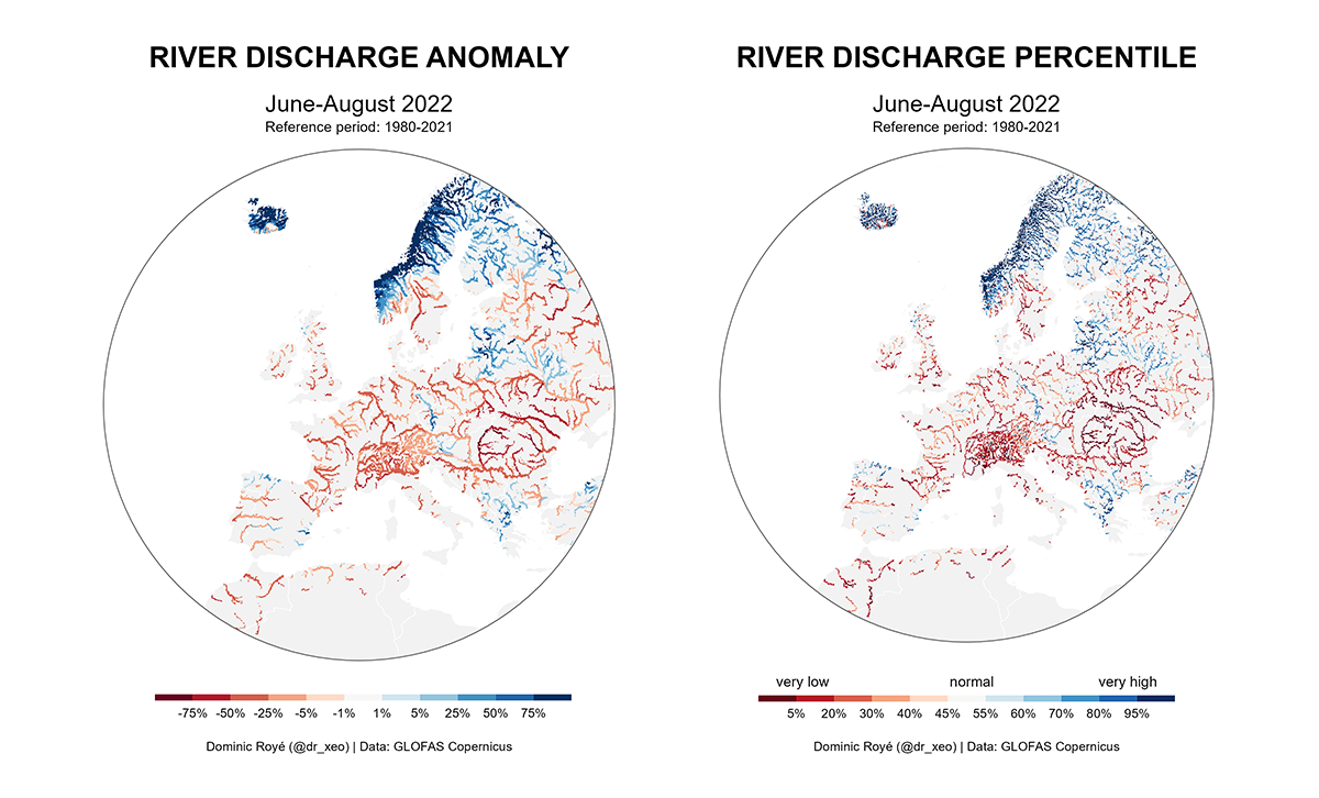
Here’s something else on climate change and extreme weather events.
Dr. Dominic Royé from the University of Santiago de Compostela (Spain) visualized the river discharge anomaly in Europe based on data from the Global Flood Awareness System (GloFAS), part of the Copernicus Emergency Management Service (CEMS). In this way, the severity of the drought in Europe, reported to be the worst in 500 years, is recognizable to the naked eye. To provide a better look at extremes, he also mapped the percentiles in a different visualization.
In addition, the scientist represented the European river discharge anomalies for the 45 years from 1980 to 2022 in small multiples, for at-a-glance comparisons.
Look at all these map visualizations on Twitter.
Air Pollution Emissions by Country Since 1750
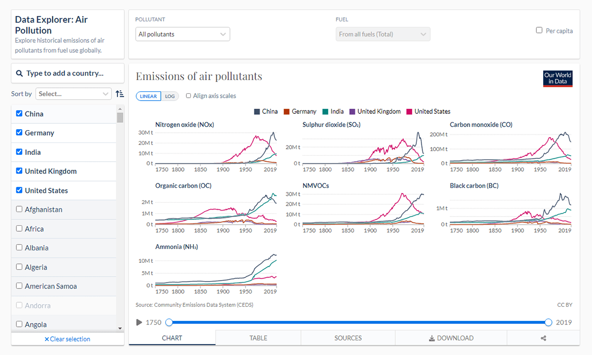
Air pollution is a huge problem attributed to millions of human deaths each year. And while some countries are making progress in reducing emissions, in others they continue to grow.
Our World in Data launched the Air Pollution Data Explorer which makes it easy to explore historical reconstructions of air pollution emissions going back to 1750, by country. The project represents long-term estimates sourced from the Community Emissions Data System (CEDS). Here, it is possible to explore a breakdown by fuel and switch to a per-capita view.
Check out the Air Pollution Data Explorer on the Our World in Data website.
Connections in Marvel Cinematic Universe
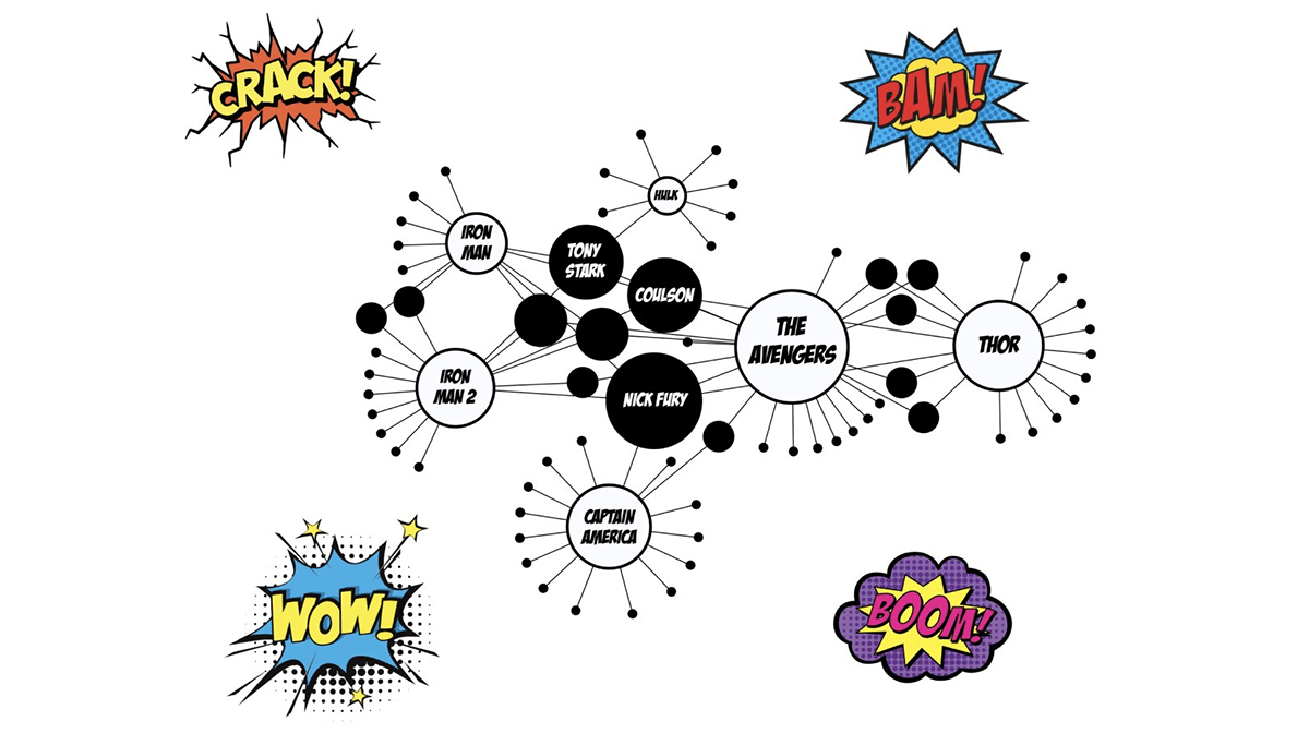
Last but not least, here’s a fun data visualization project that all fans of Marvel may well be excited to check out.
Tristan Guillevin visualized the Marvel Cinematic Universe in a network graph. He also made a cool scrollytelling piece that lets you dive into connections between characters, actors, and movies.
See the Marvel Cinematic Network at marvel.ladataviz.com.
***
Hope you like these! Want more? Stay tuned for Data Visualization Weekly!
- Categories: Data Visualization Weekly
- No Comments »