 Hardly a day goes by without some cool new charts and maps being built and published, helping to make sense of various data. Every Friday, we tell you about those that have gripped our attention the most during the past few days, within the framework of DataViz Weekly. Come see our new selection!
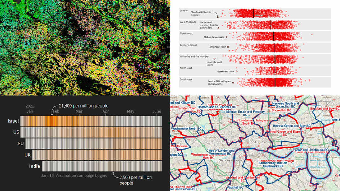
- Proposed new parliamentary constituency boundaries for England — BCE
- Reasons behind the delay of lockdown reopening in England — The Guardian
- COVID-19 vaccination campaign in India — Reuters
- Agricultural land use in Germany by crop type — Earth Observation Lab at HU Berlin, ThEO, and ZALF
Data Visualization Weekly: June 11, 2021 — June 18, 2021
Proposed New Parliamentary Constituency Boundaries for England
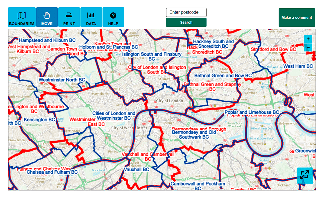
The Boundary Commission for England (BCE) is responsible for carrying out reviews of the English parliamentary constituency boundaries every five years. The 2023 review was launched early this year, to conclude with formal recommendations in June 2023. Last week, the BCE released its initial proposals and invited everyone to provide feedback within the framework of public consultation.
To facilitate the understanding of the suggested shifts, the Commission published an interactive map that makes it easy to explore the proposed new boundaries and compare them with the existing ones. Additional layers for wards, local authorities, and regions are available to be displayed.
If you are from England, see how constituencies in your area can change. You can also submit comments in response to these proposals using the same mapping tool.
Reasons Behind England Reopening Delay
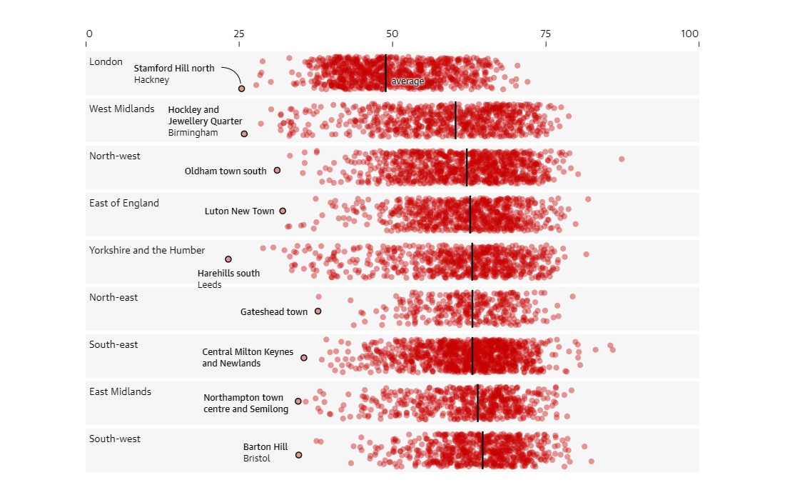
The British government decided to delay the final easing of COVID-19 lockdown restrictions in England previously scheduled for June 21. Four weeks are seen as enough time to speed up vaccination and halt a new rise in hospitalizations, preventing thousands of unnecessary deaths.
The Guardian decided to take a closer look at the reasons behind the delay in reopening and found it totally justified. The results of the analysis conducted by the newspaper reveal that almost 70% of the population in England has no sufficient protection against the dominant Delta coronavirus variant. Data also shows some parts of the country remain especially vulnerable as the progress of the vaccination campaign rollout varies across England and within each region.
A detailed explanation is provided with the help of several telling visualizations. See the picture at a glance, in the Guardian’s recent article “Vaccines are working — but these charts show why England is delaying reopening” by Ashley Kirk, Anna Leach, Niko Kommenda, and Cath Levett.
COVID-19 Vaccination Campaign in India
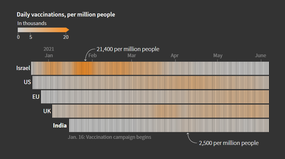
India is one of the world’s largest vaccine producers, and there is no surprise its own vaccination campaign started quite early, in the middle of January, and in earnest. At some point, however, something went wrong.
Healthcare and frontline workers were the first groups of the Indian population to be inoculated. Next came the elderly. Then 45+. But when vaccinations were opened up for ages 18-45, the campaign faltered due to shot shortages, leaving 43% of the population (about 600 million people) without enough doses. A privilege gap added to the issue.
Prasanta Kumar Dutta and Manas Mishra from Reuters used a series of creative visualizations to shed light on the problem and the current situation. The story begins with a timeline showing the pace of the campaign over time with a breakdown by age group. Check out the article to see it and more charts based on data from a wide range of sources, including the CoWIN portal, the Indian government’s press information bureau, the Duke Global Health Innovation Center, Our World in Data, and the United Nations Population Division.
Agricultural Land Use in Germany by Crop Type
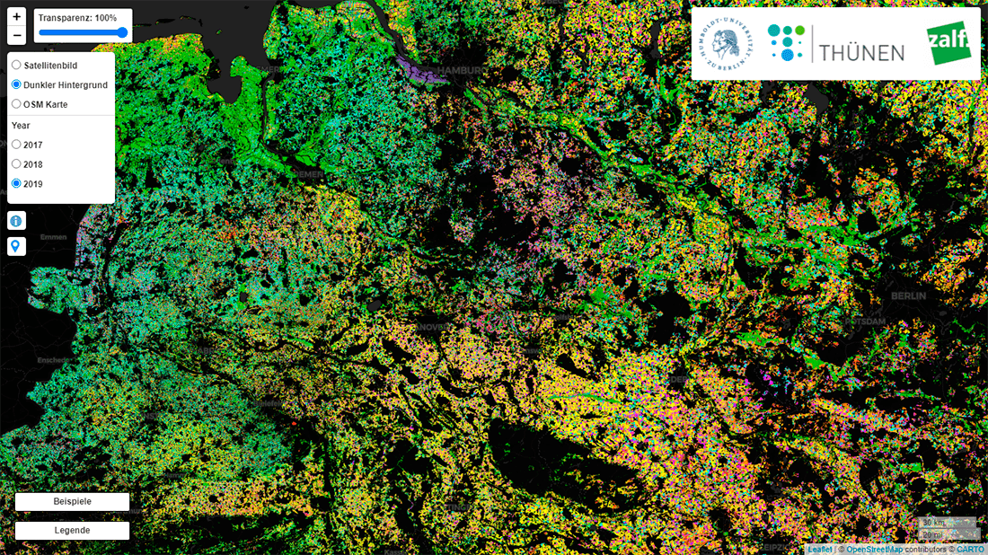
Land use maps are often beautiful and interesting to explore. Here is one fresh example.
The Earth Observation Lab at the Humboldt University of Berlin (Humboldt-Universität zu Berlin) in partnership with the Thünen Earth Observation (ThEO) working group at the Thünen Institute (Thünen-Institut) and the Leibniz Centre for Agricultural Landscape Research (ZALF) created a map that shows how agricultural land in Germany was used in 2017, 2018, and 2019.
Visualizing satellite data and various environmental data sets processed with the help of machine learning algorithms, the researchers managed to make a comprehensive and precise picture of what kind of crop was grown where, distinguishing between the major types of grains, vegetables, legumes, root crops, and permanent crops. Overall, a total of twenty agricultural classes are displayed. Consult the map’s legend to see what color is used for each crop type.
***
The next Data Visualization Weekly article will be out in a week. Stay tuned.
In the meantime, have a wonderful time!
- Categories: Data Visualization Weekly
- No Comments »