 Not too long ago, visual communication skills were nice to have. But that has changed. Nowadays, the ability to visualize data in charts and maps is a must-have and not only for analysts. Stay tuned for DataViz Weekly to see the most interesting examples of smart graphics in action!
Join us today as we look at the following new data visualization projects worth checking out:
- Historical shifts in U.S. state population rankings — The Washington Post
- Diversity of Asian Americans — CNN
- Regional differences in income and productivity across the U.K. — ONS
- Pret A Manger sandwich sales as a proxy to measure pandemic recovery — Bloomberg
Data Visualization Weekly: May 14, 2021 — May 21, 2021
Historical Shifts in State Population Rankings Since 1920
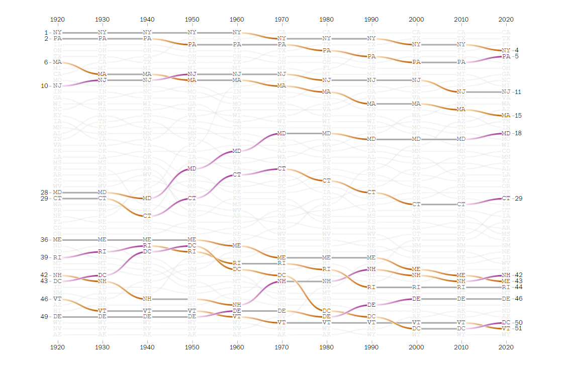
The 2020 Census data shows that the U.S. population has increased by 7.4% over the past decade. That is the lowest growth rate since the slowdown of the Great Depression in the 1930s. However, population changes could hardly be the same for the entire country. A number of states have actually attracted more people than others. Moreover, some of them have been rising in the rankings of the most populous states already for many years.
The Washington Post’s Nick Kirkpatrick and Harry Stevens arranged each state from most to least populous for each decade over the past century, since 1920. Then they looked at historical shifts in the rankings. To explore the changes, they made use of bump charts, a type of visualization specifically designed to track ranks over time.
We can clearly see Northeast and Midwestern states have experienced continuous declines. Southern and Western states have seen the largest gains. California has been the most populous state since 1970; in 1920, it was in the 8th position. Check out the article for more insights and don’t miss out on the interactive tool at the end of the story that lets you focus on how individual states have fared.
Diversity of Asian Americans
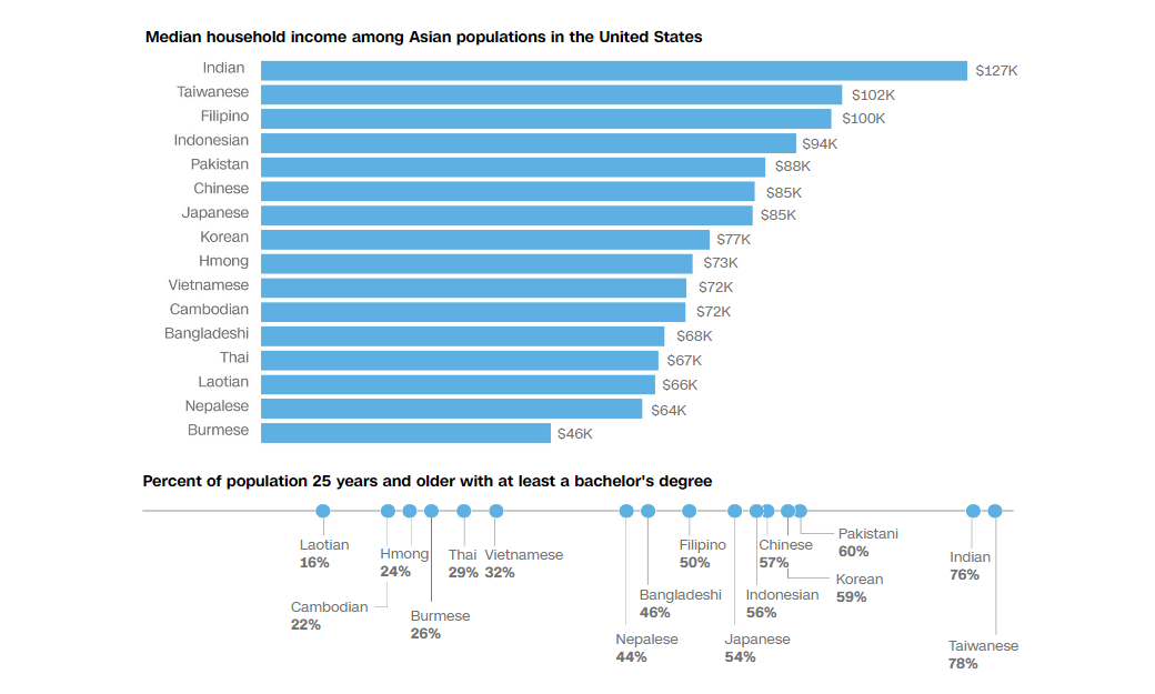
According to the census data, 7% of the U.S. population are Asian Americans. That is about 22 million people. Although they are often talked about as a single block, remember that “Asian American” is a generalized, umbrella term for a number of different groups of Asian descent. And in reality, Asians in the U.S. are not only far from a monolith but actually very diverse.
CNN’s Priya Krishnakumar and Nicole Chavez took data from the American Community Survey, Brookings Institute, and Migration Policy Institute to take (and provide) a look into the differences. The interesting visualizations they created for this article really facilitate understanding the numbers and facts. For example, here we can see it a glance what ethnicities make up the Asian community in the U.S. and to what extent, where they are clustered, what’s their income and education levels, and more.
Take a look at the graphics to realize how extremely diverse Asian Americans are, the fastest growing group of population in the United States.
Regional Differences in Income and Productivity Across United Kingdom
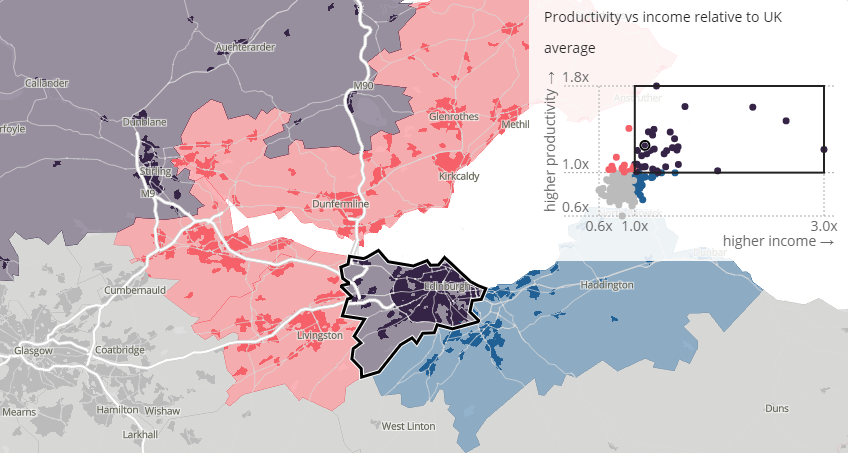
If one area contributes more than another to the economy in terms of the value of produced goods and services, people’s income levels in the former should be higher than in the latter. However, that is not always so in the real world.
The Office for National Statistics (ONS) mapped income — gross disposable household income (GDHI) per capita — and productivity — gross value added (GVA) divided by the number of hours worked — across the United Kingdom. Illuminating the regional differences, the resulting visual story reveals the areas where people’s income does not match economic output per hour. In particular, we can clearly see the North-South divide as well as the commuter effect in action.
Explore the economic inequality in the United Kingdom in this new interactive project by ONS, comparing income and productivity levels (as well as income vs productivity) across the country.
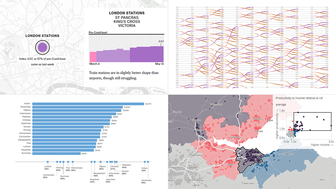
Pret A Manger Sandwich Sales as Proxy to Measure Pandemic Recovery
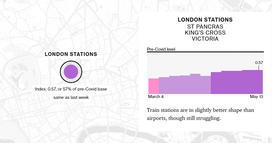
Sandwich sales can be a good indicator of how life is getting back to normal. At least that appears to be the case for the United Kingdom.
Bloomberg created what is now called the Pret Index. Based on sales data from the sandwich chain Pret A Manger provided weekly, it measures how the current transaction volume compares to the pre-pandemic level taking one from January 2020 as the baseline.
Learn more about how the Pret Index works in a compelling visual story made by Bloomberg’s Jeremy Scott Diamond and Thomas Buckley. Find out its current values and how they have changed, for major retail areas across the U.K. where Pret has already reopened its stores.
Bloomberg says the chain’s transactions are monitored on a weekly basis. So, give it a look now and check back later to see how the country’s recovery from the pandemic-caused recession goes according to the latest consumer activity data.
***
Data Visualization Weekly goes out on Fridays. Don’t miss a thing in the world of compelling charts, maps, and infographics!
- Categories: Data Visualization Weekly
- 2 Comments »