 “Numbers have an important story to tell. They rely on you to give them a clear and convincing voice,” Stephen Few once said. That actually is the purpose of data visualization. On DataViz Weekly, we show you how this works in reality. Welcome to our new roundup of the most interesting data visualization projects we’ve recently found!
- Comparing live and studio versions of songs — The Pudding
- Historical wildfires in the U.S. West — Reuters
- Boston’s most desirable streets — MIT Senseable City Lab
- Inequality and COVID-19 vaccine allocation in America — GHJP Yale & C4SR Columbia
Data Visualization Weekly: February 5, 2021 — February 12, 2021
Comparison of Live and Studio Versions of Songs
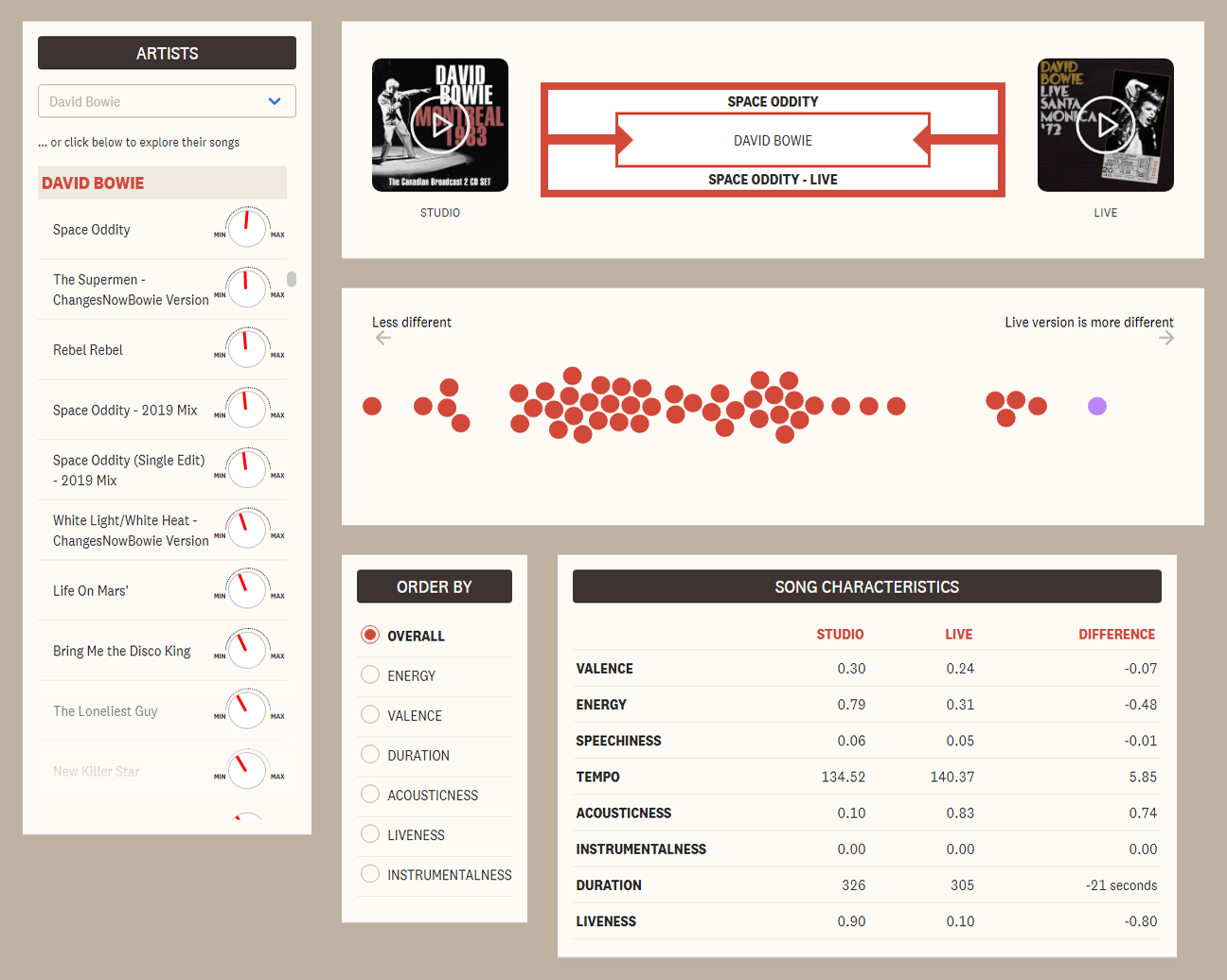
Songs often sound and feel differently at live performances compared to what can be heard in their studio recordings. That’s why the pandemic and lockdown times are especially difficult for many music lovers around the world. Shows and entire concert tours get canceled, and it’s hardly possible to listen to anything but recorded music. But how significant is that difference? Is it really worth lamenting at all?
The Pudding’s Kat Wilson and Kevin Litman-Navarro decided to find out with the help of data. They compared live and studio versions of plenty of songs across multiple numeric metrics using the Spotify API. Among the metrics taken into account were, for example, sound energy, track duration, tempo, and much more. As a result, they made a dedicated dataset and built a special interactive project based on it.
The Pudding’s Live Music Jukebox lets you choose an artist and explore the differences between studio and live-recorded versions of their songs in a convenient and visually appealing interface. Check it out.
Historical Wildfires in U.S. West
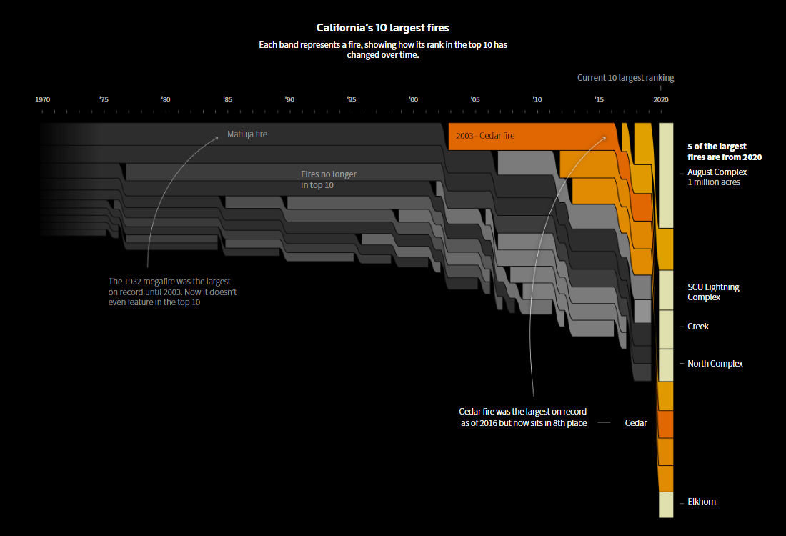
The 2020 wildfire season in the western United States was record-breaking, with millions of acres burnt by a total of about 57 thousand fires. This number includes 11 so-called “megafires” accounting for nearly one-third of the entire damage. Scientists say climate change and long-standing fire suppression efforts are to blame and we should expect such infernos to become even more common.
Manas Sharma, Simon Scarr, and Sharon Bernstein from Reuters created compelling graphics showing the truly alarming trend at a glance. Their new piece of visual storytelling begins with a comparison of the largest West Coast wildfires on record and a “race” visualization of the 10 most devastating fires in that region in 1975-2020. Then, there are state-specific charts representing how the rank of each of the 10 largest fires has changed over time — for Washington, Oregon, California, and Colorado.
Look at what’s been going on in the age of the megafires and learn more from a Reuters analysis.
Most Desirable Streets in Boston
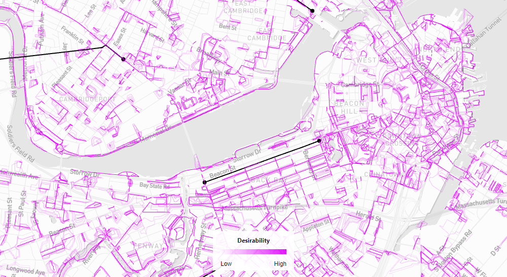
To get from one place to another within a city, pedestrians do not always take the shortest possible path. Why some streets are more attractive for walking while others are avoided? A clear understanding of that could help urban planners in designing more pedestrian-friendly environments.
MIT’s Senseable City Lab made a great effort to sort things out. Its team measured the desirability of Boston streets based on the analysis of deviations in pedestrian trajectories obtained from GPS data, comparing the shortest and actual routes between the corresponding points across over 120,000 journeys. In this way, the researchers recognized the most desirable streets and street segments across Boston. Then, they looked at what characterizes the built environment there and figured out three main features determining the attractiveness to pedestrians:
- access to parks,
- nearby shops and business establishments, and
- sidewalks and urban furniture.
The most desirable streets in Boston can be easily discovered using a special interactive map recently published by the MIT Senseable City Lab. Take a look.
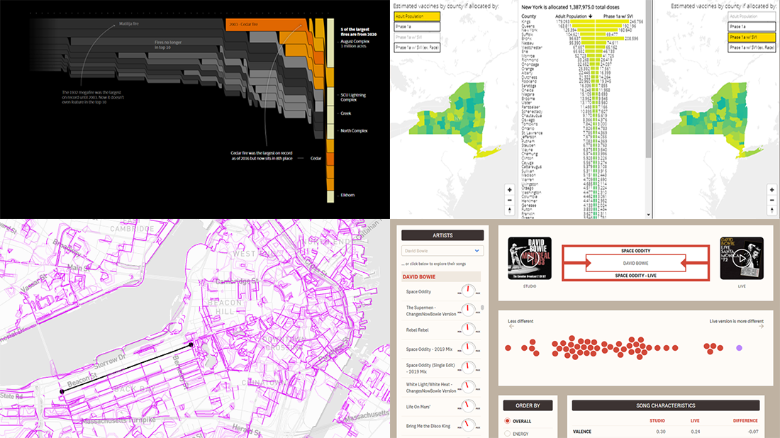
Inequality and COVID-19 Vaccine Allocation in America
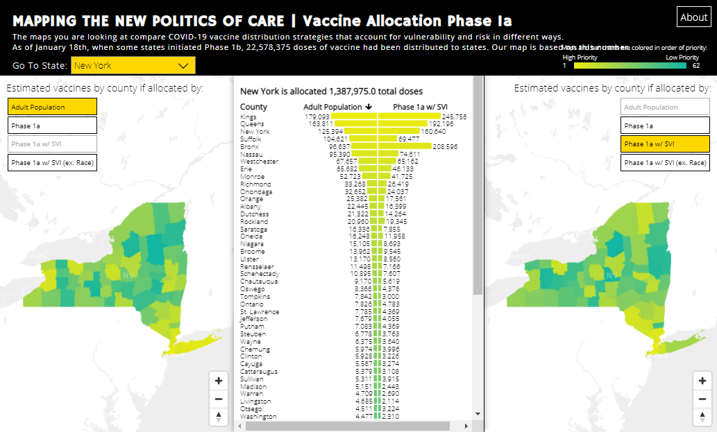
Due to limited supplies of COVID-19 vaccines, the U.S. federal government first decided to send doses to states proportionately with their total adult population. How vaccines are allocated then is up to each state’s own decision. Most states, however, followed the official recommendations of the Centers for Disease Control’s (CDC’s) Advisory Committee on Immunization Practices (ACIP) COVID-19 Vaccines Work Group, prioritizing long-term care facility residents and healthcare workers during Phase 1a. But is it equitable in the end?
A team of researchers from the Global Health Justice Partnership at Yale University and the Center for Spatial Research at Columbia University, directed by Gregg Gonsalves and Laura Kurgan, created an interactive visualization that allows you to compare four vaccine distribution strategies at the county level — find out how many doses each county could get under each of the following scenarios accounting for vulnerability and risk in different ways:
- all adults,
- prioritization of healthcare personnel and long-term care facility residents (Phase 1a),
- Phase 1a weighted by CDC’s Social Vulnerability Index (including the race/ethnicity variable), and
- Phase 1a weighted by SVI excluding race/ethnicity.
Look at the trade-offs and notice how vulnerability and race matter in who and where gets vaccinated.
***
We’ll keep you posted on new interesting charts and maps from around the Web. Stay tuned for “>Data Visualization Weekly.
- Categories: Data Visualization Weekly
- No Comments »