 In data visualization, theory is very important but practice is absolutely everything. We continue to share with you some of the new charting best practices we’ve come across around the web so you could see what others do and keep improving. Check out how various experienced data visualization professionals make data speak and tell insightful stories, in DataViz Weekly.
Today, we are happy to meet you with the following new interesting projects:
- Black Lives Matter and racial disparities in America, in 25 charts — Business Insider
- The Economist’s forecast model for the 2020 U.S. presidential election — The Economist
- Unemployment rate in the United States since 1948 — FlowingData
- Names with a similar trajectory of popularity over time as Karen — The Pudding
Data Visualization Weekly: June 12, 2020 — June 19, 2020
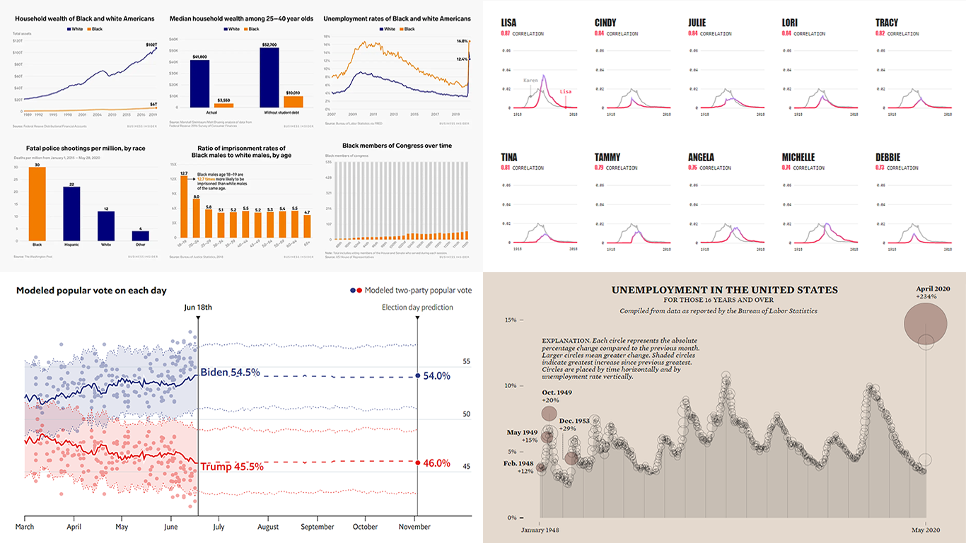
Black Lives Matter and Racial Disparities in America
Black Lives Matter protests have spread all over the United States and across the globe. Sparked by George Floyd’s death in police custody, this public rage follows along a rekindled discussion about racial inequality. To shed light on what research and data have to say, Business Insider’s Shayanne Gal, Andy Kiersz, Michelle Mark and Ruobing Su put together twenty-five charts.
The visualizations show the ways in which Black Americans are underrepresented, overrepresented, or undergo some different treatment, revealing the actual extent of racial disparities in the United States now and over time.
Look at the charts to understand the differences between the Black and White experience in nearly every aspect of modern life: employment, education, healthcare, wealth, and more.
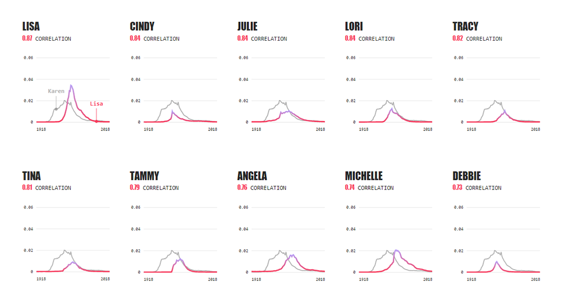
The Economist US Presidential Forecast
![]()
The Economist claimed to become the first prominent media outlet to publish a statistical forecast of the 2020 U.S. presidential election. Created by the organization’s data team in collaboration with political scientists from Columbia University, the model is designed to calculate the probability of winning the election for Republican Donald Trump and Democrat Joe Biden, in each state and nationwide. It builds on the assessment of fundamental factors along with polling data and uses machine learning algorithms to ensure the best possible accuracy.
According to the current data, Joe Biden has 88% chance of winning America’s presidency this year. Check out the project to learn more. In particular, there you’ll find interesting charts that visualize estimated electoral college and popular votes (and how these figures have been changing over time), as well as chance of winning each individual state. The source code and polling data are publicly available, by the way.
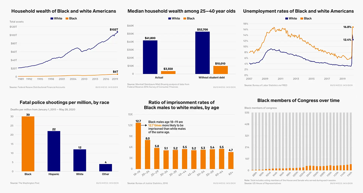
Unemployment Rate in America Since 1948
American statistician Nathan Yau published an elegant graph visualizing unemployment data for the United States from 1948 to 2020. In the chart, an area series is used display the rate over time, and circles visualize the month-over-month change. The greater the change, the bigger the circle. The source of this data is the U.S. Bureau of Labor Statistics.
Explore how the national unemployment rate has been changing so far. In particular, look at the shaded circles serving to put emphasis on the greatest increase since the previous greatest. For example, the largest one-month jump before April 2020 (+234%) took place in December 1953 when the rate grew by 29% compared to November.
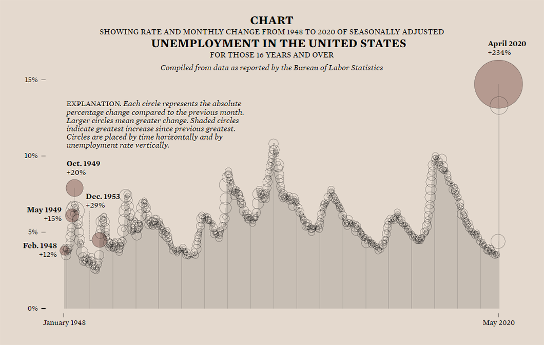
Future Karens
How many babies named Karen do you know? Obviously not as much as you would (or did) in 1965 when this name was at its historical popularity peak, the third most popular baby girl name in the United States. It broke into the female Top 20 in 1941 and stayed there for thirty years. Then it even dropped out of the Top 100 by the 1990s.
The Pudding assumed that the rapid rise and fall in the Karen name’s popularity nicely explains the origins of meme “Karen” which caricatures an entitled middle-aged White woman. So Jan Diehm, Sara Stoudt and Amber Thomas decided to find out if there are other names that followed the same pattern as Karen and therefore may become “Karens” in the future. For the analysis, they worked with baby name data from the Social Security Administration.
See what names, not only female but also male, could become the next “Karens” in 10, 20 or 30 years. Don’t miss out on a special search tool to check your own name.
***
Check out these nice examples of charting best practices. We’ll keep you posted on new interesting cases. Stay tuned at Data Visualization Weekly.
- Categories: Data Visualization Weekly
- No Comments »