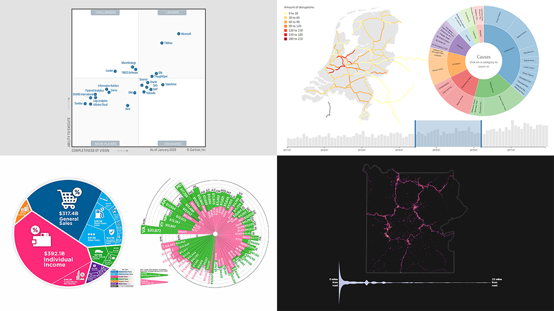
 Can’t wait to meet new awesome data visualizations in DataViz Weekly? There you go! Today we are pleased to put a spotlight on the following graphics worth seeing:
- Magic Quadrant for Analytics and BI Platforms — Gartner
- State taxes in the United States of America — Howmuch.net
- Viewing locations at U.S. national parks — Nick Underwood, Clare Sullivan and Peter Newman, UW-Madison
- Disruptions in the Dutch railway system — Chris Mostert, TU Delft
Data Visualization Weekly: February 7, 2020 — February 14, 2020
Magic Quadrant for Analytics and BI Platforms

Gartner, a global research company, published a new iteration of its Magic Quadrant for Analytics and Business Intelligence Platforms. Overviewing the entire BI software landscape and presenting the relative positions of the key market players, this regular report is designed to help data analysts decide on their analytics and BI technology portfolio.
Traditionally, Gartner assesses the completeness of vision, which is vendors’ understanding of how they can leverage market forces to create value. The second key criterion is the ability to execute, i.e. make their vision a reality.
This year, according to the new version of Gartner’s Magic Quadrant, Leaders in analytics and BI platforms are: Microsoft, Tableau, Qlik, and ThoughtSpot. Visionaries: Oracle, Salesforce, Sisense, SAS, SAP, and Yellowfin. Challengers: MicroStrategy, TIBCO Software, and Looker. Niche Players: Information Builders, Domo, IBM, Pyramid Analytics, Logi Analytics, BOARD International, Dundas, Alibaba Cloud, and Birst. Look at the quadrant chart to see who’s where exactly and read more about it on Gartner’s website.
State Taxes in America
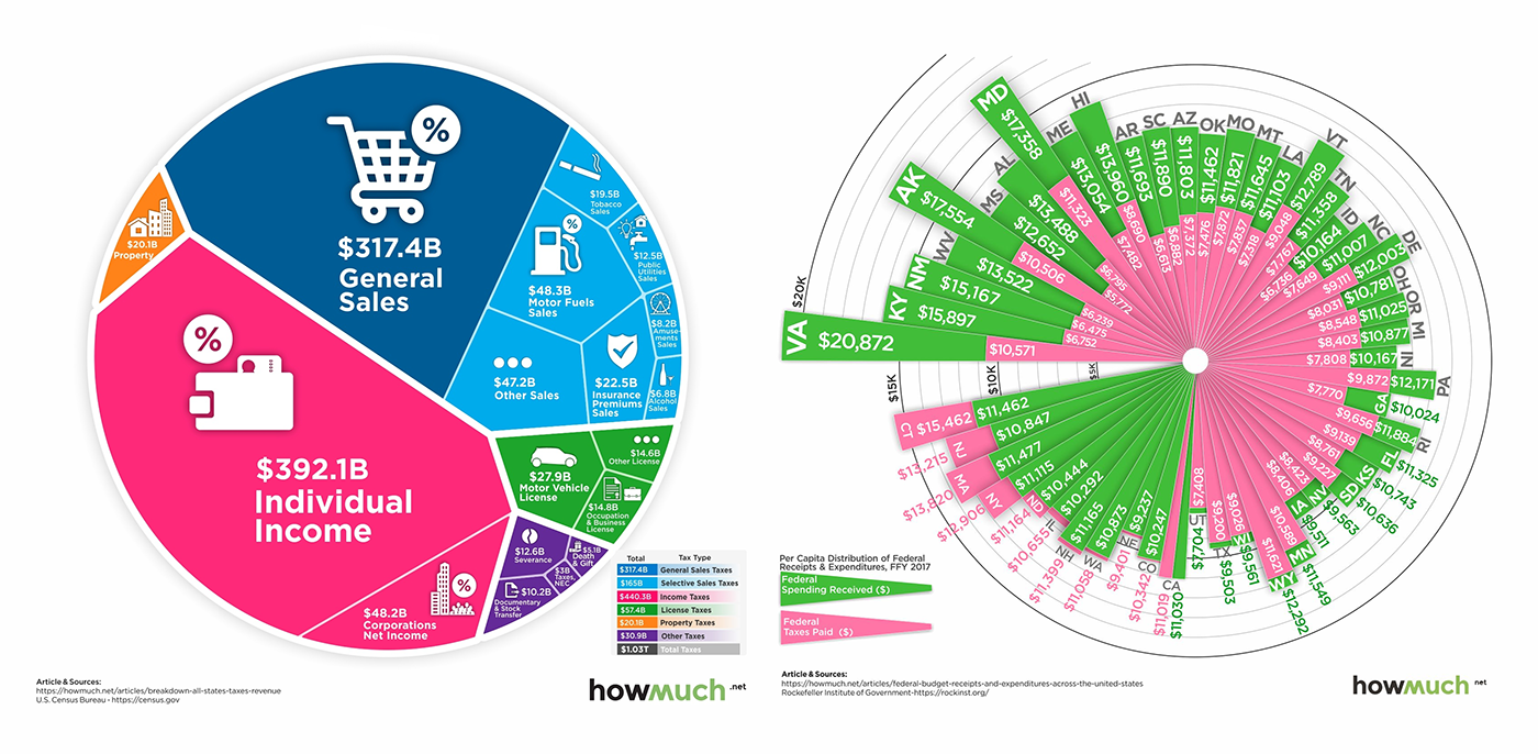
Howmuch.net shared a cool visual overview of state taxes across the United States. Actually, each state determines its own sales, income, license, property, and some other tax rates by itself. That’s why it is not easy to quickly understand, for instance, what states are the best to live in terms of tax burden.
Although U.S. state taxes are indeed a complex subject, these seven visualizations from Howmuch.net seem to be helpful in analyzing this kind of data, revealing quite a comprehensive picture of the tax situation in America. For example, we can see it a glance that Wyoming is the most tax-friendly state, Illinois is the worst state for taxes, states collected more than $1 trillion in taxes in 2018, and 80% of states receive more in federal spending than they pay in taxes.
Look at the visualizations to explore the tax landscape across the United States (and do not miss out on a graphic at the end that compares OECD countries according to how much money people take home after paying taxes).
Viewing National Parks from Roads
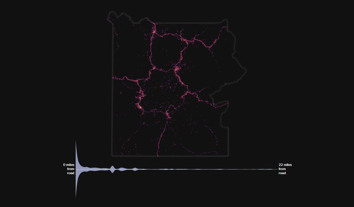
Nick Underwood, Clare Sullivan and Peter Newman from the University of Wisconsin–Madison made an interesting project with several cool visualizations dedicated to how people usually experience national parks in the United States. Using geotags of about 800,000 Flickr photos taken at national parks as a proxy for movement patterns, they discovered that the vast majority of visitors stay within one mile from a car road.
The project includes maps and violin plots for each of the 32 national parks participating in the analysis. The visualizations show the locations where photos were taken and the distances between those points and parks, respectively.
The picture above shows data for Yellowstone, and we can clearly recognize roads while observing the location marks. Check other parks in the ‘Roads and the National Parks’ project on the UW-Madison website.
Disruptions in Dutch Railway System
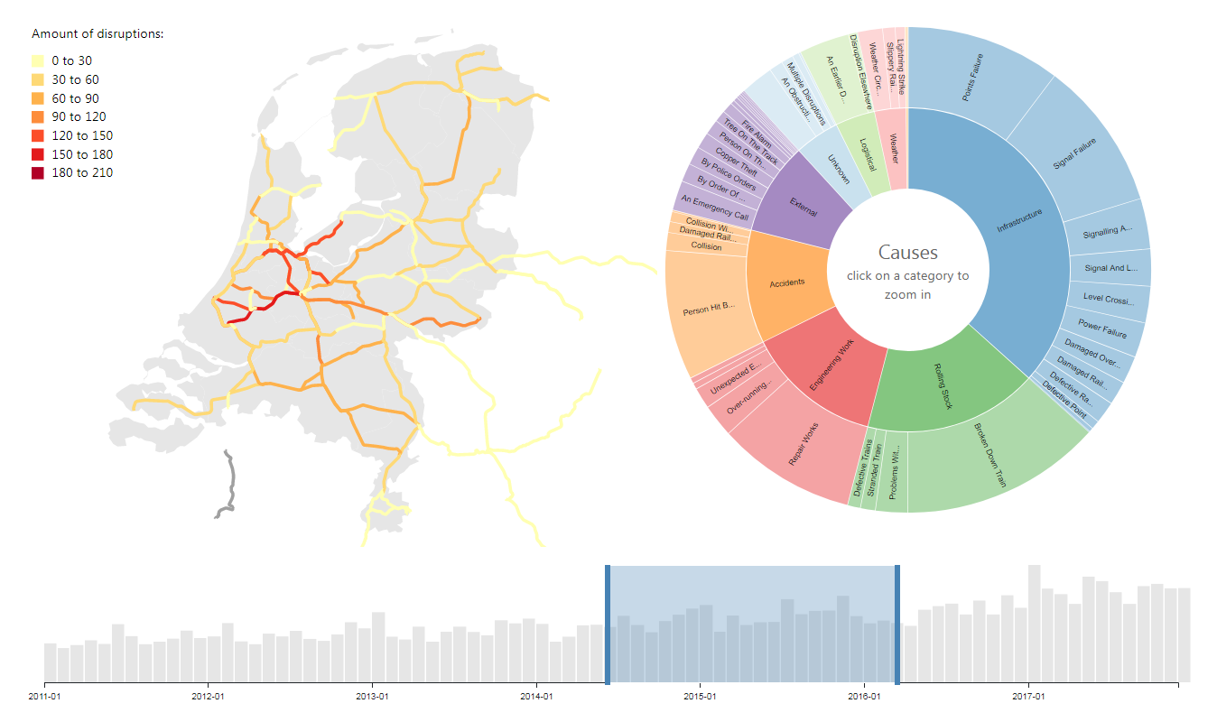
Chris Mostert from Delft University of Technology (TU Delft) visualized data about train disruptions in the railway system of the Netherlands in 2011-2017 and their causes. His dashboard consists of a chart and a map, both interactive. The chart makes it easy to explore the disruption causes and see how they compare in terms of occurrence. The map shows the number of disruptions for each part of the Dutch railway network.
Click a cause category on the chart and you will drill down into its particular causes whereas the map will update accordingly. The categories include Infrastructure, Rolling Stock, Accidents, External, Engineering Work, Logistical, Weather, Staff, and Unknown.
According to the chart, Infrastructure and Rolling Stock categories of causes were most widespread across the Netherlands over the period from January 2011 through December 2017, accounting for nearly 60% of all incidents. The biggest cause of delays was train breakdowns (22.3% of all cases). The map says that the segments connecting Utrecht with Rotterdam and Schiphol Airport had the most disruptions 429 and 430 respectively. Explore the visualizations to see more details.
***
We will publish the next Data Visualization Weekly on Friday next week. Stay tuned.
In the meantime, have a wonderful time!
- Categories: Business Intelligence, Data Visualization Weekly
- No Comments »