 A new DataViz Weekly post is finally out! Here’re some of the most interesting charts and maps we’ve found just lately:
- 2020 Iowa caucus results for Democrats — The New York Times
- Transition from weather to climate — Neil Kaye, Met Office
- Global real interest rates since the early 14th century — Paul Schmelzing, Bank of England
- Greenhouse gas emissions across the supply chain of diverse food products — Our World in Data
Data Visualization Weekly: January 31, 2020 — February 7, 2020
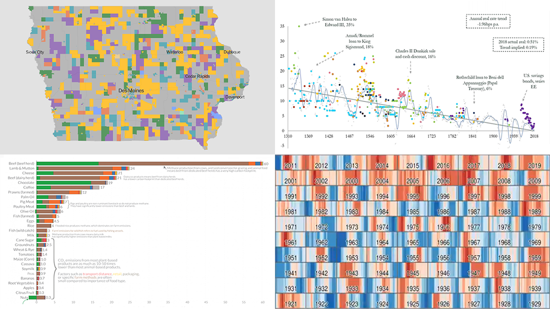
Iowa Caucus for Democratic Party
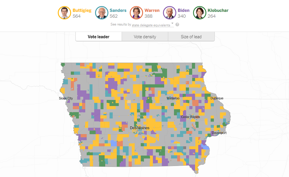
The 2020 Iowa caucuses traditionally became the first nominating contests in the Republican and Democratic party primaries for the 2020 U.S. presidential election. They were held on February 3. While the Republican caucus brought no real surprise as the victory of President Donald Trump had been widely expected, the Democratic one saw a stronger competition, of course.
We have seen several visualizations showing the results of the 2020 Iowa caucus for Democratic candidates and want to invite you to check out one from The New York Times that called it “the most detailed map of the Iowa Democratic caucus.” Each precinct here is colored by the vote leader; in addition, it is possible to explore the vote density and the size of lead. You can see the results by state delegate equivalents (SDE), as well as by first and final alignment votes. Play with various filter to look into the results for Pete Buttigieg, Bernie Sanders, Elizabeth Warren, Joe Biden, Amy Klobuchar, and others.
Transition from Weather to Climate
Updated animation showing the transition from weather to climate by looking at Central England temperature compared to normal.
The graph at the bottom now shows the range of temperature anomalies, which decrease in magnitude as the averaging period increases.#dataviz pic.twitter.com/WxgBIpU1nh— Neil Kaye (@neilrkaye) February 6, 2020
Visualization can be greatly helpful in getting big picture insights making sense of large amounts of data. Here’s a cool example. Neil Kaye, a climate data scientist at the the Meteorological Office of the United Kingdom, created an animation that displays the transition from what can be called weather to climate.
Initially, the visualization demonstrates daily temperature data for Central England in 1920-2019 compared to the long-term average over that period. Then the picture is changing to display increasingly longer averaging periods up to thirty years, providing a clear warming signal. The line chart at the bottom visualizes the range of temperature anomalies. Nice.
Global Real Interest Rates Since 14th Century
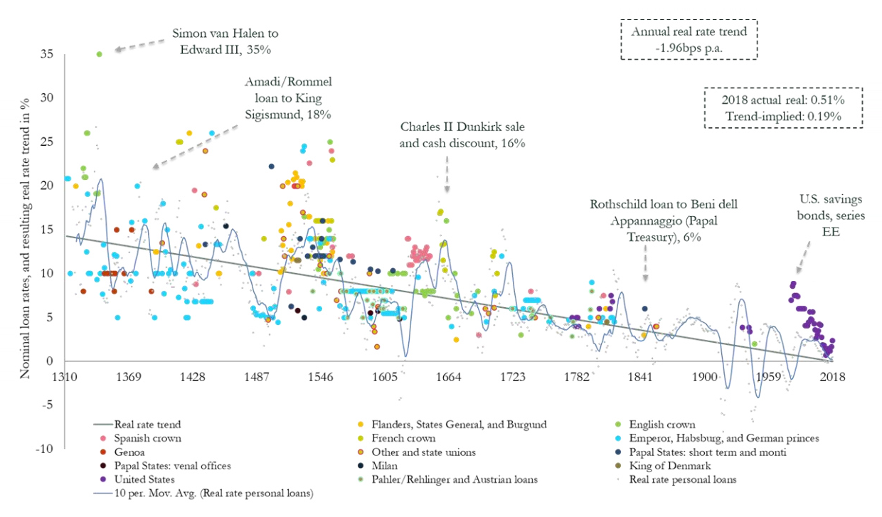
Paul Schmelzing, a postdoc research associate at the Yale School of Management (Yale SOM) and a visiting researcher at the Bank of England (BOE), made an interesting study in which he tracks global real interest rates (i.e. inflation-adjusted) covering 78% of advanced-economy GDP from 1311 to 2018. According to his findings, global real interest rates have experienced a persistent downward trend over the past several centuries.
The new research has a lot of graphics visualizing data gathered by Paul Schmelzing. Take a look. The chart pictured here above, for example, is one of the most important drawings, showing nominal loan rates and the resulting real rate trend.
Greenhouse Gas Emissions Across Food Supply Chain
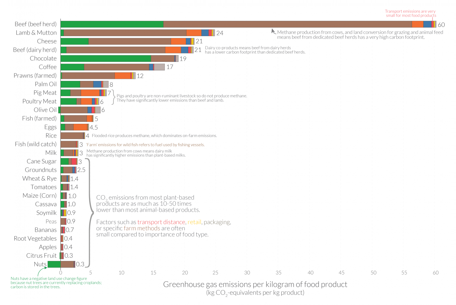
Many sources, including prominent ones like the United Nations, advise us to eat local food as one of the means of climate action. However, studies show that this recommendation is quite misguided. According to the latest data, if you want to reduce the carbon footprint of your food, you need to focus on what food you eat rather than whether it is local.
Join Our World in Data’s Hannah Ritchie as she take a closer look at the data from “the largest meta-analysis of global food systems to date” published in Science by researchers Joseph Poore and Thomas Nemecek who consolidated data on the multiple environmental impacts of more than 38,000 commercial farms producing 40 different agricultural goods in 119 countries.
In particular, there is a chart visualizing greenhouse gas emission data across the supply chain of 29 food products. It provides details on the composition, that is the amount of emissions during the land use change, farm, animal feed, processing, transport, retail, and packaging stages.
***
We appreciate your attention. Stay tuned to Data Visualization Weekly and we will keep you posted on the latest cool charts, maps and infographics from around the web.
- Categories: Data Visualization Weekly
- No Comments »