 DataViz Weekly is here! Look at four new interesting data visualization projects we’ve discovered around the web just recently. Coronavirus cases are already confirmed in more than 20 countries, making 2019-nCoV a topical global issue. So we could not help but highlight an important dashboard dedicated to it among the four. Here’s a full list of what is featured in this new DataViz Weekly post:
- Wuhan coronavirus cases — JHU CSSE
- American FM radio coverage — Erin Davis
- Global trade in live animals — The Guardian
- Job growth across the United States — The Daily Yonder
Data Visualization Weekly: January 24, 2020 — January 31, 2020
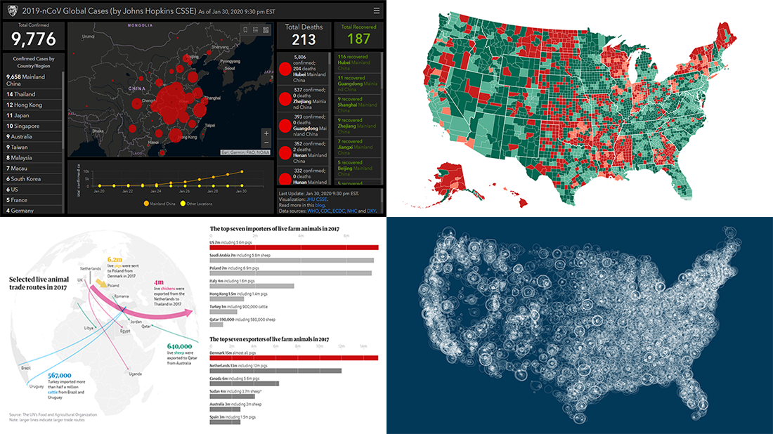
Wuhan Coronavirus Cases
The novel coronavirus is spreading both in China and beyond. As of the time of writing, there are already 9,776 confirmed 2019-nCoV cases globally, including 9,658 in mainland China, 14 in Thailand, 12 in Hong Kong, 11 in Japan, 10 in Singapore, 9 in Australia, 9 in Taiwan, 8 in Malaysia, 7 in Macau, 6 in South Korea, 6 in the United States, 5 in France, and less in other countries. These numbers change quickly as the Wuhan coronavirus outbreak continues to worsen. If you would like to stay updated, here’s a dedicated dashboard with a bubble map and a line chart, which tracks the spread of 2019-nCoV in near real time.
Created at Johns Hopkins University’s Center for Systems Science and Engineering (JHU CSSE), this coronavirus cases data visualization builds on data from a variety of sources such as the World Health Organization (WHO), the United States Centers for Disease Control and Prevention (U.S. CDC), the European Centre for Disease Prevention and Control (ECDC), the Chinese Center for Disease Control and Prevention (CCDC), China’s National Health Commission (NHC), and DXY, a Chinese website aggregating data from NHC and local CCDC reports.
The 2019-nCoV Global Cases dashboard updates in real time as the official sources being followed confirm new cases. Take a look.
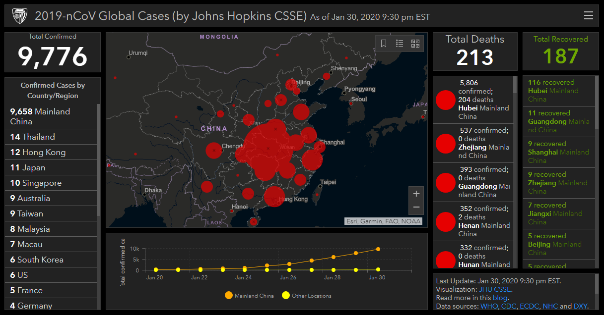
FM Radio Coverage in America
Post-Millennials, or Generation Z, may be already unfamiliar with that kind of things, but there are still many FM radio stations out there. Broadcasting diverse music, news, and talk shows, these stations transmit content via radio waves. The area where such signals remain strong enough to be well received and decoded is limited, though. And we have recently come across cool coverage maps showing this at a glance.
Data expert Erin Davis mapped the service contours of American FM radio stations based on data from the Federal Communications Commission of the United States (FCC). Providing a stunning jellyfish-like view of coverage, the project also features separate maps for particular formats — public radio, religious, country, gospel, hip-hop, college radio, Spanish language, and variety. Then, there is a map visualizing how many FM stations are available at a certain location, followed by a zoomed-in view of Arizona and Ohio. Finally, do not miss out on coverage area maps for — wait for it — broadcast TV.
You can find the Visualizing the Geography of FM Radio project on the personal website of Erin Davis.
Global Live Animal Trade
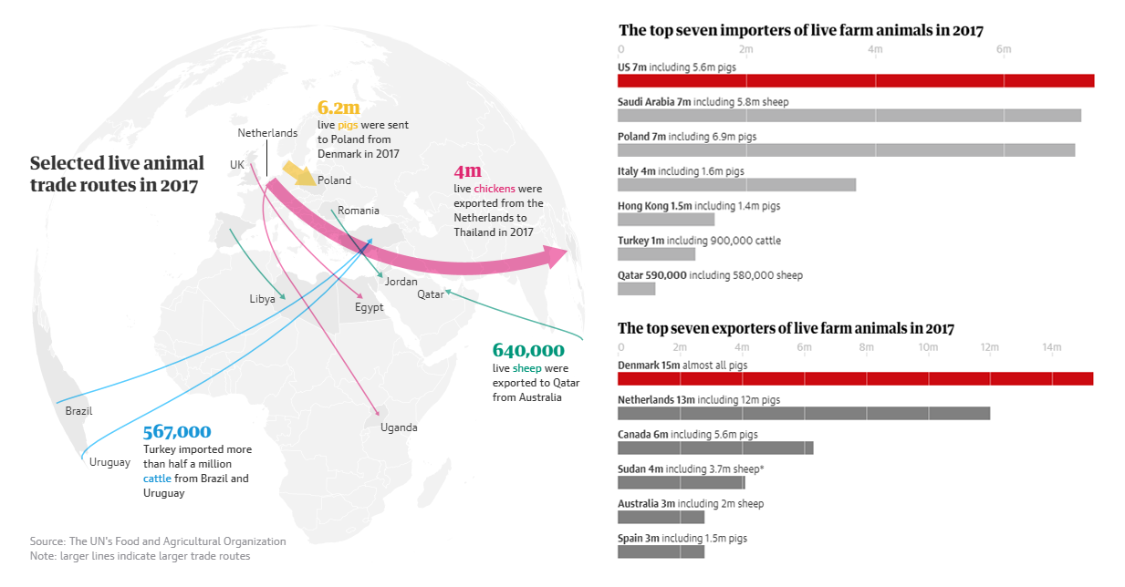
Did you know how big the global trade in live animals is? As many as nearly two billion live pigs, chickens, cattle, sheep and goats were trucked and shipped around the globe in 2017. It is 15 times more than in 1967. Some details can be learned from The Guardian’s visualizations on this topic published just last week.
Using data from the United Nations Food and Agricultural Organization (FAO), The Guardian created a number of bar charts. In particular, they show the size of the global market of live animals since 1967, top exporters and importers (countries), and top exporters of pigs, chickens, cattle, and sheep. There is also a flow map displaying selected trade routes.
See the global trade in live animals in nine charts (and one map) on The Guardian’s website.
Job Growth in U.S. Counties
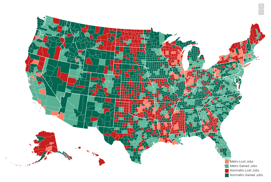
According to the latest data from the U.S. Bureau of Labor Statistics (BLS), most counties of the United States gained jobs during the previous year. However, the situation was uneven across America as job growth in rural counties continued to fall behind metropolitan areas. The Daily Yonder visualized employment data for November 2018 and November 2019 on a choropleth map for comparison, to analyze the employment change.
The map shows at a glance which counties added or lost jobs. Colors makes it easy to differentiate between metro and non-metro areas.
Explore the map and read more — in the Two-Thirds of Rural Counties Gain Jobs from November 2018 to 2019 article on The Daily Yonder. You will also find a column chart a bit further down the article, visualizing the job growth figures by category — Major Metro Core, Major Metro Suburbs, Major Metros Exurbs, Mid-Sized Metro Core, Mid-Sized Metro Suburbs, Small Metros, Non-Metro Near Metro, and Non-Metro Remote. The chart nicely shows that the more urban a county, the higher its job growth rate.
***
We hope you liked this new data visualization projects — about coronavirus cases and live farm animal trade, as well as American FM radio (and broadcast TV) station coverage and job growth. Stay tuned for more cool examples of charts and maps in action. Data Visualization Weekly gets published every Friday.
- Categories: Data Visualization Weekly
- No Comments »