 Hey everyone! Check out new great data visualization examples we’ve recently found around the web! The projects we feature today on DataViz Weekly are about Earth’s elevation and ocean depth, renewable energy in Africa, misspellings of celebrity names, and history of employment in the United States.
New Great Data Visualization Examples in New Data Visualization Weekly: February 22, 2019 — March 1, 2019
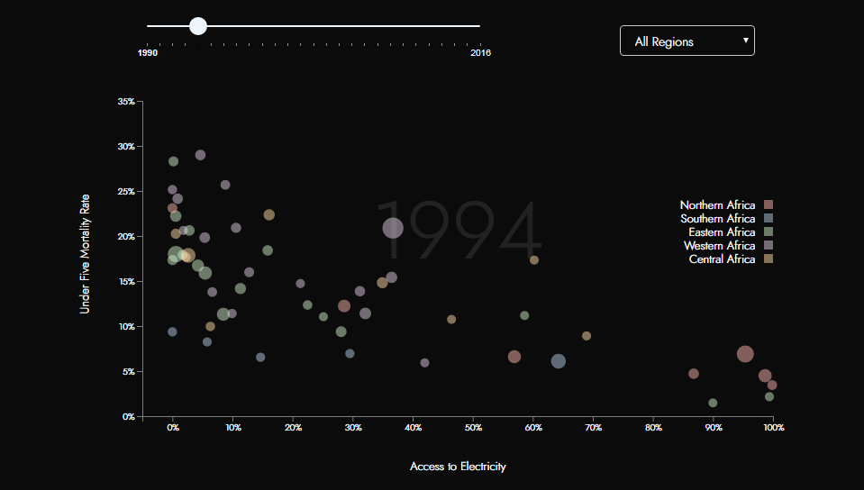
Continent Elevation and Ocean Depth Along Parallels and Meridians Across Earth
Software developer and writer Mark Jeffery took bathymetry and elevation data to visualize cross-sections through Earth along circles of latitude, from 90°N (the North Pole) across 0° (the Equator) to 90°S (the South Pole), beautifully showing the continent elevation and ocean depth at any chosen latitude. For clarity, the parts of the drawing are provided with the names of the corresponding geographical features.
To start exploring the visualization, play the animation or pick a parallel manually.
Don’t miss out on its sister project, also by Mark Jeffery, which displays cross-sections along meridians (circles of longitude) in the same manner.
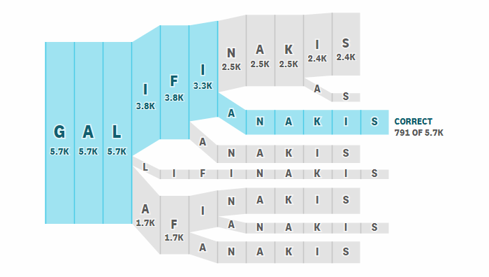
Renewable Energy in Sub-Saharan Africa
Students of the Data Visualization MS program at The New School’s Parsons School of Art and Design in New York City, in partnership with the United Nations Development Programme – Regional Bureau for Africa (UNDP RBA), researched into the issue of renewable energy in sub-Saharan Africa. The resulting studies are now published on the Parsons website, featuring many interesting data visualizations.
Here you’ll find ten projects by ten different students, revealing links between access to electricity and under-five mortality, education, health care risks, and more in these countries.
Common Misspellings of Celebrity Names
Russell Goldenberg and Matt Daniels for The Pudding decided to look at the diffulties of spelling the names of several famous people and made cool charts showing what mistakes people usually do when writing them down.
The charts show the eight most frequent permutations of Britney Spears’ first name as well as the last names of the following celebrities: Zooey Deschanel, Zach Galifianakis, Scarlett Johansson, Colin Kaepernick, Shia LaBeouf, Macaulay Culkin, Matthew McConaughey, Mark McGwire, Sarah McLachlan, Nicki Minaj, Alanis Morissette, Chuck Palahniuk, Picabo Street, Amy Poehler, and M. Night Shyamalan.
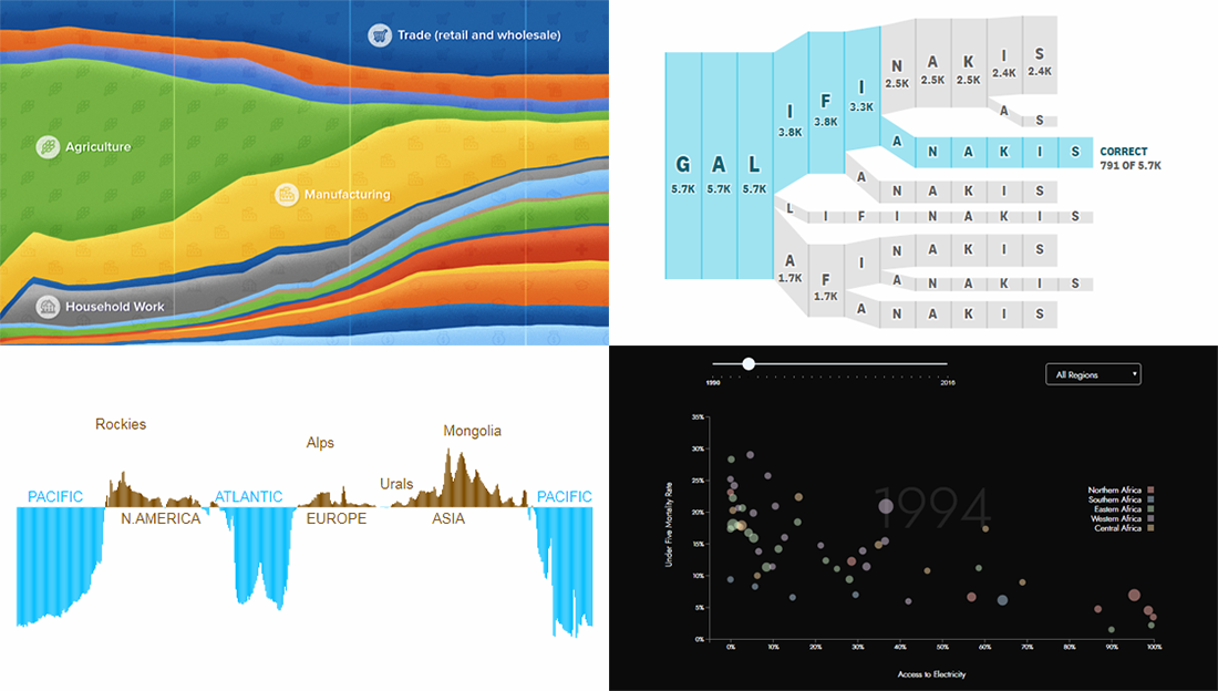
U.S. Employment Composition over Time, by Sector
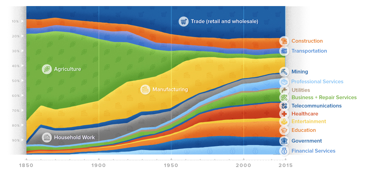
Jeff Desjardins visualized McKinsey Global Institute’s data on employment in the United States of America by sector over 165 years between 1850 and 2015.
The 100% stacked area chart he made nicely shows how sector shares of jobs changed over time. But it’s only a part of the story. Take a look at the article on Visual Capitalist to see and learn more.
***
Thank you for staying tuned for Data Visualization Weekly on our blog. We hope you liked these new great data visualization examples. More is to come!
- Categories: Data Visualization Weekly
- No Comments »