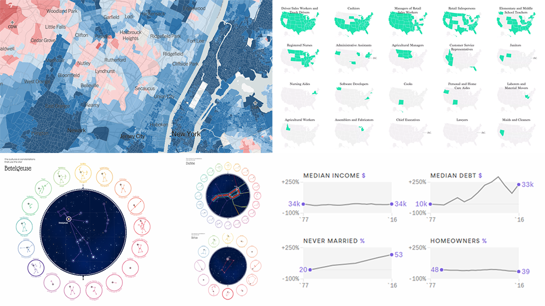
 It’s already Friday, so don’t hesitate to check out the new DataViz Weekly post on our blog. Here you’ll find visualizations about:
- 2016 U.S. presidential election, by voting precinct;
- the most popular jobs in the United States, by state;
- what’s changed in the life of young American adults in 1977-2016;
- different constellations seen by different cultures in the same sky.
Data Visualization Weekly: July 20, 2018 — July 27, 2018
2016 U.S. Presidential Election by Voting Precinct
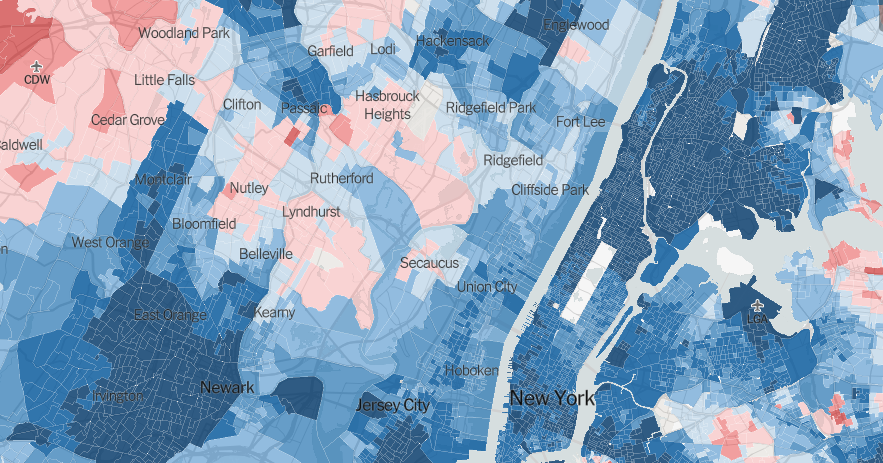
The New York Times made a very detailed interactive map of the 2016 presidential election in the U.S. While it is quite common for researchers and media to display results state by state, this map allows us to look into the outcome by revealing data down to the voting precinct level. Explore how people voted in each of more than 168,000 voting precincts across the country.
Most Popular Jobs in U.S. by State
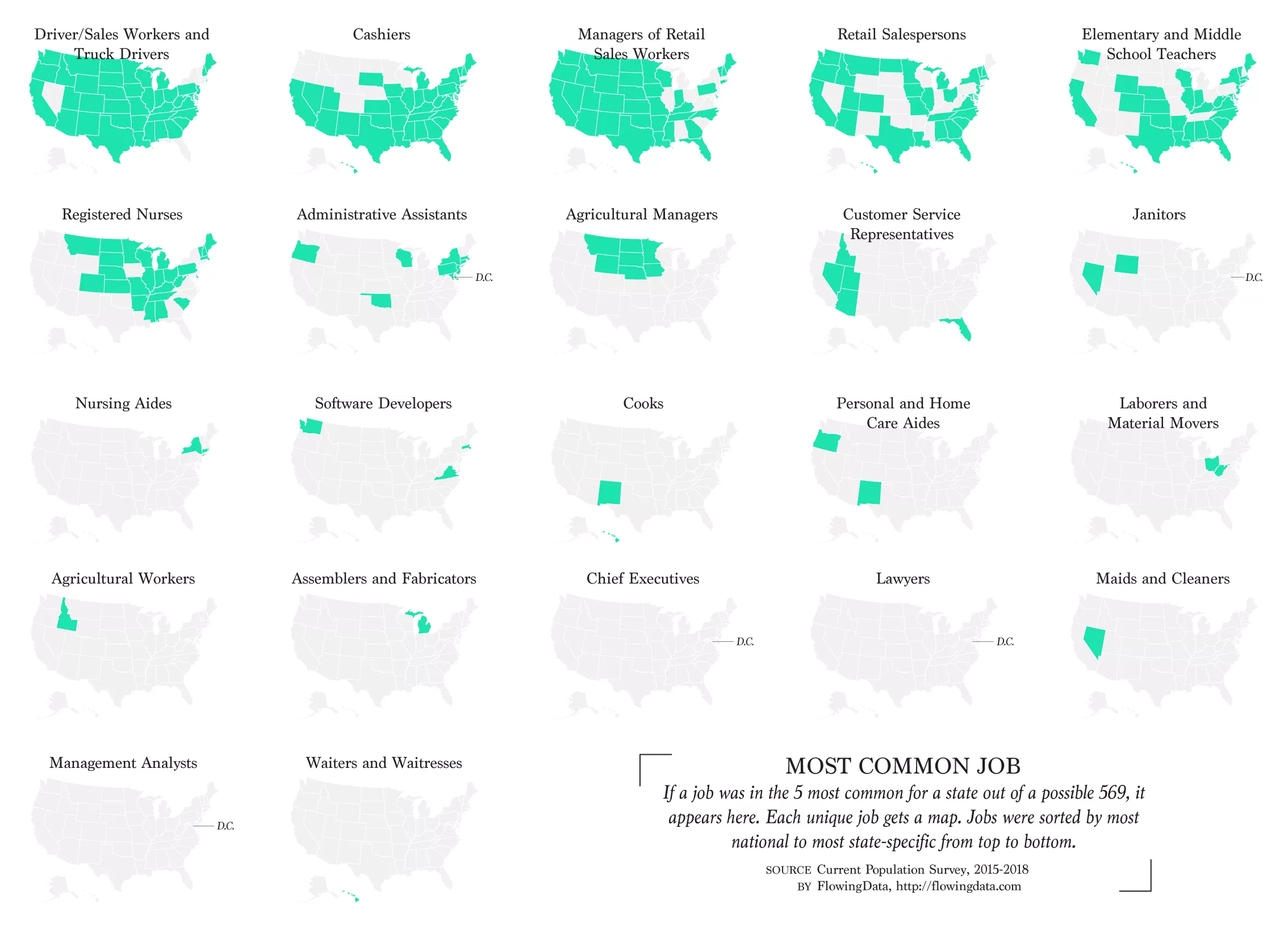
Statistician and data visualization expert Nathan Yau delivered an interesting look at occupations across the United States of America. He took data from the Current Population Survey to identify the five most common jobs in every state and made a choropleth map for each unique one, showing in what parts of the U.S. it is especially widespread. Check out the 22 visualizations, and discover nationally and regionally popular occupations.
Changes in Life of Young American Adults in 1977-2016
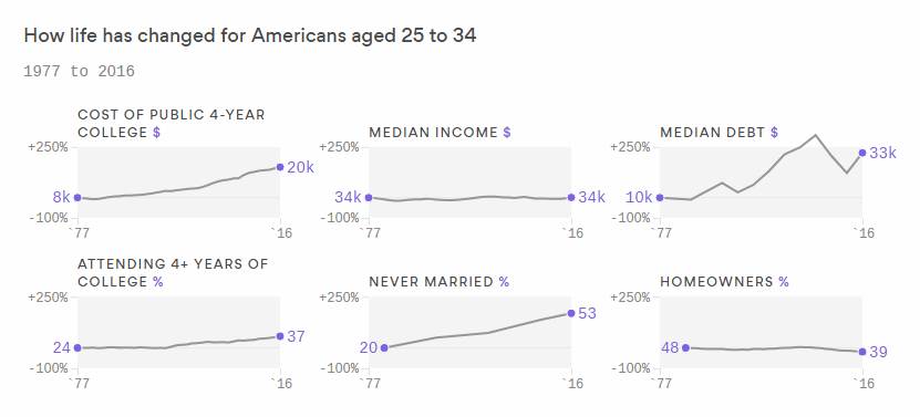
Stef W. Kight from Axios took a look at how life in the U.S. changed for 25-to-34-year-olds between 1977 and 2016. For the research, she combined data from various sources including the U.S. Census Bureau, CollegeBoard, Pew Research Center, and more. You’ll easily find some trends on the charts and are welcome to read the article to learn more.
Different Constellations Seen by Different Cultures in Same Sky
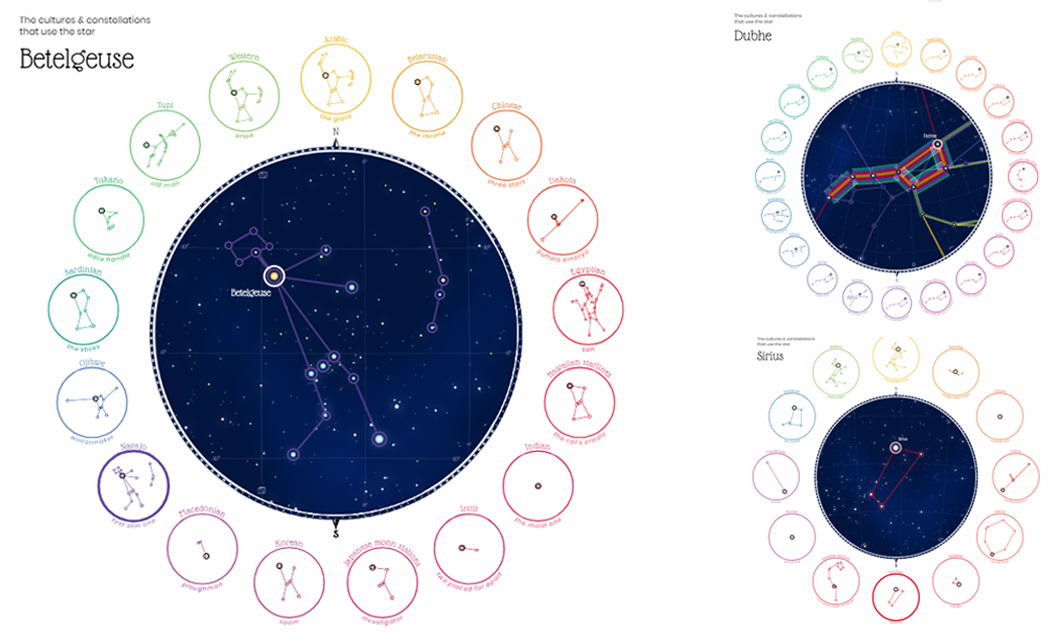
Astronomer and data visualization lover Nadieh Bremer created a project named “Figures in the Sky.” It greatly shows how different cultures have seen different shapes in the same sky, and as a result, distinguished different constellations of the same stars. There you’ll also find a chart that displays the correlation between the brightness of a star and the number of constellations it is included in. However, it appears that brightness does not determine absolutely all.
***
We hope you liked these data visualizations about different things. We’ll definitely share more next week. Meanwhile, have a great, wonderful weekend time!
- Categories: Data Visualization Weekly
- No Comments »