 The 21st FIFA World Cup in Russia attracts the attention of many millions around the world who have been thoroughly watching the matches, and the tournament is about to enter the playoff stage. Today’s DataViz Weekly post on our blog will tell you about two cool data visualization works devoted to this competition and its history:
- all (more than 2,400) World Cup goals in one chart, and
- thirty-three maps about the World Cup.
In addition, new DataViz Weekly features the following interesting graphics:
- finding the best characters in Mario Kart, and
- 12 key global economic indicators.
Data Visualization Weekly: June 21, 2018 — June 28, 2018
All FIFA World Cup Goals in 1 Chart
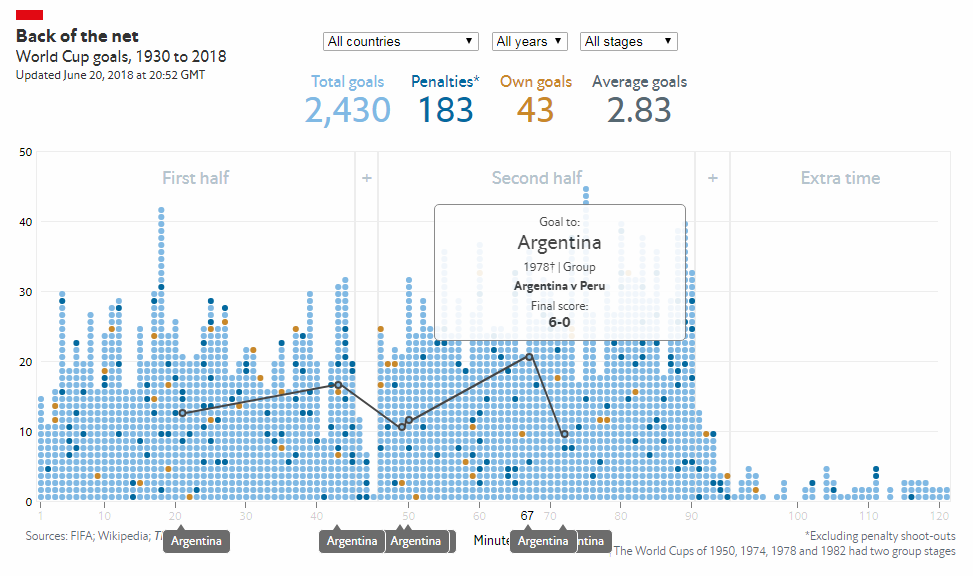
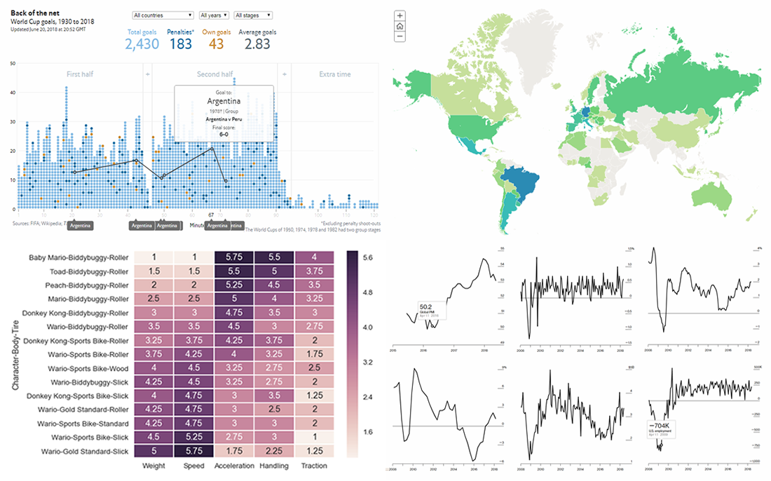
The Economist made an interactive chart to visualize all more than 2,400 (as of now) goals ever scored during the FIFA World Cup tournaments since the inaugural one in 1930. Each goal is graphically represented as a dot according to the minute in which the ball went in the net. The visualization is based on data from FIFA, Wikipedia, and The Economist itself. It gets updates from the 2018 World Cup on a regular basis.
FIFA World Cup in 33 Maps
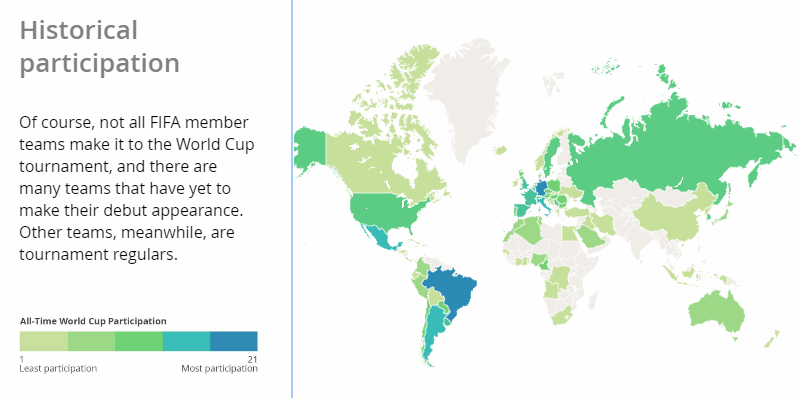 Another interesting dataviz work came from GIS software development company Esri that launched a series of 33 interactive maps devoted to the FIFA World Cup and its history. The graphics allow us to explore national team rankings, player ages, tournament venues, and much more via geographic visualization.
Best Characters in Mario Kart
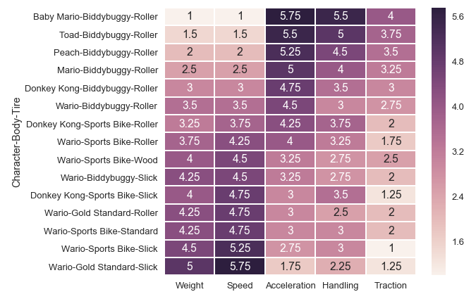
Henry Hinnefeld from Civis Analytics answered the question of which Mario Kart character is best according to what data science can tell. To analyze data from the game, he employed the Pareto efficiency concept. Check out his research and discover optimal configurations of characters, karts, and tires.
12 Key Global Economic Indicators
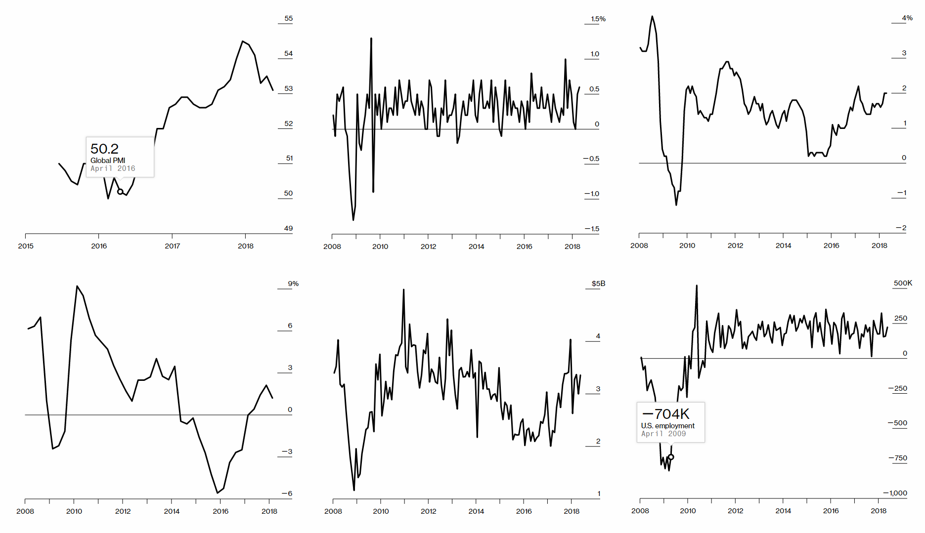
Bloomberg presented a real-time dashboard which should be helpful to quickly understand what is happening in the $90,000,000,000,000 global economy. It integrates charts for 12 indicators selected by Bloomberg’s economics team:
- Global PMI,
- U.S. Employment,
- U.S. Consumer Spending,
- U.S. Personal Consumption Expenditures,
- Brazil GDP,
- Chile Copper Exports,
- Euro-Area Inflation,
- German Ifo,
- China Manufacturing PMI,
- China PPI,
- Japan Inflation, and
- South Korea Exports.
***
As the World Cup in Russia continues, we expect more data visualizations on this topic to see the light somewhere on the Web within the near future. Well, let’s see. In any case, the next DataViz Weekly post will feature four new charts and (or) infographics that are worth looking at. As always.
Have a wonderful weekend, guys!
- Categories: Data Visualization Weekly
- No Comments »