 Understanding data gets easier when the data you are looking into is visualized. To illustrate this, here’s a new collection of interesting charts, infographics, and stories based on them that we have found on the web just recently.
Today in Data Visualization Weekly:
- life in Central New York;
- population distribution in the big picture;
- gender gap in school test scores;
- cancer risk factors.
Data Visualization Weekly: June 8, 2018 — June 15, 2018
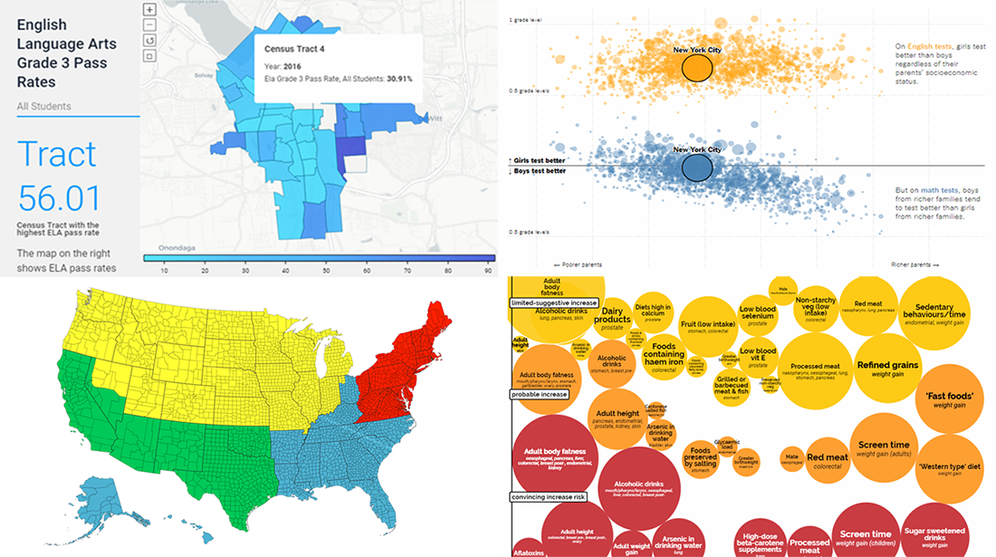
Life in Central New York
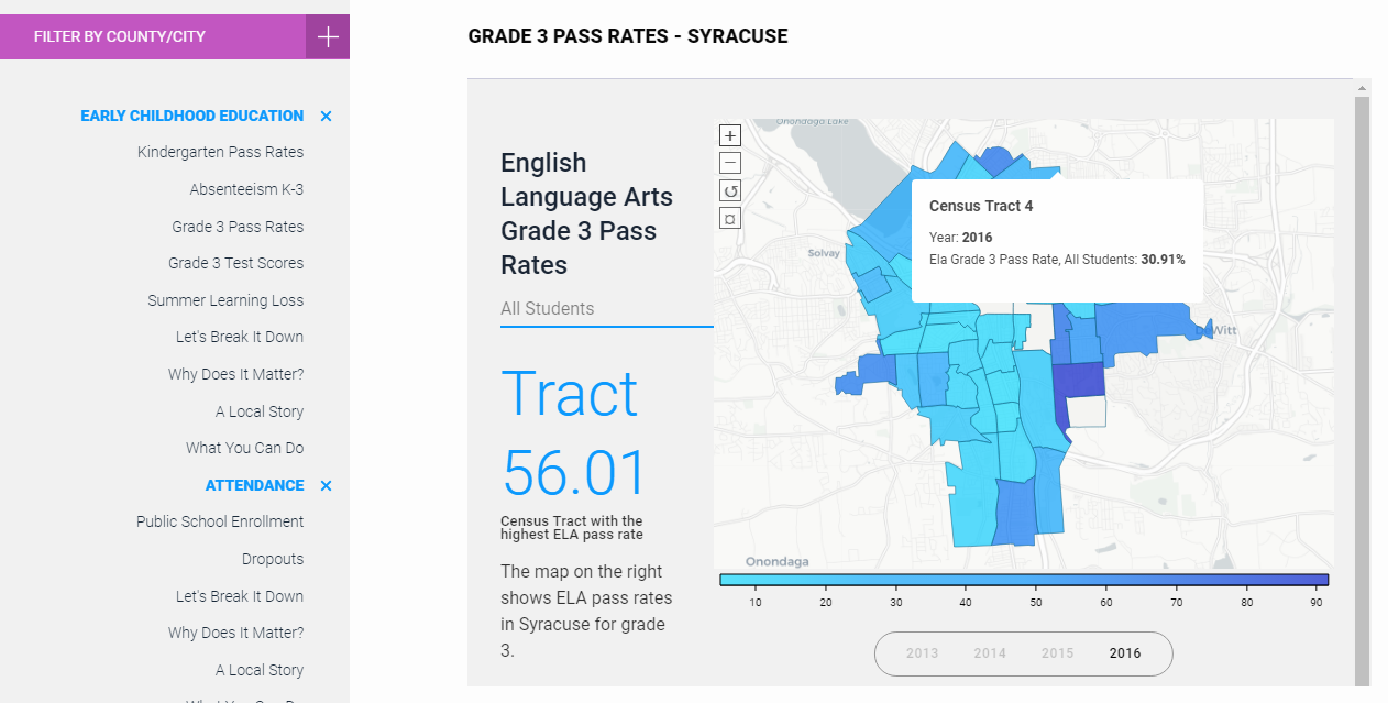
Central New York Community Foundation (CNYCF) launched a new website, CNY Vitals that allows visitors to learn about life in the central region of the state of New York. The website offers data about health, poverty, education and other important issues. Here you will find a lot of visualizations that are helpful in understanding data, as well as local stories providing a context, and analytics.
Population Distribution in Big Picture

Visual Capitalist put together five maps shared just recently on the DataIsBeautiful subreddit, which display the distribution of the population in the United States, California, Canada, Australia, and Chile in an interesting way. The technique used in these data visualizations consists in splitting a map into four areas that are populated equally. If you want to check out more maps like these, look up on DataIsBeautiful as there are hundreds of them available over there.
Gender Gap in School Test Scores
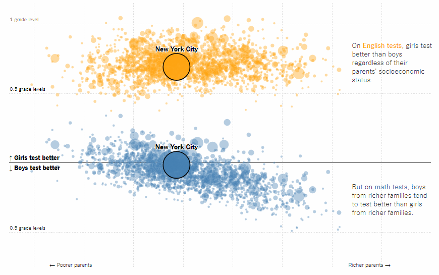
Researchers from Stanford University made a comprehensive study of the gender gap in math and ELA (English Language Arts) test scores in most of the school districts in the United States. Take a look at this interactive scatter chart on The New York Times’ The Upshot, allowing us to understand the gap in large districts. Do not miss out on visualizations in the research itself.
Cancer Risk Factors
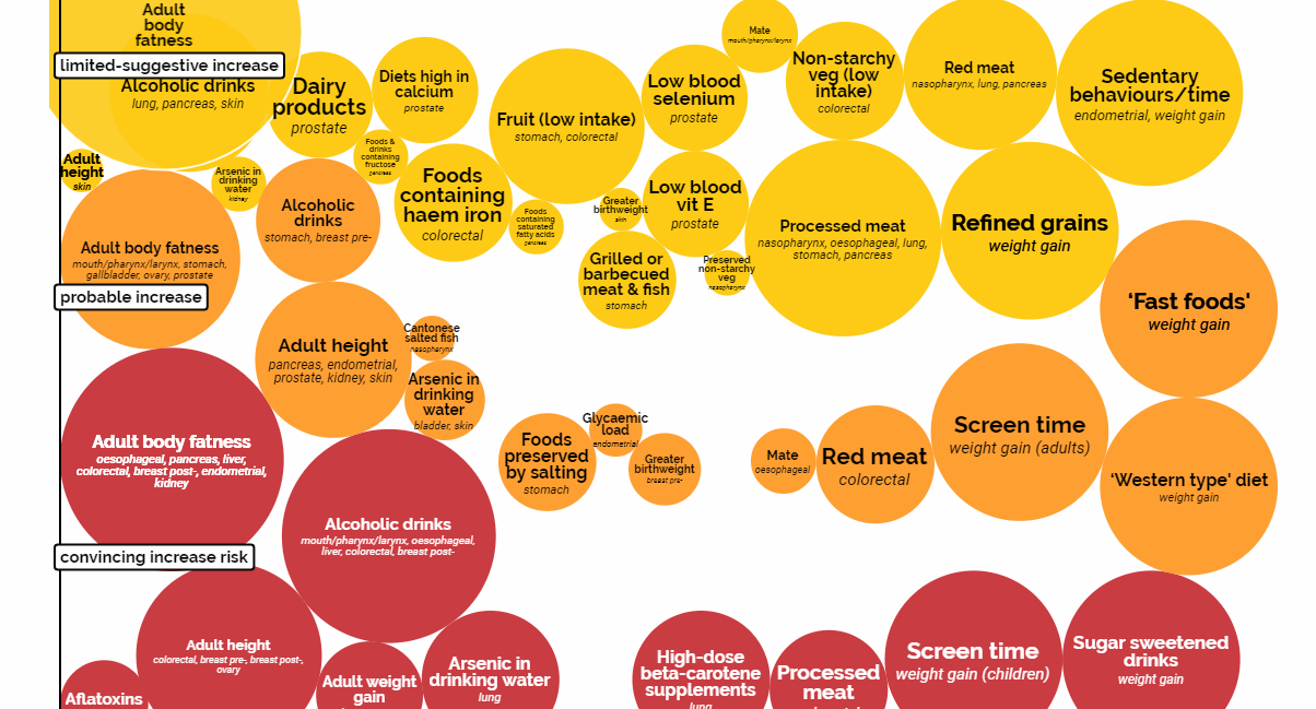
The World Cancer Research Fund made an interactive cancer risk matrix. The visualization is helpful in understanding data they have succeeded to collect and displays what lifestyle choices — in terms of food we eat, physical activity, and some other factors — might reduce or increase the cancer risk.
***
You’ll find more cool visualization examples in other DataViz Weekly posts. Follow this feature on our blog to get to know about new interesting data visuals once every seven days.
We wish you a pleasant weekend!
- Categories: Data Visualization Weekly
- No Comments »