 The new DataViz Weekly article is here. Today, we are glad to share with you the following cool data visuals, just in case you missed them out there:
- all known volcano eruptions since 1883;
- remote and non-remote workers’ time usage;
- unsolved murders in major US cities;
- Russia’s economic results.
Data Visualization Weekly: June 1, 2018 — June 8, 2018
Charting All Known Volcano Eruptions Since 1883
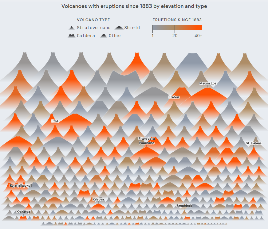
Lazaro Gamio from Axios made a chart visualizing data about every known volcano eruption since the year of 1883 when Krakatoa in Indonesia had erupted. The data was taken from the Global Volcanism Program of the Smithsonian Institution. For each volcano shown on the visualization, you can see its type, elevation, location (country), as well as how many times it erupted and when (in what year) its last eruption took place.
Visualizing Data About Remote and Non-Remote Workers’ Time Usage

Nathan Yau looked into the differences between remote and non-remote workers in terms of time usage. For this research, he visualized data from the American Time Use Survey (ATUS). Check out interesting charts on FlowingData to see what data says on how working remotely changes time use patterns.
Mapping Unsolved Murders in Major US Cities
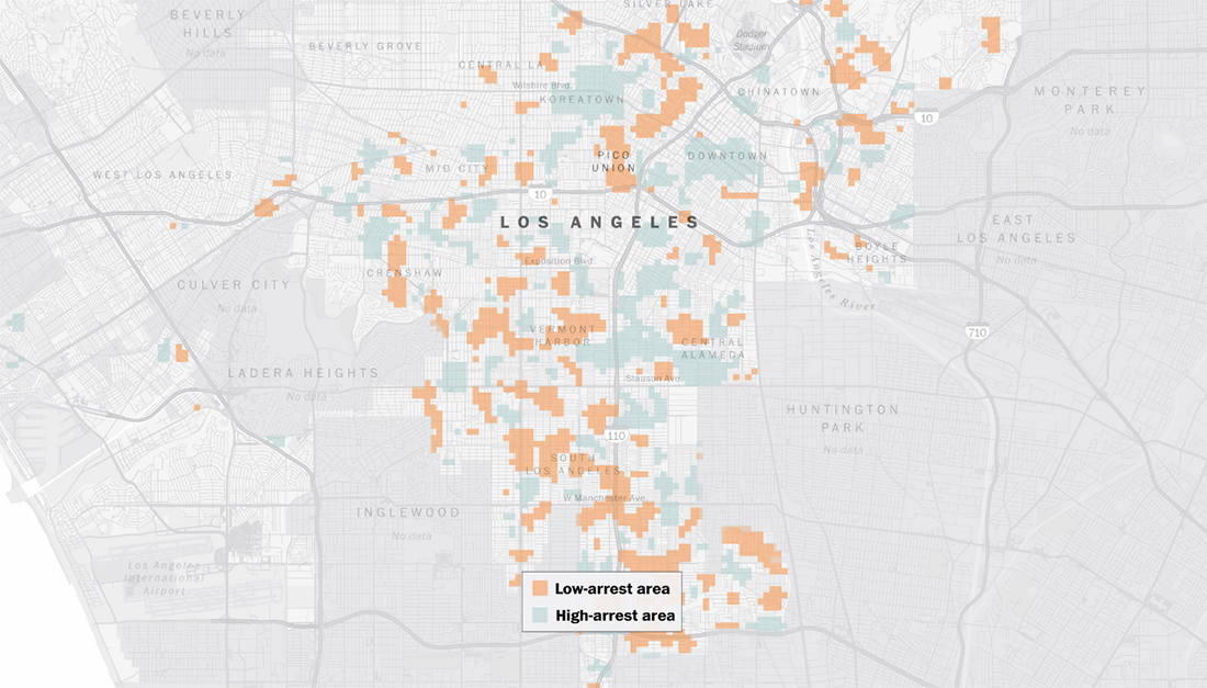
The Washington Post mapped more than 50K murders that had taken place in several major cities of the United States of America over the last 10 years and whether each of the killings resulted in an arrest or remained unsolved. Look at the resulting data story and check if your area is one of those where homicide is common but arrest rates are low.
Analyzing Russia’s Economic Results
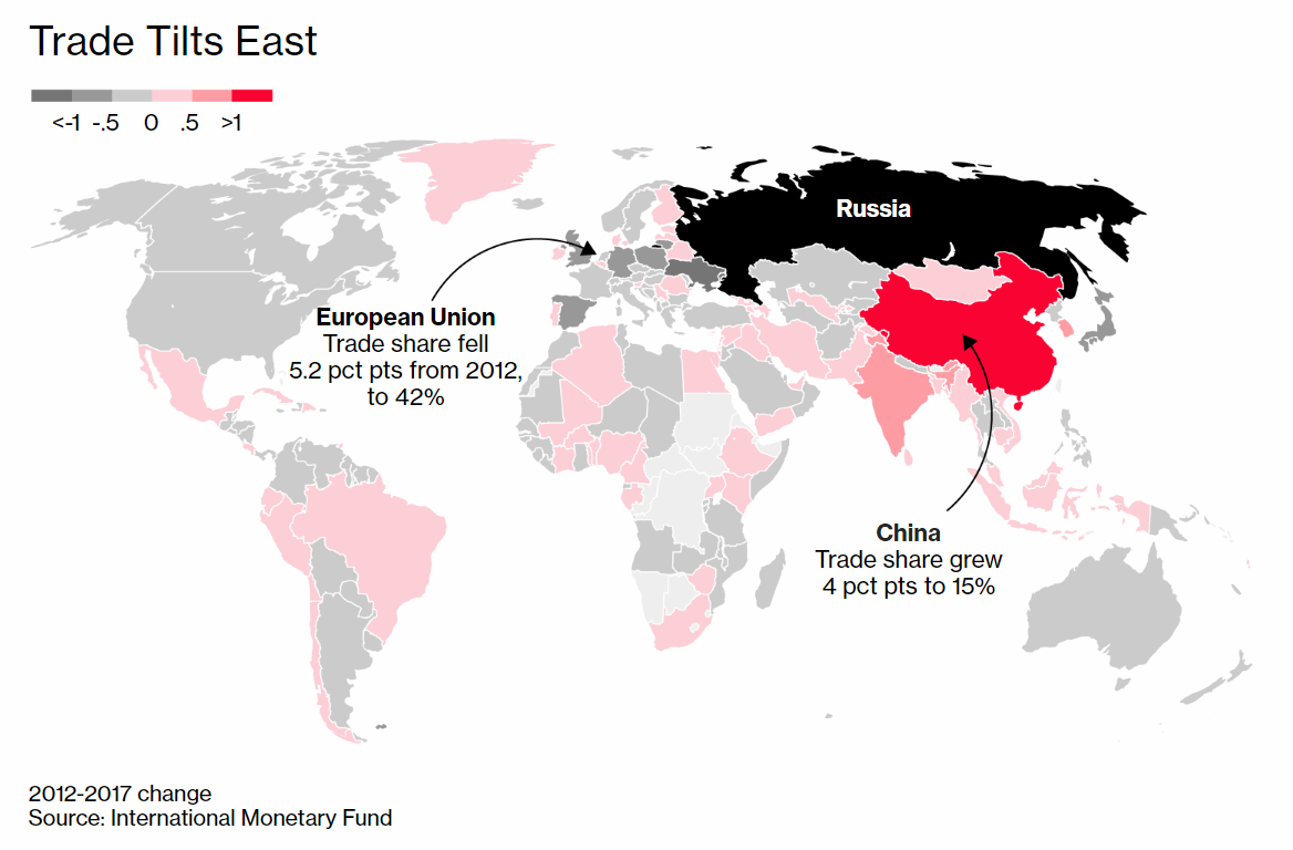
Bloomberg created charts visualizing some economic data from the International Monetary Fund and Russia’s Federal Statistics Service along with their own data to see how Russia’s economic results correspond to Vladimir Putin’s global ambitions. Take a look.
***
Thanks for your interest and for staying with us on our blog. Check out other articles within the framework of our Data Visualization Weekly feature to find even more dataviz examples that are worth seeing.
We wish you a great weekend.
- Categories: Data Visualization Weekly
- No Comments »