 Want to see new cool dataviz examples? We have some right here! Check out our this week’s selection of interesting charts and data stories in Data Visualization Weekly.
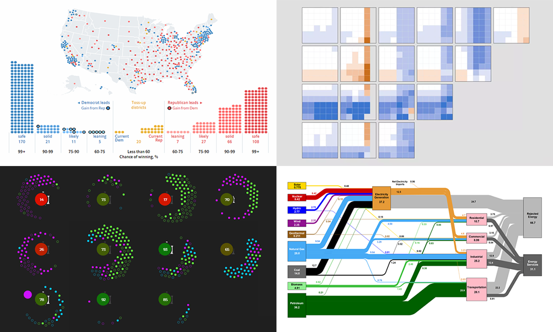
Here’s what we are glad to put a spotlight on this time:
- The Economist’s predictive model for November’s mid-term elections;
- key NBA players’ stats vs. their teams’ chance to win;
- US energy flow;
- choosing a school in Chicago.
Data Visualization Weekly: May 25, 2018 — June 1, 2018
Predictive Model for November Midterms
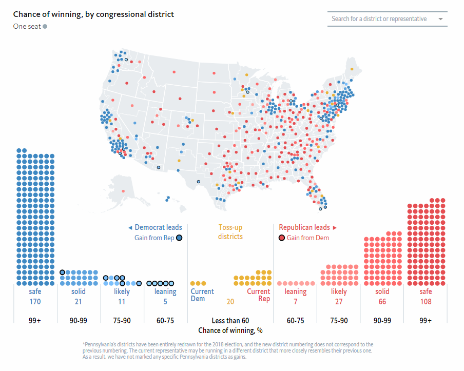
The Economist made a predictive model for the November midterms. It can tell you who is going to win according to today’s data. For example, one of the visualizations, which is pictured above, displays the chances of winning the elections in each congressional district. Check out its interactive version and other charts in the article. The data represented gets updated every day.
Key NBA Players’ Statistics vs. Their Teams’ Chance to Win
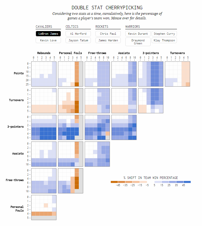
Nathan Yau made some interest charts based on the NBA statistics. Calling this “a bit of cherry stat picking,” he shows what kind of achievements the two key players of each NBA team from the playoffs need to give their team a better chance to win. Take a look at these cool interactive visualizations on FlowingData.
US Energy Flow Chart, 2017
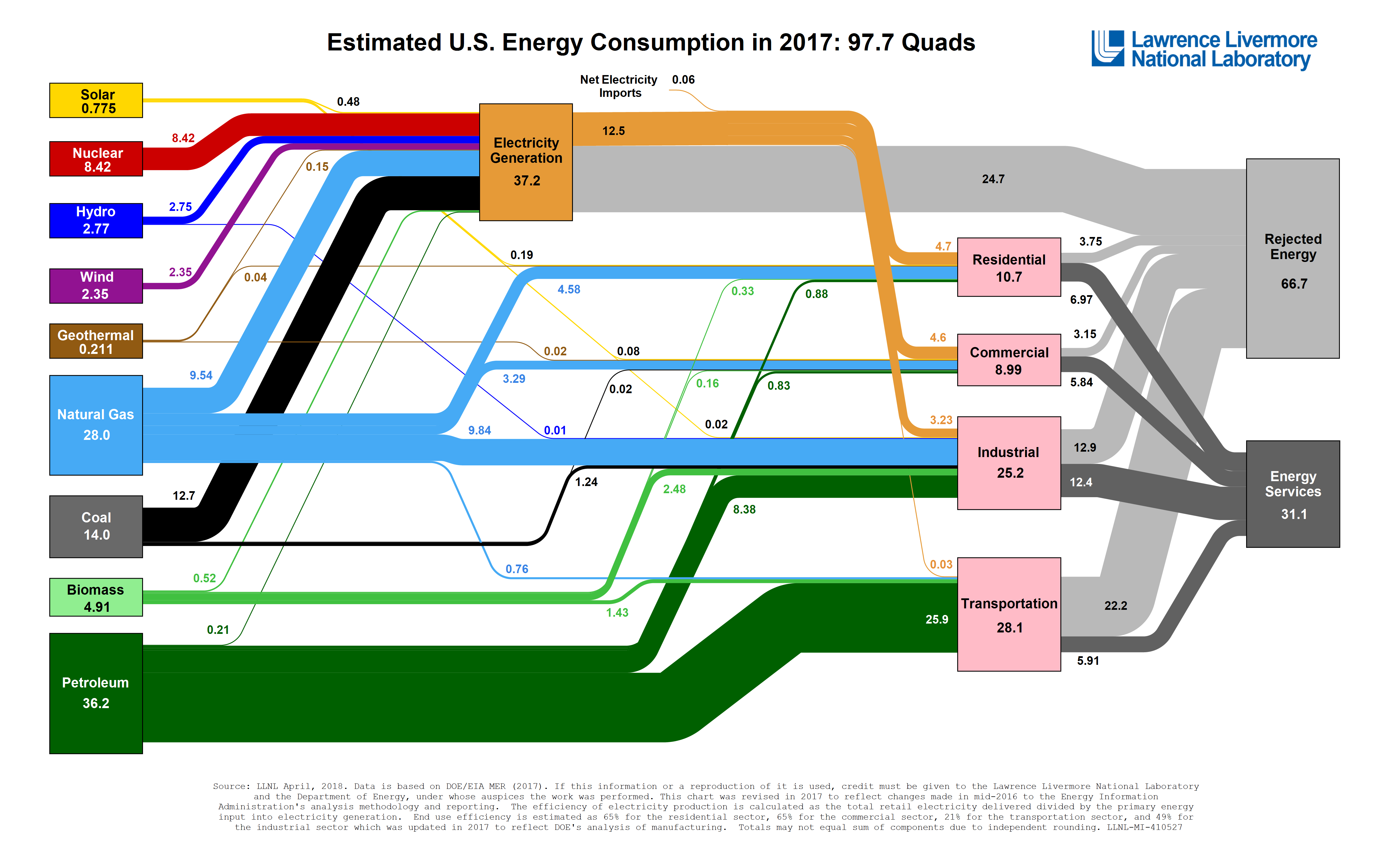
Lawrence Livermore National Laboratory published a new Sankey diagram displaying the American energy use in 2017. Click on the picture above to see this and other charts in the gallery of LLNL. Also, you are welcome to meet with an interesting analytics on TreeHugger and Vox, inspired by this latest chart of the US energy flow.
Choosing School in Chicago — DataViz-based Game
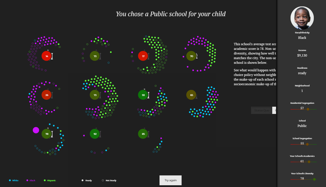
Gabrielle LaMarr LeMee created an interactive data visualization-based game to help us understand the level of segregation in Chicago schools. The project allows you to imagine you have a five-year-old son or daughter and to simulate the steps that might be taken when choosing a school for your kid to attend. Check out census data in another great action.
***
In addition, if you are interested in data visualization and data analysis, don’t miss out on our article about the regression analysis in AnyChart JS Charts.
We hope to see you again on our blog next Friday when a new DataViz Weekly post is expected to see the light and bring you another selection of cool dataviz examples.
Have an awesome weekend time!
- Categories: Data Visualization Weekly
- 1 Comment »