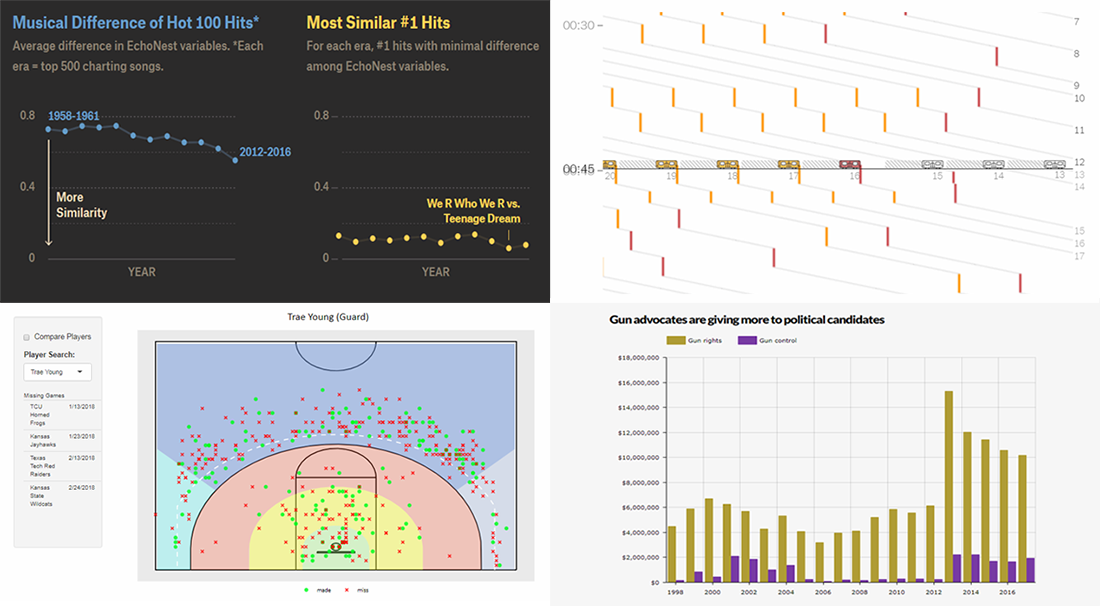
 DataViz Weekly is inviting you to check out new cool charts and infographics that we have recently found around the Web. Our today’s selection includes the following data visualizations:
- delays in the New York City subway;
- similarity of top pop music;
- NCAA basketball shot charts;
- guns and opinions in America.
Data Visualization Weekly: May 18, 2018 — May 25, 2018
NYC Subway Delays in DataViz
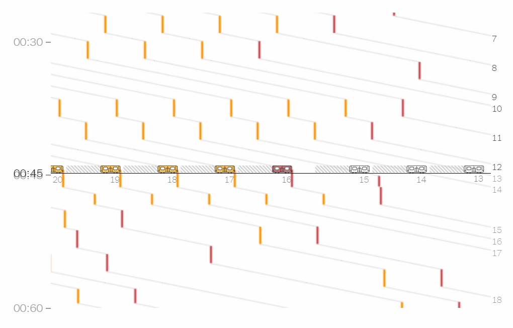
The New York Times’ graphics editor Adam Pearce presented a look into the state and origins of subway delays in NYC. In his article, you’ll find a lot of cool visualizations displaying specific data as well as what actually happens to the subway trains during the day.
Similarity of Top Pop Music
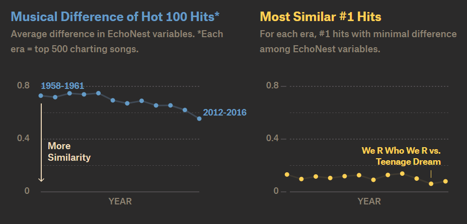
Has it ever occurred to you that some popular songs sound more or less the same? Here’s what data and charts say on that. The Pudding published an interesting story about the (further growing) similarity of Billboard hit songs.
NCAA Basketball Shot Charts
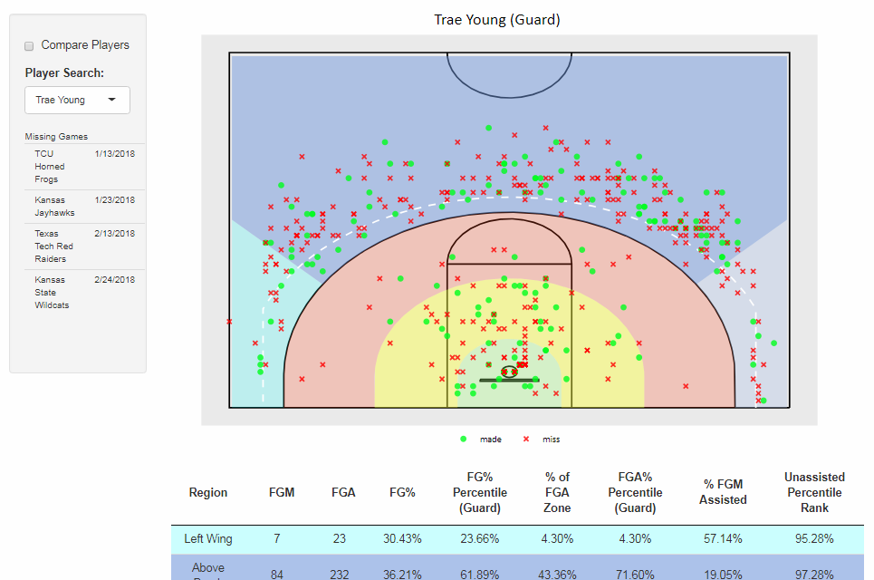
Will Schreefer made a cool NCAA basketball shot chart tool that graphically represents data about all the available 2017-2018 season games, which is about 40%. In addition to the court-based visualization showing the location from which all successful attempts and misses of every single one of over 4K players were made, there are tables for a deeper look into player shot statistics. It is also possible to compare the performance of any two players.
8 Charts on Guns in USA
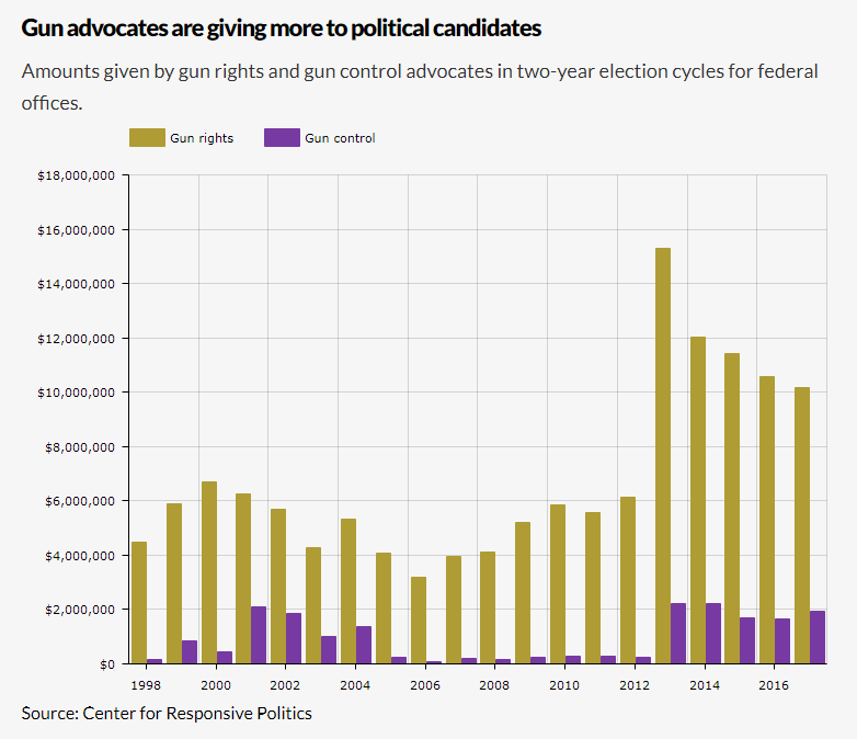
According to a new Gallup poll, the number of Americans who favor stricter gun laws has been growing over the last several years. Newsday’s Tom Brune decided to figure out what is going on in this field. Check out his outline of the situation in 8 simple charts.
***
That’s all for now, folks. Thank you for your attention. We hope you liked this new issue. And you are welcome to check out other articles within the framework of our Data Visualization Weekly feature for even more cool examples of charts in action. Don’t miss out on the next DataViz Weekly post next Friday.
- Categories: Data Visualization Weekly
- No Comments »