 Greet the new issue of Data Visualization Weekly! This time, we are glad to tell you about another four interesting data stories and projects we recently came across. Here’s what each of them is about, to start with:
- voting partnerships at Eurovision;
- Asia Power Index;
- distribution of Manhattan’s population, hour by hour;
- Ocean Color View.
Data Visualization Weekly: May 4, 2018 — May 11, 2018
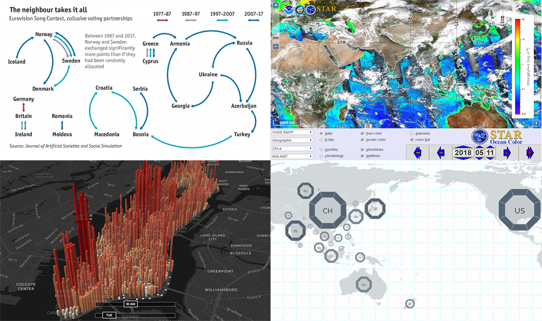
Voting Partnerships at Eurovision Song Contest
The 63th Eurovision song contest’s final will take place only tomorrow. But it is already possible to predict how some countries can be expected to vote. The Economist shared an interesting visualization charting data about alleged collusive voting partnerships at Eurovision. Refer to the source publication on the Journal of Artificial Societies and Social Simulation to learn more about the voting biases between the European countries at the Eurovision song contest since 1957.
Asia Power Index
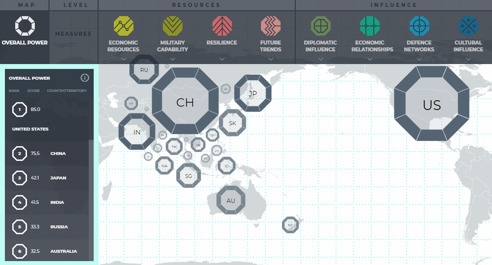
The Lowy Institute launched the Asia Power Index, an analytical tool that displays at a glance how powerful countries are in the Asia-Pacific region. It allows the distribution of power to be studied across 8 criteria and more than 100 indicators.
Distribution of Manhattan’s Population During Any Hour Of Week
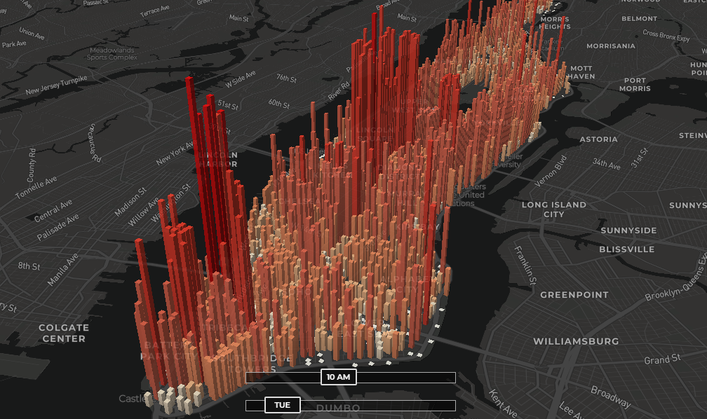
Take a look at this interactive map by Justin Hung to see how Manhattan’s population is distributed throughout the island, hour by hour. The visualization displays the population density estimates on a block-by-block basis.
Ocean Color View
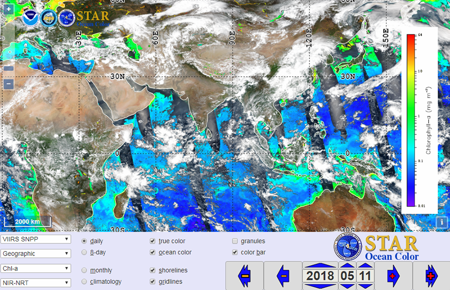
The National Oceanic and Atmospheric Administration (NOAA) launched the Ocean Color View project, aiming to interactively visualize ocean color data taken from a satellite. Read more about this data visualization tool on EOS and check out the Ocean Color View on the NOAA STAR website.
***
Charting data helps deliver it to us people in an effective way, and generally, speak. Keep following DataViz Weekly to learn about new interesting visualization examples we’ve come across, every Friday.
- Categories: Data Visualization Weekly
- No Comments »