 At a time when data is everywhere, anyone can find and look into various statistics about literally anything. But having something does not necessarily mean being able to make the best use of it. In our DataViz Weekly feature, we show you examples of how visualizing data can be helpful in (quickly) delivering much greater insights than raw numbers.
From today’s article, you’ll learn about four new interesting visualizations:
- map of diversity and segregation in America;
- sexual harassment complaints in statistics and reality;
- map of shipwrecks in Irish waters;
- NBA shot charts printed in 3D.
Data Visualization Weekly: April 27, 2018 — May 4, 2018
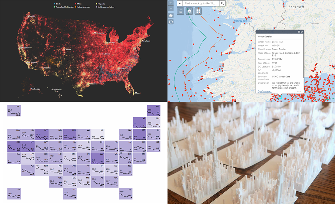
Map of Diversity and Segregation in America
The Washington Post found out that while the United States is increasingly diverse, some places in the country remain substantially segregated. Take a look at the results of the research and see how integrated the area where you live is in terms of race.
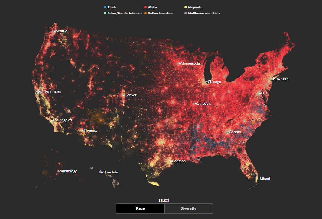
Sexual Harassment Complaints in Statistics and Reality
The number of complaints about sexual harassment in the United States has been falling and reached a 2-decade low in the year of 2017. However, experts say the main reason for this decline lies in the process of reporting complaints which is getting more private, so statistics can only reflect a part of what’s going on in reality. Check out the dedicated article on Bloomberg to see the charts visualizing data that’s been collected and to look behind it.
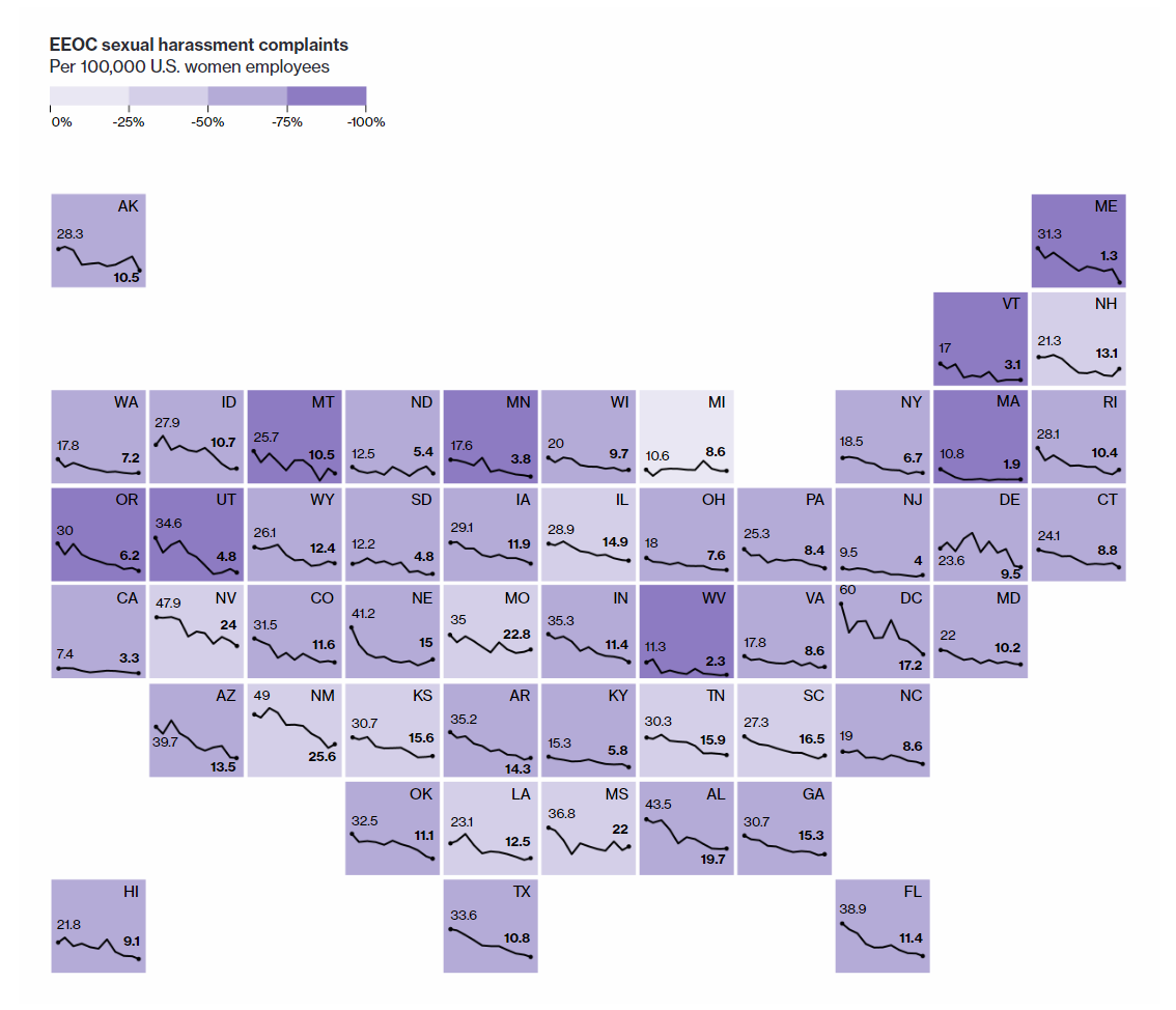
Wreck Viewer: Map of Shipwrecks in Ireland
Wreck Viewer is an interactive map displaying the information about thousands of shipwrecks that took place in Irish waters, both near Ireland and in the country’s inland waterways. Visualizing data from the Wreck Inventory of Ireland Database, the map only shows wrecks with a known precise location. The information on the others is also publicly available and can be downloaded. Generally, the database contains data about the entire maritime travel, “from prehistoric logboats to medieval trading vessels, warships and ocean liners.”
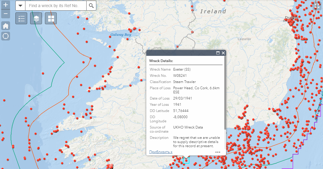
NBA Shot Charts Printed in 3D

While experimenting with 3D printing, Nathan Yau made awesome shot distribution charts visualizing favorite spots of several NBA players: James Harden, LeBron James, Kevin Durant, Stephen Curry, and more. Each cell represents 1 sq. ft on the basketball court, and the columns’ heights are on a log scale. Check out the article on FlowingData to see the charts, read about them, and meet the author’s takeaways from the experiment.
***
Thanks for staying with us. Have a great weekend time, and return to Data Visualization Weekly in a week for another selection of new interesting charts and infographics!
- Categories: Data Visualization Weekly
- No Comments »