 Can’t wait to see some more of cool information graphics and visualization-based stories? Well, this is the right place and now is the right time! Check out the new Data Visualization Weekly issue:
- Corruptions Perceptions Index by Transparency International;
- size of apartments available for $1,500 in every US city and town;
- mapping incomes across the US;
- visualizing outliers.
Data Visualization Weekly: March 2, 2018 – March 9, 2018
New Corruptions Perceptions Index by Transparency International
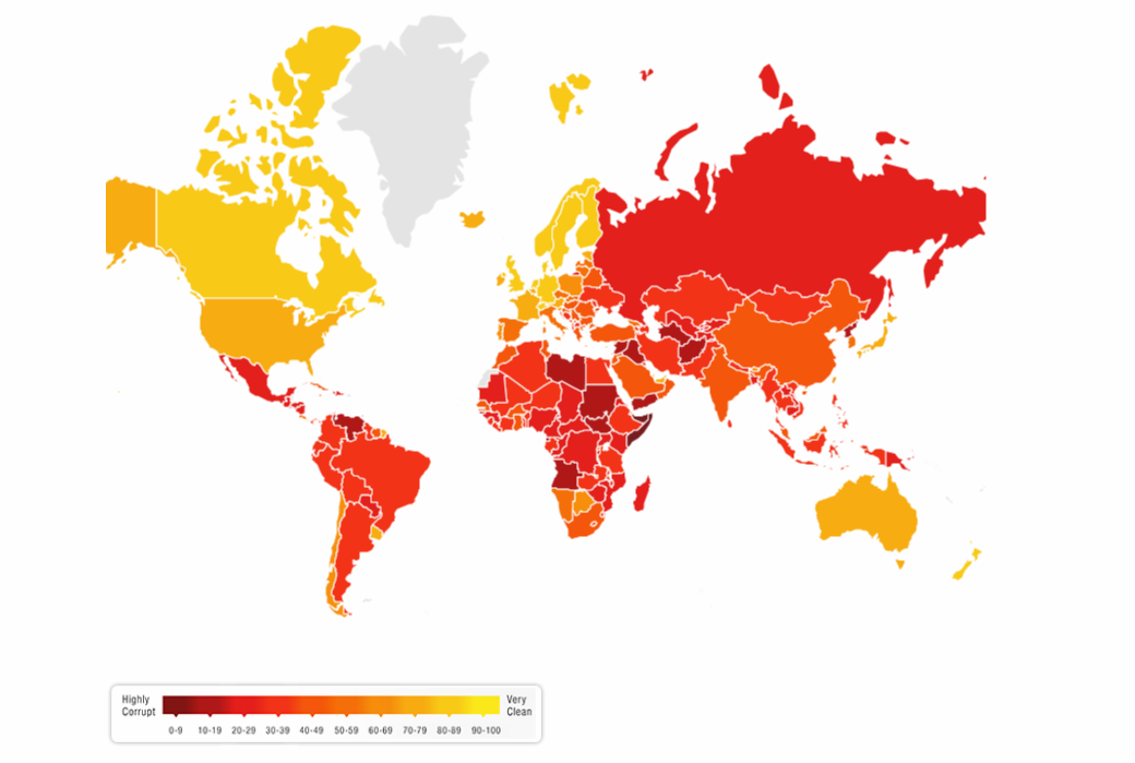
International non-governmental organization Transparency International released their new Corruption Perceptions Index. According to the expert conclusions, most of the countries saw no a little progress in coping with corruption. Well, a picture is worth a thousand words, so take a look at the announcement to see an interactive map showing how 180 countries scored this time, as well as learn more about the data right there.
Size of Apartments Available for $1,500 (by City)
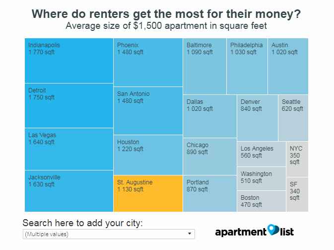
Apartment List, an apartment listing aggregator, made an interactive chart that displays how big apartments one could rent in what city and town across the US for $1,500. By default, the visualization shows the average estimated size for 20 large cities. But it is possible to select any other city or town from the dropdown list and see where data about it lands on the chart.
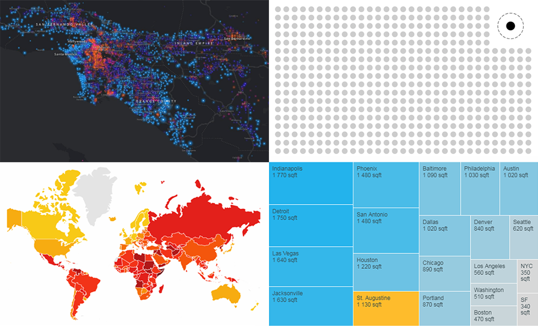
Mapping Incomes in US Cities
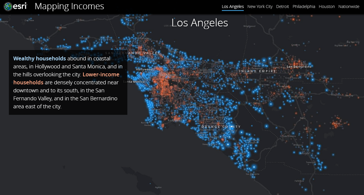
The Story Maps team at Esri made an interesting visualization-based story shining a spotlight on the income differences in several major US cities: Chicago, Los Angeles, New York, Detroit, Philadelphia and Houston. They also take a look at the situation nationwide. Check out the story in maps.
Visualizing Outliers

Join data visualization expert Nathan Yau on his blog FlowingData as he describes the options of how outliers can be visualized. Here you’ll find pros and cons for each of the available options and a lot of chart examples as illustrations.
***
That’s all for now, folks! We thank you for your attention to DataViz Weekly. Stay tuned.
- Categories: Data Visualization Weekly
- 1 Comment »