 A new Data Visualization Weekly post is here, bringing you another quick collection of interesting charts and infographics that we’ve come across just recently.
Let’s start with a list of the visualizations featured this time and then take a bit closer look at each of them:
- all space travels in one visualization;
- why wages lagged behind US job growth;
- Tesla Model 3 output;
- Treasury of Weary Souls.
Data Visualization Weekly: February 23, 2018 – March 2, 2018
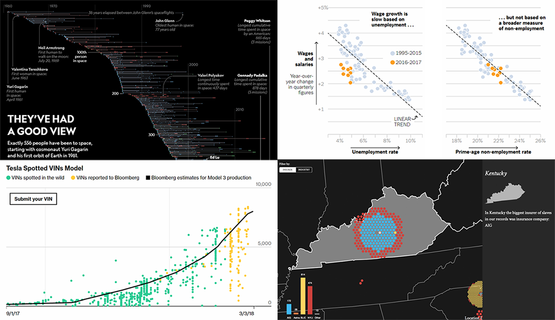
All Space Travels in One Visualization
National Geographic made a beautiful story about people who saw Earth from space. In particular, it features an interesting visualization a part of which is presented in the picture above. Take a look at the chart that shows the “careers in space” of the 556 space travelers, starting with Yuri Gagarin, displaying the length of their missions and when they happened.
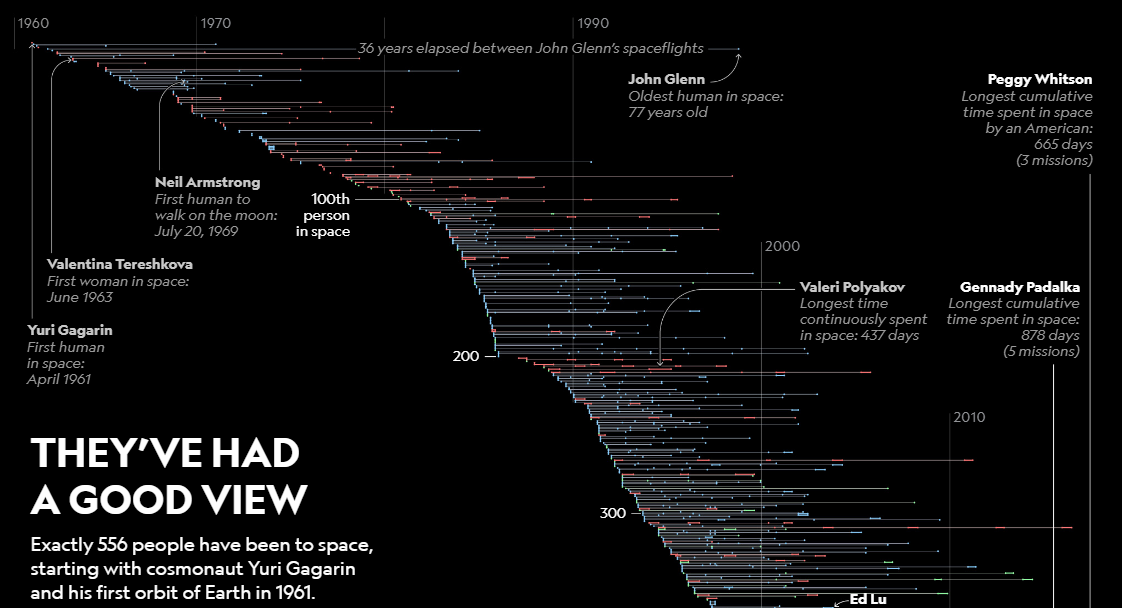
Why Wages Lagged Behind US Job Growth
The New York Times looked into why average wages in the United States do not grow as they should. Check out what six factors were found. In the article, you’ll find multiple charts that illustrate the situation in general and some of the factors in particular, based on data from the US Department of Labor (including specifically the Bureau of Labor Statistics) and the Federal Reserve Bank of St. Louis.
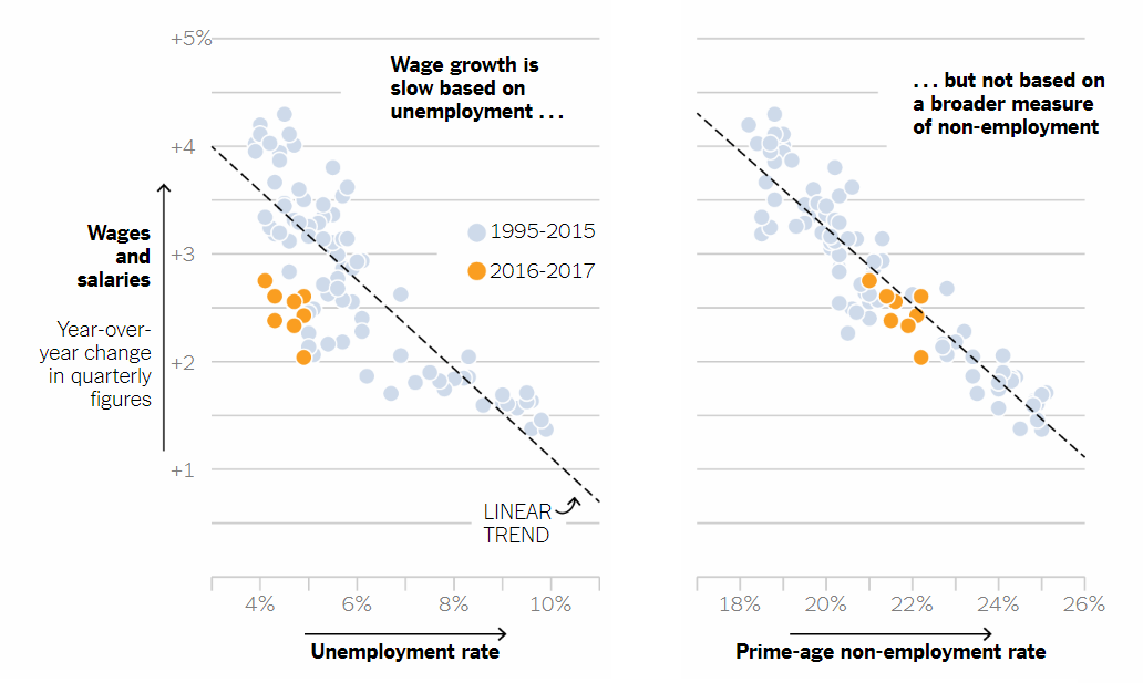
Tesla Model 3 Output
Tom Randall and Dean Halford from Bloomberg created an interesting special model to evaluate the weekly output of the Tesla Model 3 cars. Check out the charts they built as well as how (and why at all) all this was made.
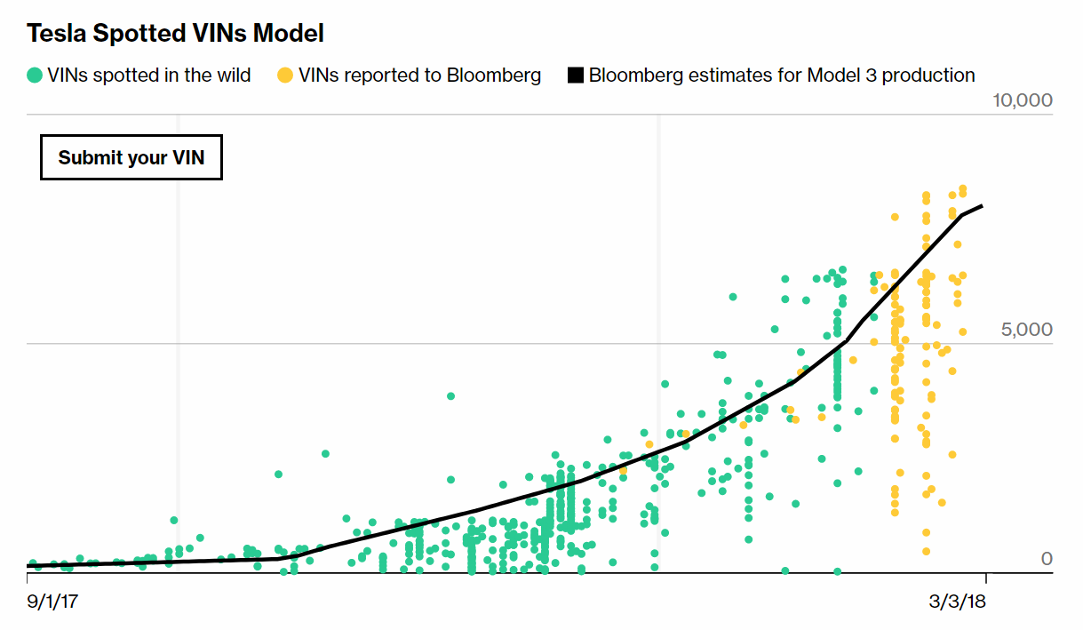
Treasury of Weary Souls: Visualizing Slave Insurance
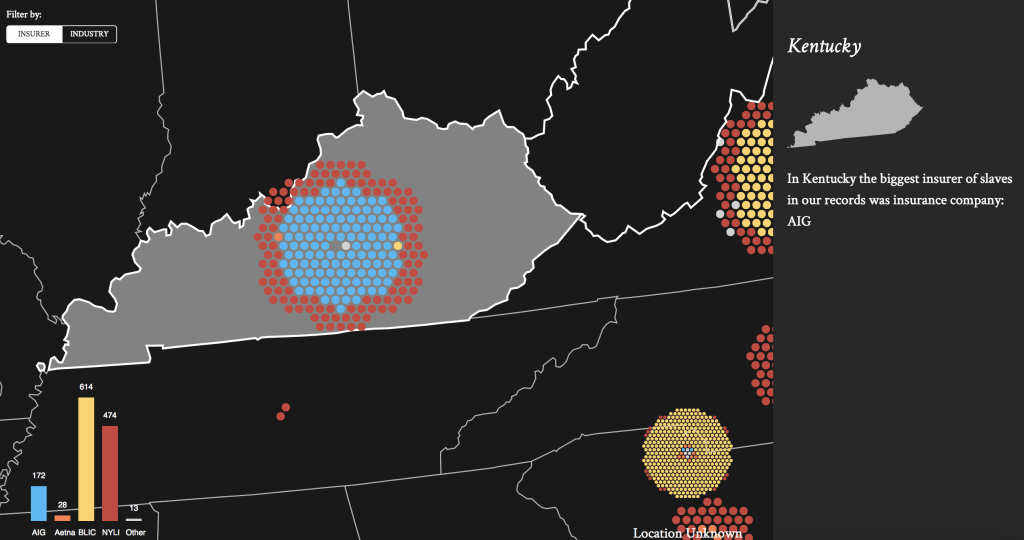
Made by New York University’s Michael Ralph and Resilient Coders’ engineers, the Treasury of Weary Souls project claims to be the most comprehensive ledger of the enslaved workers in America, including data on what financial firms hold what slave insurance policies. Read about it on TechCrunch and take a look at the map to learn more.
***
Thank you for your attention! Stay tuned for DataViz Weekly on our blog!
- Categories: Data Visualization Weekly
- No Comments »