 We know that our Data Visualization Weekly has been watched and read by many people. So we are glad to continue this series of posts and share the next one right now, presenting new cool charts showing various interesting data.
Today in Data Visualization Weekly:
- days between mass shootings in the United States;
- interactive world map of Christianity;
- how US citizens differ by age;
- what women and men think about careers and household tasks.
Data Visualization Weekly: October 13, 2017 – October 20, 2017
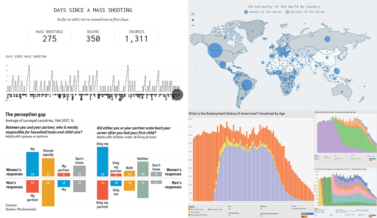
Days Between Mass Shootings in US
Nathan Yau took data from Gun Violence Archive and visualized it to see how frequently and regularly mass shootings take place in the United States.
According to this data, there was a total of 275 of them from January 1st, 2017 to early October. And we clearly see on the chart that so far in 2017, there were no more than 5 days without a mass shooting in the US.
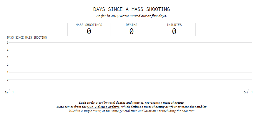
World Map of Christianity
To find out how Christianity is spread around the world, check out this interactive JavaScript-based bubble map in the gallery of the AnyMap JS Maps library by AnyChart. The visualization was well-received last week on the Data Is Beautiful subreddit on Reddit.
The map represents data from Wikipedia, by country. The size of each bubble reflects how many Christians live in a certain country. At the same time, the bigger the share of Christians in country’s population, the darker the color filling is.
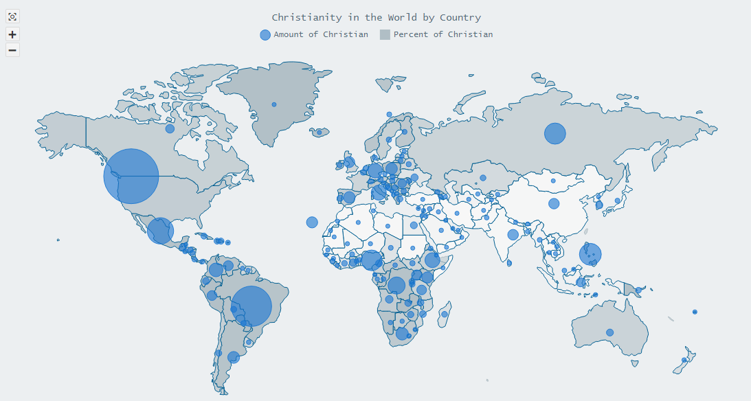
Charts Showing How US Citizens Differ by Age
Visual Capitalist published several charts showing how American citizens differ by age – in the level of education as well as marital and employment status.
It’s the big picture of the US population.
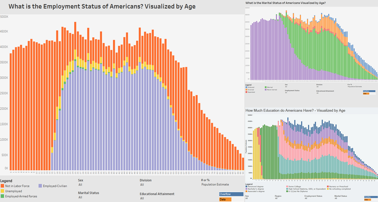
Careers and Household Tasks in Families: What Men and Women Think
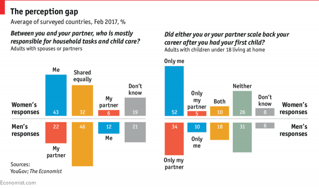
The Economist explored what men and women think about their partners’ careers and responsibility for childcare and household activities.
The chart pictured above displays the gap between women and men in the perception of who is mostly responsible for household tasks and child care as well as who, wife or husband, scaled back after their first child had been born. The article also features country-specific charts showing the same data.
***
Thank you for reading Data Visualization Weekly on our blog. Stay tuned as the next post will see the light as soon as next Friday.
Have a wonderful, amazing weekend time!
- Categories: Data Visualization Weekly
- No Comments »