 Imagine a week without any new interesting data visualizations, a week when nobody published at least one piece of dataviz that would be worth seeing… No way! Nowadays, at the times when data visualization is clearly well on the rise, the number of charts being created and shared is only growing day by day. So we are likely to always have something out there to choose from for our Data Visualization Weekly series. Well, this is definitely a good thing!
In the new weekly post, we are glad to present you with another set of interesting visualizations that have appeared and come to light only recently:
- Nine charts and infographics for visually comparing North Korea to South Korea.
- Germany’s recent election results.
- Wealth inequality between black and white families in America.
- Murder rate on the rise in the US.
Data Visualization Weekly: September 22, 2017 – September 29, 2017
Visually Comparing North Korea to South Korea
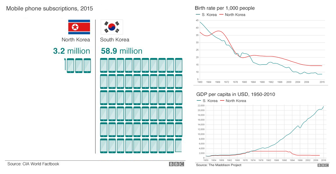
BBC shared nine charts and infographics that tell us more about North Korea through the lens of comparison to South Korea. Here you’ll learn about the number of mobile users, babies born, militaries, and some other peculiar facts.
Basically, BBC says these nine interesting data visualizations are “all you need to know about North Korea” so you should definitely check them out if you want to get a better idea of what life in North Korea is.
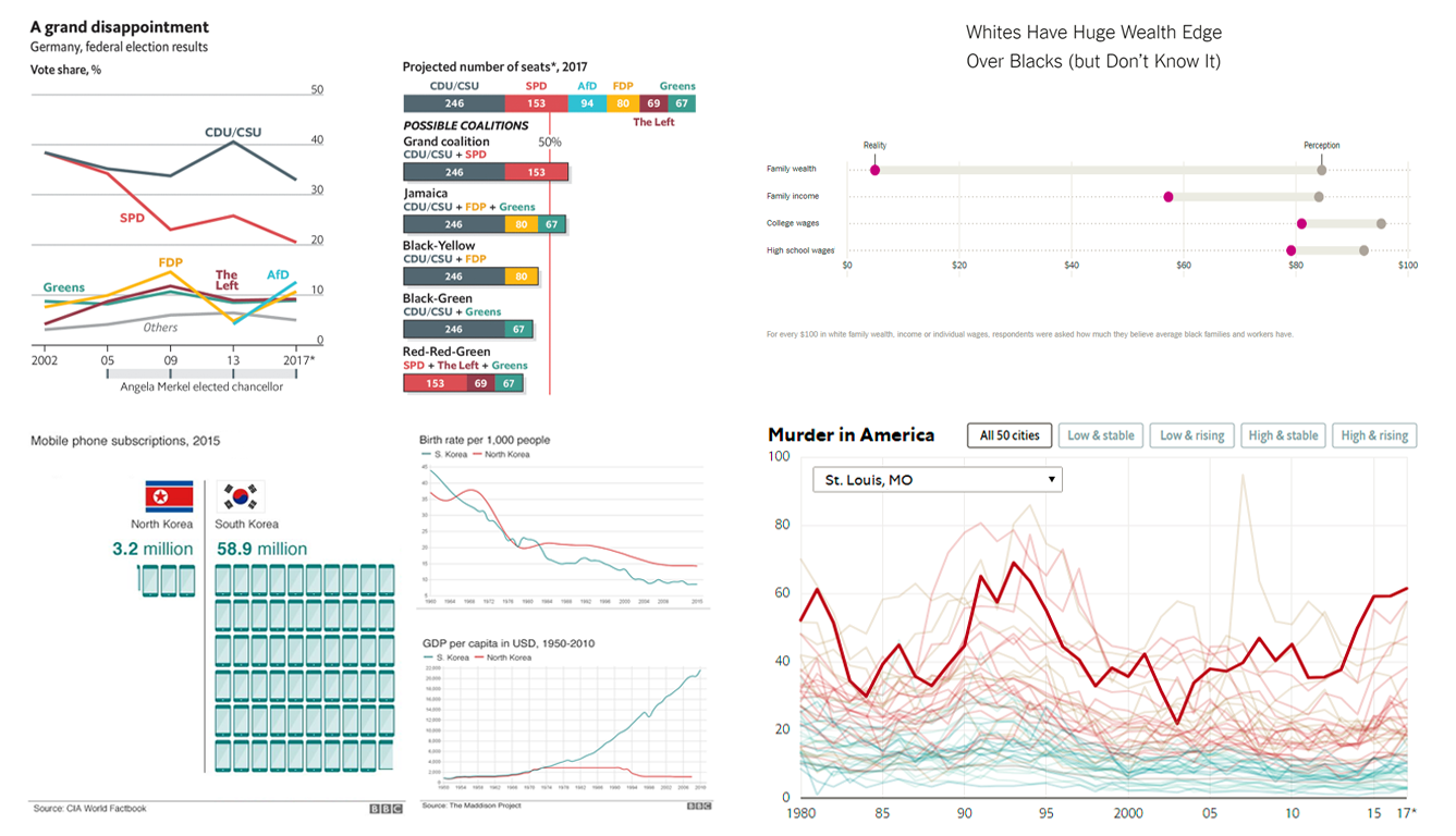
Results of Germany’s Recent Election in Interesting Data Visualizations
The Economist visualized and explained the results of the recent election in Germany. The two principal political parties there, the Social Democrats and the Christian Democrats, received the lowest combined share of the citizens’ votes since the immediate post-World War II period. At the same time, Alternative for Germany, a right-wing (actually, to far-right) party finished third and is expected to get 94 seats in the new Bundestag out of 709.
The multi-series line chart at the top of the article displays the share of votes for the leading parties since 2002. The stacked bar chart at the top right shows the composition of the new German national parliament and possible coalitions. In the article, you’ll also find choropleth maps of Germany showing the spatial perspective. The stacked area chart at the end displays how the Bundestag has been changing since 1949.
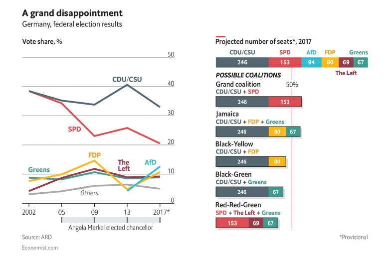
Wealth Inequality Between Blacks and Whites in US
Black families in the United States of America are reported to earn 57.3% as much as white families. Moreover, black families are reported to have accumulated only 5.04% as much wealth as white families hold. And even people who study inequality professionally are shocked at such a huge difference.
Join The Upshot as they are looking into the lack of equality in the US with the help of researchers from Yale University. In particular, the article features the chart revealing “a profound misperception of and unfounded optimism” regarding racial equality.
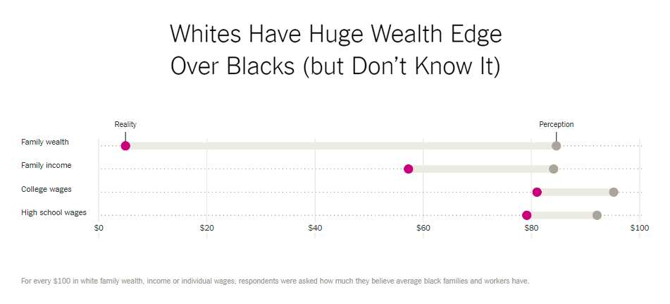
Murder Rate Rises in America
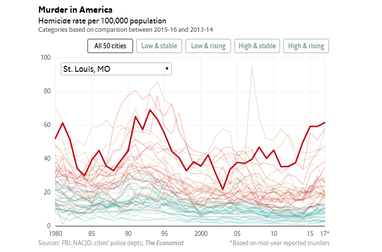
In 2016, the murder rate in the United States of America rose drastically. The Economist visualized data that sheds more light on this issue and also revealed the striking difference in the interpretations of the latest crime statistics.
Read the article to learn more and, of course, do not miss out on the set of interesting data visualizations published in the article. The small area and column combination charts at the top display the monthly numbers for murders in 10 cities, whereas the interactive multi-series line chart at the bottom shows the homicide rate in the top 50 largest (and most violent) cities in the US in 1980-2017.
***
That’s all for now, folks. Stay tuned as the next weekly post should be out in just another seven days. In the meantime, if you want, you are always welcome to browse other interesting real-world dataviz examples in previous Data Visualization Weekly articles, check out numerous interactive charting samples in our gallery, and quickly learn to visualize data with the help of AnyChart JS Charts. Thank you for your interest in data visualization and being with us!
- Categories: Data Visualization Weekly
- No Comments »