 Data visualization is one of those fields where knowledge of theory, of course, is very important but practice is basically everything. That’s why we keep sharing data visualization best practices and interesting examples every week to help you see how experienced data journalists and scientists make data speak and tell stories so you could learn from there and see what’s possible.
In today’s DataViz Weekly, you’ll find the charts delivering insights into the following:
- Better trained doctors prescribe fewer opioids.
- Male and female jobs nowadays and since the middle of the 20th century.
- The English Premier League is wealthy in money but mediocre in football.
- Enterprise BI platforms with majority cloud and on-premises deployments.
Data Visualization Weekly: September 15, 2017 – September 22, 2017
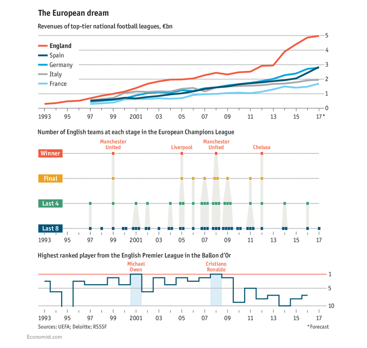
Training Doctors Better Can Reduce Opioid Addiction

Princeton University’s Janet Currie and Molly Schnell thrust the opioid prescription data into the spotlight and revealed an interesting trend. In 2006 to 2014, there was a strong correlation between the number of opioid prescriptions issued by a doctor and the rank of the medical school the doctor had been trained at.
While speaking about this study and its conclusions, The Economist shared a spline and marker combination chart that clearly shows the link.
Make sure to not miss out on the smaller marker chart to the right because it nicely illustrates another peculiar fact: Foreign-trained doctors prescribed fewer opioids than even Harvard Medical School graduates. At the same time, pretty much to everyone’s surprise, a big number of opioid prescriptions in the US came from osteopaths.
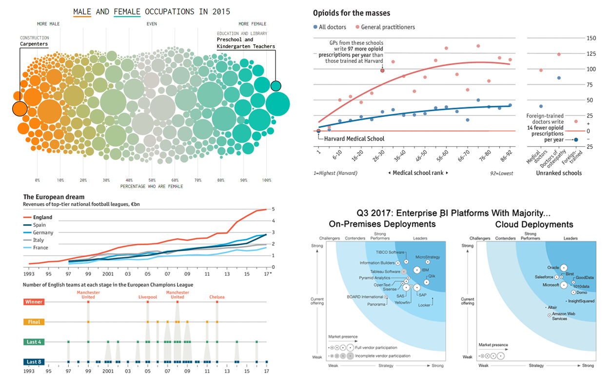
Male and Female Jobs Since Mid 1990s – Data Visualization Best Practices
Nathan Yau visualized another peculiar data from the American Community Survey to better understand the male and female occupations in the United States and how the situation changed between the years of 1950 and 2015.
Check out the Most Female and Male Occupations Since 1950 article on his blog to explore this data in a number of charts – definitely among the data visualization best practices as basically all the rest on FlowingData.
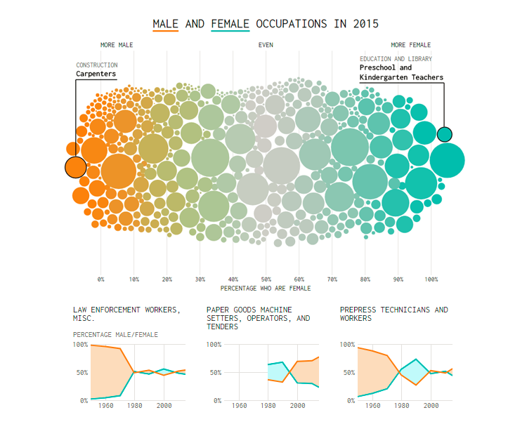
The English Premier League: Rich But Mediocre
The English Premier League is rich in money but mediocre in strength. The Economist published several interesting charts that nicely illustrate this contradiction.
The first visualization allows us to compare the revenues of the top five European football leagues during the last couple of decades. It explicitly shows that the English Premier League indeed remains richer than the rest. The other two charts basically prove the mediocrity in terms of lack of achievements on the international scene.
Enterprise BI Platforms with Majority On-Premises and Cloud Developments
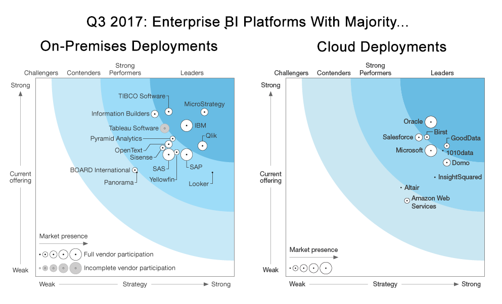
Forrester made a research of enterprise business intelligence platforms with majority on-premises and cloud deployments. They used 22 criteria for the analysis and visualized the resulting data on charts.
Check out these visualizations and you’ll quickly notice that Oracle, GoodData, Birst, and 1010data are the leaders among the enterprise BI platforms with majority on-premises deployments, whereas MicroStrategy, IBM, Qlik, and TIBCO Software take the cloud deployments lead.
***
New data visualization best practices and various chart examples are what you obviously would like to see and learn about in good time if you are a data enthusiast. Well, that’s exactly what our Data Visualization Weekly series provides and is all for! Stay tuned, and next week we’ll present you another four interesting charts, maps, or even complex interactive dataviz projects – let’s see in seven days.
Have a great weekend, guys!
- Categories: Data Visualization Weekly
- No Comments »