 Visualizing data is a great way to communicate it to people and ensure its better, more insightful perception. That’s why charts and dashboards have already become so widespread.
We continue the Data Visualization Weekly initiative to let you learn about new and interesting dataviz examples on a regular basis. This article showcases another four of them that might serve well for inspiration or simply help you get a better understanding of some facts and processes taking place out there in the world.
Data Visualization Weekly: September 8, 2017 – September 15, 2017
Cost of Natural Disasters in America
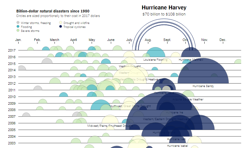
The New York Times’ The Upshot created an impressive visualization displaying the costs of the most expensive natural disasters that have taken place in the US since the year of 1980. The article named “The Cost of Hurricane Harvey: Only One Recent Storm Comes Close” tells first about Hurricane Harvey which hit Houston just recently.
Estimated at $70-$108 billion, Harvey is likely to become the second most expensive hurricane. Only Katrina in 2005 was worse with $160 billion. Check out the interactive chart and the article on The Upshot to learn more and compare the most devastating natural disasters by cost in 2017 US dollars.
Visualizing Data About Natural Disasters and Reported Deaths Worldwide
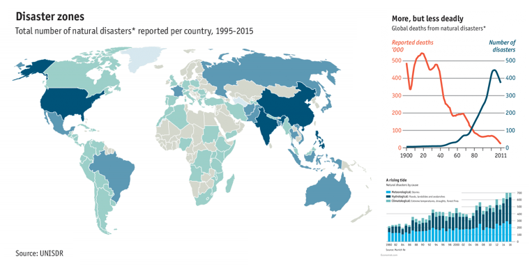
The Economist also shared charts visualizing data about natural disasters and their impact. The publication focused on global data and, in particular, found out that although the number of disasters increases, the number of human deaths they cause is falling due to various safety measures getting improved day by day.
The world map at the beginning of the article shows the number of natural disasters that happened around the world during the period between 1995 and 2015. The small line chart just below displays their total against the total number of deaths they caused, starting from 1900. There is also a stacked column chart in the article that supplies insights into the nature of disasters that took place between the years of 1980 and 2016: meteorological, hydrological, and climatological.
US Pension Fund Problems Visualized
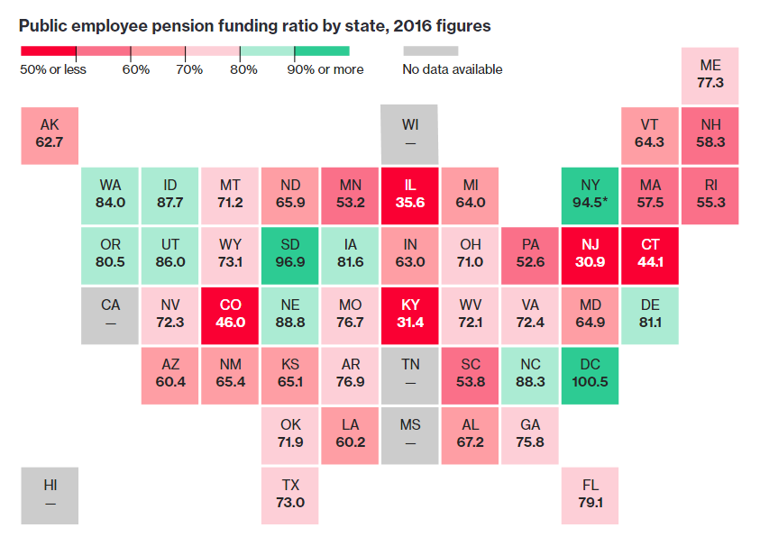
Bloomberg visualized the US public pension funding ratio data by state. And now we can clearly see how dangerous the situation in that field is out there.
The map chart in the article graphically represents each state’s pension funding ratio. In fact, only DC and six states have managed to narrow the funding gap within the latest time.
Visualizing Data About Dynamics of Migration to Britain
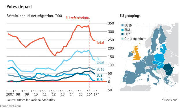
The Economist is one of our favorite publications, and we are glad to mention its other dataviz here. This one is about migration to Britain clearly falling down after the vote of the country to leave the EU. The line chart here shows how many people have come to Britain from EU8, EU15, and EU2 along with the total across all the EU countries during the last decade.
***
That’s all for today. For more cool examples of visualizing data check out our previous Data Visualization Weekly articles and stay tuned to the next issues. To create your own beautiful charts, see the AnyChart documentation and API.
- Categories: Data Visualization Weekly
- No Comments »