 It is no exaggeration to say that we encounter various examples of data visualization all the time, maybe even multiples times per day. Indeed, charts and infographics are a great tool to explore (and explain) diverse kinds of information. Data Visualization Weekly aims to highlight some peculiar examples of data visualization every week to let you quickly learn more about topical issues, funny life revelations, and so forth, not to mention getting inspiration for making your own visual presentations of data.
The new article in this series will show you four more of worth seeing examples that shed light on oil demand forecast, population change in Michigan, adult lifetime, and EV emissions data. Here they are.
Examples of Data Visualization in DataViz Weekly: June 9, 2017 – June 16, 2017
Global Oil Demand Perspectives: Chart of Different Forecasts
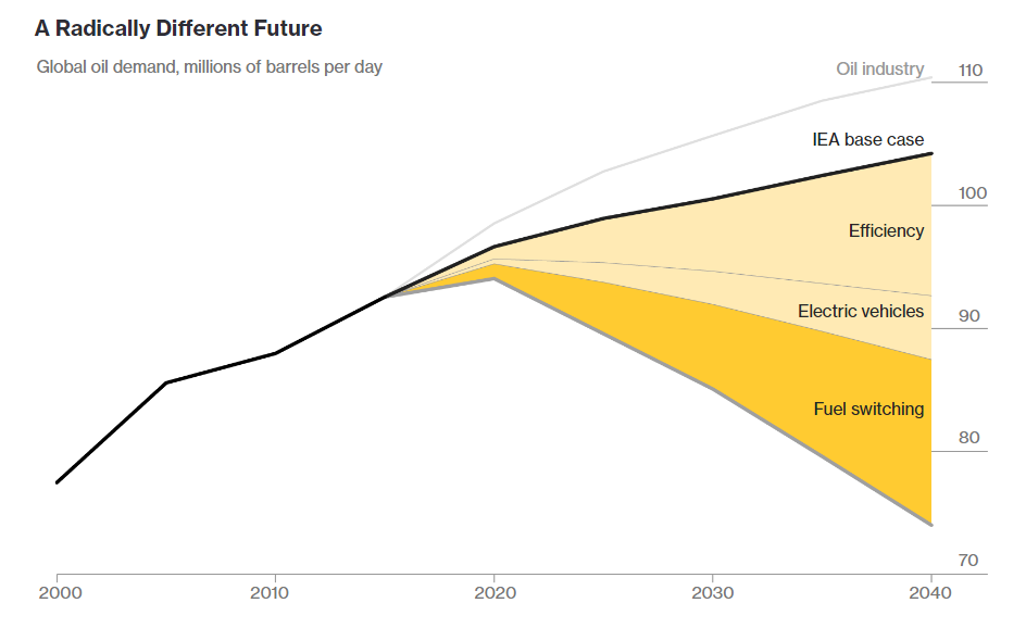
Companies and countries that produce oil see nothing but growth in the global oil demand, at least during the next few decades. However, there are different scenarios. Bloomberg shares some projections regarding the global oil demand and a lot of cool graphs for illustration mostly based on data from the International Energy Agency – in essence, peculiar examples of data visualization and how it helps understand current/future trends.
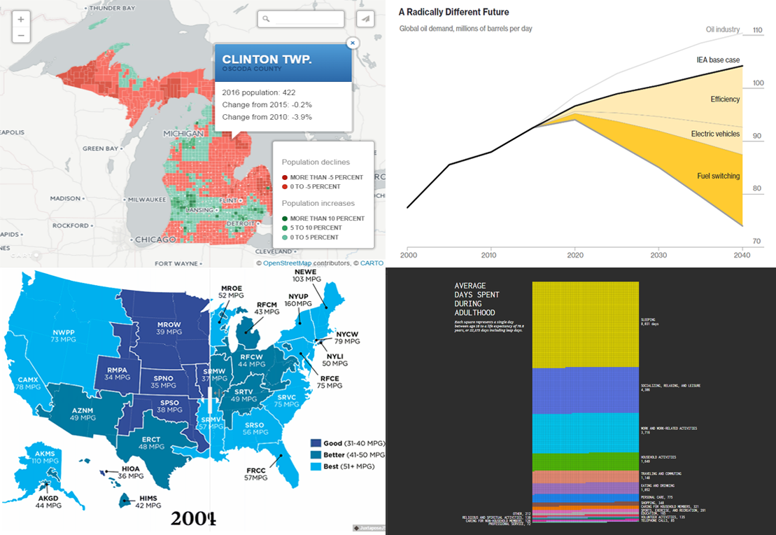
Map Example of Michigan Population Change by Community
Last month the US Census Bureau published population estimates. The Michigan data is graphically represented on this interactive map shared on Crain’s Detroit Business along the five key takeaways. Check it out to learn more about the population changes in the state of Michigan and its communities.
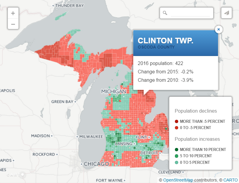
Visualizing Data on How Adults Spend Their Lifetime
How many days during a lifetime does the average adult sleep, socialize, work, or do anything else? This nice example of data visualization based on the American Time Use Survey’s information will tell. See the full-size version of this chart along with its explanation on FlowingData.
Global Warming Emissions from Electric Vehicles (EV)
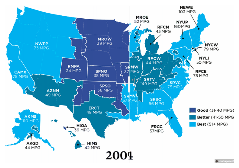
Union of Concerned Scientists published an updated version of their answer to the question of how clean electric cars are. The visualization of the United States Environmental Protection Agency’s new data allows us to assess the situation with EV emissions in 2009 against the more actual figures of 2014.
#Globalwarming #emissions from #electricity generation have fallen in https://t.co/YfwaAL6fHf via @UCSUSA #electriccars #ev #dataviz #map pic.twitter.com/ZuZJsaviY6
— AnyChart (@AnyChart) June 16, 2017
Enjoy the new issue of our weekly series. Get another portion of inspiration with these nice examples of data visualization. Learn more about life and the world around us.
And stay tuned to Data Visualization Weekly brought to you by AnyChart JS Charts. See you next week with more charts!
- Categories: Data Visualization Weekly
- No Comments »