 Data is beautiful. And the Data Visualization Weekly series brought to you by AnyChart JS Charts is designed to prove that every time. Today we’ll take a look at another four cool visualizations of peculiar. They have seen the light just recently but are already famous.
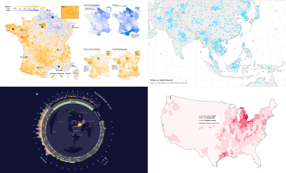
This article introduces the following stunning data visualization masterpieces:
- charts (and a map) of the relationship between robotic automation and unemployment;
- French presidential election results in five maps;
- interactive visualization of international trips of POTUS and US SecState in 1905-2016;
- map of 1,746 adults’ guesses on where North Korea is located (and what they think should be done about it).
Data Visualization Weekly: June 2, 2017 – June 9, 2017
More Robots in Workplace, Less Jobs: Map and Charts
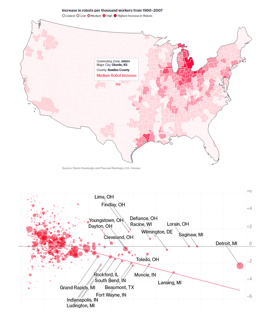
Bloomberg dug into data about robotization of the US economy and employment to understand if there’s a strong relationship between them. In this article, you’ll find a lot of data visualized in beautiful charts, including bubble, column, line graphs and a choropleth map. The overall trend is clear: More robots means fewer jobs. However, that is not the only factor affecting the employment.
Election Data is Beautiful: Maps Showing Why Macron Beat LePen
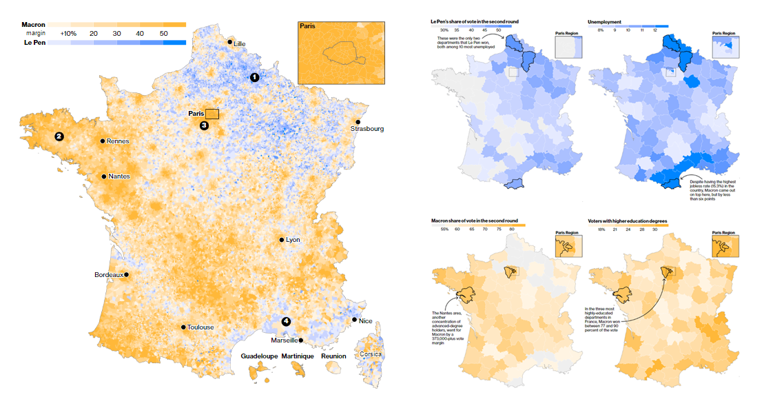
Emmanuel Macron, an independent candidate, won the presidential election in France. Check out the beautiful geographical data visualizations on Bloomberg that can shed some light on the roots of the second-round outcome, including in what regions (and why) far-right National Front party’s Marine LePen succeeded.
Visualizing International Trips of US President and Secretary of State Between 1905-2016
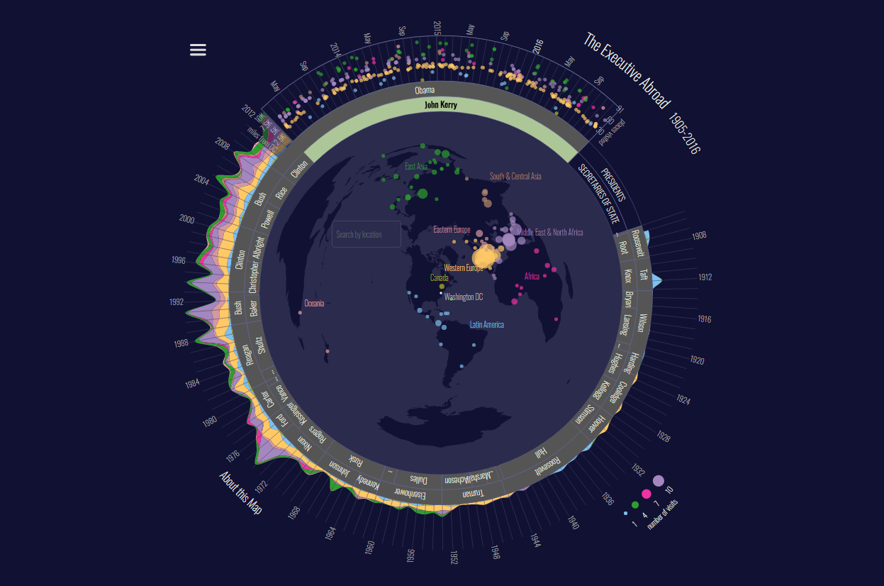
The Executive Abroad is a stunning visualization of data about all the international trips of US secretaries of state and presidents between 1905 and 2016. As a matter of fact, no American president went abroad before Theodor Roosevelt. Nowadays, an international visit is by far not a rare unicorn.
Where Is North Korea? Guesses from 1,746 American Adults Visualized
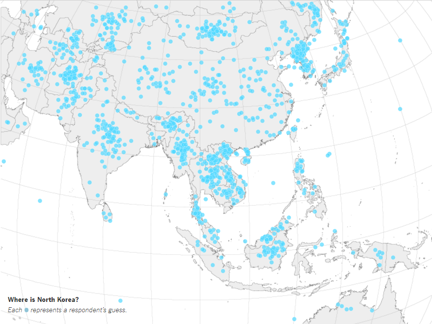 Americans were asked where North Korea is and what they want the US government to do about this country. The Upshot visualized the results. You can see a huge distribution of 1,746 adults’ guesses on the map above. Basically, just 36% of them were right. Check out the article to see the same map but with country names, if you are unsure; there’s also great data and more charts included so you better understand which groups were most successful in terms of age, gender, party, education, etc.
We appreciate your attention and hope you’ve enjoyed this new issue of Data Visualization Weekly. Indeed, data is beautiful. Just be considerate and neat when visualizing any information, select right chart types, pick appropriate chart captions, and choose the best charting library – and you’ll be able to keep and even enhance the beauty of your data by representing it graphically.
Have a great, wonderful weekend!
- Categories: Data Visualization Weekly
- No Comments »