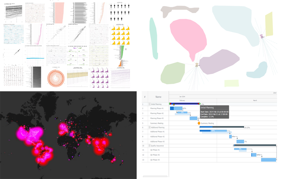
 25 data visualization examples of how you can present the same dataset, an animated map of Twitter users’ reaction during this year’s Oscars, JavaScript-based self-driving cars, and an interactive Gantt chart sample with customized connectors in the Live Edit mode. These are the masterpieces that we are highlighting in today’s Data Visualization Weekly post.
Without more ado, let’s get to our latest collection of popular and most shared new charts from around the Web.
DataViz Weekly: March 10, 2017 – March 17, 2017
Same Dataset in 25 Data Visualization Examples
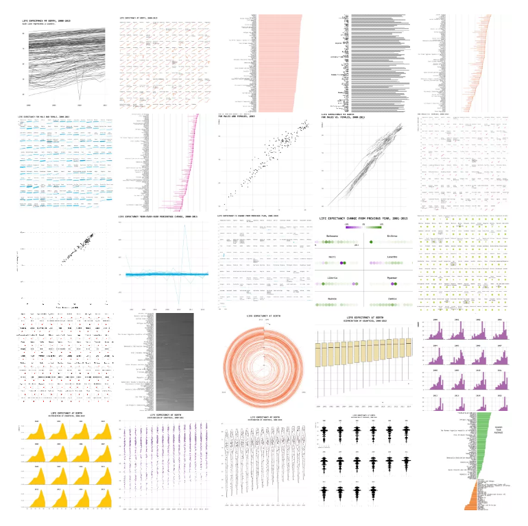
One Dataset, Visualized 25 Ways is an amazing experiment and a great practical guide for all data visualization professionals, not only beginners. Nathan Yau took the World Health Organization’s data about life expectancy in approximately 200 countries and presented it in 25 different charts. As you’ll see, each visualization supplies its own interpretation and emphasis.
Check out this project, either for education or just for fun, because it’s actually worth taking notice of.
Self-Driving Cars Within Browser
 Self-Driving Cars in the Browser is a very nice interactive project. It shows the power of machine learning and JavaScript-based data visualization in action. The author, Jan Hünermann, was going to develop “a fully self-learning agent, that would be able to control a car in a 2D bottom-down environment”. Finally, he came up with an appropriate model and created a cool demo which anyone can easily play with.
There are two cars in this visualization, cruising between initially added (or drawn with your mouse right now) obstacles that they must avoid. Here you’ll also find all the technical background in case you are interested.
Twitter Reactions to Oscars 2017

The A.V. Club published several animated map-based data visualization examples that reveal how Twitter users reacted during the Oscars 2017 ceremony. There are two peculiar moments that were researched here. The first one is about Gary and his fiancee. And the second situation that came to the spotlight is the confusion with the Best Picture announcement (remember that mistake when La La Land was named winner first, not Moonlight that got the award in a few minutes).
Interactive JS Gantt Chart with Styled Live Edit Controls
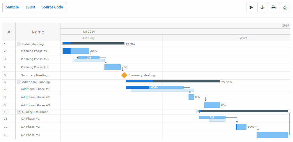
The 7.13.0 release of the AnyChart JS Charts product family delivered a whole bunch of new features and further major improvements to our interactive data visualization solutions. In particular, the opportunity to customize controls in Gantt charts powered by AnyGantt, when the Live Edit mode is enabled, was very well-received among our customers and followers on social networks. So, we couldn’t help including the cool charting example here that showcases this new feature in action.
Check it out and play with it. As always, the full source code is also provided so you could use the sample as the basis for a similar visualization in your own project management applications.
There you go folks! Don’t miss out the next issue of the Data Visualization Weekly publication to get another portion of inspiration. See you in a week!
- Categories: Charts and Art, Data Visualization Weekly, News
- No Comments »