 Now it’s time to say hello to last week’s most eye-catching data visualizations. As always, choosing just some of the best new and most popular pieces is a difficult task. But we are more than glad to do that for Data Visualization Weekly! And please don’t stop making more and more charts, people! That’s pleasant and greatly inspiring to see so many cool data visualizations emerge every week. Examining them also allows all of us to keep learning from the best practices, expand the vision, and further improve skills and understanding.
Today’s Data Visualization Weekly issue highlights the following four great presentations:
- animated map of shipping in the San Francisco Bay;
- interactive visualization of statistics and probability;
- Voronoi diagram of the global economy;
- “frog” column chart of whatever you need.
DataViz Weekly: March 3, 2017 – March 10, 2017
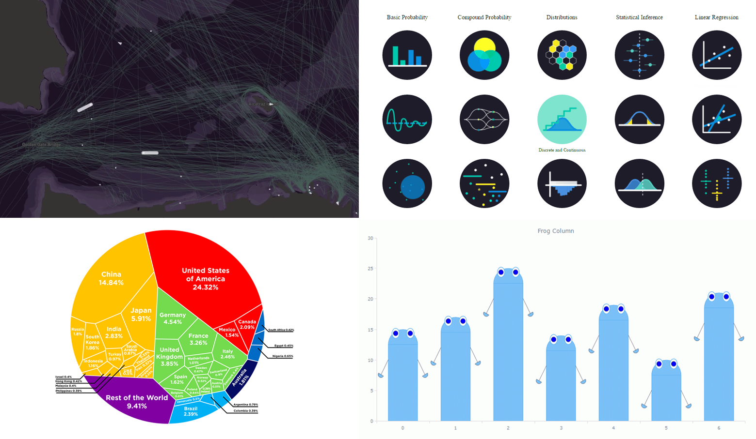
Animated Data Visualizations Reveal Frantic Shipping in San Francisco Bay
 A typical day in the San Francisco Bay is very busy. Take a look at these examples of cool data visualizations of the frantic shipping life here that shed light on how crowded with ships is this area. Another exciting sort of insights we get from exploring this map is how exactly ships, especially bigger ones, navigate in the San Francisco Bay.
Seeing Theory: Visual Introduction to Probability and Statistics
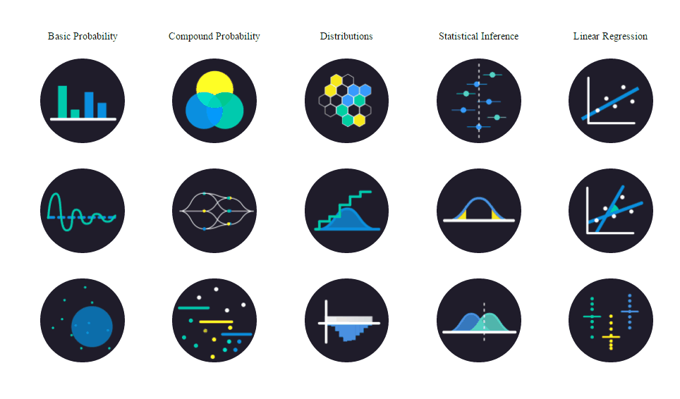 Seeing Theory is a great educational project that explains probability and statistics by means of interactive data visualizations. As a result, students and everyone else who is interested can use it to quickly the fundamentals in this field. In particular, the project greatly describes and visually represents variations of the basic and compound probability, distributions, statistical inference, and linear regression. Click on the types’ icons to learn (much) more of each option.
Global Economy by GDP: Voronoi Diagram
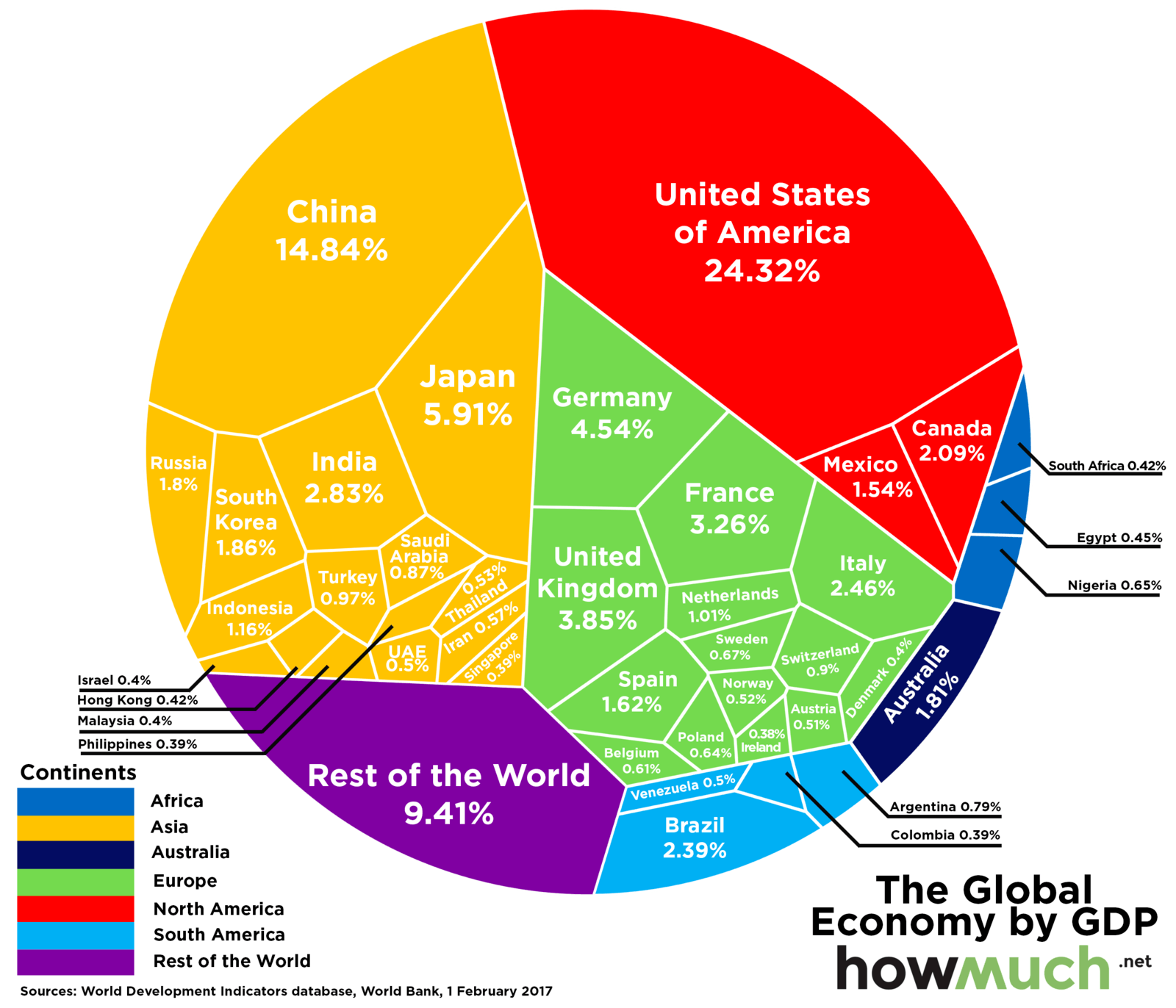 The World Bank published new global GDP data. And Howmuch nicely visualized it with the help of a Voronoi diagram. Here we see that the United States takes the lead, generating more than 24% of the overall global GDP, i.e. over $18 trillion. The second biggest economy in terms of GDP is China. Japan is on the third place.
JS Frog Column Chart Sample for Data Visualizations
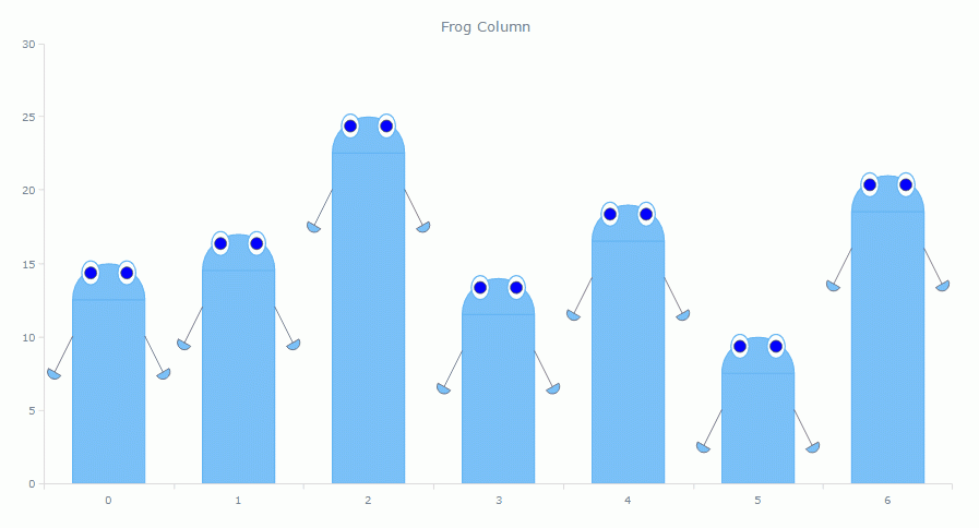 The JS Frog Column chart (click to see it live, in the interactive version) visualizes fictional data. But it looks cool, so people liked it much. And it is a great demo of the Custom Series Drawing feature just added with the recent 7.13.0 release of our JavaScript charting libraries. This new out-of-the-box option helps draw and make use of any amazing series you can imagine. So it eliminates the boundaries of the possible in AnyChart in terms of series customization. More examples of custom series drawing can be found in our chart gallery.
Thank you all for your attention to the new Data Visualization Weekly issue! We hope you liked the recap of the week.
Have a great weekend!
- Categories: Charts and Art, Data Visualization Weekly, News
- No Comments »