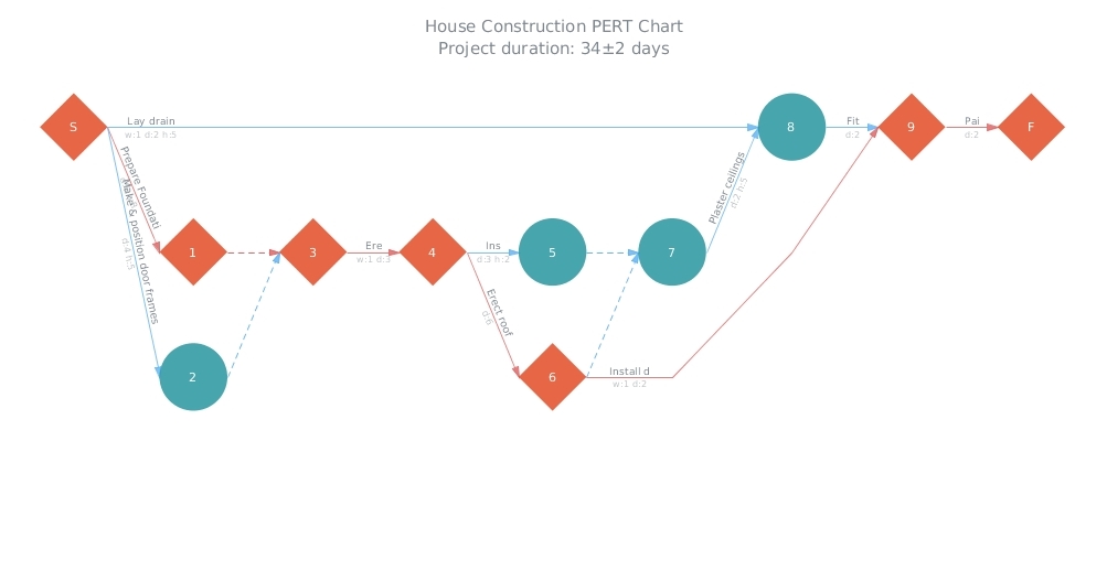
Here is a quick recap of the visualizations that we have shared with you this week on AnyChart Facebook Page and in Twitter (including an HTML5 PERT Chart by AnyGantt):
- Where Europe is most and least innovative, in 6 maps (a data visualization by The Washington Post) – The continent’s most creative and productive regions are in Germany, France, Britain and the Nordic countries. Southern England, northern Denmark, southern Germany and Paris are particularly successful — whereas Romania, Poland and Spain have disproportionately more regions that lack innovation.
- Pokémon dual-type charts – looks like playing Pokémon Go is not that easy!
- Global Sharknado Threat Map – Created by an unprecedentedly cross-discipline team of nameless chain-smoking scientists in white lab coats, this map is intended as a resource to coastal communities regarding the nature and likelihood of a sharknado incursion. Right?X
- House Construction (HTML5 PERT Chart by AnyGantt). In AnyGantt 7.11.0, we have added a new decision-making tool – PERT Charts. PERT is an abbreviation for “Program (Project) Evaluation and Review Technique”. This technique, developed by the U.S. Navy in the 1950s, is used in project management to analyze and represent the tasks involved in completing a given project. It is applied mostly in large-scale projects where time is the major factor and allows to schedule a project without knowing precisely the details and durations of all activities. For example, PERT was used in planning the 1968 Winter Olympics in Grenoble. You can see more samples of AnyGantt PERT charts in our PERT Chart Gallery.
- Categories: AnyChart Charting Component, AnyGantt, HTML5, JavaScript, News
- No Comments »
