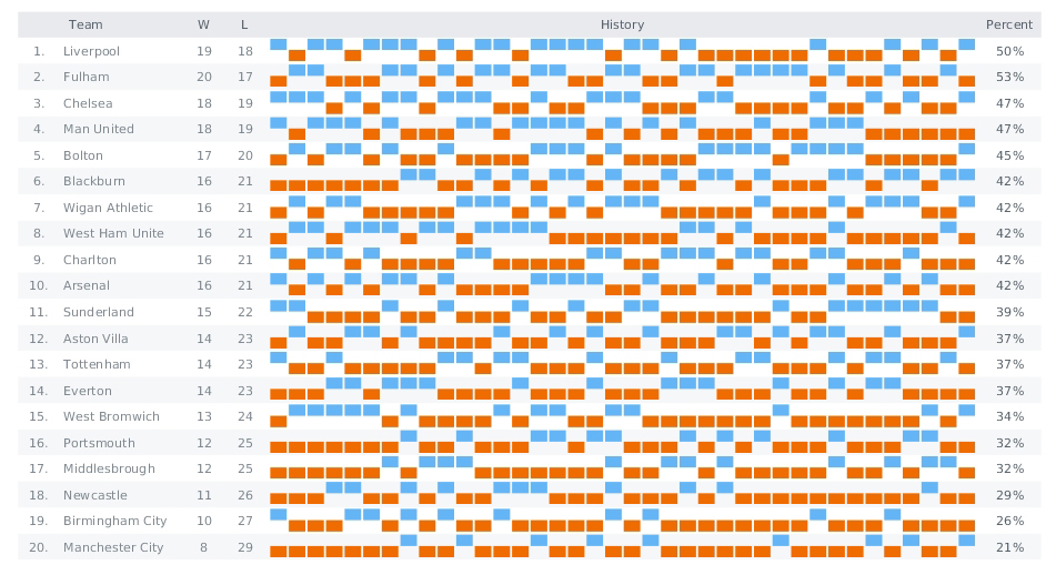
This week we have posted on AnyChart Facebook Page and in Twitter the following data visualizations (including WinLoss – a JavaScript Sparkline chart by AnyChart):
- FBI vs Apple Map – Want to know where your state sides on the Apple vs FBI debate? Check its voting record. While the FBI and Apple case is on hiatus until April 5, the public debate rages on about whether Apple should assist the FBI in unlocking the San Bernadino shooter’s iPhone. Turns out, it’s pretty easy to find out if your state supports Apple or the FBI: just look at its voting results from the 2012 presidential election. This map on The Next Web clearly demonstrates the correlation.
- The SORTING project by Carlo Zapponi is an attempt to visualize and help to understand how some of the most famous sorting algorithms work. This project provides two standpoints to look at algorithms, one is more artistic, the other is more analytical aiming at explaining algorithm step by step.
- Who is the oldest person in the world? What are the worst games ever made? What is the best way to visualize data on marijuana laws? Enjoy this selection of 47 weirdest charts from 2015 (picked up FiveThirtyEight), and you will learn everything you need and do not need to know!
- WinLoss (JavaScript Sparkline chart by AnyChart) – Sparklines are small charts: lines, areas, or columns without labels and any decorations. They can be intertwined with text or placed into table cells. While most of chart types are aimed to present as much data as possible, sparklines is a way to focus on the main point of interest and create a compact data visualization. These charts are good at showing a general shape of any measurement; there is also a special type of Sparklines (called WinLoss) that is used predominantly for scores in sports and games. It shows no values but positive and negative positions. Here we see a score table for English football teams. The first and second columns contain the numbers of the teams and their names, the two next columns contain win and loss scores, and in the fifth column, which is the widest, there are WinLoss SparkLines. Negative values are colored in red, and positive ones are blue. The last column contains the percentage of victories.
- Categories: AnyChart Charting Component, HTML5, JavaScript, News
- No Comments »
