 We know you love good data visualizations. So what we have here for you today is a presentation of new cool charts we’ve found this week. Look at the fresh examples of awesome data graphics, in DataViz Weekly:
- U.S. metropolitan growth — Zillow
- Climate change in Germany — Zeit Online
- Changes in job distribution in America — FlowingData
- Canada’s economy chartapalooza — Maclean’s Magazine
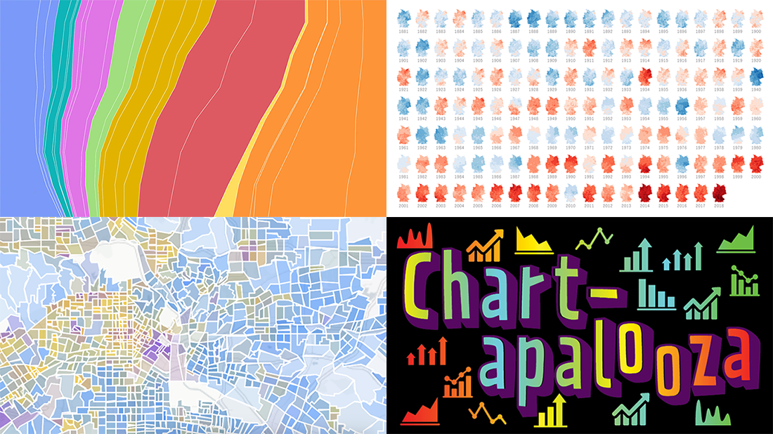
Cool Charts in Data Visualization Weekly: December 6, 2019 — December 13, 2019
U.S. Metropolitan Growth
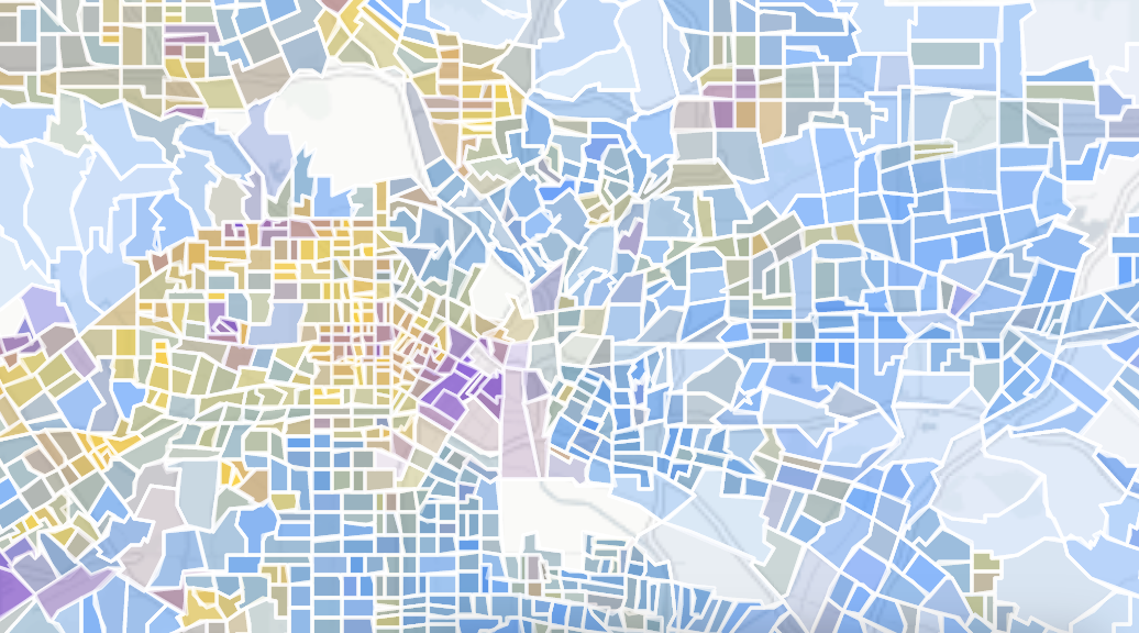
Zillow, a real estate marketplace, published an interactive map that shows the metropolitan growth of the United States over time. Displaying the type of housing along with where and when it was built, the visualization is designed by the authors as more than just another visual history lesson. According to Zillow, seeing a clear picture of how the housing stock evolved in the past is essential for better understanding the current issues with the housing affordability in the U.S. through the prism of its roots.
Use the map to track the evolution of the housing stock in large cities and metro areas across the U.S. Do not miss out on conclusions from Zillow’s analysts regarding the history of construction in Los Angeles, Houston, and Detroit as representatives of larger groups of similar American regions.
Climate Change in Germany
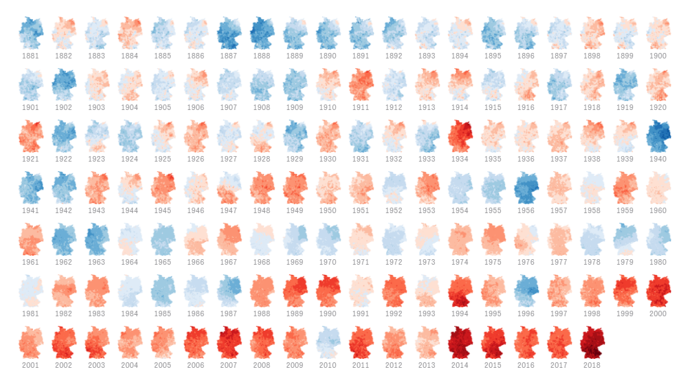
Ed Hawkins, a climate scientist from the University of Reading, is credited for first using colored vertical stripes to communicate temperature changes over time. He called this type of graphics “warming stripes,” and sometimes it is also referred to as “climate stripes” and “climate timelines.” Such stripes-based technique has been widely used to visualize the effect of global warming on the air temperature. On Tuesday, Zeit Online shared an interactive tool that can generate warming stripes for any city and community across Germany, displaying the average annual temperature in the corresponding place going back to 1881.
However, climate stripes are only part of this new Zeit’s big project dedicated to climate change in Germany. Scroll down and you’ll see a series of small colored map-based snapshots of annual temperatures for the entire country, for each year from 1881 to 2018. Then, there are other interesting graphical presentations of climate data for Germany, a line chart and another interactive map to look at the global warming in this country with respect to climate zoning.
Changes in Job Distribution in America

A cool chart that lets data speak does not necessarily need to be complicated or even interactive. Here’s one example. Data visualization expert Nathan Yau applied job statistics from the Decennial Census and the American Community Survey to a 100% stacked area chart to show the shifts in job distribution in the United States over the past several decades.
As a matter of fact, almost 50% of all employed Americans were in manufacturing or farming about seventy years ago. Take a look at this visualization on Nathan Yau’s blog FlowingData to see how the distribution of jobs across occupation groups in the United States then changed all the way through 2017.
Canadian Economy in Chartapalooza

Do you want even more cool charts? Here is a plenty of them about Canada if you would like. Canadian news magazine Maclean’s asked a number of experts in economics and finance to pick a chart about Canada’s economy that they think would be especially interesting to look at in 2020, and to explain why. Then the whole selection was published within the framework of the magazine’s sixth annual Chartapalooza project.
Check out over 80 charts visualizing data about the Canadian GDP, jobs, trade, energy, real estate, and much, much more. Very interesting.
***
We hope you like these cool charts. We’ll share more next Friday. Stay tuned for Data Visualization Weekly.
- Categories: Data Visualization Weekly
- No Comments »