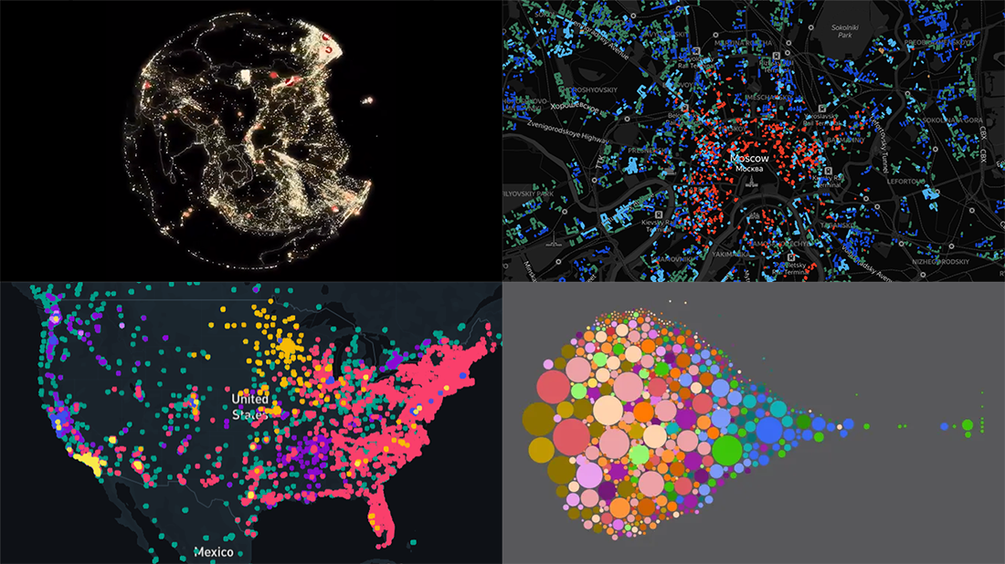
 Join us as we praise new amazing data visualization projects from around the web. These are cool examples dedicated to charting salaries, earthquakes, housing history, and coffee shop locations. Look what DataViz Weekly has to showcase today:
- Salaries across occupations in the United States — FlowingData
- Earthquakes worldwide, with exaggerated depth — Raluca Nicola
- History of Moscow housing — Strelka Mag
- Coffee shops in America and worldwide — Thinknum
Data Visualization Weekly: November 15, 2019 — November 22, 2019
Charting Salaries and Occupations
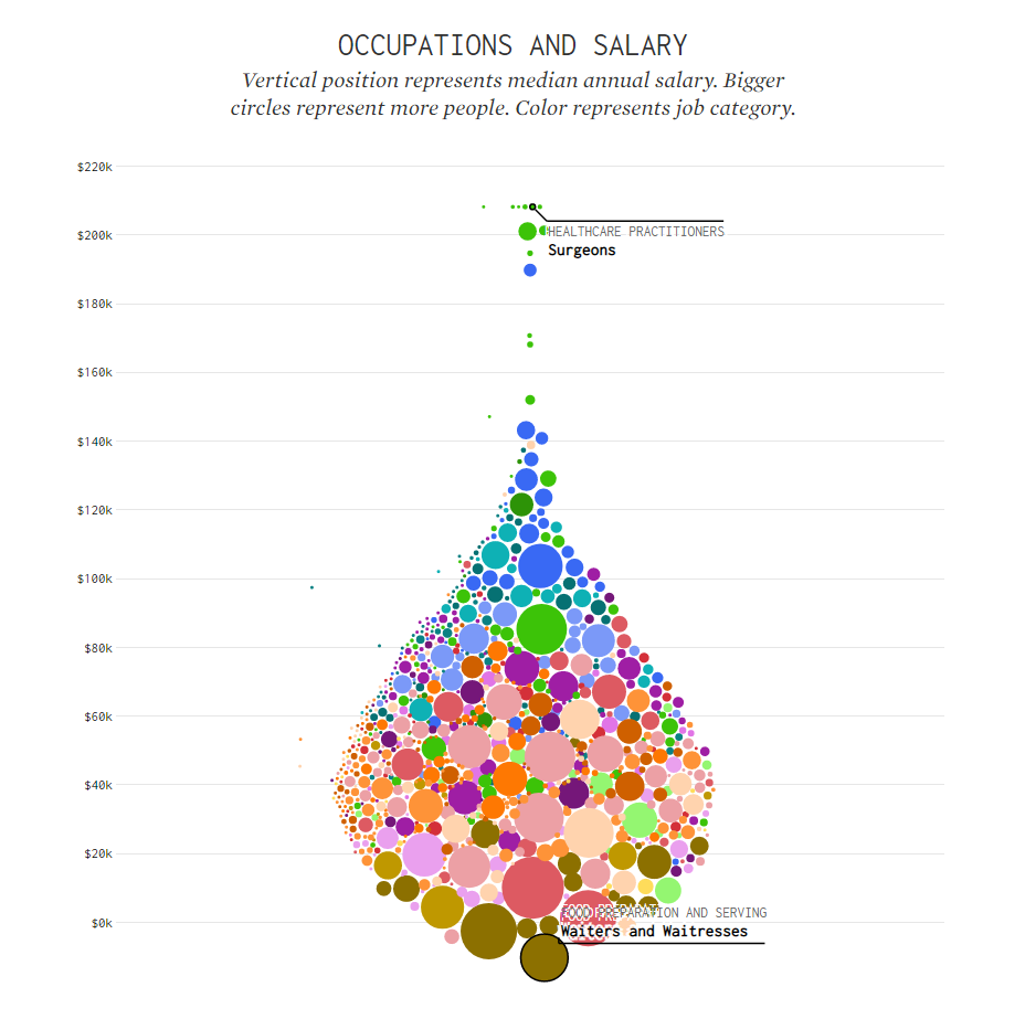
Nathan Yau published a new awesome interactive data visualization project. This time it’s about how salaries vary across different types of occupation in the United States.
Using data from the Bureau of Labor Statistics, he charted the median annual salary for each occupation. The bigger the size of a bubble, the more Americans have the corresponding job. Overall, there are 800 occupations represented. Bubbles of the same color belong to the same job group.
Scroll down and you’ll see the distributions separately for each of the 22 job categories considered in the research. Hover over the bubbles to see percentiles.
Earthquakes with Exaggerated Depth
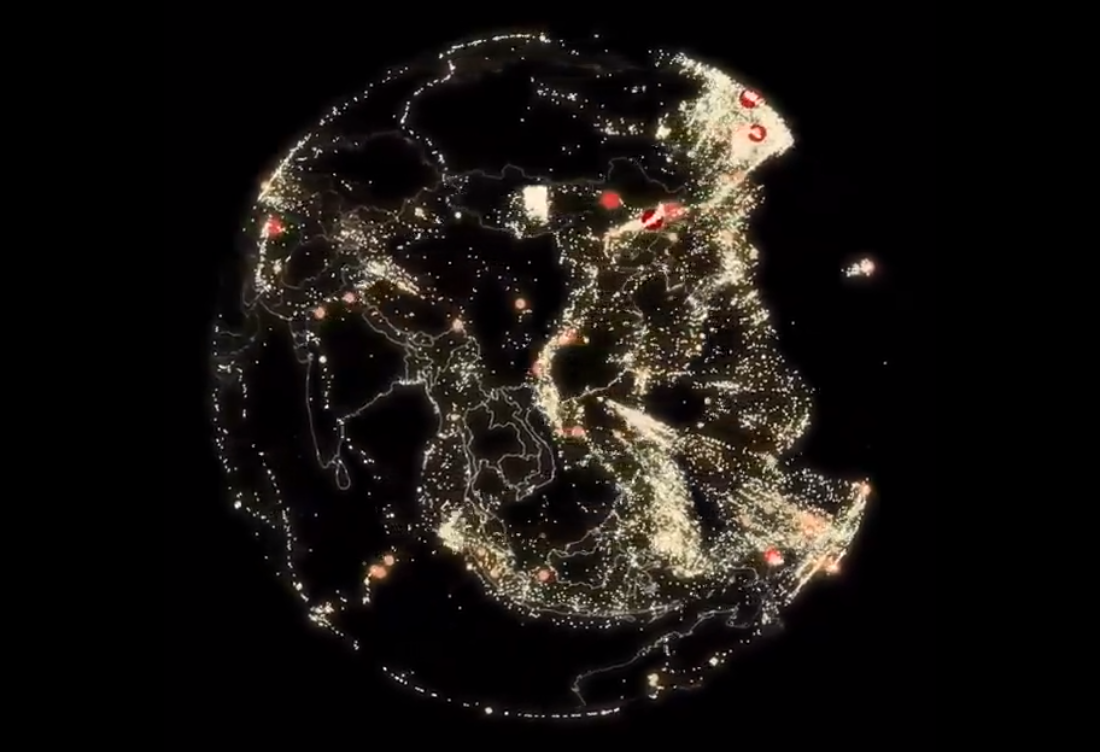
3D cartographer Raluca Nicola made an outstanding visualization that shows the location of all the earthquakes that had taken place around the world between July 2017 and July 2018. What makes this project especially exciting is the representation of the earthquake depth, like you are looking at earthquakes from inside the Earth.
For this project, the author took open data from the USGS Earthquake Hazards Program. To make the look more insightful, the depth of earthquakes is exaggerated by a factor of eight.
Check out this awesome data visualization project. It is interactive, so feel free to rotate it, zoom in and out, and click on an earthquake to find out the details about its magnitude and depth.
History of Moscow Housing
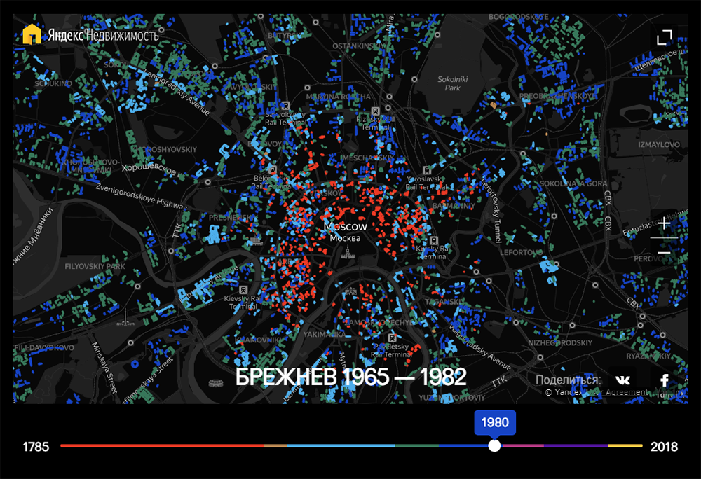
Strelka Mag, the online magazine of the Strelka Institute for Media, Architecture and Design whose purpose is to “change the cultural and physical landscapes of Russian cities,” made a very interesting interactive map that graphically represents the history of housing in Moscow since 1785.
The visualization is based on data from Yandex.Realty, which contains the records about the age of 18,873 buildings throughout the capital of Russia. Colors represent the key political eras for Russia and Moscow: the Russian Empire (to 1917), then — named after Russia’s leaders — Lenin (to 1924), Stalin (to 1953), Khrushchev (to 1964), Brezhnev (to 1982), and Andropov, Chernenko and Gorbachev (to 1991), and then — named after Moscow mayors — Luzhkov (to 2010) and Sobyanin (to 2018 which is the last year in the database).
Explore how housing has developed in Moscow over more than 230 years. Make use of the time slider at the bottom to look into particular times. Hover over a building to see its age of construction.
Coffee Shops in America and Worldwide
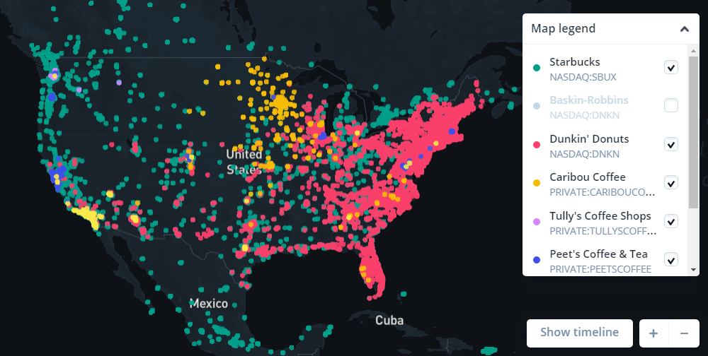
The fact that the average American spends over $1,000 per year on coffee, revealed in a report by Acorns, captured the attention of Joshua Fruhlinger, Editor-in-Chief at Thinknum Media. So he wondered where they do that for the most part and visualized the retail outlay for six coffee chains popular in America: Starbucks, Dunkin’ Donuts, Caribou Coffee, Tully’s Coffee Shops, Peet’s Coffee & Tea, and The Coffee Bean & Tea Leaf.
Check out the interactive map he made. There, you can easily explore the distribution of those chains’ stores — a total of 22,842 coffee shops — across the United States and worldwide.
Zoom in down to the level of cities and neighborhoods. Read the text to find out what Joshua noticed for his part.
***
Check out these cool projects. Let us know whenever you find or make a new cool data visualization so we can consider featuring it in Data Visualization Weekly. And stay tuned.
Have a wonderful time everyone!
- Categories: Data Visualization Weekly
- No Comments »